Crashes, No Sound, or Screen Glitches?
Random freezes, missing sound and display glitches usually trace back to one bad driver. Find and replace yours safely.Free scan · under a minute
Windows Errors? Fix Them Before They Spread
Repair common Windows errors and clear accumulated junk for a smoother, more stable PC - no reinstall needed.Free scan · no reinstall
ThatPainter is reader-supported. When you buy through links on our site, we may earn an affiliate commission. Learn More
Olive green pairs especially well with warm whites, cream, beige, taupe and brown for a grounded palette; blush pink for softness; and blue, red, orange, yellow or other greens for more contrast. The best choice depends on the particular olive’s undertone and how much energy you want in the room. Here are ten designer-backed pairings, with practical ways to use each in paint, furniture and accents.
What colors go with olive green?
Olive can act as a grounding neutral, but it is not one fixed color: some olives read more yellow-brown, while others look cooler or grayer. Compare the companion color with the actual paint, fabric or tile in your room, rather than choosing from the word “olive” alone. Livingetc describes olive as warmer and more yellow-brown than sage, which tends toward gray-blue (Livingetc).
Quick wins for a faster PC:
Fix the driver behind crashes, sound loss and screen glitchesFind Drivers →Clear out junk files and repair common Windows errorsFree Scan →Scan for outdated or missing drivers - takes under a minuteDriver Scan →These ten pairings move from quiet and earthy to brighter and more expressive. The mood descriptions reflect designers’ qualitative advice, not measured results.
10 colors that pair well with olive
1. Cream and warm white
Warm white or cream gives olive a light counterpoint without the starkness of a cooler white. Try it on walls beside olive tile, or use cream linens and trim to lift an olive-painted room. Apartment Therapy shows warm white walls enhancing olive tile, while Homes & Gardens recommends cream for a softer, warmer scheme (Apartment Therapy; Homes & Gardens).
#1 Best Overall
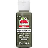
- CONVENIENT SIZE - This Apple Barrel Acrylic Paint comes in a versatile 2 oz size that is great for basecoating, stenciling, and so much more
- FUN FINISH - This brilliant acrylic paint dries to a matte finish - perfect for a variety of arts and crafts!
- BRIGHT COLOR - Grab your acrylic paint brushes and add this fun, bright acrylic paint to all your DIY projects
- USE ON MULTIPLE SURFACES - Use Apple Barrel Acrylic Paint on a variety of surfaces such as wood, paper, canvas, Styrofoam, paper mache, and so much more
- EASY CLEAN UP - Clean up is easy with this acrylic paint! Simply clean up while wet with soap and water
2. Beige
Beige is a gentle backdrop for olive walls or cabinetry, and it works especially naturally in upholstery, bedding and rugs. ELLE Decor features a beige-draped bed against olive walls; Homes & Gardens also includes beige among designers’ recommended light neutrals (ELLE Decor; Homes & Gardens).
3. Taupe
Taupe keeps an olive scheme restrained while adding a distinct neutral alongside it. Use taupe on walls with olive upholstery, then bring in wood and textured linen so the quiet palette still has visual variation. Livingetc includes taupe among its olive pairings (Livingetc).
What’s actually slowing this PC down?
Pick the symptom - the matching free tool is one click away.
4. Brown
Chocolate brown, dark leather, timber and rattan reinforce olive’s earthy character. A brown sofa against an olive ceiling or walls can feel grounded rather than stark; varied materials help separate the colors and keep the room from looking flat. Homes & Gardens and Livingetc both feature brown with olive in designer examples (Homes & Gardens; Livingetc).
Rank #2

- Winsor & Newton Galeria Acrylic Colours are strong and vibrant with good covering power and a smooth, satin finish.
- Series: 1/Color Code: 447
- Permanence Rating: A - Permanent
- Transparency / Opacity: Semi-Transparent
- Lightfastness Rating: ASTM I - Excellent
5. Blush or washed-out pink
Blush pink softens olive and creates a lighter contrast, whether used on walls beside dark olive cabinets or in smaller accents. For a more enduring, less sugary look, Livingetc’s designers favor washed-out or moody pinks over bubble-gum pink (Homes & Gardens; Livingetc).
6. Red
Red makes a higher-contrast partner for olive. Cherry red can supply a vivid focal point: Chicago-based designer Sarah Vaile described her “cherry red chinoiserie chairs against custom-colored Farrow & Ball olive walls” as an unexpected pairing the team loved (Homes & Gardens). For a subtler effect, try brick or burgundy. Keep one color dominant and use the other in a more controlled area; Livingetc cautions that muted reds can help avoid an unintended holiday-like look (Livingetc).
7. Orange or terracotta
Burnt orange and terracotta add warmth and energy while staying within an earthy palette. Use burnt-orange bedding with an olive bed, or consider peachy terracotta walls with an olive sofa. ELLE Decor and Apartment Therapy each show one of these combinations in a room setting (ELLE Decor; Apartment Therapy).
Do these 3 things before closing this tab:
1Clear out junk files and repair common Windows errors2Fix the driver behind crashes, sound loss and screen glitches3Repair Windows errors before they cause bigger problemsRank #3

- Includes 30 featured and newest released color card. Sprayed on color to see our colors in your homes lighting for more accurate color choices.
- ALL-IN-ONE Paint - NO Sanding, NO Priming, NO Top Coat Required, Low Luster, Velvet Sheen Finish
- Interior/Exterior - Paint your whole house - Ideal for hard surfaces including walls, doors, cabinets, counters, furniture, metal, glass, ceramics and floor and wall tile
- Durable yet stretches to paint smooth fabrics, vinyl and leather
- Results cannot be guaranteed. Digital screens may not show color accurately. Product search "ALL-IN-ONE PAINT by Heirloom Traditions, Color Confidence Card", for an accurate color choice.
8. Blue
Blue provides a cool counterpoint to olive, from soft blue-gray to deep indigo or blue-green. Blue-gray cabinetry can sit alongside olive walls; indigo pillows offer a smaller accent against an olive sofa. Designers cited by ELLE Decor and Livingetc describe the combination as fresh and earthy (ELLE Decor; Livingetc).
9. Yellow or gold
Mustard or warm yellow adds a lively accent, while gold can make the pairing more dramatic. Introduce yellow through accessories or smaller furnishings if you want to keep olive in the lead; gold upholstery creates a stronger statement. Apartment Therapy and Livingetc show both directions (Apartment Therapy; Livingetc).
10. Other greens
Layering green shades makes a tonal scheme. Sage, jade, forest green, mint or teal can sit beside olive in paint, upholstery, pillows or artwork. Pay attention to undertones: Livingetc notes that olive tends warmer and more yellow-brown than sage’s gray-blue cast, so the contrast between the two can help keep a green-on-green room from feeling uniform (Homes & Gardens; Livingetc).
Rank #4

- CONVENIENT SIZE - This Apple Barrel Acrylic Paint comes in a versatile 2 oz size that is great for basecoating, stenciling, and so much more
- FUN FINISH - This brilliant acrylic paint dries to a matte finish - perfect for a variety of arts and crafts!
- BRIGHT COLOR - Grab your acrylic paint brushes and add this fun, bright acrylic paint to all your DIY projects
- USE ON MULTIPLE SURFACES - Use Apple Barrel Acrylic Paint on a variety of surfaces such as wood, paper, canvas, Styrofoam, paper mache, and so much more
- EASY CLEAN UP - Clean up is easy with this acrylic paint! Simply clean up while wet with soap and water
How to choose the right pairing for your room
Start with the olive you have
Look at the color beside natural materials and in the room’s actual light. If it reads warm and yellow-brown, earthy neutrals, brown, terracotta and golden accents reinforce that character. If it looks grayer or cooler, warm cream or a contrasting blue may create more balance. Undertone is a useful comparison, not a rigid rule.
Decide which color should lead
For a quiet room, use olive with cream, beige, taupe or brown across larger surfaces, then add interest through texture. For a more vivid scheme, make olive the main color and bring in a smaller area of red, orange or yellow—or reverse the balance if a bold accent is the focus. This is particularly helpful with red, where controlling which shade dominates makes the contrast feel intentional.
Use materials and finishes to add depth
Wood, linen, aged brass, stone and woven materials can add warmth and texture alongside olive, rather than relying on color contrast alone. If you are color-drenching a room, Apartment Therapy’s cited designer suggests matte walls with satin trim; Livingetc reports that flat or matte finishes suit a modern look, while some sheen can feel more traditional (Apartment Therapy; Livingetc).
Best Value

- Made in United States
Test paint and large surfaces before committing
Try a sample of the olive and its companion color together on the intended surfaces. Check them at different times of day and against the flooring, upholstery and other fixed finishes. A color that works as a pillow or small accent may feel very different across a wall or a large sofa.
A bolder extra: purple
Purple is another documented option if you want a more unexpected accent rather than one of the ten main pairings. ELLE Decor describes jewel-toned purple bench fabric alongside olive-painted staircase railings (ELLE Decor).
Quick Recap

Product prices and availability are accurate as of the date/time indicated and are subject to change. Any price and availability information displayed on Amazon at the time of purchase will apply.

