Quick wins for a faster PC:
Quick wins for a faster PC:
Repair Windows errors before they cause bigger problemsFix Now →Scan for outdated or missing drivers - takes under a minuteDriver Scan →Scan for outdated or missing drivers - takes under a minuteDriver Scan →Repair Windows errors before they cause bigger problemsFix Now →
ThatPainter is reader-supported. When you buy through links on our site, we may earn an affiliate commission. Learn More
Effective web design is more than an attractive homepage. A successful website helps the right people complete the right tasks clearly, inclusively, quickly, confidently, and safely. For a painting business, that may mean finding a service, viewing relevant work, understanding the process, requesting an estimate, or calling without hunting for basic information.
This 2026 framework covers ten connected elements: purpose, structure, visual hierarchy, content, color and imagery, responsive behavior, accessibility, performance, interaction, and the quality of the underlying implementation. Accessibility and speed are not final-stage developer tasks; they begin in the brief and design system.
The 10 elements at a glance
| Element | Why it matters | Question to ask | Common mistake |
|---|---|---|---|
| Purpose and user flows | Turns visits into useful outcomes | What should this visitor do next? | Designing before defining the goal |
| Information architecture | Makes content predictable | Can a new visitor find the right service? | Clever, vague navigation labels |
| Visual hierarchy | Shows what deserves attention | What will people notice first? | Making every section equally prominent |
| Typography and content | Makes information readable and credible | Can someone scan and understand this? | Using placeholder copy or tiny text |
| Color and imagery | Communicates brand, status, and context | Does the design work without color alone? | Decorative images that do no useful work |
| Responsive behavior | Supports different screens and inputs | What happens when space or text changes? | Designing only desktop and mobile screenshots |
| Accessibility | Allows more people to use the site | Can it be used by keyboard and screen-reader users? | Trusting an automated scan as proof |
| Performance | Reduces waiting and frustration | How quickly does meaningful content appear? | Loading excessive media and scripts |
| Interaction and feedback | Explains what controls and states mean | What happens after an action fails? | Designing only the happy path |
| Implementation quality | Keeps the site findable, trustworthy, and maintainable | Can the site be updated safely six months from now? | Confusing a mockup with a finished product |
1. Clear purpose, audience, and user flows
Start with an outcome, not a visual style. A painting company website may serve homeowners, landlords, property managers, commercial clients, or contractors. Those audiences may use different terminology, need different evidence, and follow different paths.
Recommended Free Tools
Define the primary action for each important page. On a service page, it might be request an estimate; on a project page, view related work; on a contact page, call or submit an inquiry. Secondary actions can remain available, but competing primary calls to action make decisions harder.
#1 Best Overall

- Word-first 16K Pressure Levels: The upgraded stylus features 16,384 levels of pressure sensitivity and supports up to 60 degrees of tilt, delivering smoother lines and shading for a natural drawing experience. With no battery or charging needed, it operates like a real pen, making it easy for beginners to create effortlessly. This functionality helps novice artists develop their skills and explore their creativity without the intimidation of complex tools
- Designed for Beginners: This drawing pad desinged with 8 customizable shortcuts for both right and left-hand users, express keys create a highly ergonomic and convenient work platform
- Perfectly Adapted for Android: The XPPen Deco 01 V3 art tablet supports connections with Android devices running version 10.0 and above. It is recommended to download the XPPen Tools Android application, which adapts to your smartphone's screen aspect ratio, ensuring accurate mapping. It also supports mapping on Android screens with different aspect ratios in portrait mode
- Large Drawing Space, Bigger Bold Inspiration: This expansive drawing pad has10 x 6.25-inch helps you break through the limit between shortcut keys and drawing area
- Easy Connectivity for Beginners: The Deco 01 V3 offers USB-C to USB-C connectivity, plus adapters for USB C. This ensures easy connection to various devices, allowing beginner artists to set up quickly and focus on their creativity without compatibility concerns. Whether using a laptop, tablet, or desktop, the Deco 01 V3 provides a seamless experience, making it an ideal choice for those just starting their digital art journey
| Page | Visitor intent | Primary action | Evidence needed | Failure risk |
|---|---|---|---|---|
| Homepage | Understand the offer | Explore services or contact | Clear value proposition and proof | Generic messaging |
| Services | Find the right type of work | Open a service detail page | Plain-language descriptions | Internal jargon |
| Project page | Judge quality and fit | Request an estimate | Location, scope, materials, photographs | Overpromising |
| Contact | Start a conversation | Submit a form or call | Response expectations and service area | Too many fields |
Map the shortest credible path from an arrival to completion. Someone coming from a search result, social post, advertisement, or referral may land on an internal page, not the homepage. Test real tasks such as “Find the price range,” “See whether exterior work is offered,” or “Book an estimate.” Measure task completion, not only clicks.
Quick test
For each key page, write one sentence beginning: “This page helps [audience] do [task] so that [outcome].” If the sentence is unclear, the design brief is not ready.
2. Information architecture and navigation
Information architecture is the system that organizes pages, content, and pathways. Visitors should be able to predict where information lives without learning the company’s internal organization.
- Use familiar, specific labels such as Services, Projects, Pricing, About, and Contact.
- Use global navigation for major destinations and local navigation for sections such as documentation or service categories.
- Add breadcrumbs where they clarify location, particularly on large sites.
- Use descriptive internal links rather than vague “click here” labels.
- Design useful search, filters, empty states, and a recoverable 404 page when the site is large enough to need them.
- Keep footer navigation useful for contact details, service areas, policies, and important destinations.
Google’s Search Essentials recommends crawlable links and descriptive wording in titles, headings, alt text, and link text. That supports both visitors and search engines, but good structure does not guarantee crawling, indexing, or ranking.
Different site types need different structures. An ecommerce site needs category, product, cart, account, and checkout paths. Documentation needs versions and cross-references. A multilingual site should preserve the current page when switching languages where possible. A campaign landing page may reduce navigation, but should not hide essential trust, contact, or legal information.
Quick test
Give a new visitor a page name and ask where they would expect to find it. If several people choose different locations, revise the taxonomy or labels.
3. Visual hierarchy and layout
Visual hierarchy determines what people notice first, second, and third. It is created through the coordinated use of scale, position, contrast, spacing, typography, imagery, alignment, grouping, and interaction priority—not by making everything large.
What’s actually slowing this PC down?
Pick the symptom - the matching free tool is one click away.
A strong painting-business homepage might establish this order: what the company does and where it works; the main estimate action; examples and reviews; services; process and proof; answers to objections; contact details. The order may change for another audience, but it should be intentional.
Rank #2
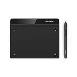
- Battery-Free Pen: StarG640 drawing tablet is the perfect replacement for a traditional mouse! The XPPen advanced Battery-free PN01 stylus does not require charging, allowing for constant uninterrupted Draw and Play, making lines flow quicker and smoother, enhancing overall performance
- Ideal for Online Education: XPPen G640 graphics tablet is designed for digital drawing, painting, sketching, E-signatures, online teaching, remote work, photo editing, it's compatible with Microsoft Office apps like Word, PowerPoint, OneNote, Zoom, Xsplit etc. Works perfect than a mouse, visually present your handwritten notes, signatures precisely
- Compact and Portable: The G640 art tablet is only 2 mm thick, it's as slim as all primary level graphic tablets, allowing you to carry it with you on the go
- Chromebook Supported: XPPen G640 digital drawing tablet is ready to work seamlessly with Chromebook devices now, so you can create information-rich content and collaborate with teachers and classmates on Google Jamboard’s whiteboard; Take notes quickly and conveniently with Google Keep, and effortlessly sketch diagrams with the Google Canvas
- Multipurpose Use: Designed for playing OSU! Game, digital drawing, painting, sketch, sign documents digitally, this writing tablet also compatible with Microsoft Office programs like Word, PowerPoint, OneNote and more. Create mind-maps, draw diagrams or take notes as replacement for mouse
- Use a consistent grid and sensible container width.
- Group related content and separate unrelated sections with spacing.
- Use whitespace to clarify relationships, not merely to create a fashionable sparse look.
- Limit focal points so the primary action remains visible.
- Use repeated patterns consistently for cards, buttons, headings, and project details.
- Reconsider the hierarchy at narrow widths instead of shrinking the desktop layout.
A five-second test is useful. Ask someone unfamiliar with the project: “What does this organization do? Who is it for? What can you do next? Why should you trust it?” If the answers are missing, more visual polish may not solve the problem; the issue may be messaging or hierarchy.
Common failures
Oversized hero sections can push useful information too far down. Decorative animation can compete with the call to action. Dense card grids can make every item appear equally important. Inconsistent spacing can make unrelated content appear connected.
4. Typography and readable content
Typography is both a visual system and a usability system. Use a limited, intentional set of styles for body text, headings, labels, captions, metadata, and status messages.
Free tools Windows power users keep installed
One-click scans. No signup required.
- Use comfortable body-text size, line height, and paragraph spacing.
- Avoid extremely light weights and overly narrow text columns.
- Make headings informative, not merely decorative.
- Use semantic heading order; visual size and HTML heading level do not have to be identical.
- Make links recognizable without relying only on color.
- Test real service descriptions, addresses, names, prices, and error messages rather than placeholder text.
- Check that fonts support every language and character set required.
- Plan for text expansion during localization.
A distinctive display font can strengthen a brand but reduce readability or increase loading cost. Variable fonts offer flexibility, but still require performance testing. All-caps labels can add emphasis, yet become difficult to scan when used everywhere. Tight line height may look effective in a headline while harming readability for people with low vision.
5. Color, contrast, and meaningful imagery
Color should be treated as a role-based system, not a collection of attractive swatches. Define roles for background, surface, text, muted text, border, accent, success, warning, and error. Design every relevant state: hover, focus, active, visited, loading, disabled, and error.
- Do not use color alone to identify errors, required fields, selected items, or status.
- Check text, controls, and focus indicators against their actual backgrounds.
- Test light and dark themes separately if both are offered.
- Use informative alt text for images that convey meaning and mark purely decorative images appropriately.
- Size and compress images for their actual display dimensions.
- Use labels, patterns, or direct annotations in charts rather than color differences alone.
Figma’s accessibility guidance highlights correct HTML elements and accessibility properties, hiding decorative elements from assistive technology, and using contrast tools during design.
For a painting company, before-and-after photographs can provide valuable evidence when they identify the project context accurately. Photos with text embedded inside them can be inaccessible and difficult to localize. Transparent logos may disappear against some backgrounds, while gradients can make text contrast change across the image.
Crashes, No Sound, or Screen Glitches?
Random freezes, missing sound and display glitches usually trace back to one bad driver. Find and replace yours safely.Free scan · under a minutePC Slower Than It Used to Be?
A free scan shows the junk files, broken settings and background clutter dragging Windows down - then fixes them in one click.Free scan · Windows 10 & 116. Responsive and adaptive behavior
Responsive design is not a set of desktop, tablet, and mobile screenshots. It is a system that adapts to width, orientation, pixel density, text length, zoom, input method, connection quality, dark mode, and reduced-motion preferences.
Rank #3

- Wacom Intuos Small Graphics Drawing Tablet: Enjoy industry leading tablet performance in superior control and precision with Wacom's EMR, battery free technology that feels like pen on paper
- Works With All Software: Wacom Intuos tablet can be used in any software program to explore new facets of digital creativity; draw, paint, edit photos/videos, create designs, and mark up documents
- What the Professionals Use: Wacom's industry leading pen technology and pen to paper feeling makes it the preferred drawing tablet of professional graphic designers
- Software and Training Included: Only Wacom gives you software with every purchase. Register your Intuos tablet and gain access to some of the best creative software and Wacom's online training
- Wacom is the Global Leader in Drawing Tablet and Displays: For over 40 years in pen display and tablet market, you can trust that Wacom to help you bring your vision, ideas and creativity to life
- Use fluid containers, flexible grids, responsive type, and responsive images.
- Introduce breakpoints when content or interaction begins to fail, not only at named device widths.
- Ensure navigation, forms, tables, charts, and comparison grids remain meaningful at narrow widths.
- Support keyboard, pointer, and touch input.
- Test zoom and increased text size.
- Prevent horizontal scrolling caused by fixed-width elements.
- Ensure fixed headers and pop-ups do not obscure focused controls.
- Prioritize content rather than simply hiding it on mobile.
WCAG 2.2 includes requirements concerning focus not being obscured and minimum target size, both relevant to responsive interaction design. Long names, translated copy, landscape orientation, intermittent connections, and older phones are practical edge cases worth testing.
7. Accessibility: use WCAG 2.2 as a starting point
Use WCAG 2.2 as the principal technical reference for new work unless a contract, jurisdiction, or procurement requirement specifies another version. WCAG 2.2 is backward-compatible with WCAG 2.1 and 2.0. It was published on October 5, 2023, with an update on December 12, 2024.
WCAG 2.2 added nine success criteria, including Focus Not Obscured, Focus Appearance, Dragging Movements, Target Size, Consistent Help, Redundant Entry, and Accessible Authentication.
- Use semantic HTML and a logical keyboard order.
- Provide a visible focus indicator.
- Label every form field and associate errors with the relevant field.
- Provide text alternatives for informative images.
- Use sufficient contrast and never rely on color alone.
- Offer a non-drag alternative.
- Manage dialog focus correctly, including restoration when a dialog closes.
- Test menus, accordions, tabs, carousels, and custom controls with a keyboard.
- Use at least one screen reader for spot checks and involve people with disabilities where possible.
Automated scanners identify only some problems; a passed scan is not proof of conformance or a universally accessible experience. Also, do not claim that WCAG conformance makes a site legally compliant everywhere. W3C notes that legal and technical regimes differ; for example, EN 301 549 currently references WCAG 2.1. Requirements vary by country, sector, contract, and service.
8. Performance and Core Web Vitals
Performance is a design constraint because media choices, fonts, animation, third-party widgets, and page structure determine how quickly people can understand and use a page.
Google’s current “good” Core Web Vitals guidance recommends:
| Metric | What it measures | Recommended target |
|---|---|---|
| LCP | Loading performance of the main content | 2.5 seconds or less |
| INP | Responsiveness to interactions | Under 200 milliseconds |
| CLS | Visual stability | Under 0.1 |
See Google’s Core Web Vitals guidance and use Search Console and other tools. These thresholds are user-experience targets, not a ranking guarantee, and lab scores do not necessarily represent real visitors.
- Serve images in appropriate dimensions and formats.
- Lazy-load genuinely offscreen media.
- Reserve space for images, advertisements, and embeds to reduce layout shift.
- Limit analytics, chat, advertising, social embeds, and other third-party scripts.
- Avoid unnecessary font families and weights.
- Prefer HTML and CSS when JavaScript is not needed.
- Test a mid-range phone and slow connection, not only a powerful desktop.
- Recheck after adding personalization, animation, AI widgets, or tracking.
Framer advertises server-side rendering, lazy loading, optimized assets, edge delivery, and Core Web Vitals support on its performance page. These are vendor claims, not independent proof that every Framer site will perform well.
Rank #4
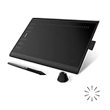
- Working Area Configuration - HUION art tablet equips with a 10 x 6.25 inches working area, providing the user with the most comfortable size to work; the 10mm slim structure and minimalist design of appearance make the drawing tablet more attractive.
- Tilt Function Battery-free Stylus: This computer graphics tablet come with a battery-free stylus PW100, no need to charge, allowing for constant uninterrupted drawing. ±60° tilt support enables imitation of lines input with diverse drawing gestures, with accuracy ensured.
- Press Keys:12 programmable press keys plus 16 programmable soft keys, you can set shortcut keys on drawing tablet's driver based on your preferences, such as erase, zoom in/out, scroll up and down, and so on.
- Compatibility: HUION graphics tablet supports Windows 7 or later/ macOS 10.12 or later/ Android 6.0 or later/ Linux (Ubuntu). A USB adapter is required to connect to a Mac computer. H1060P supports various mainstream design and drawing software, including PS, SAI, AI, CDR, etc. (Please note: The H1060P is compatible with Ubuntu, but it requires the use of the Xorg display server. Wayland is not supported.)
- NOTE: You can easily connect your phone to the art tablet via the OTG connector; while iPhone and iPad are NOT at the moment. The cursor will not show up in the SAMSUNG Galaxy S series at present. If you are not sure whether the product is compatible with your Phone or any help, please contact us.
9. Interaction design, forms, and feedback
Every control should communicate what it does, and every action needs a designed response. Include loading, success, validation, error, empty, cancellation, and recovery states—not just the ideal path.
Important patterns include buttons and links, menus, dialogs, drawers, tabs, accordions, search, filters, pagination, carousels, confirmation messages, undo, and cancellation. A destructive action should be reversible where practical.
Design forms as conversations
- Use visible labels and group related inputs.
- Explain expected formats before an error occurs.
- Ask only for information needed at that stage.
- Preserve entered values after an error.
- Explain the problem in plain language and associate it with the field.
- Say what happens after submission, such as when someone will respond.
- Keep consent and marketing opt-ins separate and clear.
- Avoid unnecessary account creation.
WCAG 2.2’s redundant-entry and accessible-authentication criteria make registration and login flows important 2026 considerations. Motion should communicate change or system status, not merely create spectacle. Provide reduced-motion behavior and never convey critical information only through animation.
10. Semantic, discoverable, trustworthy, and maintainable implementation
The final element is what determines whether a design survives contact with the real web. Use semantic HTML, correct heading hierarchy, descriptive titles and metadata, clear URLs, crawlable links, useful alt text, structured data where appropriate, canonical and indexing controls, an XML sitemap and robots controls where relevant, and Open Graph metadata for social sharing.
Content should remain understandable when extracted from its visual styling. Google’s Search Essentials emphasizes people-first content, descriptive wording, crawlable links, and appropriate handling of images, videos, structured data, and JavaScript. There is no reliable universal “AI-ready” trick: avoid promising that AI SEO, llms.txt, or a particular markup technique guarantees visibility in AI search or answer systems.
Trust and privacy
- Show clear pricing, terms, transaction details, and cancellation information where relevant.
- Identify the organization and provide usable contact information.
- Use evidence and reviews that can be verified.
- Use a secure connection and explain privacy choices in plain language.
- Collect the minimum data needed and avoid deceptive interface patterns.
Privacy obligations depend on jurisdiction, business activity, data type, and sector, so a design article should not present one universal legal checklist.
Maintainability
Use design tokens, reusable components, content models, naming conventions, documentation, version control, staging and preview environments, backups, rollback procedures, and clear ownership of domains, content, analytics, and code. Plan how the site could be exported or migrated. AI can accelerate mockups and copy, but generated work still needs fact-checking, accessibility review, responsive testing, performance measurement, and security review.
Do these 3 things before closing this tab:
1Scan for outdated or missing drivers - takes under a minute2Clear out junk files and repair common Windows errors3Fix the driver behind crashes, sound loss and screen glitchesChoosing the right website tool
There is no universally best platform. Choose according to site type, content complexity, design freedom, performance and accessibility control, collaboration, SEO controls, ecommerce needs, portability, and total cost.
Best Value

- Large Active Drawing Space: UGEE M708 V3 graphic drawing tablet features 10 x 6 inch large active drawing space with papery texture surface, provides enormous and smooth drawing for your digital artwork creation, offers no-lag sketch and painting experience
- 16384 Passive Stylus Technology: A more affordable passive stylus technology offers 16384 levels of pressure sensitivity allows you to draw accurate lines of any weight and opacity according to the pressure you apply to the pen, sharper line with light pressure and thick line with hard pressure for artistry design or unique brush effect for photo retouching
- Compatible with Multiple System and Softwares: Powerful compatibility, tablet for drawing computer, perform well with Windows 11/10/8/7, Mac OS X 10.10 or later, Android 10.0 or later, mac OS 10.12 or later, Chrome OS 88 or later and Linux; Driver program works with creative software such as Photoshop, Illustrator, Macromedia Flash, Comic Studio, SAI, Infinite Stratos, 3D MAX, Autodesk MAYA, Pixologic ZBrush and more
- Ergonomically Designed Shortcuts: 8 customizable express keys on the side for short cuts like eraser, zoom in and out, scrolling and undo, provide a lot more for convenience and helps to improve the productivity and efficiency when creating with the drawing tablet
- Easy Connectivity for Beginners: The UGEE M708 V3 offers USB to USB-C connectivity, plus adapters for USB C, ensuring easy connection to various devices and allowing beginner artists to set up quickly and focus on their creativity without compatibility concerns; Whether using a laptop, desktop, chromebook, or tablet, the UGEE M708 V3 provides a seamless experience for those just starting their digital art journey
| Tool | Best fit | Important caution |
|---|---|---|
| Figma | Wireframes, prototypes, design systems, collaboration, and handoff | A design tool is not automatically production hosting, QA, accessibility testing, CMS infrastructure, or ecommerce. |
| Framer | Visually led marketing sites, portfolios, landing pages, and smaller content sites | Check CMS, page, localization, editor, and add-on limits; it is less suited to complex application logic or ecommerce. |
| Webflow | Designer-developer collaboration and structured CMS marketing sites | Its 2026 plans and limits changed; monitor account-specific pricing and migration implications. |
| WordPress | Flexible publishing, hosting choice, and a broad plugin ecosystem | You own more responsibility for updates, security, compatibility, accessibility, backups, and performance. |
| Shopify | Ecommerce-first businesses | Check current official pricing; apps and payment costs can materially change the total. |
| Custom or headless | Maximum control and integration flexibility | Higher development, ownership, and maintenance costs. |
Pricing changes quickly, so verify before purchasing. In the August 16–18, 2026 research snapshot, Figma listed Starter as free, Professional Full at $16/month, Organization Full at $55/month, and Enterprise Full at $90/month, with other seat types priced separately. Framer listed Free, Basic at $10/month, Pro at $30/month, and custom Enterprise pricing. Webflow’s May 2026 update listed Basic at $15/month annually or $25/month monthly, and CMS/Premium-level pricing at $25/month annually or $39/month monthly. Currency, billing cycle, taxes, seats, add-ons, usage, and location may affect these figures.
Webflow’s May 2026 update also introduced revised limits and a Team plan. Existing Freelancer and Agency Workspaces or legacy plans may transition on different schedules, so check the account-specific notice before committing.
A practical web-design audit checklist
Before design
- Define the audience, business objective, primary action, and success metrics.
- Map major user flows and inventory existing content.
- Identify technical, legal, ecommerce, and integration constraints.
- Set an accessibility target, preferably with WCAG 2.2 where appropriate.
- Choose the content model, ownership model, and exit strategy.
During design
- Test hierarchy, navigation, labels, and real content.
- Design responsive states, keyboard behavior, focus, forms, and errors.
- Include loading, empty, success, cancellation, and recovery states.
- Check contrast, imagery, alt-text requirements, and reduced motion.
- Review font loading, image sizes, scripts, and content density.
Before launch
- Run keyboard and screen-reader spot checks.
- Check contrast, zoom, text enlargement, mobile widths, orientation, and touch targets.
- Measure Core Web Vitals with field data where available and test realistic devices.
- Verify titles, headings, metadata, links, redirects, canonicals, sitemap, indexing controls, and social previews.
- Test every form, notification, analytics event, payment flow, and error path.
- Review security, consent, privacy explanations, backups, rollback, and ownership.
Frequently Asked Questions
What are the most important elements of web design in 2026?
The core elements are clear purpose and user flows, information architecture, visual hierarchy, readable content, color and imagery, responsive behavior, accessibility, performance, interaction feedback, and semantic, trustworthy, maintainable implementation.
Is WCAG 2.2 legally required for every website?
No universal legal rule applies to every website. WCAG 2.2 is W3C’s latest recommendation for new work, but legal and procurement requirements vary by country, sector, service, and contract.
Do good Core Web Vitals guarantee higher Google rankings?
No. Google’s targets—LCP at or below 2.5 seconds, INP below 200 milliseconds, and CLS below 0.1—are experience goals. They are one part of page experience and do not guarantee rankings.
Which platform is best for building a business website?
It depends on the project. Framer suits visually led smaller sites, Webflow suits structured CMS and designer-developer collaboration, WordPress offers flexibility with more maintenance responsibility, and Shopify is generally strongest when ecommerce is central. Figma is primarily for design and collaboration.
The Bottom Line
The best 2026 website is not the one with the most effects. It is the one that helps the right people complete the right tasks clearly, inclusively, quickly, and confidently—and remains accurate, secure, and maintainable after launch.
The Tool Desk
Outbyte Driver Updater FREEScan for outdated or missing drivers - takes under a minuteDriver Scan →Outbyte PC Repair FREEClear out junk files and repair common Windows errorsFree Scan →Quick Recap

Product prices and availability are accurate as of the date/time indicated and are subject to change. Any price and availability information displayed on Amazon at the time of purchase will apply.