Crashes, No Sound, or Screen Glitches?
Random freezes, missing sound and display glitches usually trace back to one bad driver. Find and replace yours safely.Free scan · under a minutePC Slower Than It Used to Be?
A free scan shows the junk files, broken settings and background clutter dragging Windows down - then fixes them in one click.Free scan · Windows 10 & 11ThatPainter is reader-supported. When you buy through links on our site, we may earn an affiliate commission. Learn More
The safest wall-and-trim combinations coordinate undertones and let trim quietly frame the room. The most dramatic combinations do the opposite: they use complementary hues, a saturated trim, or a deliberate light-dark shift to make the woodwork part of the design. Below are five classic pairings and five rule-breaking alternatives, followed by a practical method for choosing whites, testing samples, and selecting sheen for your own lighting and architecture.
As an Amazon Associate I earn from qualifying purchases.
How to choose between a classic and a rule-breaking wall-and-trim scheme
Start with the effect you want, not a paint chip. White or near-white trim creates a visual frame around the wall color and can emphasize casing, baseboards, doors, and panel molding. A same-family scheme makes the room feel more continuous, while colored or strongly contrasting trim turns the woodwork into a graphic feature. These are design effects, not measured guarantees; the actual result changes with paint formula, surface, daylight, lamps, furnishings, and adjacent colors.
Recommended Free Tools
| Decision | Usually favors a classic pairing | Usually favors a rule-breaking pairing |
|---|---|---|
| Undertones | Wall and trim whites share a warm or cool bias. | Complementary or intentionally opposing hues are welcomed. |
| Value contrast | Trim is white, off-white, or only subtly lighter. | Trim is darker, brighter, or more saturated than the wall. |
| Architectural emphasis | Trim recedes so wall color leads. | Trim becomes a focal point. |
| Overall mood | Quiet, adaptable, and easier to coordinate with furnishings. | Expressive, graphic, and more dependent on the room’s light. |
Before buying full cans, test paint color samples on the actual wall and beside the existing trim. Benjamin Moore notes that lighting strongly changes how color appears, especially whites. View the samples in morning, afternoon, and evening light, and under the room’s normal lamps.
#1 Best Overall
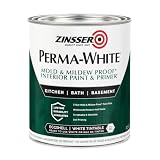
- Self-Priming formula - requires no sanding
- Mold & Mildew-Proof paint film - guaranteed for 5 years
- Resists dirt and moisture on film coating
- Finish is washable and scrubbable with soap and water
- Product contains a mildewcide to prevent the growth of mold and mildew on the paint film only
Five classic wall and trim color combinations
1. White walls with white trim
Using one white throughout is the most continuous treatment in the group. To avoid a flat, unfinished appearance, use the same color in different sheens: for example, a lower-sheen wall finish with satin or semi-gloss on casing and baseboards. Benjamin Moore Associate Manager of Color Marketing & Development Arianna Cesa describes the approach this way: “One of my favorite looks is to use the same color on the walls and trim but use a different sheen for a subtle contrast. This allows for guaranteed cohesion and uninterrupted color flow.”
The color itself still needs to suit the room. A warm white can look creamy beside warm flooring, while a crisp cool white can support blue, green, violet, or cool-gray furnishings. If the room already has painted trim, place the new wall sample directly beside it; two whites that look identical on a card can show a noticeable edge in place.
2. Greige walls with white trim
Greige combines gray’s restraint with beige’s warmth, making it a flexible backdrop for wood, stone, and mixed-metal finishes. PPG color marketing manager Ashley McCollum suggests Stonehenge Greige (PPG1024-5) with Glidden Commercial White (PPG1025-1), calling it “a fresh, cozy look.”
Do these 3 things before closing this tab:
1Repair Windows errors before they cause bigger problems2Scan for outdated or missing drivers - takes under a minute3Clear out junk files and repair common Windows errorsConfirm that the proposed white does not fight the greige’s undertone. A yellowed trim can make a cooler greige appear lavender or gray; a very blue white can make a warm greige look more yellow. Sample both colors together rather than approving each independently.
3. Gray walls with white trim
Gray walls and white trim remain classic because the value contrast is clear without requiring a bright color. The important choice is which white: warm whites generally sit more comfortably beside gray with beige, taupe, or brown undertones, while crisp whites work better with blue-based or otherwise cool grays.
Room orientation matters. In a dim room, a cool white may read gray and make the trim appear dull. In strong, warm afternoon sun, a very warm white may become noticeably creamy. Use a large sample on two walls, including the wall that receives the least daylight, before committing.
Rank #2

- PAINT + PRIMER IN ONE: Evolve’s paint-and-primer formula helps you get great coverage from the start, sealing your surface and reducing the extra work of multiple coats.
- AVAILABLE IN MULTIPLE SHEENS, COLORS & SIZES: Choose from a curated palette of designer colors in Flat, Eggshell, Satin, and Semi-Gloss sheens to match any style, room, or project. Available in 1-Gallons & 5-Gallons.
- EGGSHELL SHEEN – Soft, Velvety Glow: Offers a gentle sheen that balances elegance with durability. Ideal for moderate-traffic areas like dining rooms, hallways, and family rooms. Easy to clean without compromising the finish.
- STAIN & SCRUB RESISTANT: Built to last in real spaces, Evolve helps resist marks, scuffs, and water spotting, so your home continues to look polished and well-maintained.
- DESIGNED FOR MOISTURE-PRONE AREAS: Formulated to perform well in bathrooms, kitchens, entryways, laundry rooms, and other high-humidity spaces.
4. Blue walls with cool white trim
Blue walls benefit from trim whites that share a cool, blue-leaning undertone. Cesa recommends aligning those undertones and names Hale Navy HC-154 with Decorator’s White OC-140, or Glidden Blue Fjord (PPG1163-6) with Delicate White (PPG1001-1), as examples.
Dark blue magnifies imperfections because it creates a strong field of color. Repair nail holes, caulk open joints, and prime patched areas so the wall does not show uneven absorption. On the trim, a satin or semi-gloss finish provides separation and is easier to wipe than a flat finish.
5. Clay walls with beige trim
A clay or terracotta-leaning wall paired with beige trim creates a warm, enveloping palette. Sherwin-Williams color expert Sue Wadden recommends Redend Point (SW 9081) walls with Kestrel White (SW 7516) trim. Her description is concise: “Neutral colors create a warm environment that’s timeless and looks good forever.”
This pairing is especially dependent on surrounding finishes. Test it beside the floor, countertop, upholstery, and permanent tile; a pinkish clay can shift toward orange next to yellow oak, while beige trim can appear pink beside cool stone. If the room lacks natural light, compare the sample under the exact bulbs you use at night.
Five wall-and-trim combinations for rule-breakers
1. Light pink walls with green trim
Light pink and green are complementary in a broad design sense, but the combination does not have to look seasonal. Benjamin Moore’s examples are Georgetown Pink Beige (HC-56) with Kennebunkport Green (HC-123). Keeping the pink muted and the green moderately softened makes the contrast livable; increasing saturation makes the trim the dominant feature.
Use this approach where the trim is worth noticing—an interior door, a built-in, or detailed casing. On a room with minimal architectural trim, painting only baseboards and doors can create an intentional color band without overwhelming the walls.
Rank #3

- Use for a variety of indoor and outdoor project surfaces including wood, metal, plaster, masonry or unglazed ceramic
- Water-based acrylic formula is low odor, resist chips and provides long-lasting protection
- Covers up to 120 sq ft and dries to touch in 30 minutes for quick project completion
- Semi-gloss finish minimizes surface imperfections, goes on smoothly and provides excellent hide
- Prior to application sand surfaces with 180/200 grit sandpaper, then wash with a degreaser, allow the surface to dry and apply paint
2. Olive walls with greige trim
Olive walls create a nature-inspired envelope, while greige trim keeps the edges from becoming stark. The named pairing is PPG Olive Sprig (PPG1125-4) with Glidden Whiskers (PPG1025-3). McCollum calls Olive Sprig “an elegant, grounded, versatile, and highly adaptable green” that reflects interest in earthy tones.
The source specifically notes kitchens and bathrooms as good candidates. Check the olive against cabinet stain, tile grout, and metal fixtures; green can expose pink or yellow undertones in neighboring materials. A washable satin trim finish is practical where hands, splashes, and cleaning are common.
3. White walls with bright trim
Instead of putting color on the walls and white on the woodwork, reverse the arrangement. Sherwin-Williams examples include Daisy (SW 6910) and Tantalizing Teal (SW 6937) for the trim against white walls. The white field gives a bright color room to read clearly and keeps the ceiling and broad wall surfaces visually quiet.
Because saturated trim attracts attention, keep the line work crisp. Remove hardware where possible, mask carefully, and use an angled sash brush in a 1½-inch or 2½-inch width suited to the molding. Two finish coats may be necessary for an even, opaque result, particularly with bright yellows.
4. Light gray walls with darker gray trim
This monochromatic scheme uses different values from one color family rather than contrasting hues. Benjamin Moore Wickham Gray (HC-171) with Duxbury Gray (HC-163) is the suggested example. The darker trim outlines the room while preserving a restrained palette.
Measure the effect at the room’s darkest corner. If the values are too close, the trim may disappear; if the darker gray is much deeper than expected, it can visually narrow openings and make a small room feel more enclosed. A broad sample of both colors makes that relationship easier to judge than small cards.
Rank #4

- ALL-IN-1 PAINT & PRIMER: A hardy multi-purpose and multi-surface one-coat paint and primer in one for almost any indoor or outdoor surface. A wall, ceiling, floor, skirting board, cabinet, furniture and door paint for your bathroom, kitchen, home and garden.
- DURABLE & VERSATILE: A highly pigmented, thick formula available in 12 bold colors and a Matte, Satin or Gloss finish. Ideal for interior and exterior paint jobs on wood, laminate, plastic/UPVC, metal, concrete, brick, masonry, stone, glass and more.
- EFFECTIVE MONEY & TIME SAVER: A quick painting solution for DIY or professional builders and painters; our luxuriously opaque formula requires just 1 coat and is fast drying for a premium finish.
- ADVANCED ECO FORMULA: Our UK-made chalk paint is water-based, non-toxic, low odor, and has low VOCs for an environmentally friendly decorating choice.
- EASY APPLICATION: Remove dirt with a damp cloth, wipe the surface clean and dry, sand/score the surface (optional based upon the finish required), stir to mix the color and paint with a brush or roller.
5. Tan walls with mustard trim
Tan walls with mustard trim is the boldest of the ten pairings. The named colors are Cool Clay (PPG1071-5) and Spicy Mustard (PPG1108-5). It is presented as a trend-oriented choice, not a universally timeless solution.
Recommended Free Tools
Use the scheme selectively if you want the color without covering every piece of woodwork: a mustard window seat, built-in, or door can act as an accent. Confirm the mustard under both daylight and artificial light; yellow-based colors can become much stronger at night or beside warm bulbs.
How undertones determine whether white trim works
White is not a single color family. Benjamin Moore’s practical guidance is to place warm whites beside wall colors with red, yellow, orange, beige, or tan undertones, and crisp whites beside blue, green, violet, or cool-gray colors. Its examples include White Dove OC-17 as a softly warm option; Decorator’s White OC-149 and White Heron OC-57 for cooler walls; and Cloud White OC-130 or Simply White OC-117 for warmer walls.
These are starting points, not universal prescriptions. The same white can look different on a north-facing wall, beside a warm wood floor, or under LED lighting. If your wall color is difficult to classify, compare several white samples in the room rather than relying on a digital image or a small store card.
Independent reader supportYour contribution helps us test, update, and keep practical guides available for everyone.Read the room’s natural and artificial light
Sherwin-Williams guidance favors pure, cool white in rooms with strong natural light and cool-toned walls. It cautions that such whites can look too gray in northern climates or spaces with limited daylight, where creamy whites with warm yellow undertones may be more comfortable. Treat this as a useful consideration rather than a rule: orientation, window size, surrounding buildings, bulb temperature, and reflective surfaces all change the result.
Quick wins for a faster PC:
Clear out junk files and repair common Windows errorsFree Scan →Scan for outdated or missing drivers - takes under a minuteDriver Scan →- Place the wall and trim samples on at least two adjacent walls.
- Leave them in place for a full day so you can see direct sun, indirect daylight, and evening lighting.
- View the samples beside flooring, counters, upholstery, and existing unpainted or painted trim.
- Choose the white only after the wall color is established; the wall’s undertone changes how the white is perceived.
Use sheen to separate surfaces without adding another color
A same-color wall-and-trim treatment can still have definition. Benjamin Moore identifies satin, semi-gloss, and high-gloss as popular trim finishes and notes that higher sheens generally offer greater durability, stain resistance, and washability. That makes a higher-sheen trim useful in hallways, children’s rooms, kitchens, and other high-contact areas, provided the surface is smooth enough not to highlight flaws.
Best Value

- WHAT'S IN THIS 10 PIECE PAINT KIT FOR WALLS: includes one plastic paint tray; one 9 inch roller frame; one 4 inch mini roller frame; two 9 inch microfiber roller covers (1/2 inch nap); two 4 inch microfiber roller covers (1/2 inch nap); one 1 inch flat brush; one 1.5 inch angle sash brush; one 2 inch angle sash brush
- Versatile Application: Perfect for any project, this set includes paint rollers 9 inch for large surfaces and smaller brushes for detail work
- All-in-One Kit: This paint brush set and paint tray combo ensures you have all the paint supplies needed for any home improvement task
- Professional Grade: Get a smooth, even finish with our high-quality paint roller set; ideal for applying interior paint gallon or smaller quantities
- Cost-Effective: This paint brush and roller set provides unbeatable value; includes paint pan and paint trays for easy cleanup and reuse
Sheen is not a substitute for preparation. Sand glossy existing paint, clean away grease, caulk open seams, and spot-prime repairs. On old or uneven trim, a lower sheen may be more forgiving even if a higher sheen would be easier to clean.
Where wainscoting changes the wall-and-trim equation
Traditional wainscoting gives you a third surface to coordinate. Benjamin Moore describes white or off-white lower paneling with a different upper-wall color, such as Atrium White OC-145 paneling with Beacon Hill Damask HC-2 walls. A more assertive option reverses the emphasis: Cedar Mountains 706 wainscoting against Cloud White OC-130 walls.
Decide whether the paneling should recede or anchor the room. Light paneling with a colored upper wall preserves a conventional frame. Darker or more saturated paneling makes the lower half the feature and can visually ground a dining room, entry, or stair hall. Sample the panel color on a real panel face; grooves and shadow lines make it read deeper than a flat board.
Free tools Windows power users keep installed
One-click scans. No signup required.
Painting and sampling checklist
- Verify the current name, code, finish, and regional availability of every named shade before purchasing; listings and formulations can change.
- Buy interior paint samples for both the wall and trim colors, and test them in place.
- Inspect samples at different times of day and under the room’s normal light sources.
- Check undertones against permanent materials that will remain in the room.
- Decide whether the trim should frame, blend, or deliberately contrast with the walls.
- Choose sheen based on desired separation, surface condition, cleaning needs, and traffic.
- For trim work, keep an appropriately sized angled sash brush—1½-inch or 2½-inch widths are practical options—and protect adjacent surfaces with careful masking.
How to make the final choice
Choose white walls with white trim when you want uninterrupted color and are willing to create contrast through sheen. Choose greige, gray, blue, or clay walls with white or beige trim when you want the wall color to lead while the trim provides a dependable frame. Choose pink-and-green, olive-and-greige, bright trim, tonal gray, or mustard when the architectural woodwork deserves attention and you are comfortable with a more specific visual statement.
There is no objectively best combination in this set. The reliable decision is the one that survives an in-room sample test, works with the room’s undertones and light, and matches how much attention you want the trim to command.
Quick Recap

Product prices and availability are accurate as of the date/time indicated and are subject to change. Any price and availability information displayed on Amazon at the time of purchase will apply.

