Windows Errors? Fix Them Before They Spread
Recommended Free Tools
Outbyte PC Repair · freeRepair common Windows errors and clear accumulated junk for a smoother, more stable PC - no reinstall needed.
Fix My PC Now →ThatPainter is reader-supported. When you buy through links on our site, we may earn an affiliate commission. Learn More
No paint color can guarantee that future tastes will never change, but some cabinet colors have an unusually long design life. The most adaptable choices are clean and soft whites, warm neutrals, light gray, muted greens, blue-green, navy, charcoal and black. The right one depends less on a trend list than on your countertop undertone, natural light, backsplash, flooring and hardware.
11 classic kitchen cabinet colors
These shades are practical starting points rather than an objective ranking. Benjamin Moore and Sherwin-Williams identify these color families as timeless or versatile; the named paints below are manufacturer examples, not colors tested in one particular kitchen.
As an Amazon Associate I earn from qualifying purchases.
| Color direction | Manufacturer example | Best use | Watch for |
|---|---|---|---|
| Clean classic white | Benjamin Moore Chantilly Lace OC-65 | Bright, crisp cabinetry and a high-contrast kitchen | Can emphasize cool or blue undertones nearby |
| Soft white | Benjamin Moore White Dove OC-17 | A forgiving white with a gentler appearance | May look too creamy beside very cool finishes |
| Creamy white | Sherwin-Williams Alabaster SW 7008 | Smaller kitchens that need brightness without starkness | Check it against yellow-toned counters and floors |
| Warm off-white | Specific shade not established | Traditional, transitional and natural-material kitchens | Different off-whites vary substantially in undertone |
| Warm beige or greige | Sherwin-Williams Whisper SW 9591; Limewash SW 9589; Benjamin Moore Coastal Path AF-380 | Cozy rooms with wood, stone or brass accents | Can appear muddy beside blue-gray surfaces |
| Light gray | Benjamin Moore Seapearl OC-19 | Quiet, contemporary cabinetry that is less stark than white | May read blue or lavender in cool daylight |
| Soft green | Sherwin-Williams Evergreen Fog SW 9130 | Nature-inspired kitchens and rooms with wood tones | Green undertones shift strongly with surrounding colors |
| Blue-green | Benjamin Moore Aegean Teal 2136-40 | Colorful cabinetry with a restrained, established feel | Use a large sample; teal can become more saturated in bright light |
| Navy blue | Benjamin Moore Hale Navy HC-154; Sherwin-Williams Needlepoint Navy SW 0032 | Islands, lower cabinets or dramatic full-height cabinetry | Needs sufficient light and balanced pale surfaces |
| Charcoal or dark gray | Benjamin Moore Kendall Charcoal HC-166 | Modern contrast and a grounded lower visual line | Can make a dim or compact kitchen feel heavier |
| Black | Specific shade not established | High-contrast, architectural kitchens | Shows dust, chips and uneven prep at close range despite its visual depth |
1. Clean classic white
Chantilly Lace OC-65 is one of Benjamin Moore’s popular cabinet-color examples. Its clean appearance suits kitchens where you want the backsplash, stone or wood to provide most of the visual character. Compare it with the countertop before committing: a very cool white can make a warm stone surface look yellow.
2. Soft white
White Dove OC-17 is another Benjamin Moore cabinet favorite. It softens the sharp contrast of a pure white while remaining flexible with painted walls, natural wood and many countertop materials. It is often the safer white when existing finishes are mixed rather than strictly cool or warm.
#1 Best Overall
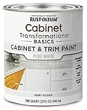
- CABINET TRANSFORMATION: Refresh outdated cabinets, vanities, furniture and trim with rich Pure White color and a smooth semi-gloss finish
- DURABLE PERFORMANCE: Easy-to-clean finish resists dirt and grime while standing up to household chemicals
- SMOOTH APPLICATION: Outstanding flow and leveling help create a beautiful finish with brush, roller, pad applicator or airless sprayer
- FAST PROJECT COMPLETION: Dries to touch in 30 minutes, recoats in 2 hours and is ready for normal use after 24 hours
- INTERIOR CABINET COATING: Ideal for kitchens, bathrooms, laundry rooms and other interior cabinet and trim applications
3. Creamy white
Sherwin-Williams describes Alabaster SW 7008 as a bright, creamy option, particularly useful in a smaller kitchen. Its warmth can make a room feel more comfortable than a stark white, but sample it beside the backsplash and floor so the combined effect does not become overly yellow.
4. Warm off-white
Off-whites remain classic because they bridge white cabinetry and warmer materials. There is no single universal off-white: undertones range from yellow and pink to beige and gray. Choose the exact paint only after comparing it with the fixed finishes that will remain in the room.
Quick wins for a faster PC:
Clear out junk files and repair common Windows errorsFree Scan →Fix the driver behind crashes, sound loss and screen glitchesFind Drivers →5. Warm beige or greige
Sherwin-Williams presents Whisper SW 9591 and Limewash SW 9589 as warmer, cozier directions, while Benjamin Moore identifies Coastal Path AF-380 as a nuanced greige for cabinetry. These colors work especially well with oak, walnut, travertine, brass and creamy quartz. Against a blue-gray counter, however, the same paint can look dull or muddy.
Rank #2

- Includes 30 featured and newest released color card. Sprayed on color to see our colors in your homes lighting for more accurate color choices.
- ALL-IN-ONE Paint - NO Sanding, NO Priming, NO Top Coat Required, Low Luster, Velvet Sheen Finish
- Interior/Exterior - Paint your whole house - Ideal for hard surfaces including walls, doors, cabinets, counters, furniture, metal, glass, ceramics and floor and wall tile
- Durable yet stretches to paint smooth fabrics, vinyl and leather
- Results cannot be guaranteed. Digital screens may not show color accurately. Product search "ALL-IN-ONE PAINT by Heirloom Traditions, Color Confidence Card", for an accurate color choice.
6. Light gray
Seapearl OC-19 appears among Benjamin Moore’s popular cabinet colors, and light gray is included in the brand’s timeless guidance. Gray gives white’s visual openness with a little more definition around doors and trim. In north-facing or otherwise cool light, inspect it carefully for an unintended blue or violet cast.
7. Soft green
Muted greens have the staying power of nature-based neutrals without becoming colorless. Sherwin-Williams lists Evergreen Fog SW 9130 for kitchens and cabinetry, and Benjamin Moore includes soft greens in its timeless palette. Pair a soft green with warm wood or aged metal when you want the room to feel collected rather than clinical.
8. Blue-green
Benjamin Moore describes Aegean Teal 2136-40 as a well-loved cabinet selection and notes that it was one of the brand’s former Colors of the Year. Its balance of blue and green makes it more adaptable than a highly saturated turquoise, but it still deserves a large in-room sample because surrounding colors can push it greener or bluer.
Rank #3

- Includes 30 featured and newest released color card. Sprayed on color to see our colors in your homes lighting for more accurate color choices.
- ALL-IN-ONE Paint - NO Sanding, NO Priming, NO Top Coat Required, Low Luster, Velvet Sheen Finish
- Interior/Exterior - Paint your whole house - Ideal for hard surfaces including walls, doors, cabinets, counters, furniture, metal, glass, ceramics and floor and wall tile
- Durable yet stretches to paint smooth fabrics, vinyl and leather
- Results cannot be guaranteed. Digital screens may not show color accurately. Product search "ALL-IN-ONE PAINT by Heirloom Traditions, Color Confidence Card", for an accurate color choice.
9. Navy blue
Hale Navy HC-154 is a Benjamin Moore cabinet example, and Sherwin-Williams suggests Needlepoint Navy SW 0032 for cabinetry. Navy is particularly effective on an island or lower run, where it supplies contrast while upper cabinets and walls keep the kitchen light. Full navy cabinetry needs adequate daylight or layered lighting.
10. Charcoal or dark gray
Kendall Charcoal HC-166 is among Benjamin Moore’s cabinet examples. Charcoal supplies much of black’s drama with a slightly softer edge and can connect stainless steel, stone and dark hardware. Benjamin Moore also says dark shades such as charcoal can hide dirt better than lighter colors; that is qualitative brand guidance, not a measured comparison.
11. Black
Benjamin Moore identifies dark black as a dramatic, timeless direction. Black cabinetry can look exceptionally architectural with pale counters, natural wood and simple hardware. It is not a universal fit: in a low-light kitchen it may absorb too much visual light, and any rough preparation or chipped edges will be conspicuous.
Rank #4

- Includes 30 featured and newest released color card. Sprayed on color to see our colors in your homes lighting for more accurate color choices.
- ALL-IN-ONE Paint - NO Sanding, NO Priming, NO Top Coat Required, Low Luster, Velvet Sheen Finish
- Interior/Exterior - Paint your whole house - Ideal for hard surfaces including walls, doors, cabinets, counters, furniture, metal, glass, ceramics and floor and wall tile
- Durable yet stretches to paint smooth fabrics, vinyl and leather
- Results cannot be guaranteed. Digital screens may not show color accurately. Product search "ALL-IN-ONE PAINT by Heirloom Traditions, Color Confidence Card", for an accurate color choice.
How to choose among timeless colors
Start with undertones, not the color name
Hold candidate chips beside the countertop, backsplash, floor, wall and metal finishes. Benjamin Moore specifically advises considering countertop undertones and existing kitchen features. A “gray,” “white” or “green” label does not tell you whether the paint leans warm or cool, which is what determines whether it harmonizes.
Crashes, No Sound, or Screen Glitches?
Random freezes, missing sound and display glitches usually trace back to one bad driver. Find and replace yours safely.Free scan · under a minuteWindows Errors? Fix Them Before They Spread
Repair common Windows errors and clear accumulated junk for a smoother, more stable PC - no reinstall needed.Free scan · no reinstallAccount for light and visual weight
Light neutrals are the safer starting point when the goal is an open, bright appearance; Benjamin Moore notes that lighter hues can make smaller kitchens feel more spacious. Deeper navy, charcoal and black create stronger contrast and visual weight. Check samples in morning, afternoon and evening light, with the room’s normal lamps switched on.
Decide whether the color belongs everywhere
A saturated or dark color may be ideal on an island, pantry wall or lower cabinets but overwhelming on every door. Conversely, a pale neutral can unify a full kitchen while allowing a colorful backsplash or wood hood to stand out. The architecture, not just the paint chip, should determine the scale of the commitment.
Best Value
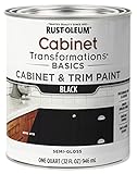
- CABINET TRANSFORMATION: Refresh outdated cabinets, vanities, furniture and trim with rich Black color and a smooth semi-gloss finish
- DURABLE PERFORMANCE: Easy-to-clean finish resists dirt and grime while standing up to household chemicals
- SMOOTH APPLICATION: Outstanding flow and leveling help create a beautiful finish with brush, roller, pad applicator or airless sprayer
- FAST PROJECT COMPLETION: Dries to touch in 30 minutes, recoats in 2 hours and is ready for normal use after 24 hours
- INTERIOR CABINET COATING: Ideal for kitchens, bathrooms, laundry rooms and other interior cabinet and trim applications
Sample the actual room
Use paint chips or sample pots on large movable boards, or paint a generous section of an inconspicuous door. Move the sample around the kitchen and view it next to each fixed material. Manufacturer color tools and chips help narrow the field, but no color appears identical on a screen, in a store or under every light source.
Choose a cabinet finish that can be maintained
Benjamin Moore identifies satin, semi-gloss and high-gloss as suitable cabinet finishes. Satin has a restrained reflection and helps disguise minor surface variation. Semi-gloss reflects more light and is commonly chosen where wipeability is a priority. High-gloss produces the strongest reflection and a contemporary effect, but it highlights dents, brush marks and uneven prep. Follow the selected coating’s label for compatible primer, application and curing requirements; sheen alone does not determine durability.
Preparation determines the final result
Repainting doors without removing grease, repairing damage and testing adhesion is the fastest way to get peeling or an uneven finish. Sherwin-Williams’ project guidance follows this sequence:
- Remove doors and hardware. Label each door and hinge position so reinstallation is straightforward.
- Clean with a degreaser. Kitchen residue can prevent primer and paint from bonding.
- Test adhesion. Apply primer in an inconspicuous spot and check that it bonds as directed before proceeding.
- Repair imperfections. Fill dents and old hardware holes, then allow repairs to dry.
- Sand as specified. Use the product’s recommended sanding method and remove all dust.
- Prime compatible surfaces. Sherwin-Williams lists Extreme Bond Primer as one manufacturer example; other surfaces may require a different system.
- Apply paint in controlled coats. Use an angled brush for detailed areas and a mini roller for broad, flat sections, as the manufacturer recommends.
- Respect drying and recoat times. Temperature, humidity and the coating change the schedule. Use the label rather than a generic timetable, and wait for the stated cure period before replacing hardware or washing the doors.
Safety when older paint is involved
If the existing coating may contain lead, sanding, scraping or otherwise disturbing it can create hazardous dust or fumes. Sherwin-Williams advises suitable respiratory and personal protection, containment and careful cleanup. In an older home, determine the applicable lead-safety requirements before disturbing the finish; do not dry-sand an uncertain coating casually.
What “timeless” can—and cannot—mean
There is no established statistic showing how long a cabinet color stays fashionable, what percentage of homeowners choose each shade, or how any color affects resale value. “Timeless” here means a classic, adaptable direction supported by manufacturer color guidance—not a promise about future taste. Your fixed finishes, daylight and tolerance for visual contrast matter more than a universal ranking.
Quick Recap

Product prices and availability are accurate as of the date/time indicated and are subject to change. Any price and availability information displayed on Amazon at the time of purchase will apply.




