Windows Errors? Fix Them Before They Spread
Do these 3 things before closing this tab:
1Clear out junk files and repair common Windows errors2Fix the driver behind crashes, sound loss and screen glitches3Repair Windows errors before they cause bigger problemsRepair common Windows errors and clear accumulated junk for a smoother, more stable PC - no reinstall needed.
Fix My PC Now →Free scan · no reinstall
ThatPainter is reader-supported. When you buy through links on our site, we may earn an affiliate commission. Learn More
As an Amazon Associate I earn from qualifying purchases.
Colour drenching means carrying one colour—or a closely related group of tones—across more than just the walls. Depending on your appetite for commitment, that can include skirting boards, doors, ceilings, radiators, cabinetry, furniture and even wallpaper. The result may be dramatic and enveloping, quietly tonal, or limited to one architectural feature.
What’s actually slowing this PC down?
Pick the symptom - the matching free tool is one click away.
Use the 13 ideas below as starting points rather than rigid formulas. First decide how much surface you want to cover, how dark you want the room to feel, and which existing furnishings must remain. Then test the actual paint in your room before committing.
#1 Best Overall
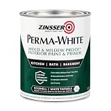
- Self-Priming formula - requires no sanding
- Mold & Mildew-Proof paint film - guaranteed for 5 years
- Resists dirt and moisture on film coating
- Finish is washable and scrubbable with soap and water
- Product contains a mildewcide to prevent the growth of mold and mildew on the paint film only
What colour drenching actually involves
In its fullest form, colour drenching uses one paint colour on walls, woodwork, ceiling, doors and selected built-ins. Little Greene also shows partial versions: walls with skirting and radiators in the same colour, or painted surfaces combined with coordinating wallpaper. Taubmans documents a family home where walls, ceilings, trims and doors all share one colour.
The technique works because edges and separate architectural elements visually connect. A skirting board no longer reads as a bright border, and a door can recede into the wall instead of interrupting it. You do not have to paint every object in sight; the point is to make a deliberate, connected palette.
Choose your level of commitment
| Approach | Surfaces | Colour relationship | Ceiling choice | Best for |
|---|---|---|---|---|
| Partial drench | Walls, skirting, selected woodwork or radiators | One shade | Usually left lighter or unpainted | A first experiment or a room with a ceiling you want to keep visually high |
| Architectural drench | Walls plus doors, frames, panelling, alcoves or cabinetry | One shade or very close tones | Optional | Making built-in features feel intentional and continuous |
| Full-room drench | Walls, woodwork, ceiling, doors and possibly furniture or radiators | One saturated colour | Same colour, with a suitable ceiling finish | A confident, enveloping scheme |
| Tonal drench | Several connected surfaces | Related light, mid and deep tones | Lighter or darker related tone | Soft contrast without a stark white break |
| Patterned drench | Wallpapered walls and ceiling with painted trim | Coordinating pattern and paint | Wallpaper or related paint | Adding texture and pattern while retaining a unified envelope |
Lighter colours are commonly described as giving a brighter impression, while deep shades are associated with cosiness or intimacy. Those are design observations, not guarantees: window direction, bulb colour, room proportions and furnishings will change the result. British Vogue reports designer Laura Stephens’s rule of thumb: choose a lighter ceiling when you want an impression of height, or a darker tone for a more cocooning effect.
Quick wins for a faster PC:
Repair Windows errors before they cause bigger problemsFix Now →Scan for outdated or missing drivers - takes under a minuteDriver Scan →Thirteen colour-drenching ideas to try
1. Deep teal in a living room
Little Greene suggests Mid Azure Green for a luxurious living-room scheme. Carry it over the walls and woodwork, then let panelling, alcoves and cabinets create depth through the shadows at their edges. Keep upholstery and timber visible so the saturated backdrop frames, rather than erases, the room’s texture.
Rank #2

- PAINT + PRIMER IN ONE: Evolve’s paint-and-primer formula helps you get great coverage from the start, sealing your surface and reducing the extra work of multiple coats.
- AVAILABLE IN MULTIPLE SHEENS, COLORS & SIZES: Choose from a curated palette of designer colors in Flat, Eggshell, Satin, and Semi-Gloss sheens to match any style, room, or project. Available in 1-Gallons & 5-Gallons.
- EGGSHELL SHEEN – Soft, Velvety Glow: Offers a gentle sheen that balances elegance with durability. Ideal for moderate-traffic areas like dining rooms, hallways, and family rooms. Easy to clean without compromising the finish.
- STAIN & SCRUB RESISTANT: Built to last in real spaces, Evolve helps resist marks, scuffs, and water spotting, so your home continues to look polished and well-maintained.
- DESIGNED FOR MOISTURE-PRONE AREAS: Formulated to perform well in bathrooms, kitchens, entryways, laundry rooms, and other high-humidity spaces.
2. A dark bedroom with matching wardrobes
For an enveloping bedroom, use a shade such as Basalt across the walls and fitted wardrobes. Painting the wardrobe fronts and surrounding trim removes the high-contrast blocks that can make storage feel bulky. Check the colour beside your bedding and bedside lighting at night as well as in daylight.
3. A green staircase
Carry a dark green such as Oilcloth across a staircase and its surrounding woodwork. The colour can connect a hallway to the rooms above and below, turning a transitional space into a deliberate feature. Sample the stairwell at several heights because light often changes sharply between landings.
4. A charcoal bathroom
Little Greene’s Vulcan example extends charcoal beyond the walls to features including the bath, sill and floor. In a bathroom, specify products suited to each substrate and moisture level rather than assuming one tin belongs everywhere. Use towels, metal fittings or pale stone to provide controlled contrast.
The Tool Desk
Outbyte Driver Updater FREEFix the driver behind crashes, sound loss and screen glitchesFind Drivers →Outbyte PC Repair FREERepair Windows errors before they cause bigger problemsFix Now →5. Honey-toned kitchen walls and cupboards
Bombolone demonstrates how a honey shade can run from kitchen walls onto cupboard doors. Warm neutrals gain strength when the vertical surfaces relate closely, so consider painting end panels and nearby trim as well. Natural timber, stone or aged metal can stop the scheme becoming visually flat.
Rank #3

- Use for a variety of indoor and outdoor project surfaces including wood, metal, plaster, masonry or unglazed ceramic
- Water-based acrylic formula is low odor, resist chips and provides long-lasting protection
- Covers up to 120 sq ft and dries to touch in 30 minutes for quick project completion
- Semi-gloss finish minimizes surface imperfections, goes on smoothly and provides excellent hide
- Prior to application sand surfaces with 180/200 grit sandpaper, then wash with a degreaser, allow the surface to dry and apply paint
6. A chocolate dining room
Use a deep brown such as Ganache on walls, woodwork and ceiling for a dining room with a strong sense of enclosure. Natural wood furniture is a useful contrasting material because its grain remains legible against the painted envelope. Test the brown under your evening lighting, when dining rooms are most often used.
7. Caramel in a utility or boot room
Brûlée is shown on walls, cladding and bench seating in a practical room. A warm caramel makes hard-working storage feel considered without requiring a formal entertaining space. Choose a scrubbable wall finish and a tougher coating for seating or frequently handled joinery.
8. Sunshine yellow in a kitchen
A warm yellow across walls and woodwork creates the energetic version of a drench. Little Greene’s Giallo example balances the yellow with dark accents and brighter details. Repeat one of those accent colours in handles, stools or artwork so the contrast looks intentional rather than scattered.
Windows Errors? Fix Them Before They Spread
Repair common Windows errors and clear accumulated junk for a smoother, more stable PC - no reinstall needed.Free scan · no reinstallOutdated Drivers Are Slowing You Down
One free scan finds every outdated or missing driver and matches the right update for your exact hardware.Free scan · exact hardware match9. An all-green living space
Carry a confident green such as Puck over walls, woodwork and ceiling for a connected, nature-associated palette. Vary texture—linen, wool, timber and ceramics—rather than adding many competing paint colours. Plants will not automatically match the green, so place them after you have checked the foliage against the sample.
Rank #4

- ALL-IN-1 PAINT & PRIMER: A hardy multi-purpose and multi-surface one-coat paint and primer in one for almost any indoor or outdoor surface. A wall, ceiling, floor, skirting board, cabinet, furniture and door paint for your bathroom, kitchen, home and garden.
- DURABLE & VERSATILE: A highly pigmented, thick formula available in 12 bold colors and a Matte, Satin or Gloss finish. Ideal for interior and exterior paint jobs on wood, laminate, plastic/UPVC, metal, concrete, brick, masonry, stone, glass and more.
- EFFECTIVE MONEY & TIME SAVER: A quick painting solution for DIY or professional builders and painters; our luxuriously opaque formula requires just 1 coat and is fast drying for a premium finish.
- ADVANCED ECO FORMULA: Our UK-made chalk paint is water-based, non-toxic, low odor, and has low VOCs for an environmentally friendly decorating choice.
- EASY APPLICATION: Remove dirt with a damp cloth, wipe the surface clean and dry, sand/score the surface (optional based upon the finish required), stir to mix the color and paint with a brush or roller.
10. Deep blue kitchen cabinetry
Hicks’ Blue on kitchen walls and cabinets creates an elegant, saturated scheme. Paint the wall behind open shelving as well as the cabinet doors if you want the storage to read as one mass. Countertops, splashbacks and flooring should be sampled alongside the blue; their undertones can make it appear cleaner, greener or more violet.
11. Warm off-white for a quiet living room
Colour drenching does not require drama. Layer related Silent White shades across walls, ceiling and panelling for a low-contrast, softly warm room. Keeping the tones close preserves the architectural continuity while allowing subtle changes in sheen to distinguish the surfaces.
12. Tonal pink in a bedroom
Combine Masquerade shades on walls and panelling with the lighter Julie’s Dream on the ceiling. This two-tone approach keeps the room connected without putting the exact same value overhead. Check pinks in both daylight and lamplight: red undertones can become much stronger after sunset.
13. Patterned walls and ceiling
Coordinating small-pattern wallpaper on walls and ceiling, with related paint on doors, frames or cabinets, is the most textural route. Match the paint to a colour that genuinely appears in the paper, and order samples of both materials. The pattern supplies variation while the painted trim maintains the visual link.
Best Value

- WHAT'S IN THIS 10 PIECE PAINT KIT FOR WALLS: includes one plastic paint tray; one 9 inch roller frame; one 4 inch mini roller frame; two 9 inch microfiber roller covers (1/2 inch nap); two 4 inch microfiber roller covers (1/2 inch nap); one 1 inch flat brush; one 1.5 inch angle sash brush; one 2 inch angle sash brush
- Versatile Application: Perfect for any project, this set includes paint rollers 9 inch for large surfaces and smaller brushes for detail work
- All-in-One Kit: This paint brush set and paint tray combo ensures you have all the paint supplies needed for any home improvement task
- Professional Grade: Get a smooth, even finish with our high-quality paint roller set; ideal for applying interior paint gallon or smaller quantities
- Cost-Effective: This paint brush and roller set provides unbeatable value; includes paint pan and paint trays for easy cleanup and reuse
Use the room’s light and architecture to edit the idea
Look at the room in morning, afternoon and artificial light before selecting a colour. A north-facing room may make a warm colour feel useful; a strongly sunlit room can intensify saturated paint. Panelling, alcoves, cabinetry and radiators can all join the drench, but they do not have to. Include a feature when it helps the room read as one composition, and leave it out when its material or maintenance needs are incompatible.
Taubmans describes a Blackburn, Victoria, family home that moves from Mountain Wine in a front sitting room to softer and more intense colours elsewhere. That approach treats colour drenching as a sequence through a house rather than a single repeated formula. British Vogue also shows a golden-yellow bathroom and a soft brownish-red TV snug, demonstrating how the method can be adapted to very different moods.
Choose finishes surface by surface
The colour can stay connected while the sheen changes. British Vogue describes flatter emulsion for restful rooms and hard-wearing eggshell on woodwork; it also reports a designer using gloss on a ceiling in a small, dim space to bounce light. Bunnings similarly suggests low-sheen or matt walls with semi-gloss or gloss trim for durability and easier cleaning.
The Tool Desk
Outbyte PC Repair FREERepair Windows errors before they cause bigger problemsFix Now →Outbyte Driver Updater FREEFix the driver behind crashes, sound loss and screen glitchesFind Drivers →| Surface | Finish decision | Reason to consider it |
|---|---|---|
| Walls | Matt or low sheen | Reduces glare and suits broad painted areas |
| Woodwork and doors | Eggshell, semi-gloss or another durable trim finish | Handles touch and cleaning more readily |
| Ceiling | Usually a low-sheen finish; gloss only when deliberately specified | Controls reflections or, in a dim room, can reflect more light |
| Radiators, cabinetry and furniture | Product-specific coating and preparation | Different substrates need compatible adhesion and heat or wear resistance |
Always follow the paint maker’s label for the particular substrate. A single colour does not mean a single product or sheen on every surface.
Prepare and paint without losing the effect
- Define the mood and coverage. Decide whether you are painting only walls and woodwork, adding the ceiling and doors, or including built-ins, radiators and furniture. Choose the finish for each surface before buying paint.
- Test in real conditions. Apply sample patches on different walls and view them in natural and artificial light. Keep the samples large enough to judge undertone and sheen beside flooring, fabrics and worktops.
- Protect the room. Move or cover furniture, protect floors with drop sheets and mask edges that must remain unpainted. Remove plates, hooks and hardware where practical.
- Clean and repair. Wash away grease and dust, fill gaps and imperfections, then sand glossy or uneven areas. Prime where the product instructions or the existing surface requires it.
- Cut in first. Use a brush around corners, trim and fixtures. Work in manageable sections so the edge remains workable when you bring the roller to it.
- Roll with a wet edge. Load the roller evenly and overlap each pass while the previous edge is still wet. An extension-pole roller reduces strain and helps keep a ceiling coat consistent.
- Apply at least two coats. Let each coat dry for the time stated on the label before recoating. Strong yellows, deep blues and other saturated colours may need especially careful coverage, but do not add coats before the specified drying time.
- Ventilate and work safely. Use the recommended protective gear, keep air moving, and follow all local product and disposal instructions. Keep children and pets away from wet paint and tools.
Start smaller if a full room feels risky
An alcove, bookshelf, chimney breast or run of cabinetry lets you test the visual principle with less paint and less disruption. Use the same preparation and finish decisions as you would for a full room. Live with the sample through a complete day and evening cycle before extending it to the ceiling or adjacent doors.
Common problems are usually correctable: patchy coverage calls for another properly timed coat; flashing can indicate uneven porosity or insufficient preparation; and a colour that feels too intense may need more daylight, a lighter related ceiling tone or calmer furnishings rather than an immediate repaint. If adhesion, moisture or heat is involved, stop and check the product’s substrate guidance before proceeding.
Quick Recap

Product prices and availability are accurate as of the date/time indicated and are subject to change. Any price and availability information displayed on Amazon at the time of purchase will apply.

