What’s actually slowing this PC down?
Free tools Windows power users keep installed
One-click scans. No signup required.
Pick the symptom - the matching free tool is one click away.
ThatPainter is reader-supported. When you buy through links on our site, we may earn an affiliate commission. Learn More
The best color picker depends on what you are trying to do. ColorZilla is a strong choice for sampling a color from a live webpage; Coolors is the best starting point for fast palette exploration; Adobe Color is better for deliberate color theory; and Figma’s Image Color Picker is useful when your starting point is a photograph or illustration.
That distinction matters because “color picker” can mean an eyedropper, color wheel, image-to-palette extractor, gradient generator, contrast checker, or design-system tool. This guide groups 15 useful options by their real job, then explains where each fits—and where it does not.
Recommended Free Tools
#1 Best Overall

- Wacom Intuos Small Graphics Drawing Tablet: Enjoy industry leading tablet performance in superior control and precision with Wacom's EMR, battery free technology that feels like pen on paper
- Works With All Software: Wacom Intuos tablet can be used in any software program to explore new facets of digital creativity; draw, paint, edit photos/videos, create designs, and mark up documents
- What the Professionals Use: Wacom's industry leading pen technology and pen to paper feeling makes it the preferred drawing tablet of professional graphic designers
- Software and Training Included: Only Wacom gives you software with every purchase. Register your Intuos tablet and gain access to some of the best creative software and Wacom's online training
- Wacom is the Global Leader in Drawing Tablet and Displays: For over 40 years in pen display and tablet market, you can trust that Wacom to help you bring your vision, ideas and creativity to life
Quick recommendations
| Tool | Best for | Type | Free access |
|---|---|---|---|
| Coolors | Fast palette exploration | Palette generator | Yes, with limits |
| ColorZilla | Sampling live webpages | Browser eyedropper | Check current extension terms |
| Adobe Color | Color theory and Adobe workflows | Theme generator | Core web tool available; account features may vary |
| Figma Image Color Picker | Extracting colors from images | Image-to-palette tool | Standalone access available; broader Figma features vary |
| Figma Color Contrast Checker | Contrast validation | Accessibility tool | Web utility available |
| CSS Gradient | Writing gradient CSS | Gradient generator | Web tool |
| Color Hunt | Curated inspiration | Palette library | Web library |
| Paletton | Traditional color harmony | Color-theory tool | Web tool |
“Free” is not a universal label here. Some tools offer free core features but limit saving, exports, palette size, or collaboration. Check the current product page before committing to a paid plan.
How to choose a color picker
Start with the input and output you need:
- One color from a webpage: Use a browser or operating-system eyedropper.
- One palette from an image: Use an image extractor such as Figma’s or Canva’s.
- A deliberate color scheme: Use Adobe Color or Paletton.
- Many palette variations: Use Coolors, ColorSpace, Colormind, or Khroma.
- A gradient for a website: Use CSS Gradient, uiGradients, or Coolors’ gradient tools.
- Accessible UI colors: Use a generator for exploration, then validate actual component combinations with a contrast checker.
Also consider whether you need HEX, RGB, HSL, HSB/HSV, CSS, SVG, PNG, JSON, Figma, Adobe, or design-token output. RGB and HSL are enough for many basic tasks, while systematic interface work may benefit from perceptual color models such as OKLCH—but support for those formats changes by product and should be verified in the current interface.
Best overall and best by task
- Best overall: Coolors for quick palette generation, refinement, visualization, and export.
- Best for color theory: Adobe Color.
- Best for webpages: ColorZilla.
- Best from images: Figma Image Color Picker.
- Best for beginners: Canva Color Palette Generator.
- Best for CSS gradients: CSS Gradient.
- Best for curated inspiration: Color Hunt.
- Best for accessibility checks: Figma Color Contrast Checker or a dedicated accessibility checker.
- Best for traditional harmony: Paletton.
- Best for personalized AI discovery: Khroma.
The 15 best color picker and palette tools
1. ColorZilla — best for sampling colors from webpages
ColorZilla is the most direct choice when the color already exists on a rendered webpage. Its browser feature set includes an advanced color picker for sampling visible web content.
Use it when you need to inspect a hero background, button, illustration, or other on-screen element without taking the image into a separate editor. It is faster than rebuilding the context elsewhere and is particularly useful for web design, QA, and frontend inspection.
Limitation: A sampled pixel is not necessarily the original CSS value. Transparency, gradients, filters, antialiasing, overlays, display rendering, and color management can alter what appears on screen. When possible, inspect the CSS declaration or design token instead. ColorZilla also does not replace contrast testing.
Best workflow: Sample the rendered color, copy its value, then confirm it against the site’s CSS and test it in the intended component.
2. CSS Gradient — best for developer-ready gradients
CSS Gradient is a gradient generator, not a general palette manager. It helps you adjust stops and direction visually, then obtain CSS for a linear or radial gradient.
It is useful when the deliverable is a background declaration and you want to avoid manually tuning gradient syntax. It is less useful for establishing primary, neutral, semantic, hover, focus, and disabled colors across an entire interface.
Rank #2
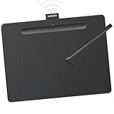
- Wacom Intuos Medium Bluetooth Graphics Drawing Tablet: Enjoy industry leading tablet performance in superior control and precision with Wacom's EMR battery free technology that feels like pen on paper
- Works With All Software: Wacom Intuos tablet can be used in any software program to explore new facets of digital creativity; draw, paint, edit photos/videos, create designs, and mark up documents
- Wireless Superior Connectivity: Connect wirelessly via Bluetooth or directly using USB-A cable which enables you to work, draw or create whether it's at a desk, on the sofa, in classrom or even outside
- Software and Training Included: Only Wacom gives you software with every purchase. Register your Intuos tablet and gain access to some of the best creative software and Wacom's online training
- Wacom is the Global Leader in Drawing Tablet and Displays: For over 40 years in pen display and tablet market, you can trust that Wacom to help you bring your vision, ideas and creativity to life
Limitation: Readability must be tested over the actual gradient. A gradient that looks attractive in isolation can make text unreadable as its background changes.
3. Figma Image Color Picker — best for image-to-palette work
Figma’s Image Color Picker accepts PNG, JPEG, and GIF files. After you upload, drag, or paste an image, it generates swatches and lets you inspect HEX, RGB, HSB, and HSL values. The palette can then be opened in Figma for further design work.
- Open the Figma Image Color Picker.
- Upload, drag, or paste a PNG, JPEG, or GIF.
- Review the generated swatches.
- Inspect values in HEX, RGB, HSB, or HSL.
- Edit the candidates and continue in Figma if needed.
This is a strong bridge between visual reference and design exploration. However, dominant colors in a photograph are only starting points. They may be muddy, overly saturated, or poorly suited to interface text. Do not upload confidential material until you have checked the service’s current privacy and retention terms.
4. ColorSpace — best for lightweight web color variations
ColorSpace is a low-friction option for expanding a starting color into shades, combinations, gradients, and other web-oriented variations.
Quick wins for a faster PC:
Scan for outdated or missing drivers - takes under a minuteDriver Scan →Clear out junk files and repair common Windows errorsFree Scan →It suits developers and beginners who want practical values without opening a full design application. It is less appropriate for collaboration, curated inspiration, or formal design-system governance.
Limitation: A generated scale is not automatically perceptually uniform, accessible, or suitable for every UI state. Treat the output as a draft and validate it in context.
5. Coolors — best overall for fast palette exploration
Coolors is the best default recommendation for most people starting from a blank page. Its central workflow is quick: generate a palette, lock the colors you like, and continue generating alternatives for the remaining swatches.
- Open the palette generator.
- Generate a palette, traditionally with the spacebar.
- Lock colors that should remain.
- Generate alternatives for unlocked swatches.
- Save, visualize, export, or check contrast as appropriate.
Coolors also offers image picking, contrast checking, palette visualization, color lookup, Tailwind previews, and integrations with tools including Figma, Adobe, Chrome, and iOS. Its claims about millions of palettes and users come from Coolors itself and should be read as first-party marketing claims.
What’s actually slowing this PC down?
Pick the symptom - the matching free tool is one click away.
Rank #3

- WACOM’S BEST PEN TECHNOLOGY: Pro Pen 3 offers amazing precision, 8192 pressure levels, tilt support & lag-free tracking for smooth, precise strokes; choose slim, straight or flared grip, adjust balance & button layout for precision and comfort
- DIAL INTO PRODUCTIVITY: Speed up and stay in the creative flow with 10 customizable tablet ExpressKeys & 2 mechanical dials conveniently located at the top of the tablet and close to your keyboard for efficiency
- DESIGNED FOR MODERN MONITORS: With a versatile 16:9 format perfect for multiple monitors and wide displays; medium size has a large active area with a small footprint 11.4 x 8.1” / 291 x 206 mm
- SLEEK AND STURDY: Measuring 4mm at its thinnest this professional-grade drawing tablet feels like pen-on-paper on your desk, combined with the robust durability of magnesium making it equally suited for your office or life on the go
- WIRELESS FREEDOM: use Intuos Pro with USB or connect wirelessly via Bluetooth to multiple computers with a simple switch
The official pricing page describes a free plan with palettes of up to five colors and storage for up to 10 palettes. Pro adds larger palettes, expanded ready-made schemes, unlimited palettes and projects, image picking, contrast checks, advanced exports, private profiles, and AI features. Because pricing and limits can change, consult the current pricing page rather than relying on an old dollar amount.
Limitation: Random generation is excellent for ideation but cannot understand your brand, information hierarchy, cultural context, or accessibility requirements.
6. Color Hunt — best for curated palette inspiration
Color Hunt is a discovery library rather than a complete production environment. Browse palettes by mood or theme when you need a visual direction quickly.
It works well for moodboards, early branding, and inspiration. It is not a substitute for checking originality, licensing, contrast, or semantic roles before using a palette commercially.
Crashes, No Sound, or Screen Glitches?
Random freezes, missing sound and display glitches usually trace back to one bad driver. Find and replace yours safely.Free scan · under a minuteWindows Errors? Fix Them Before They Spread
Repair common Windows errors and clear accumulated junk for a smoother, more stable PC - no reinstall needed.Free scan · no reinstall7. Huesnap — best for visual color exploration
Huesnap is aimed at exploratory palette work. It can suit users who think visually and want to compare combinations before formalizing a color system.
Availability of associated apps, extensions, integrations, and exports can change, so verify those details in the current official listings. Exploration alone does not establish contrast or production readiness.
8. uiGradients — best for ready-made gradient inspiration
uiGradients is a library of premade gradient backgrounds. It is useful for quickly browsing moods for landing pages, hero sections, illustrations, and other visual surfaces.
Use it for ideas rather than assuming a premade gradient is original, licensed for every use, or readable with your chosen text. Test the result in the actual layout.
Do these 3 things before closing this tab:
1Scan for outdated or missing drivers - takes under a minute2Clear out junk files and repair common Windows errors3Fix the driver behind crashes, sound loss and screen glitchesRank #4
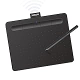
- Wacom Intuos Small Bluetooth Graphics Drawing Tablet: Enjoy industry leading tablet performance in superior control and precision with Wacom's EMR, battery free technology that feels like pen on paper
- Works With All Software: Wacom Intuos tablet can be used in any software program to explore new facets of digital creativity; draw, paint, edit photos/videos, create designs, and mark up documents
- Wireless Superior Connectivity: Connect wirelessly via Bluetooth or directly using USB-A cable which enables you to work, draw or create whether it's at a desk, on the sofa, in classroom or even outside
- Software and Training Included: Only Wacom gives you software with every purchase. Register your Intuos tablet and gain access to some of the best creative software and Wacom's online training
- Wacom is the Global Leader in Drawing Tablet and Displays: For over 40 years in pen display and tablet market, you can trust that Wacom to help you bring your vision, ideas and creativity to life
9. Canva Color Wheel — best for beginners and marketers
Canva’s Color Wheel is designed for accessible color-harmony exploration and fits naturally into Canva’s broader content workflow.
It is a good option for marketers, small businesses, and non-designers who need to select colors and immediately apply them to social graphics, presentations, or promotional material. Advanced code exports, token management, and developer handoff are not its main strengths. Account and paid-plan requirements vary by feature.
10. Colormind — best for algorithmic palette ideas
Colormind can generate palette suggestions from images or selected colors. It is useful when you want alternatives beyond your first instinct.
Algorithmic or AI-assisted output is not automatically brand-appropriate, accessible, or effective. Image extraction can also overemphasize incidental colors such as shadows, foliage, or compression artifacts. Verify current API, export, and commercial-use terms before building a workflow around it.
The Tool Desk
Outbyte Driver Updater FREEScan for outdated or missing drivers - takes under a minuteDriver Scan →Outbyte PC Repair FREERepair Windows errors before they cause bigger problemsFix Now →11. Canva Color Palette Generator — best for photo-to-palette work
Canva’s Color Palette Generator offers a simple image-upload workflow for extracting a starting palette from a photograph or other visual.
It is particularly convenient for presentations, social content, and marketing teams already using Canva. A photo palette may contain too many colors or lack a strong text/background relationship, so simplify it and run contrast checks before use.
12. Paletton — best for deliberate color harmony
Paletton is better suited to users who want to reason about relationships such as complementary, analogous, and triadic schemes rather than receive random combinations.
It can be valuable for learning color theory and constructing an intentional visual direction. Its interface may feel less immediate than newer generators, and harmony alone does not guarantee hierarchy, usability, or accessibility. Verify current export and sharing controls.
Best Value

- IMMERSIVE CREATIVE CANVAS: 16" IPS display with 2.5K WQXGA resolution (2560 x 1600) delivers sharp, crisp, detailed visuals for digital art and design
- WACOM’S BEST PEN TECHNOLOGY: Pro Pen 3 with 8192 pressure levels responds to your lightest touch; includes tilt support, 3 shortcut keys for tool access, and a holder that mounts to either side of the display with adjustable angle for quick access
- CINEMATIC COLOR DISPLAY: 99% DCI-P3 and 100% sRGB coverage with 8-bit color depth delivers the wide color gamut used in modern displays and digital media - see your artwork as it's meant to be viewed
- READY TO CREATE: Built-in fold-out legs provide a 20-degree working angle or purchase adjustable stand for personalized comfort
- CONNECTION: includes USB-C cable to connect to Windows/Mac computers with DisplayPort Alt Mode or Thunderbolt 3 or 4 input (computers without DP Alt or TB 3 or 4 input require additional cables)
13. Adobe Color — best for color theory and Adobe workflows
Adobe Color focuses on creating and discovering color themes, with a strong emphasis on color relationships and Adobe-centered workflows.
Choose it when you want a reasoned theme rather than a random palette, or when your work already lives in Adobe’s ecosystem. Some saving, library, or integration features may depend on an Adobe account or other Adobe products. Adobe Color should not be confused with a requirement to buy the entire Creative Cloud suite.
14. Khroma — best for personalized AI color discovery
Khroma uses a preference-driven approach to color discovery. It is useful for designers who want combinations tailored to their tastes and for exploring options outside their usual habits.
Personalization can also reinforce those habits rather than challenge them. AI suggestions still need human review for brand fit, accessibility, cultural meaning, and production constraints. Check current onboarding, account, data, and export behavior before relying on it for a team workflow.
15. Color Designer — best for inspecting and modifying color scales
Color Designer is aimed at more technical color exploration, including examining shades and relationships around a starting color.
It can be useful for UI designers and developers who need to modify a color systematically rather than browse inspiration. Verify current output formats and accessibility features. Do not assume support for CSS variables, JSON, Tailwind, or design tokens unless the current interface explicitly provides it.
Independent reader supportYour contribution helps us test, update, and keep practical guides available for everyone.Do not overlook native and dedicated tools
If you need one color from your screen, a web palette generator may be unnecessary. macOS includes Digital Color Meter, Windows users can use PowerToys Color Picker, and browser developer tools and design applications often include eyedroppers. These options can be faster and may keep confidential material on your device. Exact shortcuts, labels, installation paths, and operating-system support should be checked against current vendor documentation.
For accessibility work, consider dedicated options such as WebAIM Contrast Checker, Stark, Figma’s Color Contrast Checker, Coolors’ contrast tool, or Adobe Color’s accessibility functions. A palette generator with a contrast feature is useful, but it is not automatically a complete accessibility validator.
Quick Recap
A practical designer-to-developer color workflow
- Define the constraint. Start with a brand color, image, existing product, or visual brief.
- Explore. Use Coolors, Adobe Color, Paletton, Khroma, or ColorSpace to generate alternatives.
- Extract when appropriate. Use Figma or Canva for a photo or illustration, then remove incidental colors.
- Reduce the palette. Keep a small intentional set instead of carrying every generated swatch forward.
- Assign roles. Define primary, secondary, neutral, surface, border, success, warning, error, and informational colors.
- Build states. Add light and dark equivalents plus hover, focus, pressed, and disabled states.
- Check contrast. Test actual foreground/background pairs, not isolated swatches.
- Check perception. Use color-vision simulations and add non-color cues for errors, statuses, and charts.
- Export deliberately. Move the final values into the design tool, CSS, variables, JSON, or token system your team actually uses.
- Test in context. Review real components, browsers, themes, display conditions, and user settings.
Common mistakes to avoid
- Confusing a sampled pixel with the source color: overlays and gradients can change the rendered result.
- Treating an attractive palette as a usable interface: posters, photos, and dashboards have different contrast and hierarchy needs.
- Assuming contrast equals accessibility: contrast ratios do not test focus visibility, non-color indicators, magnification, charts, motion, or all color-vision differences.
- Using random palettes as final systems: generators do not know your brand strategy or semantic hierarchy.
- Uploading confidential images casually: review current privacy and retention policies first.
- Using HEX everywhere: digital HEX values do not replace print color management, CMYK, spot colors, ICC profiles, or physical proofing.
- Choosing paid software for a one-color task: a native picker or free browser utility may be all you need.

Product prices and availability are accurate as of the date/time indicated and are subject to change. Any price and availability information displayed on Amazon at the time of purchase will apply.




