Crashes, No Sound, or Screen Glitches?
Recommended Free Tools
Outbyte Driver Updater · freeRandom freezes, missing sound and display glitches usually trace back to one bad driver. Find and replace yours safely.
Find the Right Drivers →ThatPainter is reader-supported. When you buy through links on our site, we may earn an affiliate commission. Learn More
There is no single universal 2026 Color of the Year. Pantone, paint manufacturers, stain brands, color forecasters, retailers, marketplaces, and product companies each publish their own selections for different audiences and materials.
For home design, the 2026 story is especially clear: warm, nature-based neutrals and browns are gaining ground alongside grounded greens and blue-greens, while damson, aubergine, burgundy, terracotta, white, ivory, and blue provide contrast. This guide tracks major selections publicly announced through August 10, 2026, and identifies whether each is a wall paint, stain, trend forecast, or product color.

As an Amazon Associate I earn from qualifying purchases.
What’s actually slowing this PC down?
Pick the symptom - the matching free tool is one click away.
The most useful way to read this year’s announcements is not to ask which one color won. Instead, ask which selection fits your material, room, lighting, and decorating goals.
What “Color of the Year” means in 2026
“Color of the Year” is a brand-specific forecast or marketing program, not a regulated title or universal color standard. Each organization chooses colors using its own research, customer base, product category, geography, and release calendar.
#1 Best Overall
That distinction matters. Pantone’s Cloud Dancer is a color-standard selection, not a universal wall-paint formula. Minwax’s Special Walnut is a wood stain, not a paint color to roll onto drywall. KitchenAid’s Spearmint is an appliance finish, while WGSN and Coloro’s Transformative Teal is a global trend forecast.
Throughout this guide, the selections are labeled as:
The Tool Desk
Outbyte PC Repair FREERepair Windows errors before they cause bigger problemsFix Now →Outbyte Driver Updater FREEScan for outdated or missing drivers - takes under a minuteDriver Scan →- Official 2026 Color of the Year: a brand’s own standalone COTY announcement.
- Official multi-color selection or family: a brand or authority selected several coordinated colors rather than one hue.
- 2026 trend, palette, or product-brand color: a relevant new-season or category selection that should not be treated as a universal paint COTY.
Scope note: No central registry records every 2026 color announcement worldwide. This is a practical roundup of major paint, coating, stain, color-forecasting, home, marketplace, and consumer-product selections announced publicly by August 10, 2026. It is not a literal inventory of every regional or limited-edition color.
The complete 2026 roundup at a glance
The U.S. paint selections appear first because they are the most immediately useful to an American wall-paint shopper. International forecasts, stains, spray paints, and consumer products follow in their own categories.
Major paint, coating, and color-authority selections
| Brand or authority | 2026 selection | Color family | Code or identifier | Classification and availability |
|---|---|---|---|---|
| Benjamin Moore | Silhouette | Espresso brown blended with charcoal | AF-655 | Official paint COTY; Benjamin Moore paint |
| Sherwin-Williams | Universal Khaki | Warm, earthy midtone neutral | SW 6150; 207-C3 | Official paint COTY; Sherwin-Williams U.S. program |
| HGTV Home by Sherwin-Williams | Universal Khaki | Warm khaki neutral | SW 6150 | Joint selection with Sherwin-Williams; sold through Lowe’s in the United States. It is not a separate color prediction. |
| Behr | Hidden Gem | Smoky jade blue-green | N430-6A | Official paint COTY; Behr paint |
| Valspar | Warm Eucalyptus | Muted, gray-influenced green | 8004-28F | Official U.S. paint COTY; sold through Lowe’s in the U.S. |
| Dutch Boy | Melodious Ivory | Creamy warm ivory | 313-2DB | Official paint COTY; product availability depends on market |
| PPG Paints | Warm Mahogany | Rich red-brown | PPG1060-7 | Official U.S. PPG Paints COTY |
| Glidden | Warm Mahogany | Rich red-brown | PPG1060-7 | Official Glidden COTY; the same underlying color and identifier as PPG Paints’ selection |
| PPG global coatings | Secret Safari | Yellow-green with subtle lime undertones | PPG1110-4 | Global PPG coatings forecast; distinct from U.S. PPG Paints Warm Mahogany |
| C2 Paint | Epernay | Soft ochre or champagne yellow | C2-639 / #639 | Official paint COTY |
| Dunn-Edwards | Midnight Garden | Deep muted green | DE5657 | Official paint COTY; particularly relevant where Dunn-Edwards is sold |
| California Paints | Cactus Valley | Lush, earthy landscape green | 0752 | Official paint COTY; regional availability may vary |
| Clark+Kensington | Hazelnut Crunch | Warm tan with rusty, earthy character | 09A-5 | Retail paint-brand selection associated with Ace Hardware; coverage is documented by Bob Vila |
| Farrow & Ball | Naperon | Peachy terracotta or warm clay | Not confirmed here | New 2026 color and color-direction pick; do not publish a number without checking the current market-specific Farrow & Ball page |
| Graham & Brown | Divine Damson | Deep damson, burgundy, and plum | No code given | Official paint and design COTY |
| Dulux / AkzoNobel | Rhythm of Blues: Free Groove, Slow Swing, and Mellow Flow | Coordinated blue family | Regional codes vary | Official multi-color family; product names and availability vary by country |
| Little Greene | Adventurer | Deep plum, aubergine, and burgundy | Shade 7 | 2026 forecast pick; verify the brand’s formal COTY wording before describing it as a standalone COTY |
| Earthborn | Freckle | Warm, earthy clay | No code stated | Official paint COTY; U.K.-focused availability |
| Pantone | Cloud Dancer | Airy, lofty white | PANTONE 11-4201 | Global color-authority selection; not a house-paint brand |
| WGSN + Coloro | Transformative Teal | Clear blue-green teal | Coloro 092-37-14 | Global trend forecast for fashion, product, and interiors; not a retail paint formula |
Stains and specialty finishes
| Brand | Selection | Material | Code or identifier | Use |
|---|---|---|---|---|
| Minwax | Special Walnut | Wood stain | Existing Minwax stain color | Furniture, trim, cabinetry, and other compatible wood surfaces |
| Cabot | Acorn | Exterior wood stain | No code stated | Exterior timber and wood projects; not a direct wall-paint substitute |
| Krylon | Matte Coffee Bean | Spray paint | Product page shortens the name to Coffee Bean | Furniture, crafts, accessories, and small DIY projects |
Adjacent marketplace and product colors
| Brand | Selection | What it is | Important distinction |
|---|---|---|---|
| Etsy | Patina Blue | Marketplace trend color inspired by aged copper | Paired with Etsy’s first Texture of the Year, Washed Linen; it is not a paint-industry COTY |
| KitchenAid | Spearmint | Light mint-green appliance color with a sandy finish | Product finish, not a recommendation for a wall-paint formula |
| Moccamaster | Sorbet | 2026 coffee-brewer color | Product color in a specific appliance line |
The major 2026 paint colors by family
Greens and blue-greens: the most persistent 2026 family
Green appears across more categories and in more variations than almost any other family in the 2026 announcements. But “green” is not one look. The selections range from gray eucalyptus to jewel-like jade, dark garden green, yellow-green, and blue-forward teal.
- Hidden Gem by Behr is a smoky jade with enough blue-green depth to act as a focal color. It is more jewel-like and dramatic than a quiet sage. Use it on cabinetry, a study, a powder room, or an accent wall when you want color with sophistication. See the official Behr color page.
- Warm Eucalyptus by Valspar is more muted and gray-influenced. It is the calmer choice for cabinetry, bedrooms, living rooms, and whole-room color. In North America, the name is not entirely uniform: the Canadian Valspar site may use names including Sage Slate or Submission for the same 2026 direction. Check the market-specific page before ordering.
- Midnight Garden by Dunn-Edwards is a deep, earthy green with a mossier, darker presence. It can be effective in a dining room, library, entry, or color-drenched small room, but low light may make it read nearly black.
- Cactus Valley by California Paints is an organic green associated with desert and garden landscapes. It is a strong fit for rooms with natural wood, woven materials, stone, and warm metals.
- Secret Safari by PPG global coatings moves in a more yellow-green, botanical direction. It is distinct from PPG Paints’ U.S. Warm Mahogany selection.
- Transformative Teal by WGSN and Coloro is clearer, bluer, and more saturated than Warm Eucalyptus or Cactus Valley. It is a trend forecast rather than a ready-to-buy wall-paint color.
These distinctions are useful when choosing samples. Hidden Gem and Transformative Teal may feel energetic and jewel-like; Warm Eucalyptus is more restrained; Midnight Garden is shadowy and enveloping; Secret Safari is sunnier and more botanical.
Free tools Windows power users keep installed
One-click scans. No signup required.
Warm neutrals, ivory, ochre, and brown
Warm neutrals are not replacing every other color, but they are clearly central to the 2026 palette. The group includes khaki, ivory, ochre, tan, espresso, walnut, coffee brown, and red-brown. These colors tend to coordinate naturally with wood, stone, leather, brass, cream textiles, and aged finishes.
- Universal Khaki by Sherwin-Williams is a midtone warm neutral with earthy undertones. It is one of the most versatile whole-room choices in the group. HGTV Home by Sherwin-Williams uses the same selection and SW 6150 identifier, so count this as one color story presented through two brands.
- Melodious Ivory by Dutch Boy is warmer and creamier than Pantone’s Cloud Dancer. It can provide a soft backdrop for a living room, bedroom, hallway, or open-plan space without the starkness of a bright white.
- Silhouette by Benjamin Moore combines espresso brown and charcoal. It is a dark, architectural neutral suited to a dramatic dining room, office, bedroom, built-in, or accent wall. It is not the low-risk choice for a poorly lit whole room.
- Epernay by C2 Paint is a soft ochre or champagne yellow with mineral warmth. It can work as a whole-room neutral where a beige feels too expected and a saturated yellow feels too strong.
- Warm Mahogany is selected by both PPG Paints in the United States and Glidden, using the same PPG1060-7 identifier. It should be treated as one underlying red-brown color story, not two unrelated hues.
- Hazelnut Crunch by Clark+Kensington is a warm tan or rusty neutral associated with Ace Hardware retail paint.
- Cloud Dancer by Pantone is an airy, near-white design color. It should not be treated as equivalent to Melodious Ivory: Cloud Dancer is lighter and airier, while Melodious Ivory has a more obvious cream undertone.
Brown is being used in several different ways. Universal Khaki, Melodious Ivory, and Epernay are primarily wall-paint backdrop candidates. Silhouette and Warm Mahogany can create stronger painted architectural moments. Special Walnut and Acorn belong to wood finishing and should be evaluated on actual timber, where grain and absorption change the result.
Burgundy, plum, damson, and terracotta
Red-violet and clay-based colors provide the richer side of the 2026 story.
- Divine Damson by Graham & Brown is the deepest burgundy-plum choice in the roundup. It suits dining rooms, studies, bedrooms, halls, and accent walls where the goal is depth and character.
- Adventurer by Little Greene is a deep plum, aubergine, and burgundy forecast pick. It is more purple-brown than a straightforward red, and the brand lists it as shade 7.
- Warm Mahogany by PPG Paints and Glidden is a more restrained red-brown than Divine Damson or Adventurer. It can bridge warm wood tones and painted color.
- Naperon by Farrow & Ball is a lighter peachy terracotta or clay color. The color name is confirmed on the brand’s regional page, but available coverage has disagreed about its number, citing both No. 314 and No. 315. Do not publish or order by number without checking the current Farrow & Ball page for your market.
- Freckle by Earthborn is a naturally warm clay color, offering a softer alternative to a deep red or plum.
These colors can be especially effective in rooms with period details, natural materials, warm white trim, dark wood, or aged brass. Test them carefully under your actual lighting: red and purple undertones can become significantly more intense under warm bulbs.
Do these 3 things before closing this tab:
1Clear out junk files and repair common Windows errors2Fix the driver behind crashes, sound loss and screen glitches3Repair Windows errors before they cause bigger problemsRank #2

- Features 216 timeless hues from the RAL CLASSIC collection with five colors per page - fan size 15.0 x 5.0 x 2.0, color display 2.0 x 5.0 cm
- Crafted with low-solvent, low-odour water-based paints for eco-friendly use
- Enhanced UV resistance provides long-lasting color protection
- Cover made from 100% recyclable post-industrial polypropylene waste
- Compact and portable design, ideal for precise color matching on the go
Blue and white provide the cool-color counterpoint
Rhythm of Blues from Dulux and AkzoNobel is a family rather than one hue: Free Groove, Slow Swing, and Mellow Flow. Product names and codes vary by region. The family gives 2026 a clear cool-color counterpoint to the dominant browns, greens, and clay colors.
Cloud Dancer from Pantone supplies the other kind of counterpoint: lightness. It is an airy white intended to suggest clarity and quiet reflection. For a residential paint shopper, the practical comparison is Dutch Boy’s warmer Melodious Ivory. Cloud Dancer is closer to an airy near-white concept; Melodious Ivory is more obviously creamy and forgiving beside warm flooring and furniture.
Specialty 2026 colors: stains, spray paint, and wood finishes
Specialty finishes deserve their own section because a color’s behavior depends on the material underneath it.
Minwax Special Walnut
Special Walnut is Minwax’s 2026 stain selection. It is a familiar warm walnut-brown intended for compatible wood surfaces. Unlike wall paint, stain interacts with the wood’s species, porosity, sanding, existing finish, and grain. The same stain can appear substantially different on oak, pine, maple, or previously finished wood.
Cabot Acorn
Acorn is Cabot’s 2026 exterior wood-stain selection, a golden-brown finish for exterior timber. It belongs in an exterior-stain comparison, not beside wall-paint formulas as if the products were interchangeable. Confirm that the product and color are suitable for your specific wood, exposure, and project.
Krylon Matte Coffee Bean
Matte Coffee Bean is Krylon’s spray-paint COTY; the product page may shorten the name to Coffee Bean. It is useful for furniture, accessories, crafts, and small DIY projects. Its matte spray finish will not look like a wall painted in a similarly named brown, even when both are viewed under the same light.
Beyond paint: marketplace and appliance colors
Readers often search for all 2026 color announcements together, so these selections are worth noting—but they should not be presented as competing paint colors.
- Etsy Patina Blue is a marketplace trend color inspired by aged copper. Etsy pairs it with Washed Linen, its first Texture of the Year. Patina Blue is useful for finding furnishings, textiles, ceramics, and accessories, not for identifying a universal paint formula.
- KitchenAid Spearmint is a light, uplifting mint-green appliance color with a sandy finish. It can inspire a kitchen palette, but the appliance finish is not a substitute for a wall-paint sample.
- Moccamaster Sorbet is a 2026 coffee-brewer color in a specific product line. It is best used as an accent-color reference for a kitchen or coffee station.
What the 2026 selections collectively say about home design
The American Coatings Association describes the broader coatings direction as earth-inspired and emotionally comforting, while the National Kitchen & Bath Association identifies greens, blues, browns, creamy neutrals, and pale yellows among the dominant kitchen-related families. Those are useful industry contexts, but neither is a universal count of every color announced. See the American Coatings Association roundup and NKBA’s kitchen-focused list.
Quick wins for a faster PC:
Clear out junk files and repair common Windows errorsFree Scan →Scan for outdated or missing drivers - takes under a minuteDriver Scan →Repair Windows errors before they cause bigger problemsFix Now →1. Green is prominent alongside warm neutrals
Hidden Gem, Warm Eucalyptus, Midnight Garden, Cactus Valley, Secret Safari, and Transformative Teal show how many ways designers are using green. The common thread is a connection to nature, but the practical result depends on undertone, saturation, and light. Green is not simply “replacing beige”; it is being used beside khaki, ivory, brown, ochre, and wood.
2. Brown is being treated as a livable neutral
Silhouette, Universal Khaki, Warm Mahogany, Special Walnut, Matte Coffee Bean, and Acorn cover a wide range of brown applications. Some are wall paints, some are stains, and one is spray paint. Together they show a preference for grounded color and natural-material associations, not a single universally interchangeable brown.
Rank #3

- Practical to use: paint color sample standard colors cards are designed for your different paint needs,color test card paint bulk,paint color samples
- Paint cards: made of plastic and paper that provides accurate colors and reliable results,paint standard samples,water color cards
- Professional: paint color standard sample cards are great for professionals and DIY enthusiasts alike,paint color cards,paint chips samples
- Paint color sample cards: suitable for various such as floor paint, paint hardware, and more,paint color sample cards,paint color cards bulk
- Comprehensive color chart: featuring multi standard colors, great for various ,paint cards,water color paint cards
3. Burgundy, plum, and terracotta add depth
Divine Damson, Adventurer, Warm Mahogany, Naperon, and Freckle offer alternatives to both pale neutrals and blue-green. These colors can make a room feel collected and intimate, especially when used with wood, stone, linen, leather, and warm metal.
4. White and ivory remain important
Cloud Dancer and Melodious Ivory demonstrate that the return to stronger color does not eliminate light backdrops. The choice between them is not merely a matter of name: Cloud Dancer is airy and near-white, while Melodious Ivory is warmer and creamier.
5. Blue is the clearest cool-color countertrend
Rhythm of Blues and Transformative Teal provide cooler options for readers who do not want a brown, green, or clay room. Patina Blue and Spearmint extend that blue-green conversation into accessories and appliances, but their materials and finishes should not be confused with paint.
Which 2026 color should you choose?
For a whole room
Start with colors that have enough warmth or softness to support furnishings across a large area:
- Universal Khaki: a versatile warm neutral for living rooms, hallways, bedrooms, and open-plan spaces.
- Melodious Ivory: a creamy backdrop when bright white feels too stark.
- Epernay: an ochre-leaning neutral for a warmer, more distinctive room.
- Warm Eucalyptus: a muted green for a calm, nature-based room.
- Freckle: a soft clay option when you want warmth without a deep red.
- Silhouette: a dramatic whole-room choice for readers comfortable with a dark, enveloping effect and confident that the room has adequate light.
In a north-facing or naturally dim room, dark greens, espresso browns, plum, and charcoal may look substantially deeper than they do in a bright showroom photograph. Sample before committing to color drenching.
For cabinetry
Cabinets can carry more saturation than four walls, especially when the rest of the kitchen remains light:
- Hidden Gem: a jewel-like blue-green focal point.
- Warm Eucalyptus: a quieter gray-green that coordinates with stone and wood.
- Midnight Garden: a dark, moody green for a more architectural kitchen.
- Cactus Valley: an organic green with a landscape-inspired feel.
- Secret Safari: a yellow-green choice for a more botanical, lively look.
- Universal Khaki: a lower-risk neutral when you want colored cabinets without a highly saturated finish.
Compare each sample with the countertop, backsplash, flooring, appliances, and hardware. A green that looks balanced alone can appear yellow beside a cool white stone or gray beside warm wood.
For a dramatic accent wall
Consider Divine Damson, Adventurer, Silhouette, Warm Mahogany, Transformative Teal, or Midnight Garden. An accent wall is a good way to use a strong trend color without requiring every furnishing and adjoining room to coordinate with it.
For the most controlled result, repeat a smaller version of the accent color in artwork, a rug, a cushion, ceramic pieces, or window treatments. Avoid choosing an accent color from a screen image alone, since saturated blue-greens and red-violets are particularly difficult to represent accurately on monitors.
For furniture and small DIY projects
Krylon Matte Coffee Bean is purpose-built for spray-paint projects. Warm Mahogany can bring red-brown character to painted furniture, while Hidden Gem works as a stronger blue-green statement. Spearmint and Patina Blue can inspire lighter accent pieces, accessories, and kitchen styling.
Do these 3 things before closing this tab:
1Clear out junk files and repair common Windows errors2Scan for outdated or missing drivers - takes under a minute3Repair Windows errors before they cause bigger problemsRank #4

- Core Color Matching: Paint color sample cards include 83 standard colors to support paint color sample cards, color matching cards for painting, and paint chips standard samples, helping users compare shades before selecting a final finish for floor paint, hardware, and other project needs
- Reliable Reference: Paint samples are made with color matching materials designed to support accurate color comparison, giving painters and DIY users a practical paint and paint color samples reference for selecting tones that fit the project surface and intended look
- Portable Format: Measuring 3.74 x 1.57 x 1.18 in and weighing 3.88 oz, this paint samples set is compact for a toolbox, work bag, or travel use, making it easier to carry color test card paint and check shades on site when planning paint work
- Wide Project Use: Paint sample cards are suitable for floor paint, paint hardware, and related color selection tasks, offering a useful paint chips samples reference for contractors, decorators, and home improvement users working on color coordination across different surfaces
- Simple Set Package: Each package includes 1 set of paint sample cards, giving users a straightforward paint sample standard cards option for daily work, project planning, and quick shade comparison when choosing among paint color cards and paint chips sample cards
Check the product label for surface preparation, primer, recoat time, ventilation, and compatibility. A wall-paint color and a spray-paint finish require different preparation and application methods.
For wood and exterior projects
Keep Minwax Special Walnut and Cabot Acorn in the stain category. Do not substitute a wall-paint color for a wood stain or assume a stain can be used like paint. For stain, test on the same wood species and, ideally, on an offcut prepared with the same sanding process as the final project.
Independent reader supportYour contribution helps us test, update, and keep practical guides available for everyone.Warm neutral or saturated color?
Warm neutrals and browns
Examples: Universal Khaki, Melodious Ivory, Epernay, Silhouette, Warm Mahogany, Special Walnut, and Acorn.
Advantages: They tend to coordinate easily with wood, stone, brass, leather, and textiles; they are forgiving when furnishings change; and several can move from room to room.
Free tools Windows power users keep installed
One-click scans. No signup required.
Trade-offs: “Neutral” does not mean colorless. Depending on lighting and surrounding finishes, a warm neutral can read muddy, yellow, pink, or gray. Dark browns can also make a room feel smaller.
Saturated greens and blue-greens
Examples: Hidden Gem, Warm Eucalyptus, Midnight Garden, Cactus Valley, Secret Safari, and Transformative Teal.
Advantages: They create a stronger focal point and work well with natural wood, brass, stone, and cream. They are especially effective on cabinetry, built-ins, powder-room walls, and small rooms with a deliberate design scheme.
Trade-offs: Color-drenching can become overpowering, and low light can make a dark green appear nearly black. Digital photographs may flatten or exaggerate the blue-green balance.
What’s actually slowing this PC down?
Pick the symptom - the matching free tool is one click away.
Burgundy, plum, and terracotta
Examples: Divine Damson, Adventurer, Warm Mahogany, Naperon, and Freckle.
Advantages: They add warmth, depth, and visual character, particularly in dining rooms, studies, bedrooms, halls, and rooms with period architecture.
Best Value
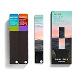
- COMPLETE FASHION, HOME & INTERIORS COLOR SYSTEM Access 2,800+ Pantone FHI colors, including 175 new shades from the Dualities collection—an essential Pantone color guide for fashion, textiles, interiors, and product design.
- DUALITIES COLLECTION – TREND-DRIVEN COLORS Explore curated palettes including New Age pastels and monochromatic Shadows, designed to reflect modern trends across apparel, home décor, and lifestyle products.
- DESIGNED FOR TEXTILES & MATERIALS Features TPG (Textile Paper – Green) colors that align with the Pantone Textile Cotton System (TCX)—ensuring accurate color development across fabrics, soft goods, and hard surfaces.
- CONNECTED TO THE FHI COTTON SYSTEM Works seamlessly with tools like the Cotton Passport, Cotton Planner, Cotton Chip Set, and FHI Cotton Library, supporting complete color development, sampling, and production workflows.
- PORTABLE FAN DECK FOR DESIGNERS ON THE GO Includes three handheld Pantone color fan decks in a compact, collector-style package, ideal for design studios, client meetings, and on-site color selection.
Trade-offs: Red and purple undertones can shift under warm bulbs, and deep reds may make a room feel more enclosed. Coordinate them with flooring, upholstery, trim, and adjacent rooms before painting a large area.
How to compare 2026 colors accurately
Use this sampling checklist
- Start with the manufacturer’s code. Use AF-655, SW 6150, N430-6A, 8004-28F, PPG1060-7, and the other identifiers listed above instead of relying on a descriptive name or screenshot.
- Buy a physical sample or tester pot. A digital swatch is useful for shortlisting, not for making the final decision.
- Test on the actual surface. Wall texture, primer, existing paint, wood species, and substrate all influence the result. For stain, use the same wood species and preparation as the project.
- View it throughout the day. Check morning, midday, evening, and artificial light. Pay particular attention to north-facing rooms, low-light corners, and rooms with warm LED bulbs.
- Place the sample beside fixed materials. Compare it with flooring, countertops, tile, cabinetry, upholstery, trim, metal finishes, and nearby wall colors.
- Evaluate the finish separately. Matte, eggshell, satin, and gloss reflect light differently. The same color can appear lighter, darker, softer, or more intense as sheen changes.
- Do not assume cross-brand equivalence. Two brands may use the same descriptive name while having different formulas, undertones, reflectance, and appearance. A Pantone identifier, Coloro code, HEX value, and paint-company formula are not automatically interchangeable.
Valspar provides product information including an LRV for Warm Eucalyptus and cautions that screen representations are secondary to in-person evaluation. Farrow & Ball likewise warns on its regional color pages that monitor representations may differ from actual paint. Use those product pages for current technical details and availability: Valspar Warm Eucalyptus and Farrow & Ball colors.
Recommended Free Tools
Geography and availability matter
- United States: The most immediately relevant architectural-paint options include Benjamin Moore Silhouette, Sherwin-Williams Universal Khaki, Behr Hidden Gem, Valspar Warm Eucalyptus, Dutch Boy Melodious Ivory, PPG Paints Warm Mahogany, Glidden Warm Mahogany, C2 Epernay, Dunn-Edwards Midnight Garden, California Paints Cactus Valley, and Clark+Kensington Hazelnut Crunch. Retail access still varies by region and store.
- Valspar: The U.S. site uses Warm Eucalyptus, while the Canadian site may use names such as Sage Slate or Submission for the same 2026 selection. Always identify the market before comparing names.
- Dulux and AkzoNobel: Product names, color codes, retail brands, and availability vary by country. Rhythm of Blues is a family, not one globally identical can of paint.
- Farrow & Ball: Regional pages and secondary coverage have produced inconsistent numbering for Naperon. Verify the current local page before ordering.
- U.K. brands: Earthborn and Little Greene may not be available to U.S. readers through the same channels as Behr, Sherwin-Williams, or Valspar. Check shipping, local stockists, and product specifications.
- PPG: Warm Mahogany refers to the U.S. PPG Paints architectural-paint program. PPG’s global coatings forecast is Secret Safari, a separate selection.
Why some 2026 roundups can look contradictory
Different roundups may list different numbers of colors because they use different definitions of “Color of the Year.” The Homes & Gardens roundup is useful for consumer paint coverage but does not fully separate paint, stain, trend-authority, and product-brand selections. The Bob Vila roundup includes useful retail and specialty selections but places products serving different materials in one list. NKBA’s “eleven major paint companies” framing is kitchen-focused, not a universal industry census.
The most important apparent duplication is Warm Mahogany: PPG Paints and Glidden use the same name and PPG1060-7 identifier. The most important category distinction is between PPG Paints Warm Mahogany and PPG global coatings Secret Safari. Likewise, Sherwin-Williams and HGTV Home by Sherwin-Williams share Universal Khaki.
A practical decision guide
- Choose the material first. Wall paint, cabinet paint, spray paint, interior wood stain, and exterior stain require different products and preparation.
- Choose the desired intensity. For a quiet backdrop, shortlist Melodious Ivory, Universal Khaki, Epernay, or Warm Eucalyptus. For a stronger focal point, look at Hidden Gem, Midnight Garden, Silhouette, Divine Damson, or Transformative Teal.
- Study the room’s fixed colors. Warm wood and brass usually support khaki, ivory, clay, brown, and earthy green. Cool gray stone or bright white surfaces may shift warm colors and require more sampling.
- Account for natural light. Dark greens, charcoal-browns, and plum need enough light or an intentionally intimate mood. Bright rooms can tolerate stronger saturation but may also reveal undertones more clearly.
- Decide whether the color should recede or lead. A neutral backdrop supports changing furnishings. A saturated cabinet, accent wall, or small room creates a more deliberate statement.
- Buy the sample before buying the project quantity. This is especially important for Naperon, Valspar’s market-specific naming, and any color being ordered from a different country or regional formula.
Update note
This roundup is a snapshot of major publicly announced 2026 selections through August 10, 2026. Additional regional brands, retailers, industrial coatings companies, wallpaper brands, textile companies, and limited-edition products may announce colors later or use different names in different markets.
Frequently Asked Questions
What is the official 2026 Color of the Year?
There is no single universal 2026 Color of the Year. Pantone selected Cloud Dancer, while individual paint brands made their own selections, including Benjamin Moore Silhouette, Sherwin-Williams Universal Khaki, Behr Hidden Gem, Valspar Warm Eucalyptus, and others.
Crashes, No Sound, or Screen Glitches?
Random freezes, missing sound and display glitches usually trace back to one bad driver. Find and replace yours safely.Free scan · under a minuteWindows Errors? Fix Them Before They Spread
Repair common Windows errors and clear accumulated junk for a smoother, more stable PC - no reinstall needed.Free scan · no reinstallWhich 2026 Color of the Year is best for a whole room?
Universal Khaki, Melodious Ivory, Epernay, Warm Eucalyptus, and Earthborn Freckle are the most approachable whole-room candidates in this roundup. Silhouette can work across a whole room when a dark, enveloping effect is intentional and the space has adequate light.
Are Warm Mahogany and Secret Safari the same PPG color?
No. Warm Mahogany is the U.S. PPG Paints architectural-paint selection and is also used by Glidden with identifier PPG1060-7. Secret Safari is PPG’s separate global coatings forecast and uses identifier PPG1110-4.
Is Pantone Cloud Dancer available as wall paint?
Cloud Dancer is Pantone’s color-authority selection, identified as PANTONE 11-4201. It is not a universal house-paint formula. A paint company’s closest-looking product would need to be independently matched and physically sampled.
Can I use a Color of the Year stain on a painted wall?
No. Minwax Special Walnut and Cabot Acorn are wood-stain selections, and their appearance depends on wood species, grain, preparation, and absorption. Use a product specifically labeled for the surface and application.
Why does Valspar use different names for its 2026 color?
Valspar’s naming is not completely uniform across North American markets. The U.S. site calls the selection Warm Eucalyptus, while the Canadian site may use names including Sage Slate or Submission. Check the local Valspar site and product code before purchasing.
The Bottom Line
The 2026 palette is not one color but a direction: warm khaki, ivory, ochre, walnut, coffee brown, mahogany, clay, and tan sit beside layered greens and blue-greens, with plum, burgundy, terracotta, blue, and white providing contrast. Choose by product category and room conditions first, then confirm the exact manufacturer code with a physical sample.
Quick Recap

Product prices and availability are accurate as of the date/time indicated and are subject to change. Any price and availability information displayed on Amazon at the time of purchase will apply.




