Recommended Free Tools
Crashes, No Sound, or Screen Glitches?
Free scan · under a minute
PC Slower Than It Used to Be?
Free scan · Windows 10 & 11
Outdated Drivers Are Slowing You Down
Free scan · exact hardware match
ThatPainter is reader-supported. When you buy through links on our site, we may earn an affiliate commission. Learn More
The best colors to pair with red depend on the red’s undertone and intensity. Blue-leaning reds such as burgundy, cranberry, and wine generally work with navy, plum, lavender, blush, and cool neutrals. Orange-leaning reds such as tomato, brick, rust, and terracotta tend to suit cream, camel, beige, olive, sage, and warm gray.
| # | Preview | Product | Price | |
|---|---|---|---|---|
| 1 |

|
Sherwin Williams Colors collection Deck Complete Paint Colors | $35.00 | Buy on Amazon |
| 2 |
|
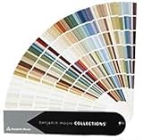
Benjamin Moore Collections Fan Deck | $33.99 | Buy on Amazon |
| 3 |
!['BENJAMIN MOORE' CLASSIC COLORS FAN DECK [CASE OF 1]](https://m.media-amazon.com/images/I/41Xq67AO80L._SL160_.jpg)
|
"BENJAMIN MOORE" CLASSIC COLORS FAN DECK [CASE OF 1] | $48.57 | Buy on Amazon |
| 4 |

|
280 Color Paint Sample Cards for Renovation Planning and Walls | $24.29 | Buy on Amazon |
Here are 21 designer-informed colors that go with red, followed by a practical guide for choosing the right combination for paint, rooms, clothing, branding, and digital design. These are useful starting points—not universal rules. Test the actual shades together before committing.
Quick answer: 21 colors that go with red
- Soft white
- Cream
- Beige
- Taupe
- Warm gray
- Charcoal gray
- Black
- Olive green
- Sage green
- Forest green
- Teal
- Navy blue
- Powder blue
- Blush pink
- Dusty rose
- Terracotta
- Rust
- Plum
- Lavender
- Mustard yellow
- Camel
Red is unusually variable. A cool crimson and a warm tomato red may both be called “red,” but they do not behave the same way beside another color. Start by identifying whether your red is blue-based, orange-based, pink-based, muted, or highly saturated.
#1 Best Overall
Neutrals that go with red
Neutrals are the safest way to make red usable over a large area. They give a strong red color somewhere to rest, whether the red appears on a wall, sofa, kitchen island, rug, coat, logo, or accent graphic.
1. Soft white
Soft white gives red breathing room without the hard, sometimes chilly contrast of pure white. Use it for trim, cabinetry, bedding, curtains, lettering, or a background around saturated red.
Warm soft whites are particularly effective with tomato, brick, coral, and red-orange shades. A white with a subtle blush or warm undertone can also balance a blue-red without making the combination look clinical.
What’s actually slowing this PC down?
Pick the symptom - the matching free tool is one click away.
2. Cream
Cream creates a warmer, more traditional pairing than bright white. It is especially comfortable with burgundy, brick, rust, and cherry red in dining rooms, living rooms, kitchens, textiles, and clothing.
Wood, leather, brass, and other warm materials reinforce the combination. If the red already has a strong orange or brown undertone, choose a cream that is warm but not noticeably yellow.
3. Beige
Beige grounds red while preserving some of its warmth. Warm beige suits tomato, terracotta, and brick; a grayer beige is usually better alongside cranberry, wine, and cooler berry reds.
Beige is useful when you want a red accent wall or furnishing to feel integrated rather than isolated. Compare the undertones in daylight: some beiges turn pink beside red, while others turn yellow.
4. Taupe
Taupe tempers red with a gray-brown character. It works well behind a red sofa, rug, headboard, or accent wall when you want a quieter, more contemporary result than cream would provide.
Do not choose taupe by its name alone. A taupe with a mauve or cool gray undertone can suit burgundy, while a warmer mushroom or brown taupe is more natural with brick and rust.
5. Warm gray
Warm gray provides a restrained backdrop for red. It is generally easier to live with than adding a second vivid color, and it helps prevent bright red from taking over a room.
Use warm gray walls with red furniture, warm-gray upholstery with red cushions, or gray packaging with a red mark. For a cool cranberry or wine red, a gray with a slightly cooler or neutral base may be more harmonious than a distinctly beige gray.
6. Charcoal gray
Charcoal gives red a dramatic, tailored look. It is effective on cabinetry, doors, furniture, graphics, and small architectural areas rather than automatically being used across every wall.
Charcoal and burgundy or oxblood create a moody palette. Charcoal and bright red create sharper contrast. Add a lighter neutral, pale wood, or warm metal if the result feels too dense.
7. Black
Black and red form a high-contrast, graphic combination. The pairing works best when one color clearly dominates and the other is controlled through accents, trim, hardware, typography, or a single furniture piece.
White, cream, wood, tan, or warm metal can prevent black and red from feeling severe. In digital work, check the actual text contrast rather than relying on the pairing’s visual drama.
Outdated Drivers Are Slowing You Down
One free scan finds every outdated or missing driver and matches the right update for your exact hardware.Free scan · exact hardware matchWindows Errors? Fix Them Before They Spread
Repair common Windows errors and clear accumulated junk for a smoother, more stable PC - no reinstall needed.Free scan · no reinstallGreens and blues that go with red
Green is red’s classic complementary family, but the exact green changes the mood substantially. Muted greens are easier to live with than two fully saturated primary colors. Blue provides a cooler counterpoint and can make red feel more polished, nautical, collegiate, or contemporary.
8. Olive green
Olive is an earthy, muted partner for red. Compared with bright emerald, it creates a less aggressive complementary contrast and works especially well with brick, rust, terracotta, and burgundy.
Try olive walls with a red textile, an olive jacket with a burgundy accessory, or olive cabinetry with restrained red details. Cream, camel, and natural wood help connect the two colors.
Rank #2
- Brand: Benjamin moore
- Container type: Box
- Finish type: Opa
9. Sage green
Sage gives red a softer, more relaxed complementary contrast. Sage walls can support red furnishings; sage upholstery can carry a red patterned textile; and small red accents can enliven a sage room.
Quick wins for a faster PC:
Scan for outdated or missing drivers - takes under a minuteDriver Scan →Repair Windows errors before they cause bigger problemsFix Now →Fix the driver behind crashes, sound loss and screen glitchesFind Drivers →The most successful combinations usually match intensity: muted sage with a softened brick or cranberry, rather than pale sage with an extremely vivid fire-engine red.
10. Forest green
Forest green creates a rich, traditional, high-impact red-and-green scheme. It suits libraries, dining spaces, classic interiors, holiday-inspired palettes, clothing, and heritage-style branding.
When both colors are dark or saturated, include an ivory, cream, pale gray, or wood-toned neutral so the composition does not become visually heavy. Red and forest green can be festive, but the surrounding materials determine whether the result feels seasonal or timeless.
11. Teal
Teal combines blue’s coolness with green’s relationship to red. It can make red feel more contemporary and energetic than a traditional red-and-green palette.
The Tool Desk
Outbyte Driver Updater FREEScan for outdated or missing drivers - takes under a minuteDriver Scan →Outbyte PC Repair FREERepair Windows errors before they cause bigger problemsFix Now →Teal with coral, tomato, or scarlet is lively and clear. Teal with burgundy creates a deeper jewel-toned look. If both colors are bright, let one occupy a smaller area or mute one through a grayer, dustier version.
12. Navy blue
Navy anchors red with a classic, tailored contrast. It works in interiors, clothing, branding, stationery, and nautical or collegiate-inspired schemes.
Navy is often more forgiving than bright blue because its lower value reduces visual noise. Pair navy with cherry or true red for crisp contrast, or with burgundy for a quieter layered palette. Soft white, cream, or camel can lighten the combination.
13. Powder blue
Powder blue lightens red and creates a friendly, approachable contrast. It is useful with cherry red, coral, and raspberry when the goal is cheerful rather than dramatic.
Keep red in an accent role if the powder blue is very pale and the room receives strong daylight. Otherwise, the red may dominate the delicate blue. A warm white can bridge the two.
Pinks and purples that go with red
Pinks and purples create either a tonal palette or a red-violet contrast. These pairings are especially useful when the red is berry-like—such as crimson, raspberry, cranberry, burgundy, or wine—but the right muted versions can also work with warmer reds.
14. Blush pink
Blush pink creates a tonal relationship with pink-reds while softening stronger shades. It works with burgundy, cherry, raspberry, and crimson in bedrooms, fashion, weddings, textiles, and feminine-leaning interiors.
Use blush as the larger background and red as the accent when you want an airy result. For more depth, reverse the proportions and add ivory, pale gray, or natural wood.
15. Dusty rose
Dusty rose is grayer and more muted than blush, making it a sophisticated companion for burgundy, wine, brick, and muted crimson.
It supports a layered, nearly monochromatic palette without requiring exact shade matching. Combine dusty rose, burgundy, and cream for a soft traditional look, or add charcoal for a more tailored one.
16. Plum
Plum adds a blue-violet counterpoint to red. It is particularly effective with burgundy, cranberry, and wine shades, where the shared depth creates a rich, enveloping palette.
Because plum and deep red can both absorb light, keep at least one element—such as ivory, pale gray, soft white, or natural wood—light enough to keep the scheme from becoming overly dark.
17. Lavender
Lavender creates a gentler red-violet contrast than saturated purple. Pair it with raspberry, cherry, or crimson for a playful modern palette, or choose a dusty lavender with burgundy for a quieter effect.
Rank #3
- Very good condition
- Benjamin Moore Classic Colors Fan Deck
- Classic Colors
- Includes the American Classic Colors (AC)
Lavender is usually most successful when the red is used selectively: a cushion, artwork, shoe, flower, title, or small piece of furniture rather than an equal block of color.
Warm colors and earth tones that go with red
Warm neighbors can make red feel earthy, collected, and less primary. They are particularly useful with orange-reds and brown-based reds, but contrast in depth and undertone is important.
18. Terracotta
Terracotta intensifies red’s earthy side. It is a natural match for brick red, rust, coral, and muted tomato, especially alongside cream, tan, natural wood, woven materials, or aged metal.
What’s actually slowing this PC down?
Pick the symptom - the matching free tool is one click away.
Designers often favor warmer, muted terra-cotta-like reds when they want the color to feel livable rather than aggressively bright. If both red and terracotta are close in value, introduce a light neutral to separate them.
19. Rust
Rust and red create a warm, autumnal palette. Make the combination clearer by choosing colors that differ in depth or undertone—for example, a clean red with brownish rust, or a deep red with a lighter orange-rust.
Rust works naturally with camel, cream, olive, and wood. Use it in upholstery, blankets, ceramics, clothing, artwork, or accessories when a red room needs more earthiness.
20. Mustard yellow
Mustard brings warmth and controlled contrast to red without the intensity of bright primary yellow. It works well in textiles, accessories, kitchens, posters, clothing, and vintage-inspired rooms.
Free tools Windows power users keep installed
One-click scans. No signup required.
Let one color lead and the other act as an accent. Red walls with mustard upholstery are more forceful than a neutral room with a red object and mustard details. Cream or charcoal can organize the pairing.
21. Camel
Camel is a warm tan that grounds red while preserving its energy. It is especially effective with burgundy, oxblood, brick, and rust in leather, wool, upholstery, clothing, bags, and accessories.
Add cream or soft white if the palette needs more lightness. Camel and a blue-red can feel polished and classic; camel and an orange-red feel warmer and more relaxed.
How to choose the right color for your particular red
1. Identify the undertone
Hold the red beside a true neutral white or gray and ask what seems to emerge. If the red looks berry, violet, or blue, treat it as a blue-red. If it looks tomato, orange, brown, or clay-like, treat it as an orange-red. If it appears pink or raspberry, it may sit between red and magenta.
Recommended Free Tools
Blue-reds such as cranberry, burgundy, and wine generally harmonize with navy, lavender, plum, blush, and cooler grays. Orange-reds such as tomato, brick, rust, and terracotta generally harmonize with cream, camel, beige, olive, sage, and warm gray. This is a practical color-theory inference, not a fixed rule.
A color wheel or physical paint color fan deck can make these relationships easier to see than a phone screen. Compare the red and possible partners side by side, not in isolation.
2. Control saturation
Two vivid complementary colors create strong visual energy. That can be desirable for a child’s room, poster, fashion look, or brand identity, but it may be tiring across a large interior surface.
For a calmer result, mute one or both colors: use sage instead of emerald, olive instead of bright green, dusty rose instead of hot pink, navy instead of electric blue, or rust instead of orange.
Do these 3 things before closing this tab:
1Scan for outdated or missing drivers - takes under a minute2Repair Windows errors before they cause bigger problems3Fix the driver behind crashes, sound loss and screen glitches3. Decide which color should dominate
A useful starting heuristic is approximately 60% dominant background or neutral, 30% secondary color, and 10% red accent. This is not a formal design standard and does not need to be measured precisely.
- Red as an accent: Use soft white, cream, beige, taupe, warm gray, or camel as the main background.
- Red as the hero color: Keep supporting colors quieter and use neutral trim, flooring, furniture, or negative space.
- Two strong colors: Give one a clear majority and repeat the smaller color in several intentional details.
4. Consider the room and materials
Lighting changes how red appears. North-facing rooms, warm incandescent bulbs, strong afternoon sun, glossy surfaces, matte walls, wood, brass, and nearby fabrics can all shift the perceived relationship.
For paint, consider whether the red will cover a whole room or only an island, door, alcove, or accent wall. A red that looks exciting on a small swatch may feel much stronger across four walls. Furniture and textiles are lower-commitment ways to test the color.
Rank #4
- Broad appeal: from professional designers to homeowners, the wall shade comparison card serves as a full spectrum palette and matching tool for diverse home decor palette sheet projects,wall coating reference sheet,residential paint Color chart
- Diverse color options: the 280 wall decoration color card is ideal for matching house coating palette, ensuring the wall tone comparison chart meets every architectural and residential requirement,exterior paint color chart,true color sample sheet
- Compact for portability: the bendable shade color card offers easy transportation and storage, making it the perfect DIY color matching card for decorators and professionals,vivid color display card,wall decoration color card
- Accurate color reproduction: crafted from paper and plastic materials, the indoor wall coating card vividly portrays each tone, providing a true color sample sheet for reliable building renovation chart use,wall coating shade chart,building wall tone Color chart
- Portable convenient: designed as a portable paint palette, this lightweight paint color chart is ideal for decorators and contractors who need paint comparison or DIY color matching card solutions,house paint selection card,house building color card
5. Choose the finish deliberately
Higher-gloss finishes reflect more light and can heighten red’s drama. Lower-sheen finishes—such as matte or eggshell, depending on the product and surface—usually make the color feel quieter and more forgiving. Use the manufacturer’s recommended finish for the surface, especially in kitchens, bathrooms, and high-traffic areas.
Free tools Windows power users keep installed
One-click scans. No signup required.
Test red combinations before committing
Do not choose a red-and-paint combination from a screen alone. Official paint guidance cautions that digital color is only an approximation and that lighting affects the result.
- Collect real samples. Use actual paint swatches from the brands you may buy, along with fabric, flooring, countertop, or trim samples that will remain in the room.
- Place large samples in the space. A small chip can conceal undertones. Use large sample boards or removable samples and move them between walls.
- Check morning, afternoon, and evening. Observe the colors in natural daylight and under the room’s planned artificial lighting.
- View the samples beside permanent materials. Red may make a beige look yellower, a gray look greener, or a white look pinker by comparison.
- Live with the combination. Look at it for at least a day before buying enough paint for the whole project.
For a DIY paint project, paint sample boards, swatch cards, or removable paint samples are more useful than trying to judge the final color from a web image. When available, use samples from the actual paint brand and product line you plan to purchase.
Applying red combinations in different settings
Paint and interiors
For a low-risk starting point, try red with soft white, beige, olive, navy, or camel. These combinations are flexible across traditional, transitional, contemporary, and eclectic rooms.
Use cream, camel, terracotta, or rust when you want a warm, collected atmosphere. Choose charcoal, black, navy, or forest green for a more dramatic result. If both the red and its partner are dark, bring in a light ceiling, trim color, rug, artwork, or upholstery.
Recommended Free Tools
Furniture and textiles
Red is easier to control in a sofa, chair, rug, cushion, headboard, blanket, curtain, or artwork than on every wall. Repeat a small amount of the red elsewhere so it looks intentional, then balance it with the room’s dominant neutral.
For example, a burgundy chair can connect to dusty rose cushions and camel leather; a tomato-red rug can connect to cream walls and olive accessories; and a cherry-red cushion can enliven navy upholstery with soft white nearby.
Clothing and accessories
Navy, camel, cream, black, charcoal, and denim-like powder blue are dependable partners for red clothing. Burgundy and wine reds often look polished with camel, blush, dusty rose, navy, or plum.
For a more energetic outfit, try red with teal, mustard, or powder blue. Keep the rest of the outfit relatively quiet when both colors are vivid.
What’s actually slowing this PC down?
Pick the symptom - the matching free tool is one click away.
Branding and graphics
Red can communicate urgency, energy, warmth, appetite, or confidence, but its meaning depends on context and neighboring colors. Black and red feel forceful; navy and red feel established; cream and red feel warmer; teal and red feel more contemporary; and olive or camel can make red feel more organic.
Do not select a palette only for appearance. Check how it performs in print, on different screens, and in small elements such as buttons, icons, labels, and charts.
Digital interfaces
A visually attractive red pairing may still be difficult to read. For normal text, WCAG 2.2 Level AA generally calls for a contrast ratio of at least 4.5:1; large text generally requires at least 3:1, subject to the applicable exceptions and definitions.
Do not use red and green as the only way to communicate status because many users cannot distinguish those colors reliably. Add text, icons, patterns, labels, or another visual cue. A color contrast checker can help test foreground and background combinations, but review the final interface in context.
Common mistakes when pairing red
- Assuming every red is interchangeable: Burgundy, coral, tomato, brick, and cherry red have different undertones.
- Matching names instead of undertones: “Gray,” “white,” “green,” and “blue” cover broad families.
- Using two saturated complements over large areas: Bright red and bright green can become exhausting without a neutral break.
- Ignoring value: Deep red beside deep plum or charcoal may need a light element for separation.
- Trusting a screen sample: Display settings, lighting, sheen, and surrounding colors alter perception.
- Using red and green without a second cue in digital design: Color alone should not carry essential information.
A practical starting palette
If you want a dependable first experiment, begin with one of these combinations:
| Red type | Good first partners | Overall effect |
|---|---|---|
| Burgundy, wine, or oxblood | Camel, cream, navy, dusty rose, plum | Rich, classic, layered |
| Cherry or clear red | Soft white, charcoal, navy, powder blue, blush | Crisp, cheerful, graphic |
| Tomato or scarlet | Cream, teal, warm gray, olive, mustard | Energetic, contemporary, warm |
| Brick, rust, or terracotta | Beige, camel, sage, olive, cream | Earthy, relaxed, collected |
| Raspberry or crimson | Blush, lavender, navy, soft white, dusty rose | Soft, modern, expressive |
For digital work, use a palette generator to explore analogous, complementary, split-complementary, triadic, and monochromatic relationships—but validate the final colors with a contrast checker and accessible text choices. Palette harmony is a starting point, not proof that a user interface is readable.
Frequently Asked Questions
What is the safest color to pair with red?
Soft white, cream, beige, warm gray, navy, olive, and camel are reliable starting points. The best choice still depends on whether the red is cool, warm, muted, or highly saturated.
What colors go with burgundy red?
Burgundy works especially well with cream, camel, navy, dusty rose, blush, plum, charcoal, and natural wood. Keep at least one light element in a dark burgundy palette.
What colors go with bright red?
Soft white, charcoal, black, navy, powder blue, blush, teal, and controlled mustard accents can work with bright red. Let one strong color dominate rather than using equal areas of several vivid colors.
Does red go with green?
Yes. Red and green are classic complementary colors, but the result depends on the shades. Olive and sage are calmer partners than bright emerald, while forest green creates a richer, more traditional look. Add a neutral when both colors are saturated.
The Bottom Line
There is no single color that goes with every red. For the lowest-risk starting point, test red with soft white, beige, olive, navy, or camel. Then adjust for undertone: cool reds usually suit blue, violet, pink, and cool neutrals, while warm reds usually suit cream, earth tones, muted greens, and warm neutrals. Always test physical samples in the actual light—and check contrast if the palette will be used digitally.
Quick Recap





