Recommended Free Tools
PC Slower Than It Used to Be?
Free scan · Windows 10 & 11
Crashes, No Sound, or Screen Glitches?
Free scan · under a minute
Windows Errors? Fix Them Before They Spread
Free scan · no reinstall
ThatPainter is reader-supported. When you buy through links on our site, we may earn an affiliate commission. Learn More
Earth-tone paint colors include warm neutrals, muted greens, and clay-inspired shades—not just beige and brown. Start with a light neutral, then layer in deeper green, gold, or clay according to the room and its existing materials. The 22 colors below are drawn from manufacturer collections; compare physical samples before choosing a paint.

What counts as an earth-tone paint color?
Earth tones take their cues from natural references such as soil, stone, clay, sand, and plant life. BEHR describes earth tones in these terms, while manufacturer collections also include warm neutrals, muted greens, clay shades, and golden hues. A softer blue can provide a cooler counterpoint.
Do these 3 things before closing this tab:
1Fix the driver behind crashes, sound loss and screen glitches2Clear out junk files and repair common Windows errors3Scan for outdated or missing drivers - takes under a minuteThis is a practical palette assembled from BEHR, Sherwin-Williams, and Dunn-Edwards collections, not a ranking or a universal industry-standard list. Color descriptions below reflect the manufacturers’ descriptions; room suggestions are styling guidance, not independent paint testing.
#1 Best Overall
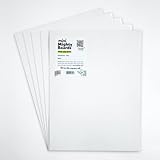
- PERFECT SAMPLES: These 12" x 9" white, styrene panels provide a smooth, warp-free surface for testing up to 5 color samples with paint, stain or other coatings.
- DURABLE MATERIAL: Made of sturdy styrene, these panels can withstand multiple coats and are non-absorbent so colors will stay true.
- CONVENIENT SIZING: At 12" x 9", the panels are just the right size for testing many common paint colors side by side before committing to a full project.
- PACKAGE INCLUDES: This value pack contains 5 white panels, enough for testing several color options on one purchase.
- VERY FLEXIBLE: Mighty Boards do not warp like foam core and you can bend them without breaking.
22 earth-tone paint colors at a glance
| Color | Brand and code | Color character or suggested role |
|---|---|---|
| Grounded | BEHR T27-01 | Mossy olive green with earthy brown undertones |
| Sedona Pink | BEHR S190-3 | Warm peach-brown, muted pink |
| Tuscan Terra | BEHR T27-02 | Deeper clay-inspired shade |
| Hayloft | BEHR MQ2-22 | Soft straw-gold |
| Coastal Beige | BEHR PPU7-13 | Light warm beige with a soft yellow undertone |
| Denim Light | BEHR PPU14-15 | Soft sky-inspired blue counterpoint |
| Natural Linen | Sherwin-Williams SW 9109 | Warm neutral foundation |
| Practical Beige | Sherwin-Williams SW 6100 | Warm beige neutral |
| Utaupeia | Sherwin-Williams SW 9088 | Warm neutral |
| Llama Wool | Sherwin-Williams SW 9089 | Warm neutral |
| Stone Lion | Sherwin-Williams SW 7507 | Warm neutral |
| Shiitake | Sherwin-Williams SW 9173 | Warm neutral |
| Divine White | Sherwin-Williams SW 6105 | Pale warm neutral |
| Whole Wheat | Sherwin-Williams SW 6121 | Warm neutral |
| Ivoire | Sherwin-Williams SW 6127 | Pale warm neutral |
| Woven Wicker | Sherwin-Williams SW 9104 | Warm neutral |
| Basket Beige | Sherwin-Williams SW 6143 | Beige warm neutral |
| Double Latte | Sherwin-Williams SW 9108 | Deeper warm neutral |
| Desert Mauve | Dunn-Edwards DE6016 | Balanced neutral with subtle warmth |
| Badlands Sunset | Dunn-Edwards DE6083 | Deep, grounded shade |
| Thick Fog | Dunn-Edwards DE6058 | Versatile warm gray |
| Melted Wax | Dunn-Edwards DE6163 | Softly golden shade |
BEHR: earthy colors inspired by nature
BEHR’s Elemental palette spans warm neutrals, clay-inspired colors, green, and gold. Its examples pair these colors with natural wood, woven textures, greenery, and creamy or neutral accents.
Grounded T27-01
BEHR describes Grounded as a mossy olive green with earthy brown undertones. The manufacturer shows it with wood, woven textures, greenery, and warm neutrals. BEHR says this color is offered in several of its paint lines; check local availability and the specific product before buying.
Sedona Pink S190-3 and Tuscan Terra T27-02
Sedona Pink is a warm peach-brown, muted pink inspired by desert sunset and clay. BEHR pairs it with natural wood, creamy textiles, and warm neutral accents. Tuscan Terra is the deeper clay-inspired option; BEHR illustrates it in a bedroom with blue, gray, and neutral bedding, natural wood, and soft lighting.
Rank #2

- PAINT + PRIMER: KILZ TRIBUTE is a low VOC, 100% acrylic advanced technology paint and primer in one formulated for superior hide and coverage with exceptional durability. Paint and primer covers light-medium stains and light-dark color changes.
- ADVANCED FORMULA: This is our most technologically-advanced acrylic product which combines paint and primer properties with exceptional stainblocking performances. This remarkable formula can be scrubbed clean safely. GREENGUARD Certified: low emissions of VOCs
- MULTIPLE SURFACES: KILZ interior paint makes a great wall paint or cabinet paint for many home improvement needs. Use on properly prepared coated or uncoated wood, drywall, masonry and cured plaster. Surfaces should be clean and free of dust, grease, chalk, rust and peeling paint. Mix well before using.
- SUPERIOR COVERAGE: KILZ TRIBUTE interior satin paint and primer covers up to 400 sq. ft. per gallon depending on surface texture, porostiy, and application method. If desired, recoat after 2 hours. We offer an 8 oz sample size for color choosing convenience. Use with high-quality brushes or paint rollers.
- KILZ has been making premium primers and paints for 40 years and leverage this experience in every gallon of KILZ Paint. Named Paint Brand of the Year in 2015 in the Harris Poll EquiTrend Rankings. Lifetime Limited Warranty (see label for details).
Hayloft MQ2-22 and Coastal Beige PPU7-13
Hayloft is a soft straw-gold that BEHR shows in a dining room with rustic wood and neutral upholstery. Coastal Beige is a light warm beige with a soft yellow undertone, used by BEHR as a foundation for a layered palette.
Denim Light PPU14-15
Denim Light is a soft, sky-inspired blue. It is a cooler counterpoint to the warmer earth hues, rather than another warm shade in the palette.
Sherwin-Williams: warm neutrals
Sherwin-Williams groups these colors in its Warm Neutrals collection under “Back to Beige” and “Earthy Undertones.” The manufacturer describes the shades as versatile and suitable for mixing with pale colors. The listed collection colors are Natural Linen SW 9109, Practical Beige SW 6100, Utaupeia SW 9088, Llama Wool SW 9089, Stone Lion SW 7507, Shiitake SW 9173, Divine White SW 6105, Whole Wheat SW 6121, Ivoire SW 6127, Woven Wicker SW 9104, Basket Beige SW 6143, and Double Latte SW 9108.
Use the codes to identify the intended colors, then assess their relative lightness and undertones in your room. Sherwin-Williams cautions that displayed colors may differ from actual paint color, so an online swatch is not a substitute for a physical sample.
Free tools Windows power users keep installed
One-click scans. No signup required.
Dunn-Edwards: warm neutrals
Dunn-Edwards’ Warm Neutrals collection includes Desert Mauve DE6016, described as a balanced neutral with subtle warmth; Badlands Sunset DE6083, described as deep and grounded; Thick Fog DE6058, a versatile warm gray; and Melted Wax DE6163, a softly golden color.
Dunn-Edwards suggests natural textures such as linen, rattan, and reclaimed wood. Its palette guidance also includes deep green, navy, and terracotta as accents, with beige and taupe helping unify open spaces.
Rank #4

- PAINT plus PRIMER: KILZ TRIBUTE is a low VOC, 100 percent acrylic advanced technology paint and primer in one formulated for superior hide and coverage with exceptional durability. Paint and primer covers light-medium stains and light-dark color changes.
- ADVANCED FORMULA: This is our most technologically-advanced acrylic product which combines paint and primer properties with exceptional stainblocking performances. This remarkable formula can be scrubbed clean safely. GREENGUARD Certified: low emissions of VOCs
- MULTIPLE SURFACES: KILZ interior paint makes a great wall paint or cabinet paint for many home improvement needs. Use on properly prepared coated or uncoated wood, drywall, masonry and cured plaster. Surfaces should be clean and free of dust, grease, chalk, rust and peeling paint. Mix well before using.
- SUPERIOR COVERAGE: KILZ TRIBUTE interior satin paint and primer covers up to 400 sq. ft. per gallon depending on surface texture, porostiy, and application method. If desired, recoat after 2 hours. We offer an 8 oz sample size for color choosing convenience. Use with high-quality brushes or paint rollers.
- KILZ has been making premium primers and paints for 40 years and leverage this experience in every gallon of KILZ Paint. Named Paint Brand of the Year in 2015 in the Harris Poll EquiTrend Rankings. Lifetime Limited Warranty (see label for details).
How to combine earth tones
- Choose a light foundation. BEHR suggests Coastal Beige as a starting point; warm neutrals from the Sherwin-Williams and Dunn-Edwards collections are other options to test.
- Add a deeper color where you want more definition. Consider a muted green such as Grounded, a straw-gold such as Hayloft, or a clay shade such as Sedona Pink or Tuscan Terra.
- Use a cooler counterpoint if the palette feels too warm. BEHR includes Denim Light as an airy blue beside its earthy hues.
- Connect rooms with repeated details. Repeat related undertones, natural materials, or neutral accents rather than making every room identical.
For example, BEHR’s guidance pairs Coastal Beige with deeper green or straw-gold for added depth, clay shades for warmth, and Denim Light as a cooler counterpoint. Across an open floor plan, natural textures and repeated neutral accents can help connect rooms. Dunn-Edwards also suggests warm neutrals for linking open spaces.
Independent reader supportYour contribution helps us test, update, and keep practical guides available for everyone.How to compare and sample paint colors
- Shortlist by role. Decide whether you need a light foundation, a deeper color, or a contrasting accent.
- Check undertone and depth. Compare options with permanent materials such as flooring, stone, wood, and textiles.
- Get physical samples or color chips. Sherwin-Williams and Dunn-Edwards describe samples or chips as ways to view colors in your space. Online swatches cannot perfectly predict a finished wall.
- View the samples in the room. Check them in the light and beside the materials they will be near before choosing.
- Confirm the product and availability. A named color and a paint line are separate details. BEHR says Grounded T27-01 is offered in several BEHR paint lines; check local availability and the intended product.
Frequently Asked Questions
What are earth tone paint colors?
Earth tones draw on natural references such as soil, stone, clay, sand, and plant life. They can include warm neutrals, muted greens, clay shades, and golden hues—not only brown.
Quick wins for a faster PC:
Scan for outdated or missing drivers - takes under a minuteDriver Scan →Repair Windows errors before they cause bigger problemsFix Now →Fix the driver behind crashes, sound loss and screen glitchesFind Drivers →How can I use earth-tone colors together?
Begin with a light warm neutral, then add a deeper green, gold, or clay shade where you want more color. A softer blue can provide contrast. Compare samples with the room’s materials before settling on a combination.
Best Value

- Package Includes: this set includes 5 paint color test boards, allowing you to evaluate multiple color options at once, improving your color selection efficiency, and enabling you to choose colors for spaces such as the living room, bedroom, and kitchen
- Moderate Size: measuring about 12 x 9 inches, these paint sample boards provide a larger color display area, allowing you to judge the visual effect of paint on the actual wall surface, and can also be placed side by side for direct color comparison
- Quality Polystyrene Material: these color tester sample boards thickness about 1 mm crafted from polystyrene material, resisting warping after it dries, and you can use it multiple times
- Portable Design: after painting, you can place the sample in different rooms, on different walls, and facing different directions to observe it, helping you to evaluate the color effect under various lighting conditions
- Versatile Uses: except home painting projects, this polystyrene sheet is also an ideal paint sample board for artists who need a color tester sample board for practice; Use it to test color mixtures before applying to final canvases
How do I coordinate earth-tone paint colors throughout a home?
Repeat related undertones, neutral accents, or natural materials between rooms to create a connection without making every room identical. Linen, rattan, wood, and other natural textures can reinforce a warm palette.
Can an online paint swatch tell me exactly how a color will look?
No. Manufacturer guidance notes that displayed colors may differ from actual paint, and a screen does not reproduce a finished wall in your room’s lighting. Use physical samples or chips to compare colors in the space.
The bottom line
Earth tones range from light warm neutrals to muted greens, clay, and gold, with a cooler blue available as a counterpoint. Choose colors by their undertone, depth, role, and nearby materials, then compare physical samples in your home before purchasing paint.
What’s actually slowing this PC down?
Pick the symptom - the matching free tool is one click away.
Quick Recap

Product prices and availability are accurate as of the date/time indicated and are subject to change. Any price and availability information displayed on Amazon at the time of purchase will apply.




