The Tool Desk
Recommended Free Tools
Outbyte Driver Updater FREEFix the driver behind crashes, sound loss and screen glitchesFind Drivers →Outbyte PC Repair FREERepair Windows errors before they cause bigger problemsFix Now →
ThatPainter is reader-supported. When you buy through links on our site, we may earn an affiliate commission. Learn More
Color psychology can help you choose a direction for a room, but it cannot guarantee that one paint color will make everyone feel calm, energetic, or cozy. Four useful starting points are a quiet cool retreat, a warm lively gathering space, a nature-linked balance, and an enveloping dramatic room. Treat each as a design hypothesis: preview the colors in your own lighting, then keep, soften, or replace them according to your response.
What color psychology can—and cannot—tell you
The strongest current evidence describes recurring associations rather than universal emotional rules. A 2025 systematic review by Jonauskaite and Mohr examined 132 peer-reviewed articles, 42,266 participants, and 64 countries, covering research published from 1895 through 2022. It found systematic links between color and emotion involving hue, lightness, and saturation, but many relationships were many-to-many: one color category could be associated with several emotions, and one emotion with several color categories. Read the review at Jonauskaite and Mohr (2025).
As an Amazon Associate I earn from qualifying purchases.
Across the review, lighter colors were associated with more positive emotions. More saturated colors were associated with more positive, higher-arousal, and higher-power emotions. Warm colors were linked with a wider range of emotions and, on average, more arousal and perceived power. These are population-level patterns, not promises about a particular wall, paint brand, room, or person.
Room context changes the result. In a study using digital images of two imaginary living rooms, warm colors produced stronger ratings for arousal, excitement, and stimulation, while cool colors were rated as less arousing, more spacious, and more restful. Because participants judged imagined rooms, the findings are suggestive rather than proof of long-term effects in occupied homes; the study is recorded at PubMed.
#1 Best Overall
!['BENJAMIN MOORE' CLASSIC COLORS FAN DECK [CASE OF 1]](https://m.media-amazon.com/images/I/41Xq67AO80L._SL160_.jpg)
- Very good condition
- Benjamin Moore Classic Colors Fan Deck
- Classic Colors
- Includes the American Classic Colors (AC)
A 2018 observational study of 443 students in color-differentiated university residence halls likewise noted that evidence about architectural color and psychological functioning was sparse. Your room’s daylight, furnishings, cultural associations, memories, and purpose all remain important. None of these studies establishes a therapeutic, sleep, or health effect from painting a particular palette.
Four palettes to try at home
The combinations below are practical syntheses of the evidence, not complete schemes tested in clinical or laboratory trials. Use the color roles as a starting formula, then tune the exact undertones and proportions to your room.
Windows Errors? Fix Them Before They Spread
Repair common Windows errors and clear accumulated junk for a smoother, more stable PC - no reinstall needed.Free scan · no reinstallCrashes, No Sound, or Screen Glitches?
Random freezes, missing sound and display glitches usually trace back to one bad driver. Find and replace yours safely.Free scan · under a minute1. Quiet, cool retreat: soft blue, muted green, and warm white
This is the most restrained option for a room intended to feel settled and open. Use a soft, slightly gray blue on the main walls, a muted green on an adjacent wall or in textiles, and a warm white for trim, ceiling, or larger unpainted areas. The blue-green family keeps the palette cool without making every surface the same temperature.
Rank #2

- Includes 30 featured and newest released color card. Sprayed on color to see our colors in your homes lighting for more accurate color choices.
- ALL-IN-ONE Paint - NO Sanding, NO Priming, NO Top Coat Required, Low Luster, Velvet Sheen Finish
- Interior/Exterior - Paint your whole house - Ideal for hard surfaces including walls, doors, cabinets, counters, furniture, metal, glass, ceramics and floor and wall tile
- Durable yet stretches to paint smooth fabrics, vinyl and leather
- Results cannot be guaranteed. Digital screens may not show color accurately. Product search "ALL-IN-ONE PAINT by Heirloom Traditions, Color Confidence Card", for an accurate color choice.
The rationale is two-part. The systematic review found blue and green categories associated with positive, lower-arousal emotions, while the living-room imagery study found cool rooms tended to be judged more restful and spacious. Neither source tested this exact three-color combination, so describe the effect as a plausible direction rather than a guaranteed mood.
- Try it in: a reading room, bedroom, home office, or living room where visual quiet matters.
- Control the intensity: choose low-to-moderate saturation if a strong blue feels chilly; keep the warm white visible on trim or ceiling to add balance.
- Watch the light: compare the blue and green in morning, afternoon, and artificial evening light. A sample that looks soft in daylight can appear noticeably grayer or brighter after sunset.
2. Warm, lively gathering space: warm white, pale yellow, and restrained terracotta
Start with a warm white as the field color, add pale yellow where you want brightness, and reserve terracotta for one accent wall, a niche, or movable furnishings. The warm white prevents the yellow from dominating, while a small amount of terracotta supplies depth without turning the whole room intensely warm.
In the review, yellow and orange categories showed positive, higher-arousal associations. In the imagined living-room study, warm colors received stronger ratings for excitement, stimulation, and high arousal. That makes this palette a reasonable candidate for rooms designed for conversation and activity, but it is not evidence that yellow or terracotta will energize every household.
Free tools Windows power users keep installed
One-click scans. No signup required.
Rank #3
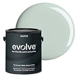
- PAINT + PRIMER IN ONE: Evolve’s paint-and-primer formula helps you get great coverage from the start, sealing your surface and reducing the extra work of multiple coats.
- AVAILABLE IN MULTIPLE SHEENS, COLORS & SIZES: Choose from a curated palette of designer colors in Flat, Eggshell, Satin, and Semi-Gloss sheens to match any style, room, or project. Available in 1-Gallons & 5-Gallons.
- SATIN SHEEN - Smooth & Durable: Soft, silky luster with added durability for high-use areas like kitchens, baths, and kids’ rooms. Resists scuffs and stains while keeping a polished look.
- STAIN & SCRUB RESISTANT: Built to last in real spaces, Evolve helps resist marks, scuffs, and water spotting, so your home continues to look polished and well-maintained.
- DESIGNED FOR MOISTURE-PRONE AREAS: Formulated to perform well in bathrooms, kitchens, entryways, laundry rooms, and other high-humidity spaces.
- Try it in: a kitchen-dining area, family room, entry, or creative workspace.
- Control the intensity: keep the yellow pale and use terracotta as a measured accent if you want animation without visual pressure.
- Check competing warmth: wood floors, brass hardware, and existing upholstery can make the combined room warmer than the paint chips suggest.
3. Nature-linked balance: sage green, warm beige, and wood tones
Sage green supplies the color, warm beige creates a quieter background, and wood tones contribute texture rather than another painted hue. This combination works when you want a natural impression without the contrast of a strongly cool or strongly warm scheme.
The evidence supports discussing green as a category associated with positive, lower-arousal emotion. The pairing of sage, beige, and wood is a design suggestion, not a measured psychological intervention. Its success depends on how much of each material is visible and on your personal associations with green and natural finishes.
- Try it in: a living room, bedroom, hallway, or workspace that already contains wood furniture or flooring.
- Control the intensity: select a dusty or gray-influenced sage for a quieter look; a clearer, more saturated sage will read as livelier.
- Coordinate undertones: place the paint sample beside the actual flooring, cabinetry, and stone. Beige can shift pink, yellow, or gray when neighboring materials change its appearance.
4. Enveloping, dramatic room: deep green or blue with warm cream accents
Use a deep green or blue on the walls and warm cream on trim, ceiling, upholstery, or large decorative elements. The contrast creates an intentionally enclosed, high-character room rather than an airy neutral one.
Rank #4

- PAINT plus PRIMER: KILZ TRIBUTE is a low VOC, 100 percent acrylic advanced technology paint and primer in one formulated for superior hide and coverage with exceptional durability. Paint and primer covers light-medium stains and light-dark color changes.
- ADVANCED FORMULA: This is our most technologically-advanced acrylic product which combines paint and primer properties with exceptional stainblocking performances. This remarkable formula can be scrubbed clean safely. GREENGUARD Certified: low emissions of VOCs
- MULTIPLE SURFACES: KILZ interior paint makes a great wall paint or cabinet paint for many home improvement needs. Use on properly prepared coated or uncoated wood, drywall, masonry and cured plaster. Surfaces should be clean and free of dust, grease, chalk, rust and peeling paint. Mix well before using.
- SUPERIOR COVERAGE: KILZ TRIBUTE interior satin paint and primer covers up to 400 sq. ft. per gallon depending on surface texture, porostiy, and application method. If desired, recoat after 2 hours. We offer an 8 oz sample size for color choosing convenience. Use with high-quality brushes or paint rollers.
- KILZ has been making premium primers and paints for 40 years and leverage this experience in every gallon of KILZ Paint. Named Paint Brand of the Year in 2015 in the Harris Poll EquiTrend Rankings. Lifetime Limited Warranty (see label for details).
This palette needs the clearest qualification. The systematic review associated lighter colors with more positive emotions overall and darker colors with more negative emotions at a broad category level. That does not mean a dark room will feel bad to you, nor does it prove that dark paint creates coziness. Some people prefer the enveloping appearance, especially when the room’s purpose calls for intimacy or drama. Treat the scheme as an aesthetic option shaped by preference, furnishings, and light.
- Try it in: a dining room, media room, library, powder room, or other space where an immersive look is intentional.
- Control the intensity: use cream on larger secondary surfaces if the wall color feels too heavy; keep the deep color to one wall if you want drama with more visual relief.
- Check the room at night: artificial light can change both the apparent depth of the paint and the contrast with cream details.
Compare the four options before you decide
| Palette | Warm–cool balance | Lightness and saturation | Intended room experience | Research-informed rationale |
|---|---|---|---|---|
| Quiet, cool retreat | Predominantly cool, softened by warm white | Light to medium lightness; muted saturation | Quiet, restful, spacious | Blue and green were associated with positive, lower-arousal emotions; cool imagined rooms rated more restful and spacious. |
| Warm, lively gathering space | Predominantly warm | Light warm base with a restrained, more saturated accent | Social, lively, stimulating | Yellow and orange showed positive, higher-arousal associations; warm imagined rooms rated more stimulating. |
| Nature-linked balance | Balanced by green, beige, and wood | Muted sage with light-to-medium neutrals | Grounded, natural, balanced | Green was associated with positive, lower-arousal emotion; the full combination is an editorial design suggestion. |
| Enveloping, dramatic room | Deep cool wall color with warm cream | Low lightness on walls; contrast supplied by lighter accents | Immersive, intimate, dramatic | Lighter colors were linked with more positive emotion and darker colors with more negative emotion at a broad level; personal preference remains decisive. |
How to choose a palette for your actual room
Start with the experience you want, not with a color name. Then use the following decision points:
- Need visual quiet? Begin with the cool retreat or the nature-linked palette, keeping saturation modest.
- Want more activity and conversation? Test the warm gathering palette, but reduce the yellow or terracotta if the room feels over-stimulating.
- Want an immersive statement? Test the dramatic palette on large sample boards before committing to all four walls.
- Unsure between two options? Compare their lightness first, then saturation. Those dimensions can change the impression more than a small hue shift.
- Have a strong personal reaction? Give it priority. The studies describe associations across groups; they do not override your taste or your room’s function.
Test interior paint samples before painting
Previewing paint is the most reliable way to connect broad color findings with your home. Manufacturer guidance also recommends using color to create a desired ambiance, but that advice is practical guidance rather than independent proof that paint causes a specific psychological outcome. One example is Sherwin-Williams’ color-psychology guide.
Best Value

- PAINT + PRIMER IN ONE: Evolve’s paint-and-primer formula helps you get great coverage from the start, sealing your surface and reducing the extra work of multiple coats.
- AVAILABLE IN MULTIPLE SHEENS, COLORS & SIZES: Choose from a curated palette of designer colors in Flat, Eggshell, Satin, and Semi-Gloss sheens to match any style, room, or project. Available in 1-Gallons & 5-Gallons.
- EGGSHELL SHEEN – Soft, Velvety Glow: Offers a gentle sheen that balances elegance with durability. Ideal for moderate-traffic areas like dining rooms, hallways, and family rooms. Easy to clean without compromising the finish.
- STAIN & SCRUB RESISTANT: Built to last in real spaces, Evolve helps resist marks, scuffs, and water spotting, so your home continues to look polished and well-maintained.
- DESIGNED FOR MOISTURE-PRONE AREAS: Formulated to perform well in bathrooms, kitchens, entryways, laundry rooms, and other high-humidity spaces.
- Define the viewing conditions. Note whether the room is used mainly in daylight, after dark, or both. Identify fixed elements—flooring, counters, tile, furniture, and window treatments—that the paint must coexist with.
- Get interior paint samples. Obtain sample-size paint or removable sample boards for every main color, including the warm white or cream. A tiny chip cannot show how a color behaves over a wall-sized area.
- Place samples on more than one wall. Put boards near windows and in shaded areas, and move them beside the largest permanent furnishings. This reveals shifts caused by orientation and surrounding colors without requiring a premature commitment.
- Observe several times. Check the samples in daylight and evening light over at least one ordinary day. Record which versions feel too cool, too warm, too dark, or too intense for the room’s purpose.
- Test the proportion. View the proposed wall color next to the trim color and accent. A palette can feel balanced as separate chips but overpowering when one saturated color covers a large surface.
- Revise once, then decide. If the direction is right but the room feels excessive, lower saturation, raise lightness, or reduce the accent area before abandoning the whole palette.
Common mistakes and how to avoid them
Assuming a color has one fixed emotional meaning
Blue is not automatically calming, yellow is not automatically cheerful, and dark paint is not automatically depressing. Associations vary by shade, lightness, saturation, context, and person. Use language such as “may feel” or “is intended to create” for your own design goal, not “will make everyone feel.”
Copying a palette without copying its conditions
A photograph or sample room may use different daylight, ceiling height, furnishings, and surrounding colors. Recreate the colors in your own room and evaluate them there rather than treating an image as a prediction.
Ignoring the difference between a category and a formula
The studies investigated color categories or room images, not the four complete combinations in this article. Evidence for green as a category does not clinically validate sage green plus beige plus wood. Keep that distinction clear when you explain your choice to others.
Using a mood claim as a health claim
Color research does not establish that these palettes improve sleep, treat anxiety, or produce a therapeutic result. Choose paint for appearance and personal experience, and seek qualified care for health concerns.
The practical verdict
There is no universally best home palette in the available evidence. The cool retreat is the most plausible starting point when you want a lighter, lower-arousal impression; the warm scheme is suited to a more stimulating social atmosphere; the nature-linked option offers a restrained, material-rich middle ground; and the dramatic scheme prioritizes enclosure and visual character over broad lightness. The right choice is the one that meets your room’s purpose and still looks good to you after you have tested real samples in real light.
Quick Recap

Product prices and availability are accurate as of the date/time indicated and are subject to change. Any price and availability information displayed on Amazon at the time of purchase will apply.

