Outdated Drivers Are Slowing You Down
One free scan finds every outdated or missing driver and matches the right update for your exact hardware.Free scan · exact hardware match
PC Slower Than It Used to Be?
A free scan shows the junk files, broken settings and background clutter dragging Windows down - then fixes them in one click.Free scan · Windows 10 & 11
ThatPainter is reader-supported. When you buy through links on our site, we may earn an affiliate commission. Learn More
The paint-color story for 2026 spans warm, grounded neutrals, expressive browns, restorative greens, softened pastels and deep, moody shades. These five directions synthesize forecasts and Color of the Year announcements from several paint brands; they are not a measured ranking of designers’ preferences or proof of what will sell best.
How to read the 2026 paint trends
Color of the Year is each manufacturer’s own selection, not a neutral market ranking. The colors and palettes below show what several major brands are promoting for 2026, alongside broader forecast themes. Treat them as ideas to consider in your space, not a guarantee that one look will suit every home.

The scale of a forecast does not establish popularity either: Sherwin-Williams’ 2026 Colormix forecast, Anthology Volume Two, comprises four palettes curated by its Trendsight Team for 2026 and beyond. Homes & Gardens reports that the forecast includes 48 shades. Those figures describe one manufacturer’s forecast, not consumer adoption.
1. Warm, earthy neutrals
Sherwin-Williams chose Universal Khaki SW 6150 as its 2026 Color of the Year, describing it as a mid-tone neutral with a slight yellow undertone. The shade makes a warmer alternative to a stark, cool neutral. Valspar’s 2026 neutral story also points toward grounding warmth. Sue Kim, Valspar’s director of color marketing, says: “In the coming year, we will redefine our notion of neutral hues. Going beyond the classified color term, neutral refers to colors that set a grounding and inviting mood with the warmth that calms our senses.”
#1 Best Overall
Think of these hues as a base for natural finishes, timber and whites if that combination suits the room; those are styling possibilities, not prescribed matches. Sherwin-Williams recommends Emerald paint for Universal Khaki and offers color chips, peel-and-stick samples and paint samples.
2. Espresso, mahogany and other rich browns
The brown direction ranges from nearly black depth to warmer red-brown. Benjamin Moore named Silhouette AF-655 its 2026 Color of the Year, describing it as espresso with charcoal notes. Glidden’s 2026 pick, Warm Mahogany PPG1060-7, is described by the company as a rich, grounded red.
Rank #2

- Easily mix, match, and plan flawless color schemes with this expansive card deck featuring 200 colors
Benjamin Moore’s Andrea Magno, director of color marketing and design, linked the choice to renewed interest in brown, classic silhouettes and timeless pieces. For a room, the practical distinction is undertone and intensity: Silhouette leans espresso-charcoal, while Warm Mahogany brings more red warmth. Glidden notes that its screen color may differ from the actual paint.
3. Restorative greens and blue-greens
Valspar’s Warm Eucalyptus 8004-28F is its 2026 Color of the Year; the company describes it as restorative and serene. Behr selected Hidden Gem as its 2026 pick. Axios characterizes Hidden Gem as “smoky jade,” a useful description to keep attributed to that publication rather than treating it as Behr’s exact wording.
Rank #3

- Core Color Matching: Paint color sample cards include 83 standard colors to support paint color sample cards, color matching cards for painting, and paint chips standard samples, helping users compare shades before selecting a final finish for floor paint, hardware, and other project needs
- Reliable Reference: Paint samples are made with color matching materials designed to support accurate color comparison, giving painters and DIY users a practical paint and paint color samples reference for selecting tones that fit the project surface and intended look
- Portable Format: Measuring 3.74 x 1.57 x 1.18 in and weighing 3.88 oz, this paint samples set is compact for a toolbox, work bag, or travel use, making it easier to carry color test card paint and check shades on site when planning paint work
- Wide Project Use: Paint sample cards are suitable for floor paint, paint hardware, and related color selection tasks, offering a useful paint chips samples reference for contractors, decorators, and home improvement users working on color coordination across different surfaces
- Simple Set Package: Each package includes 1 set of paint sample cards, giving users a straightforward paint sample standard cards option for daily work, project planning, and quick shade comparison when choosing among paint color cards and paint chips sample cards
These choices place green and blue-green alongside the year’s browns and neutrals, rather than outside the broader palette story. Valspar’s page links to a sample cart and Lowe’s purchase option; product availability can vary by retailer.
4. Soft pastels and chalky color
Not every 2026 forecast leans dark or earthy. Sherwin-Williams’ Colormix forecast includes a Frosted Tints family, while Homes & Gardens highlights soft pastels and Lemon Chiffon among forecast shades. These lighter, softened colors offer a different intensity from espresso and charcoal, and can coexist with the more grounded hues in the same year’s predictions.
The Tool Desk
Outbyte PC Repair FREERepair Windows errors before they cause bigger problemsFix Now →Outbyte Driver Updater FREEScan for outdated or missing drivers - takes under a minuteDriver Scan →Rank #4
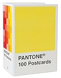
- PERFECT FOR PANTONE COLOR BOOK FANS: This charming postcard collection features a palette drawn from the Pantone Color Matching Systems.
- GRAPHIC DESIGN INSPIRATION: Each postcard in this set of 100 offers a different bold hue to brighten up the mail.
- COLOR MATTERS: Color as a form of communication is incredibly powerful. The art of Pantone makes this set of cards a brilliant way to connect.
- BLANK POSTCARDS: These high-quality cards are great for any occasion: birthdays, thank yous, sympathy, or just saying hello.
- DOUBLES AS DECOR: Postcards work wonderfully as miniature art pieces to display on the desk or bulletin board.
5. Deep, moody shades
Deep colors provide another route to contrast and visual weight. Sherwin-Williams’ broader 2026 forecast includes dark blues and charcoal-like shades; Benjamin Moore’s Silhouette supplies a brown-charcoal example. Axios describes the wider 2026 story as including grounding darks alongside sunbaked hues and pastels.
Consider how much depth you want before choosing: a pale tint, a mid-tone neutral and a saturated or very dark shade will have different effects in a room. The forecasts establish these as available directions, not as a claim that a dark color will work equally well in every space.
Best Value

- 365 Essential Color Chart Cards: Our paint sample cards offers 365 different colors, providing a comprehensive palette to inspire and fulfill any painting project. Size: 18.00X4.50X2.30cm/7.07X1.77X0.90in
- Superior Assurance: Our color cards are crafted to the highest standards, ensuring exceptional and reliability for use, making them a reliable tool for professionals and enthusiasts
- Versatile Application: Suitable for building color schemes, mixing paint, exploring palettes, and developing color charts for art, branding. our paint color matching tool are ideal for various fields. Explore endless possibilities and bring your to life
- Accurate Color Matching: Our paint color cards paint color matching tool are meticulously designed to provide precise color matching, meeting your exact requirements,suitable for professionals and DIY enthusiasts alike. Achieve the desired color results with confidence and accuracy
- Practical and Portable: Crafted with materials, our color paint cards are resistant to fading, and easy to carry. Experience the convenience of having a reliable color reference tool at your fingertips. This palette cards color card deck are ieal for artists and designers
How to choose a trend color for your room
- Start with the color family and undertone. Decide whether you want yellow-warm khaki, red-brown, espresso-charcoal, green-blue or a softened pastel. Similar names can describe noticeably different undertones.
- Check the actual room and lighting. A screen rendering is not a reliable final paint decision. Benjamin Moore cautions that screen colors can differ from the finished paint, and Glidden gives a similar warning for Warm Mahogany.
- Test the intensity at the intended scale. Compare the color with the room’s existing finishes and decide whether you want a pale tint, a mid-tone or a deeper, more saturated effect.
- Use a physical sample before committing. Sherwin-Williams offers chips, peel-and-stick and paint samples; Benjamin Moore offers chips and paint samples. A suitable sample board lets you assess the shade in the room where it will be used.
What these forecasts can—and cannot—tell you
The brand announcements establish the named 2026 selections and the forecast palettes each company is promoting. They do not establish how many designers favor each direction, which shades are selling best, or which color will dominate homes overall. Choose by the color’s undertone, the light and finishes in your room, and a physical sample—not by the label “trend” alone.
Quick Recap

Product prices and availability are accurate as of the date/time indicated and are subject to change. Any price and availability information displayed on Amazon at the time of purchase will apply.
Quick wins for a faster PC:
Fix the driver behind crashes, sound loss and screen glitchesFind Drivers →Repair Windows errors before they cause bigger problemsFix Now →
