ThatPainter is reader-supported. When you buy through links on our site, we may earn an affiliate commission. Learn More
For 2026, designers are talking about soft greens and blues, warm neutrals, deep plum and oxblood, and soft pink—alongside the enduring appeal of warm white cabinets. These are six useful paint-color directions, not a statistically ranked list of the year’s bestsellers: no cited source establishes a representative sales ranking for cabinet colors. Use them as a shortlist, then choose the shade that works with your kitchen’s fixed finishes and light.
What are the most popular kitchen cabinet paint colors?
There is no verified, industry-wide ranking of six most popular cabinet colors for 2026. The six below bring together designer forecasts and paint-maker recommendations. Manufacturer labels such as “popular” describe that company’s guidance; they are not the same as independent sales data. Homes & Gardens’ February 11, 2026 trend coverage also points to darker stained wood, but stain is not paint, so it is not included in this paint-color shortlist. Homes & Gardens’ 2026 cabinet-color trends and Benjamin Moore’s cabinet color guide are useful starting points.
| Color direction | How it reads | Where to consider it |
|---|---|---|
| Warm white and off-white | Light, familiar, and versatile; undertones range from creamy to cooler. | Perimeter cabinets when you want a bright, understated backdrop. |
| Warm neutral, greige, taupe, or mushroom | Grounded and softer than a stark white, without the intensity of a saturated color. | Perimeter cabinetry or an island with warm wood, stone, or aged brass. |
| Soft green | Nature-inspired and calming; depth can range from muted to deep. | Full cabinetry, an island, or a coffee-bar accent. |
| Soft or light blue | Fresh and gentle at the lighter end; navy makes a much bolder statement. | A pale blue on larger cabinet runs or a deeper blue on an island. |
| Deep red, plum, or oxblood | Rich, warm, and distinctly bold. | An island, pantry wall, or whole-kitchen statement where the surrounding finishes can balance it. |
| Soft pink | Subtle and warm, sometimes close to a neutral. | Cabinetry where you want a gentle color and room for accents elsewhere. |
1. Warm white and off-white
White has not disappeared from the conversation. A warm white or off-white remains the dependable choice if you want cabinets to feel light without committing to a strong color. Benjamin Moore names Chantilly Lace OC-65 and White Dove OC-17 among its popular kitchen-cabinet colors; its broader cabinet guide also highlights Cloud Cover OC-25, Simply White OC-117, and Silver Satin OC-26 as expert favorites. Sherwin-Williams includes Extra White and Pure White in kitchen project examples. These are individual brand recommendations, not a single agreed-upon best white.
Undertone matters: one white can look creamy beside a cool gray counter, while another may read stark. Compare candidate whites against your countertop, backsplash, floor, and hardware before deciding.
#1 Best Overall
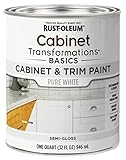
- CABINET TRANSFORMATION: Refresh outdated cabinets, vanities, furniture and trim with rich Pure White color and a smooth semi-gloss finish
- DURABLE PERFORMANCE: Easy-to-clean finish resists dirt and grime while standing up to household chemicals
- SMOOTH APPLICATION: Outstanding flow and leveling help create a beautiful finish with brush, roller, pad applicator or airless sprayer
- FAST PROJECT COMPLETION: Dries to touch in 30 minutes, recoats in 2 hours and is ready for normal use after 24 hours
- INTERIOR CABINET COATING: Ideal for kitchens, bathrooms, laundry rooms and other interior cabinet and trim applications
2. Warm neutrals, greige, taupe, and mushroom
If crisp white feels too cool but a saturated color feels like too much, consider warm taupe, greige, or mushroom. Livingetc reports designers forecasting these warmer neutrals. The Brownstone Boys name Farrow & Ball Drop Cloth as a grounded option and note its compatibility with natural wood, aged brass, and stone. Sherwin-Williams points to Whisper SW 9591 and Limewash SW 9589 for a warmer, cozier effect.
“Warm neutral” describes a family, not a universal undertone. Some shades lean beige, others gray or brown; look at how the sample relates to the fixed materials in your own kitchen. Sherwin-Williams’ 2026 Color of the Year, Universal Khaki SW 6150, is a mid-tone neutral with a slight yellow undertone. Its Color of the Year designation makes it a timely color example, not evidence that it is a top-selling cabinet paint.
Rank #2

- Includes 30 featured and newest released color card. Sprayed on color to see our colors in your homes lighting for more accurate color choices.
- ALL-IN-ONE Paint - NO Sanding, NO Priming, NO Top Coat Required, Low Luster, Velvet Sheen Finish
- Interior/Exterior - Paint your whole house - Ideal for hard surfaces including walls, doors, cabinets, counters, furniture, metal, glass, ceramics and floor and wall tile
- Durable yet stretches to paint smooth fabrics, vinyl and leather
- Results cannot be guaranteed. Digital screens may not show color accurately. Product search "ALL-IN-ONE PAINT by Heirloom Traditions, Color Confidence Card", for an accurate color choice.
3. Soft, soothing greens
Green is a flexible direction: a muted shade can lend color without dominating, while a deeper green can make cabinets a stronger feature. Interior designer Michelle Gage describes soft, nature-inspired greens as calming and says they pair with wood tones, nickel, and brass. Designer Yena Jung suggests using green on an island or coffee bar when you want to limit the color to an accent. Sherwin-Williams shows Pewter Green SW 6208 in a kitchen example.
Benjamin Moore also lists Aegean Teal 2136-40 as a saturated cabinet option. It is a blue-green, rather than a sage green, so treat it as a separate interpretation within the broader green conversation.
Rank #3

- Ultra-White Brilliance: Experience the transformative power of Titanium Infusion, an ultra-white hue inspired by the artist’s palette – perfect for a modern, timeless look.
- One-Day Transformation: Redefine your kitchen cabinets in a single day with our brush-and-roll application - no professional help needed.
- All-Inclusive Kit: Each package covers 100 square feet, ideal for the typical kitchen, and includes all the necessary tools for a flawless finish.
- Eco-Friendly & Safe: Enjoy the peace of mind with our low-VOC, water-based formula, ensuring a safer painting experience.
- Effortless Transformation: No stripping or priming required; our paint adheres beautifully to wood, laminate, and metal cabinets with minimal preparation.
4. Soft and light blues
“Blue cabinets” can mean very different things: a chalky, gray-leaning pale blue is quiet, while navy has substantially more visual weight. Interior designer Bethany Adams forecasts soft blues for 2026 and suggests brass for warm contrast. Sherwin-Williams’ Take Five appears in a designer kitchen example; Needlepoint Navy SW 0032 is a much deeper option named among its expert picks.
Blue also has a limited sales data point, but it needs careful framing: Livingetc quotes kitchen designer Tom Howley reporting a 147% increase in blue kitchen sales. The cited coverage does not provide a baseline, methodology, or geographic scope, so this is Howley’s observation—not evidence of a 147% industry-wide increase.
Rank #4
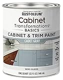
- CABINET TRANSFORMATION: Refresh outdated cabinets, vanities, furniture and trim with rich Cadet Gray color and a smooth semi-gloss finish
- DURABLE PERFORMANCE: Easy-to-clean finish resists dirt and grime while standing up to household chemicals
- SMOOTH APPLICATION: Outstanding flow and leveling help create a beautiful finish with brush, roller, pad applicator or airless sprayer
- FAST PROJECT COMPLETION: Dries to touch in 30 minutes, recoats in 2 hours and is ready for normal use after 24 hours
- INTERIOR CABINET COATING: Ideal for kitchens, bathrooms, laundry rooms and other interior cabinet and trim applications
5. Deep reds, plum, and oxblood
For a bolder, warmer choice, designer Mary Beth Sullivan, founder and principal designer of MB Sullivan Design, expects plum and oxblood to take center stage in kitchens in 2026. These gemstone-like tones can work as a deliberate statement rather than a quiet backdrop. Homes & Gardens notes pairings with unlacquered brass, polished nickel, marble, warm woods, and natural-fiber window treatments; pale pink walls are another way to keep deep red cabinetry from making the whole room feel dark.
Before using a deep red across every cabinet, consider whether you want the color to carry the entire kitchen or serve as an accent. An island or a smaller cabinet run lets the hue stand out without making it the room’s only visual anchor.
Best Value

- Includes 30 featured and newest released color card. Sprayed on color to see our colors in your homes lighting for more accurate color choices.
- ALL-IN-ONE Paint - NO Sanding, NO Priming, NO Top Coat Required, Low Luster, Velvet Sheen Finish
- Interior/Exterior - Paint your whole house - Ideal for hard surfaces including walls, doors, cabinets, counters, furniture, metal, glass, ceramics and floor and wall tile
- Durable yet stretches to paint smooth fabrics, vinyl and leather
- Results cannot be guaranteed. Digital screens may not show color accurately. Product search "ALL-IN-ONE PAINT by Heirloom Traditions, Color Confidence Card", for an accurate color choice.
6. Soft pinks
Soft pink is an individualistic alternative to beige or off-white, but it need not look sugary: the trend direction is pared back, with shades subtle enough to read almost like warm neutrals. Designer Sean Symington describes pale greens and soft pinks as calm backdrops that leave room for accent color, texture, and detail. This is a forecasted design option, not a proven bestseller.
How do you match cabinet paint to countertops and lighting?
Start with what is staying. Benjamin Moore advises taking cues from countertops, backsplash, fixtures, and flooring; its guidance specifically recommends noticing countertop undertones. A warm cabinet color beside a strongly cool surface can create contrast, whether intentional or not. Sherwin-Williams recommends testing color in the actual space, where daylight and surrounding finishes affect how a shade appears.
- Identify the fixed finishes. Note whether the counter, backsplash, floor, and hardware read warm, cool, or mixed. Choose samples that relate to those undertones rather than selecting a cabinet color in isolation.
- Decide how much color you want. Use a lighter or quieter family for perimeter cabinets if you want a low-contrast backdrop; reserve a stronger hue for an island or accent if you want a focal point.
- Test in the kitchen. Sherwin-Williams suggests color chips, peel-and-stick samples, or paint samples. View them near the countertop and backsplash, and observe them in the room’s different daylight conditions before settling on a color.
- Check the finish as well as the hue. Benjamin Moore lists satin, semi-gloss, and high-gloss finishes for cabinets. Its Advance Interior paint is described as durable with a furniture-like finish; follow the product directions and confirm suitability for your surface and project.
There are no measured light-reflectance values in the cited guidance for these six color families, so a category label alone cannot predict how bright a particular shade will look in your kitchen. For brand-specific selection advice, see Benjamin Moore’s kitchen cabinet ideas and inspiration and Sherwin-Williams’ kitchen cabinet color guide.
What cabinet finish should you choose?
Paint finish affects the cabinet’s sheen and the overall look, so settle it alongside the color. Benjamin Moore identifies satin, semi-gloss, and high-gloss as cabinet finish options and describes Advance Interior as a durable paint with a furniture-like finish. The cited guidance does not establish one finish as best for every kitchen. Check the paint maker’s directions for your cabinet material, preparation, and application method.
Sources and how to interpret the forecasts
The six directions reflect designer forecasts and paint-company recommendations, not a measured poll of designers or a verified sales leaderboard. Homes & Gardens’ February 11, 2026 article covers current designer expectations; Livingetc’s December 26, 2025 article reports additional forecasts and Howley’s attributed blue-sales observation. Manufacturer pages identify colors and project examples from their own ranges. Read those claims in their proper scope: a named expert pick or a brand’s “popular” label can help you shortlist shades, but does not establish what most homeowners bought.
Quick Recap
- Homes & Gardens: The Kitchen Cabinet Color Trends Designers Are Most Excited To Try in 2026
- Livingetc: 7 Kitchen Cabinet Colors Designers Predict Will Dominate Homes in 2026
- Benjamin Moore: Kitchen Cabinet Paint Colors
- Benjamin Moore: 21 Kitchen Cabinet Ideas: Paint Colors & Inspiration
- Sherwin-Williams: Kitchen Cabinet Colors
- Sherwin-Williams: Kitchen Cabinets
- Sherwin-Williams: Color of the Year 2026, Universal Khaki SW 6150
- Homes & Gardens: 10 best Sherwin-Williams paints for kitchen cabinets, tried and tested by interior designers

Product prices and availability are accurate as of the date/time indicated and are subject to change. Any price and availability information displayed on Amazon at the time of purchase will apply.

