What’s actually slowing this PC down?
Free tools Windows power users keep installed
One-click scans. No signup required.
Pick the symptom - the matching free tool is one click away.
ThatPainter is reader-supported. When you buy through links on our site, we may earn an affiliate commission. Learn More
As an Amazon Associate I earn from qualifying purchases.
The 2025 paint-color story was less about nine isolated shades than a broad move toward warm, earthy, and more expressive interiors. Chocolate brown, creamy taupe, olive and emerald green, navy and blue-green, muted plum, dusty pink, honeyed yellow, and carefully chosen red tones all gained attention from designers and paint brands.
The Tool Desk
Outbyte PC Repair FREEClear out junk files and repair common Windows errorsFree Scan →Outbyte Driver Updater FREEFix the driver behind crashes, sound loss and screen glitchesFind Drivers →There is an important qualification, however: no public dataset proves that these nine colors appeared in every market or ordinary household. The original headline was a forecast published by Martha Stewart on November 16, 2024. Looking back from 2026, these are better understood as nine color families that repeatedly appeared in 2025 predictions, brand palettes, designer surveys, and room-specific buyer research.
#1 Best Overall
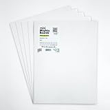
- PERFECT SAMPLES: These 12" x 9" white, styrene panels provide a smooth, warp-free surface for testing up to 5 color samples with paint, stain or other coatings.
- DURABLE MATERIAL: Made of sturdy styrene, these panels can withstand multiple coats and are non-absorbent so colors will stay true.
- CONVENIENT SIZING: At 12" x 9", the panels are just the right size for testing many common paint colors side by side before committing to a full project.
- PACKAGE INCLUDES: This value pack contains 5 white panels, enough for testing several color options on one purchase.
- VERY FLEXIBLE: Mighty Boards do not warp like foam core and you can bend them without breaking.
The practical takeaway is encouraging for homeowners: you do not need to repaint an entire house in a saturated trend color. The same direction can be used on a kitchen island, powder-room walls, cabinetry, a ceiling, a door, or painted trim. The safest choices are generally softened versions of the trend—olive instead of bright green, ocher instead of lemon yellow, blue-gray instead of electric blue, and warm taupe instead of an extremely dark brown.
What trending meant in 2025
Paint trends come from several different kinds of evidence, and they should not be treated as interchangeable:
- Forecasts: Designers and editorial color experts predicted what would gain attention before the year began.
- Brand signaling: Paint companies and color authorities released annual colors and coordinated palettes intended to influence interiors.
- Designer adoption: Surveys such as the 1stDibs survey of 643 interior designers measured professional expectations, not household paint purchases.
- Consumer preference: Zillow’s 2025 study of more than 4,200 recent and prospective home buyers tested reactions to digitally presented room images and reported stated willingness-to-pay differences.
A Color of the Year announcement is therefore a useful signal, but it is also a marketing and forecasting exercise. It does not prove that a color became the nation’s best-selling wall paint. In fact, richer colors attracted design attention while familiar neutrals continued to sell strongly. Later reporting on Behr’s 2025 bestsellers, for example, identified Blank Canvas, Swiss Coffee, and Even Better Beige among the brand’s major sellers even as saturated colors gained visibility in design coverage. Homes & Gardens reported on those sales patterns here.
Recommended Free Tools
The strongest independent signals supported brown, burgundy and dark red, blue, olive and other greens, and emerald. Dusty pink had credible but more prediction-driven support. Moody teal and peacock blue are useful editorial categories, but they overlap with navy, gray-blue, and blue-green rather than representing scientifically distinct color classes.
The nine 2025 color families at a glance
| Trend family | Confidence | Typical 2025 interpretation | Best starting point |
|---|---|---|---|
| Moody teal | Medium | Dark, atmospheric blue-green | Cabinetry, dens, studies, powder rooms |
| Creamy taupe | High | Warm beige, mushroom, mocha, and brown-based neutral | Living rooms, bedrooms, hallways, whole-home palettes |
| Gray-blue | Medium-high | Smoky blue softened with gray | Bedrooms, bathrooms, offices, cabinetry |
| Dusty pink | Medium | Earthy mauve or muted rose rather than pastel pink | Bedrooms, bathrooms, dining rooms, trim |
| Verdant green | High | Olive, moss, herb, forest, and nature-based green | Kitchen cabinets, offices, bedrooms, doors |
| Honeyed yellow | Medium | Ocher, mustard, buttermilk, and antique gold | Dining rooms, kitchens, entryways, accents |
| Muted plum | High | Brown-softened purple, burgundy-plum, or mauve-brown | Powder rooms, libraries, bedrooms, cabinetry |
| Peacock blue | High | Saturated medium or deep blue with green or warm undertones | Bedrooms, libraries, offices, built-ins |
| Sparkling emerald | High | Jewel-toned emerald, hunter, or deep green | Dining rooms, powder rooms, doors, feature cabinetry |
Confidence describes the strength of the cross-source trend signal, not a guarantee that a particular named paint will suit your room.
1. Moody teal
Moody teal is a darkened, atmospheric blue-green—not a bright tropical turquoise. It can look blue in one room, green in another, and charcoal or nearly black at night. That changeability was part of its appeal in 2025, when designers favored colors with depth and visible undertones over flat, predictable neutrals.
The original forecast used Farrow & Ball Inchyra Blue as its example, particularly for cabinetry and cozy dens. Nearby brand signals included Sherwin-Williams Rain Cloud SW 9639, a stormy deep gray-blue, and HGTV Home by Sherwin-Williams Quietude, a cool sage with a slight blue undertone. Quietude is not the same color as a dark teal, but it demonstrates the broader interest in blue-green and softened nature colors. See Sherwin-Williams’ 2025 palette and capsule and the HGTV Home collection distinction at Lowe’s.
Where it works
- Studies, libraries, dens, and powder rooms
- Kitchen islands, built-ins, lower cabinets, and interior doors
- Color-drenched rooms with sufficient natural or layered artificial light
Pair it with warm white, natural wood, brass, blush, coral, lavender, or camel leather. In a small powder room, painting the walls, trim, and ceiling together can make the dark color feel intentional rather than visually fragmented.
Watch the light: Teal is one of the riskiest colors to choose from a screen. In a north-facing room it may become bluer and colder; under warm bulbs it may appear greener or muddier. A lower-commitment version is teal on a vanity, island, door, or bookcase instead of every wall.
2. Creamy taupe, mocha, and chocolate brown
The move toward warmer neutrals was one of the clearest 2025 directions. Creamy taupe occupies the middle ground between beige, mushroom, greige, and brown; the larger story also included latte, caramel, mocha, and chocolate shades. This was not simply a return to yellow-beige. The preferred versions were nuanced, softened, and often slightly gray, pink, or brown.
Martha Stewart’s examples included Portola Paints Rustica and Benjamin Moore Rustic Taupe. Sherwin-Williams included Grounded SW 6089 in its 2025 color direction. Pantone’s PANTONE 17-1230 Mocha Mousse reinforced the brown trend, but Pantone is a color-standard and forecasting authority rather than a wall-paint manufacturer. Mocha Mousse is not automatically a paint formula available at a U.S. retailer; any paint match is a separate manufacturer’s interpretation. Read Pantone’s announcement.
Benjamin Moore’s 2025 palette also included Cinnamon Slate 2113-40, Leather Saddle Brown, Chowning’s Tan, and Glacier White, showing how brown could be used alongside both richer and lighter neutrals. See the Benjamin Moore palette.
Rank #2

- Professional Paint Color Cards Set: This bulk collection of paint colors cards features 83 standardized shades, perfect for designers and DIYers. The portable paint cards organize easily in your colors book for quick on-site matching
- Paint Chip Samples Collection: Our paint color samples cards display true-to-life hues with precise color reproduction. Use these paint chips samples to confidently select wall colors that match your vision before purchasing gallons
- Multi-Purpose Watercolor Sample Cards: Ideal for classrooms, these paint samples cards serve as both teaching tools and creative. The paper chips bulk set includes primary, secondary and specialty mixed tones
- Comprehensive Color Matching System: With 83 paint color chips covering all major brands, this set solves matching challenges between different lines. The paint chip samples withstand frequent handling in design
- Essential Color Selection Toolkit: Every professional painters needs these paint color sample cards the most reliable way to preview how colors will look in different lighting before committing to large projects
Where it works
Use creamy taupe in living rooms, bedrooms, dining rooms, hallways, libraries, and whole-home palettes. It is especially compatible with oak, walnut, stone, leather, brass, cream upholstery, and woven textures. It can soften a room more effectively than stark white while avoiding the coldness of a blue-gray neutral.
Watch the undertone: Taupe may appear pink, purple, yellow, green, or gray depending on the room. Compare it directly with your flooring, countertops, tile, and trim. If you want the lowest-risk interpretation of this trend, choose a light-to-midtone creamy taupe. A dark chocolate brown is more dramatic and should usually be tested on a large board before committing to four walls.
3. Gray-blue
Gray-blue was the more livable side of the blue trend: a smoky blue with enough gray to function as a quiet neutral. Martha Stewart highlighted Benjamin Moore Boothbay Gray HC-165 and Steep Cliff Gray. The important distinction is between a softened blue-gray and a flat, cold builder gray.
Quick wins for a faster PC:
Fix the driver behind crashes, sound loss and screen glitchesFind Drivers →Repair Windows errors before they cause bigger problemsFix Now →Consumer research gave the broader gray family meaningful support. Zillow reported dark gray as the preferred living-room color in its 2025 analysis and calculated an estimated $2,593 willingness-to-pay difference for the dark-gray living-room image. That figure reflects stated preference in Zillow’s study; it is not proof that painting a real living room dark gray causes a $2,593 increase in a home’s sale price.
Where it works
Gray-blue is adaptable in bedrooms, bathrooms, offices, kitchens, cabinetry, and rooms with warm wood. Pair it with cream, white marble, oak, walnut, brass, muted green, or soft brown. It is a good choice when navy feels too heavy but an almost-white neutral feels too bare.
Watch the exposure: Northern light emphasizes blue undertones and can make a cool gray-blue feel chilly. Southern light is typically warmer and may soften it. If your room has cool flooring or blue-white trim already, choose a warmer or more muted blue-gray rather than adding another icy note.
4. Dusty pink
Dusty pink entered the 2025 palette as a muted, earthy neutral—not a sugary nursery pastel. These shades are often mixed with gray, brown, beige, or mauve, which lets them work with wood, aged brass, olive, and chocolate brown.
Free tools Windows power users keep installed
One-click scans. No signup required.
Representative examples included Farrow & Ball Sulking Room Pink, Benjamin Moore Coastal Cottage, and Sherwin-Williams Mauve Finery SW 6282. Independent trend coverage from ELLE Decor similarly described a move toward muddied pink, purple, green, and yellow tones with complex, patina-like bases.
Where it works
Try dusty pink in bedrooms, bathrooms, dressing rooms, nurseries, entryways, and dining rooms. It pairs well with warm white, olive, burgundy, chocolate brown, natural wood, and aged brass. For less commitment, use it on a ceiling, the back of a bookcase, an interior door, or trim.
Watch the surrounding white: A blue-white trim can make dusty pink look pinker and cooler. Cream trim and wood may pull it toward beige, peach, or mauve. This was a credible but less measurable trend than brown, green, or blue, so sample it carefully rather than assuming editorial visibility equals widespread use.
5. Verdant green, olive, and moss
Verdant green covered a broad range in 2025, from herb and olive to moss, forest, and other softened nature-based greens. Sherwin-Williams recommended Dill SW 6438, a warm midtone green, for applications including kitchen cabinetry. Its coordinating colors included Spinach White, Cottage Cream, and Sequin. Martha Stewart’s original forecast used Dill as its representative example.
Green had unusually strong support across different evidence types. Zillow found dark olive green to be the preferred kitchen color in its 2025 buyer study and reported an estimated $1,597 willingness-to-pay difference for the olive-green kitchen image. Separately, emerald was the leading green family in the 1stDibs designer survey, selected by 22% of respondents. These findings support green broadly, but they do not mean that every green—or every kitchen painted green—will command more money.
Rank #3

- Practical to use: paint color sample standard colors cards are designed for your different paint needs,color test card paint bulk,paint color samples
- Paint cards: made of plastic and paper that provides accurate colors and reliable results,paint standard samples,water color cards
- Professional: paint color standard sample cards are great for professionals and DIY enthusiasts alike,paint color cards,paint chips samples
- Paint color sample cards: suitable for various such as floor paint, paint hardware, and more,paint color sample cards,paint color cards bulk
- Comprehensive color chart: featuring multi standard colors, great for various ,paint cards,water color paint cards
Where it works
- Kitchen cabinets, islands, mudrooms, and built-ins
- Bathrooms, bedrooms, offices, and interior doors
- Olive and moss for a quieter neutral effect
- Forest and emerald for a deeper, more dramatic room
Use warm white, cream, oak, walnut, brass, rust, or stone with verdant green. Specify the exact family before shopping: sage, olive, moss, eucalyptus, forest, emerald, and blue-green can behave very differently.
Watch the undertone: Yellow-green shades can become much brighter in strong southern light. In low light, an olive may look brown or gray. A cabinet door or large sample board is more reliable than a small color chip.
6. Honeyed yellow
2025 yellow was generally a softened yellow: honey, mustard, ocher, buttermilk, bronze, or antique gold rather than harsh primary or lemon yellow. It brought warmth and energy to the palette while remaining compatible with brown, olive, navy, and aged metal.
The Tool Desk
Outbyte PC Repair FREERepair Windows errors before they cause bigger problemsFix Now →Outbyte Driver Updater FREEFix the driver behind crashes, sound loss and screen glitchesFind Drivers →Sherwin-Williams included Bosc Pear SW 6390 in its 2025 capsule, and HGTV Home by Sherwin-Williams included Convivial Yellow in its collection. Dulux’s True Joy was another market-specific 2025 example, but paint names and availability vary by country. The specific brand and finish should always be verified locally before purchase.
Where it works
Consider honeyed yellow for dining rooms, breakfast areas, kitchens, entryways, doors, ceilings, and small accent zones. It works especially well with chocolate brown, warm white, navy, olive, terracotta, and brass. A yellow ceiling can add warmth without making the entire room feel saturated.
Resale warning: Zillow found that its respondents were willing to pay substantially less for a daisy-yellow kitchen or living-room image than for several darker, nature-based colors. That does not make every yellow a bad choice, but it does make bright, highly saturated yellow a higher-risk decision when selling soon. Choose an ocher or muted honey, or confine the color to a door, ceiling, island, or breakfast nook.
7. Muted plum and purple-brown
Muted plum was among the clearest 2025 signals because multiple major brands selected colors that softened purple with brown, gray, burgundy, or mahogany. The result is more grounded than a vivid violet and can read as a sophisticated neutral in the right light.
Benjamin Moore’s Cinnamon Slate 2113-40 combines heathered plum and velvety brown. PPG and Glidden selected Purple Basil PPG1046-7, a dusty violet, while C2 selected Raku, an earthy brown-red with burgundy, purple, and mahogany undertones. See the Purple Basil announcement and C2’s description of Raku.
Where it works
Use muted plum in powder rooms, libraries, bedrooms, dining rooms, wet bars, and cabinetry. It pairs with warm white, chocolate brown, olive, green, natural wood, and brass. A brown-based plum is generally easier to live with than a clean, blue-violet purple.
Watch the evening shift: Purple is highly sensitive to light. A color that looks brown-plum in daylight may turn wine, mauve, or nearly charcoal under evening bulbs. Test it on a large board and inspect it after dark before ordering the paint.
8. Peacock blue
Peacock blue was the saturated, confident side of the blue trend. It can range from a medium blue with green influence to a deep, jewel-like blue. The goal is not necessarily a literal peacock color; it is a blue strong enough to become the room’s visual anchor.
Quick wins for a faster PC:
Repair Windows errors before they cause bigger problemsFix Now →Fix the driver behind crashes, sound loss and screen glitchesFind Drivers →Martha Stewart’s example was Sherwin-Williams Connor’s Lakefront, with a recommendation to extend the color across walls, trim, and ceiling for a more immersive effect. Other 2025 blue signals included Valspar Encore 8002-45G, an atmospheric anchoring blue, and Dutch Boy Mapped Blue 429-5DB, a medium blue with subtle yellow undertones. Read Valspar’s announcement and Dutch Boy’s description of Mapped Blue.
Rank #4

- Features 216 timeless hues from the RAL CLASSIC collection with five colors per page - fan size 15.0 x 5.0 x 2.0, color display 2.0 x 5.0 cm
- Crafted with low-solvent, low-odour water-based paints for eco-friendly use
- Enhanced UV resistance provides long-lasting color protection
- Cover made from 100% recyclable post-industrial polypropylene waste
- Compact and portable design, ideal for precise color matching on the go
Where it works
Peacock blue is particularly effective in bedrooms, offices, libraries, bathrooms, kitchen islands, built-ins, front doors, and exterior accents. Pair it with warm whites, caramel leather, walnut, brass, rust, or terracotta. In a small room, color drenching can make saturation feel deliberate and cocooning; in an open-plan home, a blue feature may require careful transitions into adjoining spaces.
Lower-commitment option: Start with a built-in, island, door, or one enclosed room. Use blue-gray if you want the same calm direction with less visual weight.
9. Sparkling emerald
Emerald was the strongest jewel-tone green story of 2025. It is brighter and more saturated than most sage or olive colors, although hunter and deep forest shades sit nearby on the same spectrum. Sherwin-Williams Country Squire was the representative example in the original forecast.
What’s actually slowing this PC down?
Pick the symptom - the matching free tool is one click away.
The 1stDibs designer survey found emerald to be the leading green family at 22%. Behr’s 2025 palette also emphasized jewel tones alongside deeper blue and nature-based colors. These signals suggest strong designer enthusiasm, but emerald remains an expressive choice rather than a universal neutral.
Where it works
Try emerald in dining rooms, living rooms, bedrooms, powder rooms, cabinetry, doors, and built-ins. It works with rust, marigold, warm neutrals, natural wood, leather, and aged brass. If four emerald walls feel excessive, use it on lower cabinets or a single architectural feature and keep the upper walls warm white or taupe.
Prepare the surface: Saturated green can make uneven walls, patched areas, and inconsistent sheen more noticeable than a pale neutral. Repair, prime where necessary, and apply the number of coats specified by the paint manufacturer.
The 2025 color signal that deserves a separate mention: burgundy and ruby red
Red was not one of the original nine categories, but it is too strong an independent signal to ignore. In the 1stDibs survey, dark red and burgundy rose to 20% of designer predictions. Behr selected Rumors MQ1-15, a deep ruby red, as its 2025 Color of the Year, while other brand palettes and design coverage emphasized wine, burgundy, and red-brown shades.
Do these 3 things before closing this tab:
1Clear out junk files and repair common Windows errors2Fix the driver behind crashes, sound loss and screen glitches3Repair Windows errors before they cause bigger problemsUse this as context rather than a tenth entry in the list. Burgundy and ruby red are best treated as selective accents in dining rooms, powder rooms, libraries, doors, cabinetry, and upholstery. They can add the same warmth and depth as brown or plum, but they carry more resale and commitment risk than a muted taupe or olive.
How the colors overlap
The nine labels are editorial trend buckets, not a standardized paint classification:
- Moody teal, gray-blue, and peacock blue overlap across smoky blue, navy, blue-green, and teal.
- Creamy taupe and muted plum meet where brown and purple undertones combine.
- Verdant green and sparkling emerald overlap across forest, hunter, moss, and jewel green.
- Honeyed yellow includes ocher, mustard, antique gold, buttermilk, and bronze-leaning shades.
Do not shop by the generic word alone. Two paints called taupe or teal can have entirely different light reflectance values and undertones, and the same color name can vary substantially between manufacturers.
Independent reader supportYour contribution helps us test, update, and keep practical guides available for everyone.Which 2025 colors are safest for resale?
No paint color guarantees a higher sale price. Zillow’s research is useful because it shows room-specific buyer preference, but its figures represent stated willingness to pay from randomized room images—not realized transaction premiums.
Within that limitation, the most defensible resale-friendly directions from the study were:
Best Value

- Core Color Matching: Paint color sample cards include 83 standard colors to support paint color sample cards, color matching cards for painting, and paint chips standard samples, helping users compare shades before selecting a final finish for floor paint, hardware, and other project needs
- Reliable Reference: Paint samples are made with color matching materials designed to support accurate color comparison, giving painters and DIY users a practical paint and paint color samples reference for selecting tones that fit the project surface and intended look
- Portable Format: Measuring 3.74 x 1.57 x 1.18 in and weighing 3.88 oz, this paint samples set is compact for a toolbox, work bag, or travel use, making it easier to carry color test card paint and check shades on site when planning paint work
- Wide Project Use: Paint sample cards are suitable for floor paint, paint hardware, and related color selection tasks, offering a useful paint chips samples reference for contractors, decorators, and home improvement users working on color coordination across different surfaces
- Simple Set Package: Each package includes 1 set of paint sample cards, giving users a straightforward paint sample standard cards option for daily work, project planning, and quick shade comparison when choosing among paint color cards and paint chips sample cards
- Dark olive green in a kitchen: an estimated $1,597 willingness-to-pay difference in Zillow’s study.
- Navy blue in a bedroom: an estimated $1,815 difference.
- Dark gray in a living room: an estimated $2,593 difference.
If selling soon, use a muted version of a trend and limit highly personal colors to areas that are easy to repaint:
- Choose olive over bright chartreuse.
- Choose navy or blue-gray over an intensely saturated peacock blue.
- Choose warm taupe or midtone brown over dark chocolate on every wall.
- Use red, yellow, plum, and emerald in a powder room, door, island, or other contained area.
Buyers are not a single group, and local architecture, light, room function, and finish quality matter more than a trend label. The evidence should guide your risk assessment, not dictate the color of your home.
How light and undertones change the result
Before selecting any trend color, identify both its visible mass tone and its subtler undertone. Sherwin-Williams explains that undertones can make a nominal neutral appear blue, green, pink, yellow, or purple, and that lighting direction and bulb temperature change how those undertones are perceived. Read the company’s undertone guidance.
- North-facing rooms: Often emphasize blue undertones. Warm taupe, brown, muted plum, olive, or a warmer blue may prevent the room from feeling icy.
- South-facing rooms: Usually receive warmer, stronger light that can soften gray and blue but intensify yellow-green and warm colors.
- East-facing rooms: Change substantially from cool morning light to warmer afternoon and evening light.
- West-facing rooms: May look subdued earlier in the day and much warmer or more intense late in the afternoon.
- Warm incandescent and soft-white LEDs: Can pull yellow, red, brown, and plum forward and make blue look duller.
- Cool or daylight LEDs: Can exaggerate blue and green and make warm neutrals look flatter or pinker by comparison.
Also test against fixed finishes. A countertop, backsplash, hardwood floor, stone fireplace, sofa, or existing white trim can change the apparent color more than the paint chip suggests. Sherwin-Williams recommends comparing a questionable neutral with purer reference colors and examining the darker end of a color strip, where undertones are often easier to see.
How to test a trend color before buying gallons
- Narrow the family first. Select three or four samples that are genuinely comparable: several olives, several blue-grays, or several warm taupes. Do not compare an isolated teal with a completely unrelated beige and expect the result to explain the undertone.
- Use physical samples. Digital renderings and phone screens are approximations. Buy manufacturer samples or use a reputable peel-and-stick sample, then verify the actual paint before a large purchase.
- Make the sample large. Paint a large board or a substantial wall section. Saturated colors often look different when seen across several square feet rather than on a small chip.
- Apply representative coverage. Benjamin Moore recommends at least two coats for a meaningful sample. Follow the product instructions, especially when covering a light wall with a dark or highly saturated shade.
- Move the board. Put it on more than one wall and near the trim, floor, countertop, or cabinet finish it must live with. A single wall can hide how the color behaves elsewhere.
- Watch the full day. Observe the sample in morning, midday, afternoon, and evening light. Turn on the actual bulbs used in the room after dark. Benjamin Moore recommends this changing-light approach, and Behr likewise recommends a room swatch viewed through day and night.
- Live with the sample. Look at it for at least a day before deciding. If you still like it beside the permanent finishes in both daylight and artificial light, then calculate the quantity and purchase the full-size paint.
Choose the finish as carefully as the color
Finish changes how much light the surface reflects, so it changes perceived color as well as durability. A saturated emerald in a slightly reflective finish will read differently from the same formula in a dead-flat finish.
- Flat or matte: Minimizes the appearance of small wall imperfections, but may be less suitable for frequently handled or scrubbed areas depending on the product.
- Eggshell or satin: Common wall choices that offer more cleanability and reflectance than flat paint.
- Semi-gloss: Usually more appropriate for trim, doors, and cabinetry than for broad walls, where glare can emphasize surface flaws.
- Related sheens: Using one color in different sheens on walls, trim, doors, or ceiling can create subtle contrast without introducing another hue.
For bathrooms, kitchens, children’s rooms, doors, and cabinets, follow the product’s use and sheen recommendations rather than choosing solely for the appearance of a color card. Zillow also notes that matte, satin, and semi-gloss finishes reflect light differently. See Zillow’s finish guidance.
How much of a trend should you use?
A commitment ladder lets you enjoy a stronger color without making the entire home depend on it:
Outdated Drivers Are Slowing You Down
One free scan finds every outdated or missing driver and matches the right update for your exact hardware.Free scan · exact hardware matchPC Slower Than It Used to Be?
A free scan shows the junk files, broken settings and background clutter dragging Windows down - then fixes them in one click.Free scan · Windows 10 & 11- Lowest commitment: A lamp, framed panel, furniture piece, or small decorative object.
- Low commitment: An interior door, ceiling, stair risers, niche, or powder room.
- Medium commitment: A kitchen island, lower cabinets, built-ins, fireplace wall, or one enclosed room.
- High commitment: All walls, trim, doors, ceiling, and architectural details in a saturated shade.
Color drenching means using one color or closely related shades across multiple surfaces—not merely painting one accent wall. It can make a small room feel enclosed and intentional, especially when the trim and ceiling are included. It can also make a poorly lit or open-plan space feel heavy, so test the complete application rather than judging a single painted wall.
A practical chooser
| If you want… | Start with… | Safer application |
|---|---|---|
| The warmest neutral shift | Creamy taupe, mushroom, or mocha | All walls, hallway, bedroom, or living room |
| Nature-inspired cabinetry | Olive, moss, or verdant green | Lower cabinets, island, mudroom, or built-ins |
| A calm bedroom | Navy, gray-blue, or softened peacock blue | Walls with warm white trim and wood |
| Drama without red | Muted plum or brown-based purple | Powder room, library, or bedroom |
| A jewel-tone statement | Emerald or deep forest green | Dining room, powder room, door, or cabinetry |
| Cheerful warmth | Honey, ocher, or muted mustard | Dining room, breakfast nook, ceiling, or door |
| A romantic neutral | Dusty pink or earthy mauve | Bedroom, dressing room, bathroom, or trim |
| A cocooning room | Moody teal or dark brown | Enclosed den, study, library, or powder room |
Common mistakes to avoid
- Choosing from a screen: Digital color is not a reliable substitute for a physical sample.
- Ignoring undertones: A neutral can clash with flooring, tile, counters, or upholstery.
- Testing only a tiny chip: Large expanses of saturated color behave differently.
- Testing only at noon: Blue, purple, red, and yellow can change dramatically after sunset.
- Treating color names as universal standards: Taupe, mocha, teal, emerald, and similar names vary by manufacturer.
- Assuming one coat is enough: Follow the product instructions and use appropriate primer or additional coats when needed.
- Overgeneralizing room advice: A dark color that is effective in a powder room may overwhelm a large, poorly lit living room.
- Confusing product categories: Minwax’s 2025 Violet was an interior wood stain, not a standard wall-paint Color of the Year. See the Minwax announcement.
- Confusing brand programs: HGTV Home by Sherwin-Williams’ Quietude was separate from Sherwin-Williams’ own 2025 nine-color capsule.
- Assuming Pantone has a direct paint equivalent: Mocha Mousse is a Pantone standard; a paint company’s match is its own formulation.
Named colors, product lines, finish availability, retailer stock, and regional availability can change. Verify the current product listing and buy a physical sample before purchasing full-size paint.
Frequently Asked Questions
Were these nine colors really everywhere in 2025?
Not in a measurable, universal sense. They were nine editorial trend families assembled from designer forecasts, brand announcements, designer survey data, consumer preference research, and design-media coverage. The evidence supports repeated visibility, not adoption in every household or market.
What was the safest 2025 trend color for resale?
Muted olive, navy or blue-gray, dark gray, and moderate warm brown had the strongest room-specific support in Zillow’s 2025 buyer study. The study measured stated willingness to pay from more than 4,200 respondents and did not establish guaranteed real-world sale-price premiums. Bright yellow and fire-engine red were riskier choices in that research.
Recommended Free Tools
Can dark paint colors work in a low-light room?
Yes, but they will usually make the room feel more enveloping rather than brighter. Warm brown, muted plum, olive, or a softened blue can make a north-facing room feel intentional, while a cool blue-gray may feel colder. Test a large sample in both daylight and the room’s actual evening lighting.
Is Pantone Mocha Mousse a paint color I can buy?
Mocha Mousse, PANTONE 17-1230, is a Pantone color standard and forecast. It is not automatically a universal wall-paint formula. A paint manufacturer may offer a close interpretation, but confirm the specific brand, product, and finish.
How many coats should I use on a paint sample?
Use enough coats to represent the finished surface; Benjamin Moore recommends at least two coats for sample coverage. Follow the product instructions, particularly when testing a dark or highly saturated color over a light wall.
The Bottom Line
The most reliable 2025 direction was not one magic color but a shift toward warmer neutrals, earthy greens, smoky blues, softened purples, and selective jewel tones. For the broadest appeal, start with creamy taupe, olive, or blue-gray. For more drama, try muted plum, teal, peacock blue, or emerald in an enclosed room, cabinetry, a door, or a powder room. Whatever family you choose, test a large physical sample in changing natural and artificial light before buying the gallons.
Quick Recap

Product prices and availability are accurate as of the date/time indicated and are subject to change. Any price and availability information displayed on Amazon at the time of purchase will apply.




