Outdated Drivers Are Slowing You Down
Windows Errors? Fix Them Before They Spread
Repair common Windows errors and clear accumulated junk for a smoother, more stable PC - no reinstall needed.Free scan · no reinstallCrashes, No Sound, or Screen Glitches?
Random freezes, missing sound and display glitches usually trace back to one bad driver. Find and replace yours safely.Free scan · under a minuteOne free scan finds every outdated or missing driver and matches the right update for your exact hardware.
Scan My Drivers Free →Free scan · exact hardware match


ThatPainter is reader-supported. When you buy through links on our site, we may earn an affiliate commission. Learn More
The 20 Stunning Interior Design Color Schemes in this guide range from low-contrast warm neutrals to calming analogous palettes and bold complementary, triadic, split-complementary, and tetradic combinations. They are flexible hue-family frameworks—not exact paint formulas—so lighting, undertones, existing finishes, and physical samples determine the final choice.
#1 Best Overall
Use the ideas below to find colors that work with your furniture and the way your room is used. The most dependable palette is not necessarily the brightest or trendiest one; it is the combination that maintains the right contrast and temperature beside your flooring, cabinetry, textiles, metals, and changing light.
Key takeaways
- Monochromatic and analogous schemes create blended transitions, while complementary, split-complementary, triadic, and tetradic schemes create more visible contrast.
- Existing flooring, countertops, cabinetry, stone, furniture, wood, and metal finishes are already part of a room’s color palette.
- Light, value, saturation, and undertone can change how the same nominal hue appears in a room.
- Benjamin Moore offers more than 3,500 paint colors, so physical comparison is more reliable than choosing from a phone screen alone.
- Test two or three palette directions with larger physical samples in morning, afternoon, evening, and artificial light before buying full quantities of paint.
What are the 20 best interior design color schemes?
These 20 Stunning Interior Design Color Schemes cover layered neutrals, calm analogous combinations, high-contrast complementary pairings, monochromatic rooms, and more expressive triadic, split-complementary, and tetradic palettes. The combinations are practical starting points rather than exact paint formulas; lighting, undertones, fixed finishes, and sample testing determine the final result.
Color names in this article—such as sage, terracotta, navy, and greige—refer to hue families, not specific products from a paint manufacturer. A successful room usually assigns one dominant color, one or two supporting colors, and smaller accents instead of giving every color equal visual weight.
How do the color schemes compare?
The table below provides a quick way to match a palette with the room’s mood, contrast level, and practical use.
Free tools Windows power users keep installed
One-click scans. No signup required.
| # | Palette | Color relationship | Best rooms | Balancing approach |
|---|---|---|---|---|
| 1 | Warm white, sand, and natural oak | Layered neutral | Living rooms, open-plan spaces, small rooms | Use muted black only in small details |
| 2 | Soft white, charcoal, and camel | Neutral with warm accent | Living rooms, offices, entryways | Keep charcoal on smaller surfaces in low light |
| 3 | Navy, warm white, and cognac | Blue-led complementary contrast | Studies, dining rooms, libraries, bedrooms | Anchor one major surface with navy |
| 4 | Sage green, cream, and terracotta | Muted green/red-orange contrast | Kitchens, bedrooms, relaxed living spaces | Use terracotta in accents rather than equal wall area |
| 5 | Dusty blue, blue-green, and pale gray | Analogous cool scheme | Bathrooms, bedrooms, coastal interiors | Add oak, rattan, or aged brass |
| 6 | Sea-glass green, aqua, and warm white | Analogous blue-green | Bathrooms, sunrooms, guest rooms | Keep saturation restrained and vary texture |
| 7 | Terracotta, rust, and ochre | Analogous warm scheme | Dining rooms, kitchens, studios | Use cream on large surfaces |
| 8 | Butter yellow, olive, and cream | Yellow-green analogous | Kitchens, breakfast nooks, mudrooms | Choose softened, complex hues |
| 9 | Blush, burgundy, and warm taupe | Red-to-red-violet tonal family | Bedrooms, dressing rooms, dining rooms | Let blush and taupe cover larger areas |
| 10 | Lavender, plum, and pale yellow | Muted purple/yellow contrast | Bedrooms, reading corners, powder rooms | Use creamy yellow instead of bright lemon |
| 11 | Teal, coral, and sand | Blue-green/red-orange contrast | Dining areas, media rooms, eclectic rooms | Make teal dominant and coral secondary |
| 12 | Cobalt, saffron, and white | High-energy blue/yellow contrast | Playrooms, kitchens, creative spaces | Use cobalt and saffron mainly as accents |
| 13 | Forest green, clay, and parchment | Deep green with earth-tone counterpoint | Libraries, dining rooms, bedrooms | Use parchment to prevent visual heaviness |
| 14 | Black, ivory, and ochre | Graphic neutral with warm accent | Dining rooms, foyers, kitchens | Reserve black for details, cabinetry, or furniture |
| 15 | Greige, muted blue, and blackened bronze | Neutral with cool accent | Whole-home palettes, halls, connected rooms | Repeat greige and oak, varying blue intensity |
| 16 | Monochromatic blue | Multiple blue values and chromas | Bedrooms, bathrooms, studies | Vary value, fabric, gloss, and pattern |
| 17 | Monochromatic olive | Multiple green values | Bedrooms, kitchens, conservatories | Keep ceilings and large textiles lighter |
| 18 | Soft triadic primary-inspired | Muted blue, yellow, and red families | Family rooms, art-filled homes | Choose one dominant hue and two accents |
| 19 | Split-complementary indigo, mustard, and coral | Split-complementary | Dining rooms, bedrooms, creative spaces | Give indigo the greatest visual weight |
| 20 | Tetradic plum, olive, rust, and blue-gray | Four-color rectangular scheme | Maximalist rooms, libraries, dining rooms | Use cream and wood as visual pauses |
1. Warm white, sand, and natural oak
Warm white walls, sandy beige upholstery, natural oak, oatmeal textiles, and muted black details create a low-contrast palette for living rooms, open-plan spaces, and small rooms. The scheme depends on value, material, and texture rather than strong hue contrast, so use the darkest tone sparingly on lighting, frames, or hardware.
2. Soft white, charcoal, and camel
Soft white, charcoal gray, camel leather, aged brass, and medium walnut produce a contemporary neutral scheme with a warm counterpoint. The palette works in living rooms, offices, and entryways. In a room with limited daylight, keep charcoal on smaller surfaces and let camel and wood soften the contrast.
3. Navy, warm white, and cognac
Deep navy, warm white, cognac leather, medium wood, and antique brass suit studies, dining rooms, libraries, and sophisticated bedrooms. Navy can anchor one major wall or a group of furnishings, while cognac supplies the smaller warm counterpoint.
4. Sage green, cream, and terracotta
Dusty sage, creamy off-white, terracotta, natural linen, and aged wood create a relaxed palette for kitchens, breakfast rooms, bedrooms, and living spaces. Green and red-orange provide a muted complementary tendency, but cream softens the relationship. Use terracotta in pottery, cushions, and art rather than giving terracotta equal wall-area prominence.
5. Dusty blue, blue-green, and pale gray
Dusty blue, muted teal, pale gray, white oak, and soft white form an analogous cool scheme for bathrooms, bedrooms, coastal interiors, and calm spaces. Oak, rattan, or aged brass adds one warm material and helps prevent the room from feeling visually cold.
Rank #2
6. Sea-glass green, aqua, and warm white
Sea-glass green, pale aqua, warm white, bleached wood, and sandy beige suit bathrooms, sunrooms, guest rooms, and light-filled vacation-style interiors. Keep saturation restrained, then create interest through tile, linen, glass, and woven materials.
7. Terracotta, rust, and ochre
Burnt terracotta, rust, ochre, cream, and dark walnut form an analogous warm scheme for dining rooms, kitchens, creative studios, and autumnal interiors. Put cream or pale plaster tones on the largest surfaces and reserve the deepest rust for accents.
8. Butter yellow, olive, and cream
Soft butter yellow, olive green, warm cream, natural wood, and aged bronze bring a softened yellow-green relationship to kitchens, breakfast nooks, mudrooms, and cheerful family spaces. Complex, muted versions of yellow and green are easier to live with than highly saturated primary hues.
Recommended Free Tools
9. Blush, burgundy, and warm taupe
Dusty blush, burgundy, warm taupe, ivory, and walnut create tonal depth for bedrooms, dressing rooms, dining rooms, and romantic traditional interiors. Burgundy works best as an accent or lower-value anchor while blush and taupe cover the larger areas.
10. Lavender, plum, and pale yellow
Gray lavender, deep plum, pale butter yellow, warm white, and light wood create a muted purple-yellow contrast for bedrooms, reading corners, powder rooms, and expressive interiors. Creamy pale yellow keeps the combination livable; bright lemon would make the contrast more forceful.
11. Teal, coral, and sand
Deep teal, muted coral, sand, ivory, and dark wood suit dining areas, media rooms, eclectic living rooms, and statement spaces. Let teal carry the dominant visual weight and use coral in artwork, textiles, or occasional furniture.
12. Cobalt, saffron, and white
Cobalt blue, saffron yellow, crisp or warm white, natural cane, and black accents make a high-energy palette for playrooms, kitchens, creative workspaces, and modern eclectic rooms. Unless a dramatic result is intentional, use cobalt and saffron as accents and allow white to control the intensity.
The Tool Desk
Outbyte PC Repair FREEClear out junk files and repair common Windows errorsFree Scan →Outbyte Driver Updater FREEFix the driver behind crashes, sound loss and screen glitchesFind Drivers →13. Forest green, clay, and parchment
Forest green, clay, parchment, dark walnut, and aged brass create a deep, earthy palette for libraries, dining rooms, bedrooms, and moody traditional spaces. Parchment-colored trim, ceilings, and textiles provide light relief so the deep colors do not visually close in the room.
14. Black, ivory, and ochre
Soft black, ivory, ochre, natural wood, and brushed metal create a graphic neutral scheme for modern dining rooms, foyers, kitchens, and high-contrast apartments. Use black in architectural details, cabinetry, lighting, or furniture rather than assuming every wall should be black.
15. Greige, muted blue, and blackened bronze
Warm greige, slate blue, blackened bronze, cream, and medium oak make a restrained whole-home palette for transitional interiors, hallways, and rooms connected by sightlines. Repeat greige and oak across spaces, then vary the intensity of blue from room to room.
16. Monochromatic blue
Mist blue, mid-tone denim, deep ink, soft white, and warm wood create a monochromatic blue interior for bedrooms, bathrooms, studies, and calm layered spaces. Because one hue does most of the work, vary value, fabric, gloss, and pattern to keep the room from becoming flat.
A monochromatic scheme uses variations within one color family. Benjamin Moore’s color guidance describes monochromatic schemes as tints and shades of one color, while Sherwin-Williams explains that different tints within one color family create a monochromatic scheme.
17. Monochromatic olive
Pale celadon, sage, olive, deep moss, and warm cream create a nature-inspired monochromatic green palette for bedrooms, kitchens, conservatories, and restful rooms. Keep the ceiling and largest textile pieces toward the lighter end of the value range.
18. Soft triadic primary-inspired palette
Dusty blue, ochre, muted brick, warm white, and natural wood reinterpret a triadic blue-yellow-red structure for family rooms, art-filled interiors, and collected eclectic homes. Desaturate all three hues, choose one dominant color, and let the other two appear as accents.
19. Split-complementary indigo, mustard, and coral
Indigo, mustard, coral, ivory, and walnut create a colorful split-complementary scheme for dining rooms, bedrooms, creative spaces, and modern interiors. Indigo can carry the largest visual weight, while mustard and coral divide the warm accent role.
What’s actually slowing this PC down?
Pick the symptom - the matching free tool is one click away.
20. Tetradic plum, olive, rust, and blue-gray
Plum, olive, rust, blue-gray, cream, and dark wood provide a layered tetradic palette for maximalist rooms, libraries, dining rooms, and textile-rich interiors. Use cream and wood as visual pauses, then assign one dominant hue, two supporting hues, and one small accent instead of treating all four colors equally.
How does a color wheel help you choose colors that go together?
A color wheel organizes common relationships between hues. Sherwin-Williams states that “Colors on the opposite side of the wheel from each other are called complementary colors.” Colors next to one another are analogous, and variations within one color family are monochromatic.
| Scheme | How it is structured | Typical visual effect | Examples from this article |
|---|---|---|---|
| Monochromatic | Tints and shades of one color | Blended and layered | Monochromatic blue; monochromatic olive |
| Analogous | Colors next to one another | Harmonious and relatively low contrast | Dusty blue, blue-green, and pale gray |
| Complementary | Opposite colors | Strong focal contrast | Lavender, plum, and pale yellow; teal and coral |
| Triadic | Three hues equally spaced around the wheel | Balanced but energetic | Soft blue, yellow, and red families |
| Split-complementary | One hue plus the two hues beside its complement | Contrast with more flexibility than a direct complement | Indigo, mustard, and coral |
| Tetradic | Four hues arranged as a rectangle | Layered and potentially dramatic | Plum, olive, rust, and blue-gray |
Sherwin-Williams’ color organization guidance identifies triadic schemes as three equally spaced hues, tetradic schemes as four evenly spaced hues, split-complementary schemes as one hue plus the two hues adjacent to its complement, and double-complementary schemes as two hues and both complements. A physical interior-design color wheel can make these relationships easier to compare, but the wheel cannot show how a particular paint will look on your wall.
How should you choose among the 20 palettes?
Choose a palette by comparing contrast, temperature, value, saturation, existing finishes, and lighting rather than choosing a color in isolation.
Contrast
Monochromatic and analogous schemes usually create more blended transitions. Complementary and split-complementary schemes create stronger focal contrast. A room can also gain contrast from light-versus-dark value differences even when its hues are quiet.
Temperature and undertone
Warm reds, oranges, and yellows often support energetic or inviting impressions, while blues, greens, and violets often support calmer impressions. These are tendencies, not guarantees. The undertone of a nominally neutral white, gray, beige, or greige can shift the appearance of nearby colors.
Benjamin Moore’s Color Handbook explains common color relationships and the influence of color characteristics. Adobe visual content designer Diana Walker says, “I use it to establish mood and identity, but also to support hierarchy, clarity, and cohesion across a design system,” a useful reminder that color should organize a room as well as decorate it.
Value and saturation
Light values can make a palette feel airy, while dark values add visual weight and intimacy. Muted colors are generally easier to combine across large surfaces; stronger chroma is easier to control on a focal wall, artwork, upholstery, or small accessory.
Do these 3 things before closing this tab:
1Clear out junk files and repair common Windows errors2Scan for outdated or missing drivers - takes under a minute3Repair Windows errors before they cause bigger problemsExisting finishes
Flooring, countertops, cabinetry, stone, metal, furniture, wood, and upholstery are existing colors in the room. Compare proposed wall colors beside those finishes instead of selecting a palette from an empty digital mood board.
Lighting and exposure
Natural and artificial light change how colors and undertones appear. A north-facing, shaded, sunlit, or artificially lit room can make the same sample look substantially different, so evaluate the palette in the room where it will be used.
Independent reader supportYour contribution helps us test, update, and keep practical guides available for everyone.How can you test paint colors before painting the whole room?
Test physical samples on larger movable boards or substantial brush-on areas, then view them in different parts of the room and at different times of day. Benjamin Moore recommends brush-on samples and movable boards, noting that larger samples provide a truer representation and that sheen and lighting affect the result.
- Select two or three palette directions. For example, compare a warm neutral, a muted analogous scheme, and a higher-contrast complementary scheme rather than sampling every possible hue.
- Assign roles. Identify the dominant wall color, supporting color, trim or ceiling color, and accent color before choosing specific products.
- Compare physical color chips near fixed finishes. Place the chips beside flooring, countertops, cabinetry, upholstery, wood, stone, and metal.
- Use larger samples or movable boards. A small chip can hide undertones and makes it difficult to judge how a color behaves over a wall-sized area.
- Move the samples around the room. Check the wall opposite the windows, corners, areas beside trim, and locations near major furnishings.
- View the samples in morning, afternoon, evening, and artificial light. Do not make the final decision under only one lighting condition.
- Check sheen and texture. The same color can appear different as a matte wall, satin trim, glossy tile, woven fabric, or polished metal.
- Buy the full quantity only after the palette survives the checks. A fan deck narrows choices, but a fan deck is not a substitute for a larger real-paint sample.
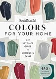
A paint color fan deck is a practical portable tool for comparing many colors and narrowing wall, trim, and accent choices before purchasing paint. Benjamin Moore’s current guidance covers more than 3,500 paint colors, but the fan deck still represents printed chips rather than the final appearance of paint under your room’s lighting.
Quick wins for a faster PC:
Fix the driver behind crashes, sound loss and screen glitchesFind Drivers →Clear out junk files and repair common Windows errorsFree Scan →Can digital tools replace physical paint samples?
Digital tools can help you explore relationships and visualize possibilities, but digital tools should not replace physical sampling. A room visualizer can show a proposed direction on an uploaded photo, while a palette generator can explore harmony types; neither reproduces every effect of screen calibration, wall texture, sheen, surrounding finishes, and changing light.
Benjamin Moore’s Personal Color Viewer provides a way to apply selected colors to uploaded room photos. Adobe’s color palette generator supports color-wheel exploration and can help identify analogous, complementary, triadic, and other relationships. Use both as planning aids, then confirm finalists with physical samples.
How should trim and ceilings work with the wall color?
Trim and ceilings do not have to be automatically lighter or darker than the walls. Use lighter trim or a lighter ceiling when you want a softer transition or more reflected light, use a darker trim or ceiling when you want architectural definition, and use related values when visual continuity matters. The correct choice depends on the palette, fixed finishes, room proportions, and lighting.
For example, warm white, sand, and oak benefits from close values and texture, while black, ivory, and ochre may use black selectively on trim-like architectural details or cabinetry. Forest green, clay, and parchment can use parchment on trim or ceilings to interrupt the visual weight of deep colors. Sample the trim and ceiling color beside the wall color rather than judging either color alone.
Free tools Windows power users keep installed
One-click scans. No signup required.
Frequently Asked Questions
What are the best interior design color schemes?
The best interior design color scheme depends on the room’s existing finishes, lighting, desired contrast, and tolerance for color intensity. Warm neutrals are versatile, analogous schemes feel blended, monochromatic palettes feel layered, and complementary or split-complementary schemes create stronger focal contrast.
What wall color goes with my furniture?
Treat flooring, countertops, cabinetry, stone, furniture, upholstery, wood, and metal as existing colors in the room. Pull a wall, supporting, trim, and accent color from those finishes, then compare physical samples beside them in changing light.
How do I make a small room look brighter with color?
Use light values, warm whites, restrained saturation, and visual continuity to make a small room feel brighter, but no color guarantees that result in every room. Lighting direction, window size, fixed finishes, sheen, and contrast also affect the perceived space.
How do I use a color wheel to decorate my home?
Use a color wheel to identify analogous colors next to one another, complementary colors opposite one another, three equally spaced triadic colors, split-complementary relationships, and four-color tetradic relationships. Use the wheel to plan relationships, then use physical paint samples to judge the actual room.
Do these 3 things before closing this tab:
1Scan for outdated or missing drivers - takes under a minute2Repair Windows errors before they cause bigger problems3Fix the driver behind crashes, sound loss and screen glitchesHow can I test paint colors before painting the whole room?
Test larger brush-on samples or movable sample boards beside the room’s fixed finishes in morning, afternoon, evening, and artificial light. Digital visualizers and color generators can narrow the choices, but they should not replace physical sampling before a full paint purchase.
The Bottom Line
The best interior design color scheme is the one that fits the room’s existing finishes and lighting, not simply the one that looks most attractive on a screen. Start with one of the 20 palette frameworks, assign dominant and supporting roles, and confirm the finalists with large physical samples through a full day of changing light.
Quick Recap

Product prices and availability are accurate as of the date/time indicated and are subject to change. Any price and availability information displayed on Amazon at the time of purchase will apply.




