Do these 3 things before closing this tab:
1Scan for outdated or missing drivers - takes under a minute2Clear out junk files and repair common Windows errors3Fix the driver behind crashes, sound loss and screen glitches
ThatPainter is reader-supported. When you buy through links on our site, we may earn an affiliate commission. Learn More
Farrow & Ball’s 12-color palette expansion is real, but it is not an upcoming 2026 launch. The collection was announced in February 2025 and became available on February 27, 2025. It added nine new colors and returned three archived shades to the main palette.
Farrow & Ball’s 12-color palette expansion is real, but it is not an upcoming 2026 launch. The collection was announced in February 2025 and became available on February 27, 2025. It added nine new colors and returned three archived shades to the main palette.

The collection remains relevant because Farrow & Ball’s current regional color pages continue to show the shades as part of its 132-color palette. Availability of individual colors, finishes, sample pots, sizes, and delivery options can vary by country and stockist, so check the local Farrow & Ball site or an authorized retailer before ordering.
What is the idea behind the collection?
Farrow & Ball called the collection The extraordinary ordinary. Rather than drawing inspiration only from dramatic landscapes or historical interiors, the brand looked to familiar domestic details: gardening tools, cleaning objects, traditional fireplaces, decorating materials, weathered metals, and everyday household scenes.
#1 Best Overall
The result is a grounded palette of earthy greens, terracottas, muted browns, soft pinks, restrained blues, and an aged yellow. The colors are richly pigmented but generally softened rather than aggressively bright, which places them comfortably within the ongoing interest in warm, lived-in interiors. That does not mean every shade will look warm or muted in every room: natural light, artificial light, adjacent colors, surface texture, and finish can substantially change the result.
The nine new Farrow & Ball colors
These nine shades were created for the 2025 expansion. Their numbers continue the sequence after the existing palette, running from No.311 through No.319.
Soft neutrals
- Scallop No.311: A soft, delicate neutral with a pink influence. It is a gentler alternative to a stark white, but it should not be treated as a universally neutral wall color. Cooler daylight may emphasize its pinkness, while warm lamps can make it feel more blush-like.
- Sizing No.314: A crisp, pale neutral with a blue base. Its name refers to sizing, the starch-like material traditionally used in decorating. Sizing is the cooler, cleaner counterpoint to Scallop and may read noticeably blue in north-facing or otherwise cool light.
Earthy greens and blue-greens
- Dibber No.312: An understated, grounded green named after a gardening tool used to make holes for planting. It is one of the more approachable choices for someone who wants color without a highly saturated result.
- Reduced Green No.313: A deep, muted green with a strong brown influence. It has more visual weight than Dibber and can create a cocooning effect in a study, dining room, hallway, or bedroom, subject to the room’s light and proportions.
- Douter No.318: A green-gray positioned between Inchyra Blue and Green Smoke in the brand’s color story. Its inspiration includes tarnished brass and a candle snuffer, giving it an aged, slightly smoky character.
Together, Dibber, Reduced Green, and Douter form the new collection’s most coherent green family. Dibber is the softer starting point, Reduced Green the darkest and browniest, and Douter the cooler, more blue-gray option.
Warm clay and terracotta colors
- Naperon No.315: A warm, faded terracotta or peachy-clay shade. It is subdued rather than fiery and may work well where a room needs warmth without the visual intensity of a clear orange.
- Marmelo No.316: A warmer, more orange-leaning aged terracotta inspired by familiar domestic color. Compared with Naperon, it is the more obviously orange direction of the two.
Naperon and Marmelo are not interchangeable. Naperon’s faded clay character can sit closer to a warm neutral, while Marmelo is more likely to become a focal color. Test both on the actual wall before choosing between them.
Blue and yellow
- Kakelugn No.317: A pale blue inspired by Swedish tiled fireplaces. It introduces the clearest cool contrast to the collection’s greens, browns, and terracottas, while its traditional reference keeps it from feeling like a purely contemporary accent color.
- Duster No.319: An aged, earthy yellow inspired by the familiar household cleaning tool. This is not a bright lemon or primary yellow; its appeal lies in its softened, timeworn quality.
The three archived colors returning to the palette
Farrow & Ball also brought three previously archived shades back into its main palette. They are part of the 12-color launch, but they are not newly created colors.
Rank #2
!['BENJAMIN MOORE' CLASSIC COLORS FAN DECK [CASE OF 1]](https://m.media-amazon.com/images/I/41Xq67AO80L._SL160_.jpg)
- Very good condition
- Benjamin Moore Classic Colors Fan Deck
- Classic Colors
- Includes the American Classic Colors (AC)
- Etruscan Red No.56: A rich, earth-derived red with historical associations. It provides the deepest and most dramatic warm accent in the group.
- Broccoli Brown No.198: A muted dark brown that sits naturally alongside weathered wood, stone, leather, and other organic materials. It can be a strong choice for a room where a near-black or charcoal would feel too hard.
- Sap Green No.199: An olive-leaning green associated with natural vegetation. Its depth and muted quality may be especially useful in smaller spaces, although room size alone does not determine whether a dark color will work.
The return of these shades is historically significant for the brand. Farrow & Ball described the move as the first time archived colors had been brought back into its signature palette. The launch therefore represents two decisions at once: adding current colors suited to the renewed interest in earthy interiors and treating the company’s archive as an active source of design ideas.
How the 12 colors fit together
| What you want | Good starting points | How they differ |
|---|---|---|
| A quiet light neutral | Scallop, Sizing | Scallop is pink-influenced and soft; Sizing is paler and blue-based. |
| A grounded green | Dibber, Sap Green | Dibber is a new, understated earthy green; Sap Green is the more visibly olive archival return. |
| A deep green | Reduced Green | Brown influence makes it darker and earthier than the softer green options. |
| A smoky blue-green | Douter | It sits between a blue-green and gray-green, with an aged character. |
| A pale blue | Kakelugn | The collection’s clearest cool, light-toned color. |
| A clay tone | Naperon, Marmelo | Naperon is the faded peachy terracotta; Marmelo leans warmer and more orange. |
| A historic red | Etruscan Red | The richest and deepest warm color in the collection. |
| A dark natural brown | Broccoli Brown | A muted brown suited to weathered, organic material palettes. |
| An aged yellow | Duster | Earthy and softened rather than bright or lemon-like. |
Color combinations to test
There is no single “correct” scheme for the collection, but these are useful starting points:
- Dibber with Scallop: A quiet green-and-soft-neutral combination. Scallop can temper Dibber’s earthiness, while Dibber gives the pale shade more definition.
- Douter with Sizing: A cooler pairing built around the blue-gray green and blue-based pale neutral.
- Etruscan Red with a restrained neutral: A way to use the historic red without allowing it to dominate every surface.
- Marmelo with Broccoli Brown: A warmer, more enveloping combination for readers who want a distinctly earthy room.
- Kakelugn with Reduced Green: A pale blue against a darker brown-green, providing contrast without relying on pure white.
These are editorial pairings, not laboratory-tested combinations or guarantees of how the colors will behave in a particular home. Put the proposed colors next to the flooring, trim, countertops, upholstery, and artwork that will remain in the room.
Why a color card is useful—and why it is not enough
Online images are useful for narrowing the field, but they are a poor basis for committing to several gallons of paint. Screens differ in calibration, photographs are affected by lighting and white balance, and a digital swatch cannot show the texture and sheen of a painted wall.
A Farrow & Ball color card is useful for comparing the complete 12-color group in one place and identifying possible relationships between shades. Treat it as a comparison tool, not a replacement for a painted sample. A paper card does not reproduce the exact appearance of paint on your wall, and it cannot show how the finish interacts with the surface.
Rank #3
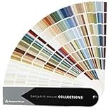
- Brand: Benjamin moore
- Container type: Box
- Finish type: Opa
Farrow & Ball’s own guidance recommends using sample pots or painting a sample on paper and observing it in the intended room. If you are ready to test the palette, look for Farrow & Ball sample pots through the official regional site or a verified local stockist. Do not assume that every shade is offered in every finish, size, or country.
A practical sampling process
- Shortlist two or three colors. Start with the room’s fixed elements rather than a trend photograph. Flooring, tile, stone, cabinetry, and large upholstered pieces often determine whether a color feels balanced.
- Paint a large sample. A small card can hide undertones. Use a generous painted area on paper or a removable sample board; if possible, test more than one wall.
- Watch the sample throughout the day. Check morning, midday, evening, and artificial light. A blue-based neutral such as Sizing may change more noticeably than expected when the room’s light shifts.
- Leave the room furnished. The same paint can appear different beside warm wood, cool gray tile, red brick, bright white trim, or patterned fabric.
- Compare the dry finish. Do not judge only while the paint is wet. Allow the sample to dry according to the product instructions before making a decision.
- Confirm local product details. Check the regional product page for finish names, available sizes, sample formats, primer or undercoat guidance, and current stock.
Choose the finish for the surface, not just the color
The same color can feel different when applied in different sheens. Farrow & Ball’s regional product information identifies Estate Emulsion as a low-sheen, matte finish commonly used on walls and ceilings, while Modern Emulsion is a more washable option for higher-use areas. The appropriate choice depends on the room, surface, cleaning demands, and the products available in your region.
Primer and undercoat requirements can vary according to the existing surface, substrate, previous color, and chosen paint. Follow the product-specific instructions rather than assuming that one preparation method works for every shade. A sample can help you assess color, but it does not replace proper cleaning, repair, priming, and preparation.
Availability and buying considerations
The colors were announced as handcrafted in Dorset and released on February 27, 2025. Farrow & Ball’s current regional materials continue to list the collection, including the numbered shades, but retail conditions are regional. The United States, United Kingdom, Japan, and other markets may differ in stockists, shipping, finish terminology, sample-pot formats, and available tin sizes.
For US readers, Farrow & Ball showrooms and authorized stockists—including independent paint retailers—may be purchase routes, but local inventory can change. Use the official regional store or verify a stockist before relying on a particular listing. A marketplace result is not automatically proof that a product is official, current, or available in the finish and size you need.
Do these 3 things before closing this tab:
1Scan for outdated or missing drivers - takes under a minute2Clear out junk files and repair common Windows errors3Fix the driver behind crashes, sound loss and screen glitchesRank #4

- Core Color Matching: Paint color sample cards include 83 standard colors to support paint color sample cards, color matching cards for painting, and paint chips standard samples, helping users compare shades before selecting a final finish for floor paint, hardware, and other project needs
- Reliable Reference: Paint samples are made with color matching materials designed to support accurate color comparison, giving painters and DIY users a practical paint and paint color samples reference for selecting tones that fit the project surface and intended look
- Portable Format: Measuring 3.74 x 1.57 x 1.18 in and weighing 3.88 oz, this paint samples set is compact for a toolbox, work bag, or travel use, making it easier to carry color test card paint and check shades on site when planning paint work
- Wide Project Use: Paint sample cards are suitable for floor paint, paint hardware, and related color selection tasks, offering a useful paint chips samples reference for contractors, decorators, and home improvement users working on color coordination across different surfaces
- Simple Set Package: Each package includes 1 set of paint sample cards, giving users a straightforward paint sample standard cards option for daily work, project planning, and quick shade comparison when choosing among paint color cards and paint chips sample cards
Further reading for planning a room
If you want guidance beyond these 12 shades, Farrow & Ball: How to Decorate is a broader decorating resource associated with the brand and its color experts. It covers room planning, color, light, and finishes; it should be treated as supplementary reading, not as documentation of this particular 2025 launch. Check the current edition and seller details before buying.
Independent reader supportYour contribution helps us test, update, and keep practical guides available for everyone.Bottom line
Farrow & Ball’s palette expansion consists of nine genuinely new colors—Scallop, Dibber, Reduced Green, Sizing, Naperon, Marmelo, Kakelugn, Douter, and Duster—plus the returning archive shades Etruscan Red, Broccoli Brown, and Sap Green. Its strongest design direction is earthy and familiar rather than loud: muted greens, aged clay, natural brown, a soft pink neutral, a pale blue, and a weathered yellow.
The collection is a strong source of ideas for warm, grounded interiors, but the safest way to choose among it is still practical: compare the shades with a physical card, test painted samples in changing light, and confirm the local finish and preparation instructions before purchasing a full tin.
Frequently Asked Questions
When did Farrow & Ball release the 12 new colors?
The collection was announced in February 2025 and became available on February 27, 2025. It is not a new 2026 launch, although the colors remain listed in Farrow & Ball’s current regional palette materials.
What’s actually slowing this PC down?
Pick the symptom - the matching free tool is one click away.
Which Farrow & Ball colors are actually new?
There are nine new colors: Scallop No.311, Dibber No.312, Reduced Green No.313, Sizing No.314, Naperon No.315, Marmelo No.316, Kakelugn No.317, Douter No.318, and Duster No.319. The other three—Etruscan Red No.56, Broccoli Brown No.198, and Sap Green No.199—are revived archive colors.
Best Value

- 1.Widely Compatible: You will receive 20 sheets color chart template.The watercolor swatch card's overall size is 8.27x2.56 inch. Precisely compatible with most 24-color half-grid watercolor paint boxes on the market. Whether you are a novice practicing watercolor color matching, recording commonly used swatches, or a professional artist organizing color matching schemes, it can easily meet your needs.Painters color diary is an exclusive matching tool for 24-color half-grid watercolor paint boxes.
- 2.Accurately Record Color Details:Every swatch rectangle features a clear black line, which is designed for easily checking the transparency of watercolor paints and neatly separating half-tones for precise color distinction.This thoughtful layout lets you quickly and clearly record the original shade of each watercolor paint, as well as the unique mixing effects of different color combinations for all your watercolor creation needs.
- 3.Flexible and Convenient:Paper watercolor paint palette equipped with 1 gold circular metal loose-leaf ring with an inner diameter of 0.98 inch, which is firm and durable. The inner paper watercolor paint palette can be flexibly removed and added, facilitating the organization of swatch records and the supplement of new color matching samples. The loose-leaf design is easy to carry around, allowing you to record watercolor color matching inspiration anytime and anywhere, making it more flexible to use.
- 4.High-Quality Material:The cover is made of 300g white cardboard with single-sided color printing, not easy to deform; the watercolor palette swatch cards are made of high-quality paper suitable for watercolor, with smooth writing and no ink bleeding, which can clearly present the original color of the paint. The 300g thick material balances texture and practicality, and is not easy to damage with long-term use.
- 5.Multi Purpose Use:More than just a paper for recording watercolor pigment shades, this swatch book is a versatile tool for mixing practice and mapping out art creations. It’s a must-have for art students, hand-painting lovers and professional artists.Color swatch notebook fits seamlessly into home creation, school art classes, outdoor sketching and casual on-the-go doodling.
What is the difference between Scallop and Sizing?
Scallop is the pink-influenced soft neutral, while Sizing is the cooler, blue-based pale neutral. Neither should be assumed to be a universally neutral white; test both in the room’s actual light.
Should I test Farrow & Ball paint before buying a full tin?
Yes. Farrow & Ball’s guidance recommends using sample pots or painting samples on paper and viewing them in morning, midday, evening, natural, and artificial light. A color card is useful for comparison but cannot replace a painted sample.
Are all 12 colors available everywhere?
Availability varies by region and stockist. Check the official local Farrow & Ball site or a verified retailer for current stock, finish names, sample formats, sizes, shipping, and primer or undercoat requirements.
Recommended Free Tools
The Bottom Line
Announced in February 2025 and available from February 27, 2025, Farrow & Ball’s 12-color expansion contains nine new shades and three revived archive colors. Sample the paint in your own room before committing, because light, surrounding materials, sheen, and surface preparation can significantly change the result.
Quick Recap

Product prices and availability are accurate as of the date/time indicated and are subject to change. Any price and availability information displayed on Amazon at the time of purchase will apply.




