ThatPainter is reader-supported. When you buy through links on our site, we may earn an affiliate commission. Learn More
Make a picture from text by treating each character as a visual tile: establish a simple silhouette, add structure with light and dark marks, and preserve the resulting grid in a monospaced font. The method works with ordinary ASCII punctuation, Unicode box-drawing and block characters, and even Braille-pattern symbols—but portability, accessibility, and careful testing determine whether the finished artwork survives outside your editor.
What text art is—and what you need to begin
To make a picture out of text, treat each character as a small visual tile in a grid. Start with a simple subject, build its silhouette using one strong character such as # or @, then add lighter marks and empty space for structure and shading. Work in a monospaced font, preserve every space and line break, and test the finished piece where you intend to publish it.
The broad term for this practice is text art: imagery made with letters, numbers, punctuation, symbols, or other characters. ASCII art is the narrower historical form made primarily from the printable ASCII character set. People often use “ASCII art” loosely for all text-based pictures, but the distinction matters when character compatibility and layout are important. The tradition reaches from typewriters and early printers to terminals, bulletin-board systems, IRC, and modern online platforms. The ASCII Art Archive’s history of ASCII art provides a useful overview.
What’s actually slowing this PC down?
Pick the symptom - the matching free tool is one click away.
#1 Best Overall

- PLEASE NOTE:XPPen Artist13.3 Pro drawing tablet Need to connect with computer,you need to use it with your computer or laptop, the 3 in 1 cable is included
- Drawing Tablet with Screen: Tilt Function- XPPen Artist 13.3 Pro supports up to 60 degrees of tilt function, so now you don't need to adjust the brush direction in the software again and again. Simply tilt to add shading to your creation and enjoy smoother and more natural transitions between lines and strokes
- Graphics Tablets: High Color Gamut- The 13.3 inch fully-laminated FHD Display pairs a superb color accuracy of 88% NTSC (Adobe RGB≧91%,sRGB≧123%) with a 178-degree viewing angle and delivers rich colors, vivid images, and dazzling details in a wider view. Your creative world is now as powerful as it is colorful
- Drawing Pad: One is enough- The sleek Red Dial on the display is expertly designed with creators in mind, its strategic placement allows for natural drawing postures. With just one wheel, you can effortlessly zoom in and out, adjust brush sizes, and flip the canvas—all tailored to suit the habits of everyday artists. The 8 customizable shortcut keys allow you to personalize your setup, streamlining your workflow and enhancing creative efficiency
- Universal Compatibility & Software Support:supports Windows 7 (or later), Mac OS X 10.10 (or later), Chrome OS 88 (or later), and Linux systems. Fully compatible with major creative software including Photoshop, Illustrator, SAI, and Blender 3D. Register your device to access additional programs like ArtRage 5 and openCanvas for expanded creative possibilities.
Related forms include:
- ANSI art: text graphics associated with extended character sets, color, and terminal escape sequences. ANSI art is not simply another name for ASCII art; it usually depends on terminal behavior in addition to characters.
- Unicode text art: work using characters beyond basic ASCII, including box-drawing symbols, block elements, geometric signs, emoji, and Braille patterns.
- Concrete or shaped poetry: words or lines arranged into a visual form while the language itself remains central to the artwork.
“Text art” is therefore the safest umbrella term. Use “ASCII art” when the character set and style genuinely fit.
Why a monospaced font matters
Text art depends on alignment. In a monospaced—or fixed-width—font, every character has the same horizontal advance, so the characters form dependable columns. A letter, punctuation mark, or space can act like a coarse pixel.
In a proportional font, an i is narrower than an M, and punctuation may occupy a different amount of space. A design built in fixed columns can consequently shift, compress, or lose its silhouette.
Use a monospaced font while drawing and previewing. A plain-text editor is enough; a code editor can make the work easier if it offers visible whitespace, column guides, undo history, and a fixed-width preview. Keep the artwork in a code block or preformatted document while editing so leading spaces are not silently removed.
Free tools Windows power users keep installed
One-click scans. No signup required.
A beginner exercise: draw a recognizable cat
Do not begin with a detailed portrait or landscape. Faces, animals, plants, icons, buildings, and simple objects have clear outlines and are easier to reduce to a small grid. Try a compact cat first:
 /_/\
( o.o )
 > ^ <
This works because a few marks communicate the ears, face, eyes, nose, and paws. It does not need realistic shading to be recognizable.
Step 1: Choose the subject and its canvas
Decide how much room the image may occupy. A small chat message might support only a narrow design, while a terminal or document can accommodate more columns. Begin with a deliberately small grid rather than trying to reproduce every detail of a reference image.
Reduce the subject mentally—or with a rough sketch—to four values:
Do these 3 things before closing this tab:
1Repair Windows errors before they cause bigger problems2Fix the driver behind crashes, sound loss and screen glitches3Clear out junk files and repair common Windows errorsRank #2

- [Perfect Compatibility]: Our silver pen display riser is compatible with a wide range of laptops, including Macbook, Dell, HP, and Lenovo. It's also suitable for 10 to 15.6-inch drawing tablets or displays, such as the XPPen Artist 2nd Gen Series, Artist 12/12 Pro/13.3 Pro/15.6 Pro/16TP, and more.
- [Lightweight and Portable]: Our aluminum pen tablet stand weighs only 0.8 lbs and comes with a storage bag, making it easy to take with you to the office or on the go.
- [Stable and Secure]: With anti-slip silicone pads, our silver stand can hold your computer, tablet, or display steady on any surface.
- [Improved Cooling]: The alloy material helps your display or tablet cool better, preventing overheating and improving performance.
- [Designed for XPPen Artists]: Our stand is fully compatible with XPPen Artist 10 2nd, Artist 12, Artist 12 2nd, Artist 13 2nd, Artist 13.3 Pro, Artist 15.6 Pro, Innovator 16, and Artist Pro 16, making it the perfect accessory for any XPPen artist.
- Empty: background space
- Light: highlights and faint texture
- Midtone: form and secondary structure
- Dark: outline, shadow, and the most important features
Step 2: Block the silhouette
Use one dense character, such as #, @, or *, to establish the outside shape. Ignore eyes, texture, and small contours for now. If the silhouette is not recognizable, extra detail will usually make the result busier rather than better.
Symmetry can be built by drawing one side and mirroring it, or by counting columns from the center. A single missing space can move an eye, break a border, or flatten a diagonal.
Step 3: Add internal structure
Replace selected dense marks with lighter characters, punctuation, or spaces. Dashes, slashes, parentheses, underscores, and vertical bars are useful for line work. Use small features sparingly: viewers need a strong outline and a few meaningful landmarks more than a complete inventory of every surface.
Work from large forms to small ones. For an animal, establish the head and body before adding facial features. For a building, draw the outer walls and roof before windows and brickwork. At each stage, temporarily step back or view the piece at its intended size. If the subject stops reading, undo detail and simplify.
Choosing characters for shading
A practical grayscale palette can move from visually light to visually dense:
.,:;irsXA253hMHGS#9B&@
That sequence is only a starting point, not a universal brightness scale. A character’s apparent weight changes with its font, size, weight, antialiasing, and rendering engine. A compact hand-drawn palette is easier to control:
| Visual role | Useful characters |
|---|---|
| Empty background | A regular space |
| Light marks | . ' , |
| Medium marks | : + * |
| Dark marks | # % @ |
| Edges and line work | - / ( ) _ | |
Use the same character consistently for similar values. Too many symbols can create visual noise, especially in a small image. The most successful work often has a limited palette and a clear separation between background, outline, and focal features.
ASCII, Unicode, ANSI, and concrete poetry: which technique fits?
Basic ASCII for maximum portability
Basic ASCII uses a small, familiar repertoire of letters, numbers, punctuation, and spaces. It is the safest choice for plain-text files, code comments, terminal output, email, and systems where compatibility matters more than detail. It will not provide the same density or connected borders as some Unicode techniques, but it is less likely to be missing from a font or interpreted as an emoji.
Recommended Free Tools
Rank #3
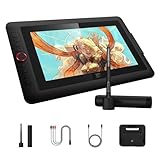
- Word-first 16K Pressure Levels: 1.5x* faster than ever. Initial response rate decreases to 90ms*. Accuracy increases by 20% to bring out every art project precisely what you want. Virtually no lag or broken lines. X3 pro smart chip stylus delivers much more precise and smooth lines than ever before - exceling athyper-nuanced creation and beyond
- Easy Control, One Scroll for All: Easy & efficiency Red Dial Quick Key simplifies the interface for beginners, like aspiring graphic designers and junior illustrators, allowing them to master essential controls such as brush size, navigation and zoom In/Out. This design ensures a natural hand position, reducing wrist strain during prolonged use. Additionally, with 8 customizable keys, users can easily assign frequently used functions, streamlining their workflow and minimizing interruptions
- User-friendly Setup: Understanding that many artists and designers, especially beginners, may not be tech-savvy,the new 13-inch drawing tablet features clear setup instructions for hassle-free installation. With an updated driver and intuitive interface, users can easily configure the drawing screen, and pens with a single installation. Quick access to settings allows adjustments to brightness, contrast, and color temperature (Windows only), enabling even newcomers to start creating right away
- Stunning Color Accuracy: Featuring 125% sRGB, 107% Adobe RGB, 95%display P3 color gamut, this tablet ensures every stroke has exceptional color fidelity. With 16.7 million colors at 8-bit depth, you can enjoy smooth gradients and rich transitions. The 250 cd/m² brightness and 1000:1 contrast ratio provide clearer, more vivid images, allowing artists to see their creations accurately. Ideal for both professionals and hobbyists
- Exceptional Visual Experience: Our 13.3-inch drawing tablet features a full-laminated screen with AG Film, reduces parallax and glare for a paper-like feel. With Full HD resolution and an IPS panel, enjoy vibrant colors and sharp details from a wide 178° viewing angle, ideal for drawing, animation, photography, fashion, architecture design, and much more
Box-drawing characters for borders and diagrams
Unicode box-drawing characters are designed to connect across character cells. They are useful for frames, maps, diagrams, floor plans, and architectural forms:
┌─────────┐
│  TEXT   │
└─────────┘
Because these symbols depend on a font’s glyph design and cell metrics, test them in the actual destination. A border that aligns in one terminal or browser may look uneven in another.
Block elements for greater apparent resolution
Block elements fill all or part of a character cell. Full blocks, half blocks, and fractional fills can suggest more vertical detail than ordinary punctuation. Unicode defines the Block Elements range as U+2580–U+259F; the Unicode Core Specification explains the role of block and box-drawing characters.
These marks are excellent for compact monochrome graphics, but they are less portable than basic ASCII. A missing glyph, unexpected font fallback, or different cell width can alter the result.
The Tool Desk
Outbyte Driver Updater FREEScan for outdated or missing drivers - takes under a minuteDriver Scan →Outbyte PC Repair FREERepair Windows errors before they cause bigger problemsFix Now →Braille patterns for dense monochrome images
Braille-pattern characters can pack a relatively dense dot arrangement into each text cell. Unicode encodes all 256 eight-dot patterns in the range U+2800–U+28FF. They can be effective for high-resolution monochrome text imagery, but these code points represent dot patterns; they should not automatically be treated as ordinary literary Braille without regard to the language and Braille conventions involved. See Unicode’s discussion of Braille patterns.
Unicode art gives you more expressive tools, but every additional symbol introduces compatibility questions. A character may be absent, rendered at an unexpected width, substituted with an emoji-style glyph, or handled differently by text-processing software. When reliability is essential, use ASCII or provide a fallback.
Converting an image into text art
Image-to-ASCII converters can speed up experimentation, but their first output is rarely finished artwork. A useful conversion workflow is:
- Crop the source: remove empty margins and unimportant background areas.
- Increase contrast: separate the subject from its surroundings before converting.
- Choose a small character palette: fewer values usually produce a clearer result.
- Correct the aspect ratio: text characters are often taller than they are wide, so an uncorrected conversion may look vertically stretched.
- Repair important features by hand: eyes, hands, edges, lettering, and other recognition cues often need manual editing.
- Preview in the final font and width: conversion is not complete until the intended platform displays it correctly.
A converter is a starting point, not a substitute for visual editing. Cropping, contrast, spacing, and simplification matter more than generating a large number of characters.
Rank #4

- Universal Compatibility: It's compatible with Windows 7/8/10/11, Mac 10.10 or later, Linux. Compatible with Photoshop, Illustrator, SAI, Painter, MediBang, Clip Studio, and more. It's ideal for digital drawing, animation, sketching, photo editing, 3D sculpting, and more (XP-PEN Artist12 drawing tablet must be connected to a computer to work).
- 11.6 HD IPS display: Artist12 drawing tablet is the XP-PEN’s latest smallest 1920x1080 HD display paired with 72% NTSC(100%SRGB) Color Gamut, presenting vivid images, vibrant colors and extreme detail for a stunning display of your artwork. It's pre-installed anti-reflective screen protector already. The slim touch bar can be programmed to zoom in and out, scroll up and down. Its 6 shortcut keys are customizable, XP-PEN driver allows the shortcut keys to be attuned to other different software
- Battery-free stylus with a digital eraser at the end: XP-PEN advanced P06 passive pen was made for a traditional pencil-like feel! Featuring a unique hexagonal design, non-slip & tack-free flexible glue grip, partial transparent pen tip, and an eraser at the end! Delivering technical sense, high efficiency, with a fashionable and comfortable grip, and there are 8 replacement pen nibs included with the multi-function pen holder
- XP-PEN Artist12 drawing tablet with screen is ideal for online education and remote work. Set the Artist12 drawing screen as an extended display when working from home, visually present your handwritten notes on the screen directly. Teachers and students can write and edit complicated functional equations with ease. It's compatible with XSplit, Zoom, Twitch, Microsoft Teams, ezTalks Webinar, Idroo, Scribbiar, wiziQ, and more
- XP-PEN provides a one-year warranty and lifetime technical support for all our drawing pen tablets/displays. Register your XP-PEN Artist12 drawing tablet on xp-pen web to apply for an ArtRage 5, openCanvas, or Explain Everything. Your laptop/desktop needs to have HDMI and USB-A ports available for the connection, or you need an extra converter(such as Thunderbolt to HDMI, depends on what ports that your laptop/desktop has) for the connection
Keeping text art intact on the web
HTML normally collapses runs of ordinary whitespace and line breaks. If you paste a text picture into a regular paragraph, its carefully counted spaces may disappear. Use the <pre> element for preformatted artwork; it is commonly displayed in a non-proportional font and is specifically suitable for ASCII art. MDN’s <pre> documentation also discusses alternative text for meaningful text art.
<figure>
<pre role="img" aria-label="A small cat made from text"> /_/\
( o.o )
> ^ <</pre>
<figcaption>A cat drawn with text characters.</figcaption>
</figure>For the actual HTML artwork, ensure that characters such as < and & are escaped. A literal < can otherwise be interpreted as markup.
Choose wrapping deliberately
white-space: pre preserves spaces and line breaks without wrapping. This protects the image’s geometry but can create horizontal scrolling on a narrow screen. white-space: pre-wrap preserves spaces and line breaks while allowing long lines to wrap. That may improve ordinary text layout, but a wrap in the middle of an image can make the picture unreadable. MDN’s white-space reference documents these behaviors.
For a responsive design, choose one of these approaches:
Quick wins for a faster PC:
Scan for outdated or missing drivers - takes under a minuteDriver Scan →Clear out junk files and repair common Windows errorsFree Scan →Fix the driver behind crashes, sound loss and screen glitchesFind Drivers →- Keep the artwork below a known maximum width.
- Allow horizontal scrolling for a wide, fixed-layout piece.
- Create a compact mobile version as well as the detailed version.
- Use an image for visual presentation while retaining a meaningful text alternative.
Do not let automatic wrapping decide the composition for you.
Independent reader supportYour contribution helps us test, update, and keep practical guides available for everyone.Terminals, documents, chat, and print
- Terminal: test the actual emulator, font, color support, and character encoding. ANSI-style color and escape sequences may work in one terminal and appear as raw text elsewhere.
- Chat and social platforms: use a code block when available. Check the narrowest likely display, especially on mobile, because automatic wrapping can split the drawing.
- Plain-text files and email: basic ASCII is the safest choice. Avoid relying on tabs, which may have different tab stops.
- Documents: apply a monospaced font and verify that paragraph settings do not alter spacing or line breaks.
- Print: inspect the selected font, page size, margins, and line spacing. A design that fits a screen may wrap or be clipped on paper.
Before sharing, paste the final copy into the real destination and compare it with the source. Different platforms may trim leading or trailing spaces, normalize characters, substitute fonts, or change line width.
Accessibility: make the picture understandable without its layout
A text picture is still content. A screen reader may announce punctuation one character at a time, skip decorative detail, or produce a confusing stream of symbols. If the artwork communicates meaning, provide a concise alternative such as “A seated cat facing left, drawn with punctuation and letters.” A figure caption can add context without forcing the description into the artwork itself.
If the piece is decorative, mark it so it does not interrupt the reading flow. Do not make essential information depend only on fixed spacing, color, or visual density. Users may change font characteristics and text spacing, and the meaning should remain available. WCAG’s text-spacing guidance addresses the need to preserve content when readers adjust presentation. For surrounding prose, WCAG’s visual-presentation guidance identifies 80 characters as a useful maximum line-width target for many text blocks. The artwork itself may need to be wider, but label it and offer an alternative rather than forcing all explanatory text into the same width.
Best Value

- PLEASE NOTE: The XPPen Artist 15.6 Pro needs to connect with a computer to use. You need to use it with your Computer or Laptop. It is NOT a standalone drawing tablet
- Outstanding Visuals: The immersive 15.6 inch large screen with 1920x1080 p full HD resolution presents your creation in the depth of detail, provides you with clarity to see every detail of your work
- 8 customized express keys: The Artist 15.6 Pro monitor features 8 fully customizable shortcut keys and puts more customization options at your fingertips to suit you preferred work style, allowing you to capture and express your ideas easier and faster for optimized workflow
- Full-laminated Technology: XPPen Artist15.6 Pro art tablet is adopting full-laminated technology, seamlessly combines the glass and the screen, to create a distraction-free working environment that's also easy on the eyes
- Advanced Pen Performance: With up to 16384 levels of pressure sensitivity, the Battery-free Stylus provides you with increased accuracy and enhanced performance to create the finest sketches and lines
Troubleshooting checklist
| Problem | Likely cause | Fix |
|---|---|---|
| The image looks stretched or crooked. | It was displayed in a proportional font or a font with incompatible metrics. | Use a monospaced font, then preview it in the destination. If necessary, share a raster image with a text alternative. |
| The left edge no longer aligns. | Leading spaces were trimmed or whitespace was collapsed. | Use a code block, <pre>, or a plain-text attachment. Check the copied version rather than assuming it is unchanged. |
| The picture breaks on mobile. | Automatic line wrapping. | Reduce the width, enable deliberate horizontal scrolling, or provide a compact version. |
| Unicode borders do not connect. | Font fallback, differing glyph widths, or unsupported characters. | Test the intended font and platform; replace uncertain symbols with ASCII or provide a fallback. |
| A symbol appears as an emoji. | The platform selected an emoji presentation or a different fallback glyph. | Use a safer character, control presentation where the environment supports it, and test the actual destination. |
| The subject is muddy. | Too much detail or too many shading values. | Return to the silhouette, reduce the palette, and restore only features that improve recognition. |
Practice ideas and optional resources
Repeat the same subject at three sizes: a tiny icon, a medium drawing, and a wider version with shading. This teaches you which contours are essential and which details can be discarded. You can also redraw a leaf, mug, face, house, or animal using only three values—empty, medium, and dark—before experimenting with Unicode blocks or Braille patterns.
A plain text editor costs nothing and is sufficient for the core exercise. If you want a physical source of examples, exercises, and historical context, an optional ASCII art book can supplement practice; choose a title appropriate to your preferred style and language rather than treating any particular book as required. A graph-paper or monospaced notebook can also help you sketch columns by hand, but digital text remains the final test.
When reusing someone else’s text art, retain known initials, signatures, or attribution. Text art is easy to select and paste, which makes unattributed copying especially tempting. The ASCII Art Archive asks users to respect artists and preserve attribution when known.
A final workflow before you publish
- Confirm that the subject reads from its silhouette alone.
- Check the image in a monospaced font.
- Count or compare columns where symmetry and borders matter.
- Remove detail that does not improve recognition.
- Decide whether ASCII compatibility or Unicode detail matters more.
- Paste it into the actual website, terminal, document, or platform.
- Check narrow screens and line wrapping.
- Add a caption or alternative description if the artwork conveys information.
- Preserve attribution when the work is not yours.
The central skill is not filling a page with symbols. It is reducing a subject to a readable arrangement of shape, spacing, contrast, and emphasis. Once the grid is stable, even a small set of ordinary characters can become a surprisingly expressive drawing.
Outdated Drivers Are Slowing You Down
One free scan finds every outdated or missing driver and matches the right update for your exact hardware.Free scan · exact hardware matchPC Slower Than It Used to Be?
A free scan shows the junk files, broken settings and background clutter dragging Windows down - then fixes them in one click.Free scan · Windows 10 & 11Frequently Asked Questions
What is the difference between text art, ASCII art, Unicode art, and ANSI art?
Text art is the broad category for images made from characters. ASCII art traditionally uses printable ASCII characters, while Unicode text art may use box-drawing symbols, blocks, emoji, or Braille patterns. ANSI art commonly adds extended character sets, color, and terminal escape sequences.
Why does ASCII art need a monospaced font?
Use a monospaced or fixed-width font. It gives each character a consistent horizontal position, allowing columns to align like a coarse pixel grid.
How do I stop text art from becoming distorted?
Use a code block or HTML <pre> element, test the artwork in the actual destination, and check for trimmed spaces, font substitution, unsupported characters, and automatic line wrapping.
How can I make text art accessible?
Provide a concise alternative description when the artwork conveys information, such as “A seated cat facing left, drawn with punctuation and letters.” Mark purely decorative artwork so it does not interrupt screen-reader users.
The Bottom Line
Start with a simple silhouette, build it in a monospaced grid, use a restrained character palette, and test the final copy in its real destination. Choose basic ASCII for portability; use Unicode only when its extra detail is worth testing and providing a fallback.
Quick Recap

Product prices and availability are accurate as of the date/time indicated and are subject to change. Any price and availability information displayed on Amazon at the time of purchase will apply.




