Quick wins for a faster PC:
Repair Windows errors before they cause bigger problemsFix Now →Fix the driver behind crashes, sound loss and screen glitchesFind Drivers →
ThatPainter is reader-supported. When you buy through links on our site, we may earn an affiliate commission. Learn More
Benjamin Moore’s official blue-gray collection offers a useful starting shortlist, but the available sources do not verify 24 shades personally endorsed by experts. Below are the ten colors Benjamin Moore features or lists as blue-grays, followed by a few clearly attributed alternatives from other sources. Treat the manufacturer list as a catalog selection, not a ranking.
Benjamin Moore’s blue-gray catalog picks
Benjamin Moore describes blue-gray as cool and silvery, with the option to lean toward a grayer or bluer look. Its official page features or lists these ten shades:
| Color | Code |
|---|---|
| Little Falls | 1621 |
| Philipsburg Blue | HC-159 |
| Wolf Gray | 2127-40 |
| Smoke | 2122-40 |
| November Skies | 2128-50 |
| Santorini Blue | 1634 |
| Wedgewood Gray | HC-146 |
| Quiet Moments | 1563 |
| Pale Smoke | 1584 |
| Brewster Gray | HC-162 |
Benjamin Moore suggests pairing blue-grays with cool off-white and natural materials for a coastal feel, or introducing pale yellow. These are styling suggestions, not fixed rules; the right balance depends on the room’s light and finishes. See Benjamin Moore’s blue-gray collection.
Outdated Drivers Are Slowing You Down
One free scan finds every outdated or missing driver and matches the right update for your exact hardware.Free scan · exact hardware matchWindows Errors? Fix Them Before They Spread
Repair common Windows errors and clear accumulated junk for a smoother, more stable PC - no reinstall needed.Free scan · no reinstallDesigner-noted colors that sit near blue-gray
These examples have specific expert or designer context, but they should not be mistaken for a larger consensus list of universally recommended blue-grays.
#1 Best Overall
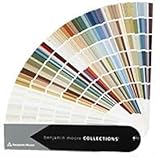
- Brand: Benjamin moore
- Container type: Box
- Finish type: Opa
Oyster Bay: a blue-green gray
In a Homes & Gardens feature published August 5, 2026, Sherwin-Williams color marketing manager Emily Kantz called Oyster Bay “a soft green-gray with subtle slate-blue undertones that creates a calming, sophisticated feel,” and noted that its appearance shifts with light. Designers Staci Steidley and Jennifer Verruto also discussed its gray, blue, and green character. Because of that green component, it is best understood as a blue-green/gray option rather than an unequivocal blue-gray. Read the Oyster Bay feature.
De Nimes: a blue with gray undertones
Livingetc reports gray undertones in Farrow & Ball’s De Nimes and quotes Yond Interiors designer Julia Miller: “We used a fresh coat of De Nimes blue paint to highlight the incredible existing architecture.” This supports it as a designer-used blue with gray undertones, not as proof of an expert consensus. Read the De Nimes feature.
Rank #2
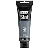
- BASICS IS FOR ALL – from those new to painting to experienced artists. Ideal if you’re a beginner or on a budget. Perfect for underpainting or sketching if you’re a serious artist and for color scoping and exploration if you’re a creative professional.
- HIGHEST QUALITY PIGMENTS – All Liquitex paints use the highest quality pigments and rigorous manufacturing process. With BASICS, the only difference is a lower concentration of pigment than our professional paints.
- ECONOMICAL AND INTERMIXABLE – Push your budget harder with BASICS. Use on their own or combine together with professional materials. Perfect for everyday use, for sketching out preliminary ideas, or for underpainting your final paint application
- ARCHIVAL QUALITY – As with all Liquitex paints, the pigments have passed extensive tests for lightfastness. Your work will have the greatest archival permanence possible, withstanding color shifting or fading to stay vibrant and true.
- SAFE - BASICS acrylics are safe for you to use. All colors hold the Approved Product seal from the Art and Creative Materials Institute and are ideal for studio and educational use.
Other useful blue-gray directions
Calico and Rainstorm from Sherwin-Williams
Sherwin-Williams describes Calico as blue-green with hints of gray: it can look bluer in direct light and greener in darker settings. Rainstorm SW 6230 is described as a deep blue with a slate-gray undertone. These descriptions help distinguish a shifting blue-green from a darker, slate-leaning blue; they do not establish a second verified ten- or 24-color list. See Sherwin-Williams’ color guidance.
Stonington Gray and Wickham Gray from Benjamin Moore
Benjamin Moore’s color handbook identifies cool blue undertones in Stonington Gray HC-170 and Wickham Gray HC-171. They are adjacent options for someone seeking a gray that is cooled by blue, though the handbook passage does not classify them as blue-gray paints. It also explains that light, decor, and neighboring paint colors can amplify or soften undertones. Consult the Benjamin Moore color handbook.
Rank #3
!['BENJAMIN MOORE' CLASSIC COLORS FAN DECK [CASE OF 1]](https://m.media-amazon.com/images/I/41Xq67AO80L._SL160_.jpg)
- Very good condition
- Benjamin Moore Classic Colors Fan Deck
- Classic Colors
- Includes the American Classic Colors (AC)
How to choose the right blue-gray for your room
- Decide which color should lead. Compare whether you want a shade that reads mainly blue, mainly gray, or blue-green. Calico’s lighting-dependent shift is a reminder that a color description alone cannot predict every room.
- Match the depth to the space. Consider how light or dark the paint should feel against the room’s trim, floor, furnishings, and available daylight. The named catalog colors are not presented here as a standardized lightness ranking.
- Check for secondary undertones. Green can make a blue-gray feel more aquatic; a slate-gray undertone can make blue feel more subdued. Look at the paint alongside the finishes that will stay in the room.
- Sample where the paint will go. Place a real sample in the intended room and observe it in both natural and artificial light. Benjamin Moore recommends sampling in the space and cautions that screen and printed representations may differ from actual paint. Sherwin-Williams likewise notes, “With the right undertones and lighting, you can find a blue paint color that shifts in different lighting.” Benjamin Moore’s sampling guidance.
Make the shortlist work in context
For a coastal direction, Benjamin Moore’s suggested combination of cool off-white and natural materials offers a starting point; pale yellow is another accent the brand recommends. Before settling on a shade, compare the sample with the room’s fixed finishes and check it at different times of day. The manufacturer and designer descriptions above identify useful starting points, but none substitutes for seeing the paint in your own lighting.
Quick Recap
Best Value

- Prestige Paints has created a comparable Color based on Color specifications of the original Color using industry leading technology
- This Benjamin Moore paint Color Name is a trademark of Benjamin Moore. Prestige Paints is not associated or affiliated with Benjamin Moore in any way
- Smooth application ideal for living rooms, family rooms, media rooms, bedrooms, dining rooms, kitchens and hallways
- 100% Acrylic latex paint for easy soap and water clean-up
- Low VOC: less than 5 g/L prior to tinting
Rank #4
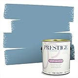
- Prestige Paints has created a comparable Color based on Color specifications of the original Color using industry leading technology
- This Benjamin Moore paint Color Name is a trademark of Benjamin Moore. Prestige Paints is not associated or affiliated with Benjamin Moore in any way
- Smooth application ideal for living rooms, family rooms, media rooms, bedrooms, dining rooms, kitchens and hallways
- 100% Acrylic latex paint for easy soap and water clean-up
- Low VOC: less than 5 g/L prior to tinting

Product prices and availability are accurate as of the date/time indicated and are subject to change. Any price and availability information displayed on Amazon at the time of purchase will apply.




