What’s actually slowing this PC down?
Pick the symptom - the matching free tool is one click away.
ThatPainter is reader-supported. When you buy through links on our site, we may earn an affiliate commission. Learn More
Red pairs successfully with far more than black and white. The best match depends on the red’s undertone, the companion color’s temperature and value, the material, the lighting, and how much of each color you use. The 21 palettes below cover crisp contrast, quiet neutrals, complementary greens, neighboring warm hues, and rich red-violet combinations.
How color relationships make red easier to match
A color wheel gives you a useful starting point before you compare actual paint, fabric, clothing or digital swatches. Complementary colors sit opposite one another; red and green are the classic example. Analogous colors sit beside one another, such as red, red-orange and orange. Triadic schemes use three colors spaced evenly around the wheel. These relationships explain why some pairings feel energetic and others feel blended, but they do not replace testing the exact shades in your setting.
21 colors that go with red
1. Crisp white
White creates clean, graphic contrast with red. Use it for kitchens, logos, sneakers and holiday accents when you want the red to look clear and deliberate.
#1 Best Overall
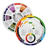
- Helps organise colours to make choices and combinations easier;Defines common terms and helps the artist to understand colour uses and interactions.
- Designed for all artists, including: Painters, crafters, interior, graphic, garden, and landscape designers;Perfect gift for creative people!
- Two-sided rotating wheel shows colour relationships;230mm diameter,2 packs Convenient and portable.
- UV coated to minimise fading and protect from moisture.Paper cover makes it;Paper evelope cover makes it difficult to break during transportation.
- Good for beginners to identify any of the colors easily and recognize the middle of the color simply.
2. Warm cream
Cream softens the contrast of white and adds warmth. It is a useful partner for a red wall, upholstered piece or room that feels too stark with bright white.
3. Charcoal gray
Charcoal grounds red in a modern, quieter way than black. Try charcoal cabinetry, trim or tailoring with a brighter red accent.
4. Black
Black and red deliver maximum drama. Keep one color dominant and use the other in controlled areas so the combination does not become visually heavy.
5. Navy
Navy supplies a confident warm-cool contrast. It suits tailoring, nautical interiors and classic branding, especially when the red is used as the focal color.
Recommended Free Tools
6. Denim blue
Denim makes red feel relaxed rather than formal. The pairing is particularly effective in casual clothing and rooms with cotton, canvas or other informal textures.
7. Cobalt blue
Cobalt and red create energetic primary-color contrast. For control, make one hue dominant or choose a tint of one color rather than using two equally intense blocks.
Rank #2
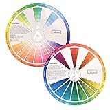
- This package include one Creative Color Mixing Board with one regular Color Wheel (9.25 inch).
- Easy-to-use tool that visually illustrates relationships between colors and demonstrates the results Features a grayscale, tints and tones, definitions of color terms, and illustrations of color.
- Color Wheel helps show which colors are complimentary, and how they go (or don't go) together.
- Some people know instinctively, and others need a visual tool to help them choose.
- Two sided wheel with indicators for complementary, split complementary and triad color schemes, how to tint and shade, primary, secondary and tertiary references, and more.
8. Teal
Teal is a blue-green counterpoint that cools red while keeping the overall palette lively. It works well in accents, artwork, textiles and contemporary interiors.
9. Forest green
Forest green follows the traditional complementary direction for red. Deepen or mute both colors when you want the pairing to feel sophisticated instead of overtly seasonal.
Quick wins for a faster PC:
Scan for outdated or missing drivers - takes under a minuteDriver Scan →Repair Windows errors before they cause bigger problemsFix Now →Fix the driver behind crashes, sound loss and screen glitchesFind Drivers →10. Sage green
Sage offers a quieter version of red and green. Its grayness makes a strong red easier to live with in bedrooms, sitting rooms and soft furnishings.
11. Olive
Olive gives red an earthy, restrained setting. It is especially natural with terracotta, brick and other red shades that already contain brown or orange.
12. Blush pink
Blush and red create a tonal, gentle palette. Vary their lightness so the two colors remain distinct rather than merging into one flat field.
13. Burgundy
Burgundy adds monochromatic depth because both colors belong to the red family. Include a light neutral between or around them when the combination needs separation.
Rank #3
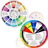
- Package include: 2 creative color wheel, 5.5 inch in diameter, the artist wheel helps show which colors are complimentary, and how they go (or don't go) together, suitable for learning how to color; Two identical color wheels, with different designs on the front and back
- Color mixing guide: the color wheel shows color, from basic principles and color mixing results on the front side; Spin around the paint wheel, then you will find the color mixture results in the windows, to learn the color theory in a fun way
- Color leaning tool: the backside of the color artist wheel that visually illustrates relationships between colors and demonstrates the results features a grayscale, and triad colors tints and tones, definitions of color terms, and illustrations of color, such as complementary colors, and triad colors
- Easy to use: this color mix guide consists of 3 layers, made of reliable cardboard with smooth surface and smooth rotation; And the size is moderate, easy to operate and carry
- Wide application: the relationship wheel is suitable to use when painting, quilting, interior design, having creative craft projects, and home decorating; Suitable for artists, teachers, kids, painters, designers, and tattoo learners
14. Coral
Coral brings analogous, warm energy to red while its softened orange-pink quality prevents the pairing from feeling too severe. Let one hue lead and use the other selectively.
15. Orange
Orange and red form an expressive neighboring-hue combination for graphics, fashion and accent pieces. Muting or lightening one color keeps the warmth from becoming overwhelming.
16. Mustard yellow
Mustard gives red a vintage-leaning contrast. Cream or brown can settle the palette when the two warm colors together feel too bright.
17. Lavender
Lavender introduces a playful contemporary counterpoint through the red-violet and blue-violet side of the wheel. It is effective when the red is concentrated in a small area.
18. Plum
Plum creates rich neighboring depth for textiles, dining rooms and evening outfits. Its darkness lets a brighter red act as an intentional highlight.
19. Tan or camel
Tan and camel are earthy neutrals that let red remain the focal point. Use them for coats, leather, rugs, walls or furniture when you want warmth without another saturated hue.
Rank #4

- Comprehensive Color Theory Guide: This color wheel clearly organizes hues, tints, shades, and tones in a visually intuitive layout, making it easy to understand color relationships and harmonies. It includes essential color theory terms and definitions, helping users expand their knowledge while providing a practical reference for creating balanced and appealing color schemes in various projects. Tips: Instructions printed on the exterior of the product
- Enhanced Learning and Creativity Support: Designed with a detailed English-language interface, the wheel effectively illustrates color mixing results and interactions. It supports both intuitive and technical color selection, allowing artists to quickly identify complementary, split-complementary, and analogous colors. This tool helps reduce guesswork and improves accuracy in color matching
- Durable and User-Oriented Design: Made from lightweight yet durable paper material, the color wheel is resistant to frequent use and easy to clean. Its compact and portable design offers convenience for artists and instructors on the go. The clear markings and smooth spinning mechanism ensure effortless operation during creative sessions
- Suitable for Multiple Disciplines and Users: Ideal for painters, quilters, makeup artists, art students, and teachers, this color wheel is a versatile tool across various fields. It supports activities such as watercolor painting, fabric dyeing, cosmetic blending, and classroom instruction, making it an essential accessory for anyone working with color
- Package Contents and Size Details: Both wheels are designed with the same accurate color layout and sturdy construction, offering flexibility for different working environments and user preferences
20. Chocolate brown
Chocolate brown grounds brick, rust and oxblood reds especially well. The result is warm and substantial, with less visual shock than a black-and-red scheme.
21. Pale blue
Pale blue gives red a light, high-versus-low temperature contrast that is gentler than navy. A muted red keeps this pairing calm in bedrooms, nurseries and relaxed clothing.
How to choose the right red palette
Check temperature
Warm reds lean toward orange; cool reds lean toward blue or violet. Warm companions such as cream, camel, olive and chocolate usually reinforce an orange-leaning red. Navy, teal, pale blue and lavender can balance or emphasize a cooler red.
Check value
Value means lightness or darkness. A dark red beside a dark companion can lose definition, while a bright red beside pure white can look exceptionally sharp. Add a lighter neutral when two deep colors need breathing room.
Check saturation
Two vivid colors compete for attention. If the red must stand out, mute the supporting color with gray, brown or white. Conversely, a restrained red can carry a stronger cobalt, teal or mustard accent.
Set proportions
Start with the red object or surface that must remain visible. Choose one supporting color, then reserve a third color or neutral for small accents. A dominant red does not need equal quantities of every other hue.
The Tool Desk
Outbyte PC Repair FREEClear out junk files and repair common Windows errorsFree Scan →Outbyte Driver Updater FREEScan for outdated or missing drivers - takes under a minuteDriver Scan →Best Value

- Master Color Theory Visually - This dual-sided artist color wheel makes understanding color theory effortless. The front is a dynamic spinning color wheel for instant color mixing results, while the back explains advanced relationships like complementary colors, serving as your ultimate color harmony wheel and artist mixing guide.
- Interactive Dual-Sided Learning - Simply spin the interactive color wheel to see color combinations come to life in the window. Flip it over to discover sophisticated color combinations and triad schemes, providing endless inspiration for your paintings, designs, and creative projects.
- Complete Set for Every Need (3 Sizes) - Get unmatched value with three durable color wheels in large and pocket color wheel sizes. This versatile set is perfect for the studio, classroom, or on-the-go, ensuring you always have the right paint mixing guide or color matching wheel at hand.
- Professional-Grade & Built to Last - Crafted from high-gloss, coated paper, our professional color wheel features a smooth 360-degree rotation that won't catch or tear. The laminated surface resists water and paint stains, making it a durable blending guide for everyday use.
- Your Universal Creative Companion - More than a paint color wheel, it's an essential tool for artists, makeup artists, tattoo designers, interior decorators, and teachers. This color wheel art teaching tool simplifies color theory for beginners and provides a quick reference for professionals in any field.
Apply the combinations to rooms, clothing and accents
For a red couch
Use cream, charcoal, camel, sage or pale blue on surrounding walls, rugs and curtains. Add black, navy or forest green in smaller doses if you want more contrast.
For red walls
Balance the large red area with warm cream, tan, charcoal or muted sage. Keep furniture and trim simpler so the wall remains intentional rather than competing with several saturated colors.
For red clothing
Denim, navy, camel, charcoal, white and chocolate brown are dependable supporting choices. Cobalt, teal, lavender and mustard create a stronger fashion statement; use one as the clear accent.
For red accents
A red lamp, cushion, door or artwork can tolerate bolder neighbors because its area is limited. Teal, forest green, cobalt, orange and black all work when the surrounding field is comparatively quiet.
Windows Errors? Fix Them Before They Spread
Repair common Windows errors and clear accumulated junk for a smoother, more stable PC - no reinstall needed.Free scan · no reinstallCrashes, No Sound, or Screen Glitches?
Random freezes, missing sound and display glitches usually trace back to one bad driver. Find and replace yours safely.Free scan · under a minuteTest before you commit
- Confirm the relationship. Use a physical artist color wheel to see whether the proposed match is complementary, analogous, triadic or simply a practical neutral pairing.
- Sample the exact materials. Compare paint cards, sample pots, peel-and-stick swatches, fabric or digital color chips rather than relying on color names alone.
- View the samples in place. Daylight and artificial light can change how red reads. Check the combination at more than one time of day and beside the materials that will remain in the space.
- Adjust proportion. If the pairing feels loud, reduce the saturated color, increase the neutral area or shift one shade lighter, darker or grayer.
- Save alternatives digitally. Adobe Color and Canva’s Color Wheel can help you explore and save variations before buying paint or fabric.
A practical starting formula
For most rooms or outfits, use the red as the focal color, one supporting hue for structure, and a neutral for separation. Red with cream or camel is the gentlest route; red with charcoal or navy is balanced and modern; red with teal, cobalt, forest green or orange is more expressive. The exact winner is the version whose temperature, value, saturation and proportion suit your light, materials and intended mood.
Quick Recap

Product prices and availability are accurate as of the date/time indicated and are subject to change. Any price and availability information displayed on Amazon at the time of purchase will apply.




