The Tool Desk
Outbyte PC Repair FREERepair Windows errors before they cause bigger problemsFix Now →Outbyte Driver Updater FREEScan for outdated or missing drivers - takes under a minuteDriver Scan →
ThatPainter is reader-supported. When you buy through links on our site, we may earn an affiliate commission. Learn More
Some unusual color names describe a pigment or dye; others refer to a place, a material, or simply a shade. Here are eleven intriguing names featured in a 2019 Interesting Engineering article, with a distinction between what the name suggests and what is firmly established about its history. They are curiosities, not a standardized catalog of rare colors.
Why unusual color names can mean more than a shade
In painting, a color name may identify a material as well as its appearance. Pigments differ in composition, history, permanence, compatibility, and handling, as the National Gallery of Art’s Artists’ Pigments handbook explains. Other names are descriptive labels or words borrowed from places, plants, and objects. The eleven names below do not all belong to the same category.
Eleven rare and interesting color names
1. Synthetic ultramarine
Ultramarine is associated with the deep blue of the mineral lazurite, but “synthetic ultramarine” means a manufactured pigment rather than naturally occurring mineral material. The 2019 article contrasts the two, though the specific timeline it gives for the synthetic version is not independently established by the sources available here. For painters, the key distinction is material origin—not a guarantee of one exact blue swatch.
Free tools Windows power users keep installed
One-click scans. No signup required.
2. Australien
The 2019 article describes Australien as a rusty, outback-inspired color and says the name appeared in the 1897 guide House Decoration, later finding use in Victorian fashion. That first-use story has not been independently verified, so the date and fashion connection are best treated as the article’s account rather than settled color history.
#1 Best Overall
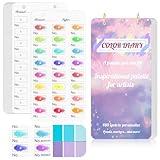
- 【Note】Compatible with different types of pens. Multiple layers using water-based pens may result in minor surface pilling.
- 【Durable & Practical Design】This color diary features a premium 300 gsm white card cover with a purple watercolor design and a matching solid purple back cover. The color swatch notebook measures 3.5×7 inches, with two top pre-punched holes and 1-inch gold metal rings for easy page turning, secure storage, and long-lasting use.
- 【Organize Up to 480 Colors】Each color chart template includes 20 single-sided pages, with 24 swatch boxes per page and space for self-assigned numbering, allowing you to record and display up to 480 unique colors. Perfect as a color chart book or color swatches book, it helps artists keep paint samples, mixing notes, and palettes in order. Each swatch box also includes space to note the color brand and type, ensuring every hue is easy to find, classify, and reference.
- 【Premium 300 GSM Paper】Crafted with thick 300g card stock, this swatch card resists bleed-through and warping. Ideal for watercolor, gouache, colored pencils, markers, or pastels, making it a versatile tool for students and professionals. Each outline provides a smooth surface for accurate pigment testing.
- 【Portable & Flexible Use】Compact and easy to carry, this colors swatch book doubles as a creative color swatch charts logbook wherever inspiration strikes. The removable pages make it convenient to expand or rearrange, turning your color chart card collection into a personalized swatch reference for painting, design, or travel.
3. Drunk tank pink
Also called Baker-Miller pink, this name is associated in the 2019 article with pink used in holding cells. The article also links the color to calming effects, but the evidence available here does not establish that pink reliably calms people. The name is more secure as a popular label than as a general behavioral claim.
4. Lusty gallant
The 2019 article describes lusty gallant as a pale, coral-like red. It offers possible links to a Tudor-era dance or to dressmakers, but neither etymology is verified by the sources available here. The name is memorable; its exact origin remains uncertain.
Rank #2
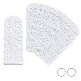
- Blank Color Swatch--You will receive 60 sheet blank sheets (dimensions: 16x5.5cmx0.3mm/6.3x2.17 inchx0.3mm), enabling creation of up to 720 unique color swatches. This meets the core needs of color enthusiasts and artists for recording multiple color references and exploring color mixing, providing ample capacity for daily creative work
- Paper Material--Crafted from paper with a smooth, refined surface, it applies only to acrylic marker tools. Single-sided thickened design eliminates the pain point of pigment bleeding through to the reverse side at its source. Colors apply smoothly without bleeding, and deliver clear, consistent color results
- Pre-punched Design--Pre-punched floral center holes allow direct coloring within petal areas, serving as both precise color markers and elegant decorative elements. The hole design also facilitates quick color comparison and matching, enhancing color accuracy and doubling creative efficiency
- Loose-leaf Storage--Includes 2pcs binding rings. Pre-punched design allows easy assembly into a loose-leaf color swatch book. Organize freely by markers series or shade intensity, for efficient searching, browsing, and adding swatches—say goodbye to messy color charts
- Multi-Scene Adaptability--Designed for color enthusiasts, professional artists, and crafters, it serves as a versatile tool for recording color chart, preserving color schemes, and referencing palette combinations for acrylic markers
5. Puke
In the 2019 list, puke is a dark brown. The article suggests a possible connection to “puke-stocking” in Shakespeare’s Henry IV, Part 1, but that derivation is not confirmed by the institutional sources available here. It is safer to treat “puke” as an old color label reported by the article, not a securely explained historical term.
6. Smaragdine
Smaragdine means emerald-like green in the 2019 article’s account. The same article calls it a Pantone Color of the Year in 2013, but that attribution is not confirmed here and should not be repeated as fact. The name’s association with emerald green is the useful point; a formal Pantone designation is not established.
Rank #3

- Compact and Portable Design: Suitable size, these cards can accommodate 54 reference colors for each season while being convenient for handheld use. Each card has perforations and come with a bead chains, making it easy to put in a pocket or hang on a keychain
- Seasonal Color Theory Based: These cards are designed based on seasonal color theory, aiming to help you choose the most pleasing color tone for your wardrobe.Each card contains the popular main colors of each season
- Easy Color Matching: Take an original photo of your face under natural light, and then place a color chart on the photo. By comparing various colors, it is easy to find the color that suits you best, making your fashion choices more personalized and flattering
- Fun and Engaging Experience: Share this process with friends and get their opinions to confirm the best color choices. This interactive approach makes the experience fun and engaging, turning color selection into a social activity
- Annual Updates: A set of 6 cards, including 12 major seasonal colors, is updated annually to reflect the latest trendy colors. Stay ahead of the fashion curve and ensure your wardrobe always looks fresh and stylish
7. Falu
Falu is presented as a red connected with Falun, Sweden, and the red paint traditionally associated with rural barns. The place-linked explanation is plausible and appears in the 2019 article, but an authoritative Swedish or historical source was not available here to verify the details. It should not be confused with a single standardized paint formula or color value.
8. Mummy brown
The 2019 article describes mummy brown as a pigment made from resinous material on Egyptian mummy wrappings and says it was used in the eighteenth and nineteenth centuries. The National Gallery of Art handbook supplies broad context on artists’ pigments, but the specific account and dates are not independently confirmed by the sources available here. The name should be approached as a reported historical pigment story, not a reason to assume widespread use or a uniform recipe.
Rank #4

- 【40 Blank Watercolor Swatch Cards — Refill for Your Binder】40 blank-format watercolor swatch cards (7" x 3.5" each) with boxes and center-cut holes for precise color matching. Fits any standard 6-ring A6 color swatch binder.
- 【Premium 300gsm Watercolor Paper】Thick 300gsm double-sided paper (single-side printing) handles watercolor, gouache, acrylic inks, and colored pencils—no bleeding or buckling.
- 【6-Hole Punched for Easy Rearrangement】Pre-punched with 6 holes, compatible with A6 6-ring binders. Easily reorder pages by brand, palette, or project in your color diary.
- 【Box-with-Center-Hole Layout for Quick Matching】Place paint samples directly over the center-cut holes for instant color matching. Build a clean, consistent color chart card library.
- 【Versatile Refill for All Artists】Perfect for beginners or pros. Use in studio, classroom, or plein-air. Expand your painters color diary swatch card collection anytime.
9. Dragon’s blood
Dragon’s blood is described in the 2019 article as a red resin obtained from a rattan palm. The article does not identify a botanical species, so the name should not be taken to refer to an animal or to one precisely specified plant source. It is a resin-based colorant, not simply a standardized red pigment name.
10. Wenge
Wenge is a dark brown name associated in the 2019 article with the wood of Millettia laurentii, and it is described there with coppery undertones. No forestry or conservation source available here verifies the article’s endangered-status claim. As a color description, “wenge” does not specify a standardized value; the word also names a material.
Best Value

- Notice: This color card is compatible with various types of pens. Multiple layers of water-based pen coloring may cause slight surface pilling. Thank you for your understanding.
- 1.Portable Size:With 7.48x3.54 inch size, this painters color diary is lightweight and easy to carry in bags, handbags and art storage bags for outdoor painting, studio creation. The loose-leaf design of color swatches color analysis combines pink cover, the comprehensive practical performance of color palette book makes the color card set become an essential professional tool for all kinds of color research.
- 2.300-Color Classification:This painters color diary allows users to store 15 color swatches on each single page, and the complete 20 sheets inner page design supports holding up to 300 colors in total for unified color management. Every inner page of the color palette grid comes with pre-punched 3mm holes, which greatly assists you in accurate color comparison, color matching and visual color analysis work.
- 3.Loose-leaf Design:Color palette book is equipped with 2 pieces of 0.98 inch inner diameter round golden metal loose-leaf rings, and these metal rings own sturdy structure and smooth opening and closing function. The loose-leaf rings can stably fix the inner pages together, realizes flexible repeated use for long-term color recording.
- 4.High-Quality Material:Our color chart cards are made of premium thick paper with durable texture. This high-quality paper material resists ink seepage and bending deformation perfectly in daily use, keeping every color display neat and clear without messy marks.
11. Coquelicot
Coquelicot is linked in the 2019 article to the poppy and described as a vivid poppy-like red. The article gives 1795 as the first recorded use of the color name, but that precise date is not independently confirmed here. Its appeal lies in the botanical association and distinctive French-derived name, not a verified first-use date.
Independent reader supportYour contribution helps us test, update, and keep practical guides available for everyone.How these names compare with documented pigment histories
Color history becomes clearer when a name is tied to a defined substance and documented process. Egyptian blue, for example, is a synthetic copper-calcium silicate pigment. The Smithsonian’s National Museum of Asian Art describes it as one of the earliest man-made pigments, produced by combining silica, calcium, and copper sources and applying heat. Ancient blues and purples also represent different materials, not interchangeable names: a 2007 review distinguishes Egyptian blue, Han blue, Han purple, and Maya blue by their chemical compositions.
Tyrian purple offers another contrast. The University of Chicago Library describes it as an expensive historical dye made from mollusk secretions and associated with elite and Roman imperial use. The National Gallery, London notes that William Perkin discovered a synthetic alternative in 1856. These examples show why it matters whether a color name points to a mineral, a manufactured pigment, an extracted dye, or only a descriptive shade.
Modern materials science continues to produce new colorants. Oregon State University says YInMn blue was discovered in 2009 during research; it is an oxide containing yttrium, indium, and manganese, with properties including thermal stability and near-infrared reflectivity. It is not one of the eleven names above, but it illustrates the difference between a material-defined color discovery and a colorful historical label.
Quick Recap

Product prices and availability are accurate as of the date/time indicated and are subject to change. Any price and availability information displayed on Amazon at the time of purchase will apply.




