Do these 3 things before closing this tab:
1Scan for outdated or missing drivers - takes under a minute2Repair Windows errors before they cause bigger problems3Fix the driver behind crashes, sound loss and screen glitches
ThatPainter is reader-supported. When you buy through links on our site, we may earn an affiliate commission. Learn More
For 2027, paint brands and designers are pointing to nature-linked greens, softened blues, warm earth tones, nuanced pinks and mauves, and deep plum. The more important shift may be how color is used: layered tonal palettes and room-wide color treatments are gaining attention. These are forecasts and designer observations—not proof that any one shade will dominate homes.
What color trends are emerging for 2027?
The clearest common thread is a move toward colors with more nuance than a plain, one-note neutral. Greens appear in several brand forecasts, while designers also anticipate warm browns, earthy pinks, muted mauves, mustard, and deep plum. The selections vary by source, so treat them as directions to consider rather than a universal top-ten ranking.

1. Soft yellow-green
Sherwin-Williams and HGTV Home by Sherwin-Williams selected Celery as their shared 2027 Color of the Year. The companies describe it as a soft, muted yellow-green with a calm, light presence. The paint codes are Celery SW 6421 and Celery HGSW6421, respectively. The official announcement lists White Flour, Potentially Purple, Cosmos, Georgian Bay, Artichoke, Cocoon, Woven Wicker, Kirsch Red, and Plum Brown as complementary colors. See the official Celery announcement and availability details.
Quick wins for a faster PC:
Repair Windows errors before they cause bigger problemsFix Now →Scan for outdated or missing drivers - takes under a minuteDriver Scan →Sherwin-Williams color marketing manager Ashley Banbury said Celery was chosen because it reflects “wellness, balance and connection.” That explains the company’s selection; it is not independent evidence of consumer preferences.
#1 Best Overall
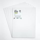
- PERFECT SAMPLES: These 12" x 9" white, styrene panels provide a smooth, warp-free surface for testing up to 5 color samples with paint, stain or other coatings.
- DURABLE MATERIAL: Made of sturdy styrene, these panels can withstand multiple coats and are non-absorbent so colors will stay true.
- CONVENIENT SIZING: At 12" x 9", the panels are just the right size for testing many common paint colors side by side before committing to a full project.
- PACKAGE INCLUDES: This value pack contains 5 white panels, enough for testing several color options on one purchase.
- VERY FLEXIBLE: Mighty Boards do not warp like foam core and you can bend them without breaking.
2. Sage green
Dulux named Soulful Sage its 2027 Colour of the Year, according to Woman & Home’s September 8, 2026 report. Dulux Creative Director and Colour Expert Marianne Shillingford connected green with nature, new growth, and the feeling of breathing outdoors. Soulful Sage and Celery are both greens, but they are separate brand selections; neither announcement establishes that one exact green will be the year’s dominant shade.
3. Pale greens as a neutral alternative
Beyond specific Color of the Year picks, pale shades such as sage and mint are being described as alternatives to white and other simple neutrals. They can bring color into a room without the visual weight of a dark or highly saturated shade. Homes & Gardens’ 2027 interiors feature discusses this quieter use of green.
4. Warm, softened brown
Little Greene’s Marle (335) was among the brand picks reported by ELLE Decor on October 1, 2026. The roundup describes it as a softened warm brown. Brown also fits the broader interest in earth-derived color: it can read as grounding and warm without requiring a bright accent hue.
Windows Errors? Fix Them Before They Spread
Repair common Windows errors and clear accumulated junk for a smoother, more stable PC - no reinstall needed.Free scan · no reinstallCrashes, No Sound, or Screen Glitches?
Random freezes, missing sound and display glitches usually trace back to one bad driver. Find and replace yours safely.Free scan · under a minute5. Earthy pink and mineral pink
Graham & Brown’s Rose Earth, also in ELLE Decor’s October 2026 roundup, is a muted mineral pink. Designers cited by Homes & Gardens also expect earthy pinks, dusty pinks, and muted mauves. These descriptions point to toned-down, complex pinks rather than a single vivid pink trend.
Rank #3

- PAINT + PRIMER: KILZ TRIBUTE is a low VOC, 100% acrylic advanced technology paint and primer in one formulated for superior hide and coverage with exceptional durability. Paint and primer covers light-medium stains and light-dark color changes.
- ADVANCED FORMULA: This is our most technologically-advanced acrylic product which combines paint and primer properties with exceptional stainblocking performances. This remarkable formula can be scrubbed clean safely. GREENGUARD Certified: low emissions of VOCs
- MULTIPLE SURFACES: KILZ interior paint makes a great wall paint or cabinet paint for many home improvement needs. Use on properly prepared coated or uncoated wood, drywall, masonry and cured plaster. Surfaces should be clean and free of dust, grease, chalk, rust and peeling paint. Mix well before using.
- SUPERIOR COVERAGE: KILZ TRIBUTE interior satin paint and primer covers up to 400 sq. ft. per gallon depending on surface texture, porostiy, and application method. If desired, recoat after 2 hours. We offer an 8 oz sample size for color choosing convenience. Use with high-quality brushes or paint rollers.
- KILZ has been making premium primers and paints for 40 years and leverage this experience in every gallon of KILZ Paint. Named Paint Brand of the Year in 2015 in the Harris Poll EquiTrend Rankings. Lifetime Limited Warranty (see label for details).
6. Muted mauve and dusty pink
Michelle Murphy of Demi Ryan Interiors told Homes & Gardens she expects colors with depth and complexity, including muted mauves and dusty pinks. Her comments are one designer’s forecast, not an industry-wide survey. A muted mauve may suit a room where a bright pink would feel too sharp, while still adding more color than a neutral wall.
7. Warm mustard
Designer Elizabeth Burch described the mustard direction as warmer and muddier, with the potential to work almost like a neutral, in Homes & Gardens’ trend reporting. It is a more assertive choice than sage or softened blue, but a subdued mustard can pair naturally with browns and other earth-derived shades.
Rank #4
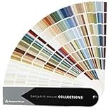
- Brand: Benjamin moore
- Container type: Box
- Finish type: Opa
8. Deep plum and aubergine
John Maloney McNamara of Coosa described a particularly deep, near-black plum-purple direction to Homes & Gardens. Plum and aubergine offer more drama than pale green or a softened blue; they are better understood as a strong design choice than as a broadly neutral wall color.
9. Softened and smoky blues
Several 2027 brand picks fall in the blue family, though they differ in character. ELLE Decor’s October 1 roundup listed Clark+Kensington’s Vantage Point (38B-4), a softened midtone blue; Glidden’s Artifact (PPG10-16), a warm smoky blue; and Valspar’s Cottage Door (8004-38E), a reflective midtone neutral blue. These are separate brand forecasts, not three names for the same shade.
Best Value

- Core Color Matching: Paint color sample cards include 83 standard colors to support paint color sample cards, color matching cards for painting, and paint chips standard samples, helping users compare shades before selecting a final finish for floor paint, hardware, and other project needs
- Reliable Reference: Paint samples are made with color matching materials designed to support accurate color comparison, giving painters and DIY users a practical paint and paint color samples reference for selecting tones that fit the project surface and intended look
- Portable Format: Measuring 3.74 x 1.57 x 1.18 in and weighing 3.88 oz, this paint samples set is compact for a toolbox, work bag, or travel use, making it easier to carry color test card paint and check shades on site when planning paint work
- Wide Project Use: Paint sample cards are suitable for floor paint, paint hardware, and related color selection tasks, offering a useful paint chips samples reference for contractors, decorators, and home improvement users working on color coordination across different surfaces
- Simple Set Package: Each package includes 1 set of paint sample cards, giving users a straightforward paint sample standard cards option for daily work, project planning, and quick shade comparison when choosing among paint color cards and paint chips sample cards
10. Burnished orange and olive
The same ELLE Decor roundup listed Dutch Boy’s Deep Rooted (311-7DB), described as a burnished earth-toned orange, and Behr’s Grounded (T27-01), a brown-leaning olive green. Together with the other picks in that roundup, they show how brand forecasts cover a wide range of earth-influenced colors rather than converging on one palette. The roundup was a snapshot as of October 1, 2026, and said additional announcements were expected.
Independent reader supportYour contribution helps us test, update, and keep practical guides available for everyone.Color is also changing in how it is applied
A trend can be a method as much as a hue. Homes & Gardens’ 2027 interiors feature describes three approaches that can make a room feel more deliberately colored:
- Layered tonal schemes: combine related shades so the room has variation without relying on one flat color.
- Hue-drenching: use several shades of one color across a room for a more enveloping effect.
- Color capping: create a painted gradient effect, moving between tones rather than stopping at a single uniform block of color.
Sherwin-Williams’ 2027 Colormix forecast, Rewild, also frames color as something to interpret rather than follow prescriptively. Announced July 30, 2026, it includes 48 handpicked hues organized into three stories—Revive, Reignite, and Reconnect—plus ten Continuity Colors. The company describes Revive through heritage and timeworn details, Reignite through expressive color and contrast, and Reconnect through links to nature. These are the paint company’s forecast themes, not measured findings about household choices. Read Sherwin-Williams’ Rewild announcement.
How to choose a 2027-inspired paint color for your home
Start with the room and the commitment you are willing to make, not just a trend name. The same family can look very different depending on warmth, depth, the surrounding finishes, and the light in your space.
- Choose a color family. Decide whether you are drawn to green, blue, pink or mauve, brown and earth tones, mustard, or plum.
- Compare undertone and warmth. For example, Sherwin-Williams describes Celery as yellow-green, while the brand picks also include smoky and neutral-leaning blues. Look at neighboring colors and finishes before deciding which direction fits your room.
- Decide how much visual weight you want. A pale green or softened blue may be easier to use broadly; deep plum, mustard, and a saturated tonal treatment make a stronger commitment.
- Match the application to the color. Consider whether you want a small accent, a wall, cabinetry or trim, or a room-wide tonal scheme. A color that feels right on a small sample may feel more prominent across a large surface.
- View physical chips or samples in the room. Check them in the space where they will be used and under its actual lighting before buying paint in quantity. Sherwin-Williams says color chips are available through its channels; its announcement states the HGTV Home paint line can be tinted to Celery and is sold through Lowe’s in the United States. Availability may vary by retailer and location.
What these forecasts do—and do not—tell you
Paint brands’ Color of the Year choices are useful for seeing which shades those companies are promoting, and designer commentary helps explain how particular colors might be used. Neither is the same as an independent measure of what most households will paint. The sources cited here do not establish a universal top ten or provide an adoption statistic showing which colors will dominate interiors in 2027.
Quick Recap

Product prices and availability are accurate as of the date/time indicated and are subject to change. Any price and availability information displayed on Amazon at the time of purchase will apply.




