Crashes, No Sound, or Screen Glitches?
Random freezes, missing sound and display glitches usually trace back to one bad driver. Find and replace yours safely.Free scan · under a minute
PC Slower Than It Used to Be?
A free scan shows the junk files, broken settings and background clutter dragging Windows down - then fixes them in one click.Free scan · Windows 10 & 11
ThatPainter is reader-supported. When you buy through links on our site, we may earn an affiliate commission. Learn More
You can design a clear, effective poster without prior design experience. Start by deciding what the viewer should take away, then choose a size and layout for where the poster will be seen. Build a simple reading order, use type and imagery that support the main message, and check the exported file against your printer’s specifications before ordering.
1. Decide what the poster needs to do
Before opening a design app, write the poster’s message in one sentence. Decide what someone should know, feel, or do after seeing it. That sentence is your filter: if an element does not help communicate the message or provide necessary information, leave it out.
Free tools Windows power users keep installed
One-click scans. No signup required.
Adobe’s beginner’s guide to poster design recommends defining the goal before choosing a tool or arranging elements. A strong poster makes one idea easy to grasp; supporting details should clarify it, not compete with it.
2. Choose the format and viewing context
Decide whether you are making a printed poster or a digital graphic, where it will appear, and how far away people are likely to view it. Set the working dimensions before you lay out text and images, because a poster meant for a wall has different proportions and detail needs from a graphic viewed on a phone.
#1 Best Overall

- [HIGH QUALITY]: Our white cardstock 8.5 x 11 is made from heavyweight 85 lb (230 GSM) offset paper with a smooth matte finish, and even ink absorption and measures 11 inches x 8.5 inches, Cardstock paper is perfect for writing, drawing, doodling and creating fun and unique covers.
- [Excellent design]: This 8.5 x 11 white cardstock has an Double sided matte design, with a smooth feel and smooth pen strokes, suitable for a wide range of pens (markers, pens, pencils, crayons, etc.). The card is perfect for creating eye-catching posters and making your artwork shine.
- [Production & Printing] 11 x 8.5 Cardstock Ideal for book covers, body copy, inserts, illustrations, maps, posters, colorful packaging, and more. Both the front and back of the card stock for a printer can be printed on multifunction printers and photocopiers, but please refer to your printer manual before ordering to ensure the printer can handle 85 lb (230 GSM) cover paper.
- [MULTIFUNCTIONAL APPLICATIONS] Cardstock paper is thick and strong, rendering it ideal for personal use, office and school supplies, art projects, business communications, posters, printed documents, and more. The cardstock paper holds ink well and delivers rich, vibrant colors and sharp images with perfect results. Unleash your creativity by cutting, folding, and gluing to your favorite size or shape. Card stock paper can be used to create brochures, menus, photo mats, and more.
- [Package] You will receive 30 sheets of white cardstock 8.5 X 11 to ensure you have enough paper for multiple projects.
Adobe gives 11×17, 18×24, and 24×36 inches as common print examples, as well as 8.5×11 inches for a small poster or flyer. These are examples rather than universal standards; choose a size that suits the placement and the printer’s available options. For online sharing, use dimensions suited to the platform and expect to adjust the layout rather than simply shrinking the print design. A phone-sized preview can make fine print and small details hard to read. Adobe discusses both print and social formats in its poster layout guide.
3. Sketch the layout before designing
Make a quick rough sketch on paper. Mark where the headline, main image, supporting information, and call to action might go. The sketch does not need to be neat; it is a way to test the composition before spending time refining it in software. Canva recommends this planning step in its step-by-step guide to designing from scratch. Scrap paper is enough; a sketchbook is optional.
4. Set a clear visual hierarchy
Give the viewer a path through the poster: first the hook, usually a headline or dominant image; next the context; then the supporting details. Make the headline clearly dominant, and resist the temptation to make every item large, bold, or brightly colored. Adobe describes this kind of three-level reading order in its poster design guide, and Canva’s poster lesson also covers structuring information with hierarchy.
Rank #2

- Photo Paper Package: 36 sheets of glossy photo paper, 8.5×11 inch, industry standard 180gsm/48lb, single-sided printing and blank back side for recording or writing something; compatible with inkjet printers and dye ink
- Glossy Finish: our glossy photo paper features its a reflective finish, that adds a professional and attractive touch and makes every picture look like a work of art; the printed photos and graphics are so outstanding
- Leave Vivid Colors: thanks to the good ink absorption of the picture paper, the printed photos come out vibrant colors and sharp details that truly come to life; remain beautiful landscapes and impressive moments forever
- Instant Dry: due to the advanced super cast coating, the ink on prints dry quickly without smearing and jamming; plus, the prints retain their vibrant color over time; makes your memories and designs shine in their full glory
- Wide Application: perfect for printing photos to record important and sweet moments, and also ideal for printing detailed graphics, various greeting cards, posters, chip bags, flyers, brochures, calendars, baby book
As you arrange elements, leave enough open space around important text and images. Canva graphic designer Lynneal Santos advises checking whether elements feel balanced, centered where appropriate, and too close to neighboring elements or the page edge; her practical summary is, “Keep it simple.” See Canva’s guide to designing from scratch.
5. Choose imagery that supports the message
Use an image when it helps explain or reinforce the subject. One focal visual is often easier to scan than several competing images, and a type-led poster can work without a picture. Avoid placing detailed imagery behind text if it makes the words difficult to read.
If you use a photograph, begin with the full-resolution original rather than a small image copied from a screen. The resolution needed depends on the final size and the printer’s requirements; Adobe recommends checking those details with the printer in its poster creation tutorial.
What’s actually slowing this PC down?
Pick the symptom - the matching free tool is one click away.
Rank #3

- Premium Medium Weight Smooth Cardstock, White, 80lb, 176gsm, 8.5” x 11” – Ideal for Invitations, Menus, Business Cards - Printer Paper
- Cranium Press offers thick, white card stock paper with a high bright-white shade and smooth finish. This premium medium cardstock paper ensures excellent printability, proper ink holdout, and minimal show-through, resulting in vibrant prints.
- Our medium weight cardstock paper presents a thick, white option boasting a high bright-white shade and a smooth finish. This premium cardstock paper guarantees outstanding printability, effective ink holdout, and minimal show-through, ensuring vibrant prints.
- Perfect for printing at home, school, or the office, this premium cardstock printer paper enhances colors, making them bolder, brighter, and more realistic. Additionally, it offers superior strength, making it ideal for die-cutting, scoring, and folding tasks.
- Derived from sustainable sources, our papers are entirely made in the USA and hold Forest Stewardship Council (FSC) certification. Purchasing our cardstock paper contributes to forest replenishment efforts and sustains forestry jobs for American landowners, fostering environmental and economic sustainability.
6. Refine typography, color, and spacing
Keep typefaces under control
Use type size, weight, color, and position to reinforce the reading order. Canva recommends using no more than two fonts in a design, pairing a more decorative face with a simpler one; Adobe gives similar advice for most posters. A restrained pairing makes it easier to distinguish the headline from supporting text without creating visual noise. See Canva’s poster guide and Adobe’s beginner’s guide.
Check contrast and margins
Make sure text contrasts clearly with its background. Keep important content away from the page edges, and leave breathing room around it. Small details that seem readable on a monitor may disappear at the poster’s actual viewing distance, so prioritize the information people need to notice first.
Use color with the output in mind
Choose a palette that suits the subject and keeps the message legible. Do not assume the color on your screen will look identical in print: Canva’s print setup guide notes that converting RGB artwork to CMYK can shift colors. The printer’s specifications should guide the final file setup.
Rank #4

- 1 ream (500 sheets) of 8.5 x 11 white copier and printer paper for home or office use
- Multipurpose letter size copy paper works with laser/inkjet printers, copiers and fax machines
- Smooth 20lb weight paper for consistent ink and toner distribution; dries quickly and resists paper jams
- Bright white paper (92 GE; 104 Euro) offers great contrast for crisp printing and vivid color
- Virgin copy paper providing professional quality results; acid-free to prevent yellowing
7. Prepare and check the file before printing
Set the document to the intended finished size and check the selected printer’s requirements for resolution, bleed, color mode, and file format. These specifications can vary, so do not rely on one export recipe for every print job. Adobe advises consulting the printer about poster dimensions and resolution in its poster tutorial.
Canva’s print setup guide gives practical starting points: extend background artwork 3 mm beyond the finished edge for bleed, use PDF Print, and include crop marks and bleed when needed. It describes 300 DPI as ideal for high-quality print. Treat these as general preparation guidance, not a substitute for the printer’s own instructions.
Keep an editable working file as well as the file you send or share. For example, Adobe’s Photoshop tutorial distinguishes a layered project file from exported poster files.
Best Value
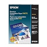
- Perfect for non-glare photographs, craft projects and signage.
- Resists fading up to 72 years.
- Guaranteed to work with all inkjet printers.
- Pack of 50 Sheets
8. Review the design at its intended size
Before committing to a print run, make a test print at actual size if practical. Check the type, image detail, color, margins, and whether the main message is clear from the distance at which people will see the poster. A screen preview can hide problems that become obvious on paper, including unexpectedly small text or colors that print differently.
Choose a design workflow that fits your project
A template-led online editor can help you get started quickly, and may also let you build a design from scratch. An image-editing application can offer more control over layers and image treatment. Neither approach is best for every beginner: choose based on how much layout control you want, whether you need particular image adjustments, and whether the tool can create the dimensions and export file your printer requires. Canva’s poster lesson and Adobe’s Photoshop tutorial illustrate different ways to work.
Quick Recap

Product prices and availability are accurate as of the date/time indicated and are subject to change. Any price and availability information displayed on Amazon at the time of purchase will apply.




