What’s actually slowing this PC down?
Pick the symptom - the matching free tool is one click away.
ThatPainter is reader-supported. When you buy through links on our site, we may earn an affiliate commission. Learn More
As an Amazon Associate I earn from qualifying purchases.
Colour and texture can make a bathroom feel deliberate rather than merely functional. You can change the room with paint, tile, grout, lighting-aware finishes, or replaceable towels and rugs; a full renovation is not required. The most reliable approach is to decide where colour should be permanent, where texture should provide interest, and which surfaces must meet wet-area and flooring requirements.
The Tool Desk
Outbyte PC Repair FREERepair Windows errors before they cause bigger problemsFix Now →Outbyte Driver Updater FREEScan for outdated or missing drivers - takes under a minuteDriver Scan →Use the nine ideas below separately or combine two or three. Always test paint, tile and grout samples in the actual bathroom, beside the ceiling, fittings and furniture, and at more than one time of day. Light and neighbouring colours can make the same sample look substantially different.
#1 Best Overall
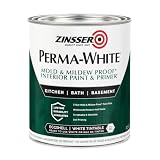
- Self-Priming formula - requires no sanding
- Mold & Mildew-Proof paint film - guaranteed for 5 years
- Resists dirt and moisture on film coating
- Finish is washable and scrubbable with soap and water
- Product contains a mildewcide to prevent the growth of mold and mildew on the paint film only
1. Paint one wall in a dry zone
A single painted feature wall is the quickest way to introduce a stronger colour without asking every surface to compete. Choose a wall outside direct shower and bath spray—such as the wall behind a vanity, toilet or freestanding bath—and use a more saturated version of the surrounding palette. Keep the other walls, ceiling and large fittings quieter so the feature wall has visual authority.
Where this works best
- Behind a basin or mirror, where the colour is framed by furniture and fittings.
- On a wall opposite a window, where daylight can show the shade’s undertones.
- In a cloakroom or small powder room, where a bolder colour can be used without covering a large area.
Dulux’s guidance on painted wall panels places them in dry zones and recommends tile for wet zones. Follow the instructions for the actual paint, panel system and substrate, including preparation, drying time and ventilation. A bathroom-labelled coating is not a substitute for checking whether the wall is exposed to recurring water.
2. Build a coloured-tile feature wall
Tile can carry a stronger colour than you may want to paint across a whole room. A blue, green, terracotta or pink tile can become the anchor behind a vanity, around a bath or on a shower wall, while the remaining surfaces stay neutral. None of these colours is universally “best”; the right choice depends on the light, adjoining materials and the atmosphere you want.
Quick wins for a faster PC:
Repair Windows errors before they cause bigger problemsFix Now →Scan for outdated or missing drivers - takes under a minuteDriver Scan →How to keep a bold tile controlled
- Repeat one small element of the tile colour in a towel, tap finish or artwork so the wall feels connected to the room.
- Use plain tile on neighbouring walls when the feature tile already has colour and pattern.
- Check the tile beside the sanitaryware and worktop, not only against a white showroom board.
Tile is a relatively permanent colour decision. Order physical samples and confirm batch, shade variation and installation suitability before committing to a full order.
3. Change the visual rhythm with tile size
Tile size affects how the bathroom is read just as strongly as tile colour. Geberit notes that both choices matter and that larger formats can create a calmer visual effect. Fewer joints allow the eye to travel across a surface, while smaller tiles create a denser rhythm and make the grid more noticeable.
Rank #2
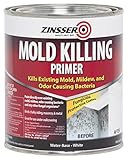
- Kills existing mold, mildew, and odor causing bacteria without extensive pre‐cleaning
- EPA registered ‐ assures product performance and quality. (EPA Reg. No. 87469‐1‐69587)
- Water based fungicidal protective coating works under any coating and aides in covering fungal stains. Ideal with ZINSSER Perma‐White.
- Paint directly over existing mold and mildew without extensive pre‐cleaning. (*Fix all moisture issues. For structurally unsound surfaces, refer to label for remediation guidelines.)
- Recommended for residential, commercial and industrial applications including bathrooms, basements, wall cavities, window frames, office buildings, factories and more.
Choosing a scale
| Tile approach | Visual effect | Useful when |
|---|---|---|
| Large-format tile | Quieter fields and fewer visible interruptions | You want a restful, continuous backdrop and the substrate can be prepared sufficiently flat |
| Medium rectangular tile | Balanced rhythm with clear direction from the layout | You want the installation pattern to contribute without dominating |
| Small-format or mosaic tile | More joints, scale and pattern | You are defining a niche, border, floor zone or compact feature area |
Size does not remove the need for movement joints, falls, waterproofing or a suitable substrate. It changes appearance, not the underlying installation requirements. Lay sample boards in the proposed orientation—horizontal, vertical or stacked—because the same tile can make the room feel wider, taller or busier depending on its direction.
4. Make the grout line part of the composition
Grout can either let a tiled surface read as one broad plane or deliberately reveal a grid. A grout colour close to the tile reduces contrast and supports a continuous appearance. A contrasting grout makes the joints a visible graphic element, which can emphasise brick bonds, vertical stacks, herringbone or a geometric mosaic.
Decide what you want the joints to do
- Recede: select a grout near the tile colour when the tile’s surface or colour should lead.
- Define: select a considered contrast when the laying pattern is a feature.
- Bridge mixed shades: use a grout that appears in more than one tile in a multicolour scheme.
View grout sample cards beside the actual tile; printed charts are only approximations. Grout choice does not make a bathroom maintenance-free, and performance depends on the product, joint width, cleaning routine and installation. Follow the grout manufacturer’s sealing and curing directions where applicable.
5. Use a patterned or printed tile to unite several colours
A patterned tile can do the colour coordination for you. Dulux describes printed tiles as a way to add interest and connect a multi-shade scheme. Pull one quiet colour from the pattern for painted walls, another for towels and a third for a small accessory rather than introducing unrelated colours.
Keep a busy pattern readable
- Identify the background colour and treat it as the room’s largest supporting neutral.
- Choose one accent colour for a wall or joinery; do not repeat every colour at full strength.
- Use a plain transition—such as a painted wall, simple trim or unpatterned tile—between patterned areas.
- Check the repeat at the intended viewing distance. A sample that looks delicate up close may become visually loud across a whole wall.
Printed tiles vary in repeat, registration and shade. Confirm how many different faces are in a box and plan the layout before adhesive is spread.
Rank #3

- PAINT + PRIMER IN ONE: Evolve’s paint-and-primer formula helps you get great coverage from the start, sealing your surface and reducing the extra work of multiple coats.
- AVAILABLE IN MULTIPLE SHEENS, COLORS & SIZES: Choose from a curated palette of designer colors in Flat, Eggshell, Satin, and Semi-Gloss sheens to match any style, room, or project. Available in 1-Gallons & 5-Gallons.
- EGGSHELL SHEEN – Soft, Velvety Glow: Offers a gentle sheen that balances elegance with durability. Ideal for moderate-traffic areas like dining rooms, hallways, and family rooms. Easy to clean without compromising the finish.
- STAIN & SCRUB RESISTANT: Built to last in real spaces, Evolve helps resist marks, scuffs, and water spotting, so your home continues to look polished and well-maintained.
- DESIGNED FOR MOISTURE-PRONE AREAS: Formulated to perform well in bathrooms, kitchens, entryways, laundry rooms, and other high-humidity spaces.
6. Add texture while keeping the colour family calm
Texture does not have to mean another colour. A tile with relief, ribbing, handmade variation or a directional surface can create depth while remaining close in colour to the wall. This is useful when you want a calm palette but still need the room to feel layered.
Ways to use near-colour texture
- Run fluted or ribbed tile behind a vanity so side light reveals the profile.
- Pair a smooth wall tile with a gently irregular tile in the same colour family.
- Use a textured strip inside a recessed niche instead of covering every wall.
Light direction matters: grazing light can exaggerate relief, while flat overhead light may make it subtle. Ask to see a sample under lighting similar to your bathroom. A textured appearance is not proof that a product is safe for a wet floor; check the manufacturer’s stated floor use and slip-performance information for the exact product.
7. Mix matte and glossy finishes deliberately
Finish changes how light moves across a room. Glossy tile can reflect a window or wall light and make colour appear more luminous; matte surfaces absorb more light and often look quieter. Combining finishes in a restrained way gives depth without adding another hue.
A simple finish strategy
- Choose one dominant finish for the largest tiled area.
- Add a second finish on a defined plane, such as a niche, splashback or vanity wall.
- Keep highly reflective finishes away from sightlines where glare would be distracting.
Do not generalise a manufacturer’s performance claim from one finish to another. Cosentino’s anti-slip statement, for example, concerns its named Dekton Grip+ treatment; it does not establish that every textured or matte bathroom surface is suitable for a wet floor. Confirm the product’s intended location, cleaning instructions and slip classification before specifying it underfoot.
8. Use towels and rugs for soft, changeable colour and texture
Accessories are the lowest-commitment way to alter both palette and tactile character. Towels, bath mats and washable rugs bring soft texture that hard tile and painted walls cannot provide. They can also test a colour before you commit to paint or tile.
Free tools Windows power users keep installed
One-click scans. No signup required.
Rank #4

- Use for a variety of indoor and outdoor project surfaces including wood, metal, plaster, masonry or unglazed ceramic
- Water-based acrylic formula is low odor, resist chips and provides long-lasting protection
- Covers up to 120 sq ft and dries to touch in 30 minutes for quick project completion
- Semi-gloss finish minimizes surface imperfections, goes on smoothly and provides excellent hide
- Prior to application sand surfaces with 180/200 grit sandpaper, then wash with a degreaser, allow the surface to dry and apply paint
Build an accessory layer
- Start with the permanent palette—floor, wall, worktop and sanitaryware.
- Select one accent colour for towels or a mat, then add a second tone only if the room still feels balanced.
- Vary texture rather than adding many colours: for example, combine a looped bath mat with a plain woven towel.
- Check washing, drying and slip-control instructions for each item, especially on floors that become wet.
Because accessories are replaceable, they are useful in rented homes, temporary refreshes and bathrooms shared by people with different preferences. They can also reveal whether a proposed accent works in the room’s actual lighting.
Independent reader supportYour contribution helps us test, update, and keep practical guides available for everyone.9. Sample every colour and finish in the bathroom
Sampling is a design step, not an optional final check. Geberit advises evaluating choices in place because light and surrounding colours affect appearance. A sample viewed in a shop can shift when it sits beside your ceiling white, timber, metal fittings and existing floor.
A practical sampling procedure
- Obtain physical paint cards, tile pieces and grout samples; include more than one batch when shade variation is expected.
- Place them on the wall or floor where they will be used, beside the vanity, bath, worktop and largest existing colour.
- View them in morning, midday and evening light, with the bathroom’s normal electric lights switched on.
- Move samples between a bright area and a shadowed corner to expose undertones and glare.
- Photograph the arrangement for comparison, but make the final decision in person because cameras alter colour.
- Mark the intended tile orientation and grout width on the sample board so you judge the installed rhythm, not an isolated piece.
Keep the approved sample, batch information and product instructions for the installer. If the finished product differs materially from the approved sample, pause before installation and resolve the discrepancy with the supplier.
How to choose between paint, tile and accessories
The best material depends on exposure to water, how permanent you want the change to be and the manufacturer’s instructions. Use the following as a decision aid rather than a performance ranking.
| Choice | Best suited to | Commitment | Checks required |
|---|---|---|---|
| Paint | Dry-zone walls and quick colour changes | Moderate; can be repainted | Product suitability, substrate preparation, ventilation and drying time |
| Tile | Wet zones and durable colour or pattern | High; removal is disruptive | Waterproofing system, tile rating, substrate flatness, layout, grout and movement joints |
| Towels or rugs | Accent colour and soft texture | Low; easily replaced | Wash care, drying, colourfastness and floor slip considerations |
Dulux’s cited guidance specifically places painted wall panels in dry zones and tile in wet zones. Treat that as a location principle, then verify the instructions for the exact product and substrate in your project.
Best Value
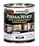
- Mold & Mildew-Proof paint film
- Washable, scrubbable, stain & moisture resistant finish
- Self-priming – sticks to surface without sanding
- Water-base, low odor
- Tintable to off-white, pastel and medium colors
Combining the nine ideas without visual overload
Start by assigning roles. Let one element carry the strongest colour, a second provide pattern or texture, and the rest support those decisions. For example, a coloured tile wall can be paired with quiet paint, low-contrast grout and plain towels; or a neutral tile field can carry a textured niche while towels supply the seasonal accent.
- Limit the number of competing patterns. A patterned tile and a strongly gridded contrasting grout may be enough together.
- Repeat a colour at least once in a smaller element when a feature wall feels disconnected.
- Use finish contrast where colour contrast is low, and colour contrast where surfaces are otherwise similar.
- Keep safety and wet-area suitability separate from appearance decisions.
Manufacturers’ pages from Geberit UK, Dulux and Cosentino provide design guidance and product-specific information, not independent rankings of every bathroom material. Their advice is most useful when applied to the named product, location and installation system you are actually choosing.
Frequently Asked Questions
Can I use paint instead of tile around a shower?
Only when the specific wall system and coating are approved for that exposure. The cited Dulux guidance recommends painted wall panels for dry zones and tile in wet zones; follow the exact product and substrate instructions rather than assuming ordinary bathroom paint is suitable for direct spray.
Does a textured tile automatically make a bathroom floor less slippery?
No. Texture alone is not a safety rating. Check the exact product’s stated floor suitability and slip-performance information; a claim about a named treatment applies only to that treatment.
Should grout match or contrast with bathroom tile?
Match grout when you want the tile field to read continuously; contrast it when you want the laying pattern to become a feature. Judge the colour beside the actual tile and confirm the manufacturer’s maintenance instructions.
How many colours should a bathroom have?
There is no universal number. A practical method is to choose one dominant field, one accent and optional supporting tones drawn from a pattern or accessory, then test the combination in the room’s changing light.
Quick Recap

Product prices and availability are accurate as of the date/time indicated and are subject to change. Any price and availability information displayed on Amazon at the time of purchase will apply.
Recommended Free Tools

