What’s actually slowing this PC down?
Pick the symptom - the matching free tool is one click away.
ThatPainter is reader-supported. When you buy through links on our site, we may earn an affiliate commission. Learn More
The strongest backsplash for blue cabinets is not determined by cabinet color alone. Start with the complete palette—cabinet shade and undertone, countertop movement, floor, wall color, hardware, and light—then choose whether the tile should contrast with the cabinets or create a tonal connection. Light neutral tile lets blue cabinetry stand out; a lighter or distinct blue keeps the scheme connected; and a multicolor pattern can bridge blue with other finishes without requiring an exact match.
As an Amazon Associate I earn from qualifying purchases.
Start with the whole kitchen, not a paint chip
Blue cabinets can read navy, slate, denim, teal, powder blue, or gray-blue depending on undertone and lighting. The same backsplash can look crisp beside one blue and muddy beside another. Before choosing tile, identify three things that will remain in the room:
- The cabinet blue: note whether it leans gray, green, violet, or nearly neutral, and compare it in morning, afternoon, and evening light.
- The countertop: determine whether it is quiet and mostly uniform or has strong veining, speckles, or several colors.
- The fixed background: include flooring, wall paint, appliances, metal finishes, and any wood grain that will remain visible.
The backsplash occupies a large visual area between upper and lower cabinets. It therefore has to relate to the counter as well as the cabinet doors. A tile that looks attractive beside a blue sample can compete with a veined counter once both are installed. Think of the backsplash as one member of a material palette rather than an isolated accent.
#1 Best Overall

- Easy DIY, Just Peel & stick, cut with tin snip, utility knives or hand saws, saving large amount on labor
- 3"x6" individual subway tile, plans the layout freely to your imagination
- Waterproof, heat resistant, stain resistant, anti-scratch, high impact, color fadeless, easy to clean, durable
- Suitable surfaces: painted gypsum/dry wall, ceramic tile, linoleum, glass, marble/granite, metal/steel, sealed/polished/painted wood
- Unsuitable surfaces: brick wall, oily glossy painted wall, textured wall and any uneven rough surfaces
Light neutral tile: the reliable contrast
White, warm white, cream, pale gray, and other light neutrals create clear contrast with medium and dark blue cabinets. They give the cabinetry visual prominence and can make a compact kitchen feel brighter. This is the most restrained direction when the room already contains active flooring, a patterned counter, or prominent wood.
Choose the neutral undertone deliberately
A cool blue cabinet often sits comfortably with a clean white or pale gray tile. A blue with green or gray warmth may work better with an ivory, limestone-like, or soft greige neutral. The goal is not to make every surface the same temperature; it is to avoid an accidental clash, such as a creamy tile beside a strongly icy blue cabinet.
Keep a white backsplash from feeling flat
Variation can come from grout, shape, or a subtle surface finish rather than from a second bold color. A narrow rectangular tile in a stacked layout feels more contemporary and graphic; a handmade-looking surface with slight edges introduces movement while remaining quiet. If the countertop already has dramatic veining, stay closer to a simple field tile and let the counter lead.
What’s actually slowing this PC down?
Pick the symptom - the matching free tool is one click away.
Distinct blue tile: a tonal connection without an exact match
Blue-on-blue works when the backsplash is visibly different from the cabinetry. A pale blue behind navy doors creates contrast within one color family. A dusty blue can soften a saturated cabinet, while a deep blue backsplash behind a lighter cabinet creates a more enveloping effect.
Use value and saturation to separate surfaces
Value is the lightness or darkness of a color; saturation is its intensity. Changing either one is usually enough to distinguish the backsplash from the doors. For example, a muted blue tile can relate to a vivid cabinet while remaining quieter, and a light, clear blue can stand apart from a dark, gray-blue cabinet even when their undertones are similar.
Do not chase a perfect paint match
Tile, paint, and cabinet finishes reflect light differently, so an attempted exact match can look mismatched in the room. Vanessa Horwat’s advice, reproduced by Deslaurier, is: “I wouldn’t try to tie a colour into the backsplash – it can end up looking a little dated”. This is professional design advice, not a rule. The practical alternative is to repeat a family resemblance while changing value, texture, scale, or undertone.
Patterned tile with several blue shades
A pattern can connect blue cabinetry to countertops, flooring, or accessories that are not blue. Designs containing two or more blues plus a neutral create a visual bridge: one color echoes the doors, another can relate to the counter, and the neutral prevents the composition from becoming a single-color block.
The Tool Desk
Outbyte PC Repair FREEClear out junk files and repair common Windows errorsFree Scan →Outbyte Driver Updater FREEScan for outdated or missing drivers - takes under a minuteDriver Scan →When a pattern earns its place
Use a multicolor pattern when the countertop and other fixed surfaces are relatively calm. The backsplash can then supply identity and become the room’s secondary focal surface. Geometric, encaustic-inspired, or small-format mosaics all work in principle; what matters is the number of colors, contrast between them, and scale relative to the kitchen.
Rank #2

- 2-3 Times Thickness: Much thicker than ordinary peel & stick tile, 2mm-2.5mm each, durable and solid tile, unlike soft sticker tiles
- Stronger Upgrade Adhesive: 3X Stronger backing glue than ordinary vinyl backsplash tile, not only stick firmly to the smooth surface, but also available on lightly textured wall
- 1.4 Times Coverage Area: 10 sheets thickened self-adhesive tiles, 12" X 12" each, which covers 40% more area than 10"x10" tile
- Widely Use: Perfectly decorated in kitchen island walls, bathroom backsplash, shower, fireplace, and installed behind the stove
- Easy Do It Yourself: Just peel, interlock and stick. No need to overlap, no grout and no mess, save your time and money on labor
When to reduce the pattern
If the counter has prominent veining or the cabinet doors have strong grain, a busy backsplash may create competing lines. In that situation, choose a pattern with fewer colors, lower contrast, or a larger repeat so the eye can settle on one primary feature.
Texture and finish: add depth without adding another color
A backsplash can be visually active through relief, sheen, or irregularity even when its color is restrained. Glossy tile reflects under-cabinet lighting and can brighten a dark blue kitchen. Matte tile absorbs more light and gives a softer, quieter appearance. Ribbed, handmade, or lightly undulating surfaces create shadow lines that are noticeable at close range.
Balance texture against surface movement
When the countertop is simple, a more textured tile can give the wall depth. When the countertop is already the star, choose a smoother tile so the two surfaces do not compete. Cabinet grain matters in the same way: pronounced oak or walnut texture calls for a calmer backsplash than flat, painted doors do.
Plan for lighting and cleaning
Look at finish samples under the actual under-cabinet lights, not only in a showroom. High-gloss surfaces reveal reflections, while deeply textured surfaces create more grout and shadow to maintain. The most practical finish is the one whose visual effect and cleaning demands suit how the kitchen is used.
Let the countertop decide who leads
Assign a visual hierarchy before selecting tile. One surface should lead, one should support, and the remaining finishes should connect the two.
| Existing counter condition | Backsplash direction | Why it works |
|---|---|---|
| Strong veining or several visible colors | Light neutral, simple shape, restrained texture | Provides a calm field and keeps the counter from competing with the cabinets. |
| Quiet solid or subtly mottled counter | Patterned tile or more pronounced texture | Allows the backsplash to contribute color and character. |
| Dark counter with dark blue cabinets | Lighter neutral or lighter blue | Creates value contrast so the work area does not read as one heavy block. |
| Light, plain counter and light blue cabinets | Deeper blue, medium neutral, or dimensional surface | Adds definition without requiring a high-contrast pattern. |
This hierarchy is a decision tool, not a fixed style rule. If you intentionally want both counter and backsplash to be focal points, keep their colors related and vary the pattern scale so their lines do not collide.
Account for cabinet shade and undertone
Navy and ink blue
Very dark blue cabinets benefit from light neutrals, pale blue, or a pattern that includes a light background. These choices preserve separation around the work surface. A dark backsplash can also work, but it needs enough counter or lighting contrast to avoid making the wall recede into the doors.
Recommended Free Tools
Slate and gray-blue
Gray-blue cabinets can support cool white, soft gray, blue-gray, or muted multicolor patterns. Check samples against the cabinet in daylight; a tile that appears neutral in a store may reveal a green or violet cast next to slate paint.
Rank #3
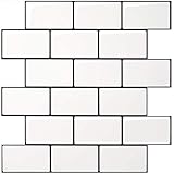
- Upgraded Thicker Build: 2–3 times thicker than regular peel and stick tiles, resistant to tearing and bending for easier installation.
- Stronger Adhesive Backing: Upgraded backing glue grips smooth, clean surfaces and lightly textured walls firmly for a more secure application.
- Classic Contrast Style: White subway tiles with contrasting black grout add crisp definition and a timeless look to your wall.
- Standard Size & Value Pack: Includes 10 ticker self-adhesive tile sheets measuring 12 x 12 inches for your wall makeover project.
- Versatile Wall Decor: Suitable for kitchen backsplashes, kitchen island walls, and other decorative wall applications.
Teal and green-leaning blue
Warm whites, sandy neutrals, and blue-green patterns can reinforce the cabinet’s character. Very icy whites may look stark unless that contrast is intentional. Wood tones and aged metals can help connect a green-leaning blue to a warmer backsplash neutral.
Powder and pale blue
Pale cabinets can disappear against a similarly pale wall. A medium-value neutral, a deeper blue accent, or a pattern with clear line definition gives the backsplash enough contrast to outline the cabinetry without overwhelming it.
Independent reader supportYour contribution helps us test, update, and keep practical guides available for everyone.Compare physical samples before ordering
Online photographs and isolated samples cannot show how all the finishes will read together. Use ceramic backsplash tile samples or samples of the material you intend to install, and compare them beside the actual cabinet door and countertop.
Do these 3 things before closing this tab:
1Repair Windows errors before they cause bigger problems2Fix the driver behind crashes, sound loss and screen glitches3Clear out junk files and repair common Windows errors- Collect the fixed samples. Bring a cabinet door or finish chip, a countertop sample, flooring or wall paint information, and hardware references if available.
- Shortlist two directions. Include one light-contrast option and one tonal or patterned option so you are comparing design strategies, not just shades of the same idea.
- View samples vertically. Tape or prop the tile at backsplash height. A horizontal sample on a counter receives different light and can give a false impression.
- Check several times of day. Observe natural light, under-cabinet lighting, and evening ambient light. Note whether grout lines, sheen, or veining become more dominant than expected.
- Test the full repeat. For patterned tile, place several pieces together. A single sample cannot show scale, color frequency, or how quickly the pattern becomes visually busy.
- Evaluate from the room entrance. Step back and view the kitchen as a whole. A detail that is appealing up close may dominate the sightline from an adjacent room.
- Confirm practical details. Verify the tile’s recommended adhesive, grout width, edge treatment, and cleaning requirements before purchase. Order enough material from one batch when possible so color variation is controlled.
Common pairing mistakes and how to correct them
Trying to match the cabinet paint exactly
Problem: The tile and cabinet appear almost—but not quite—the same, making the mismatch conspicuous.
Correction: Choose a clearly lighter, darker, grayer, or more textured blue, or move to a neutral that gives the cabinet a clean outline.
Ignoring the countertop’s movement
Problem: Veining, patterned tile, and strong cabinet grain all compete for attention.
Correction: Let the most visually active surface lead and simplify at least one of the others.
Choosing from a single tile piece
Problem: The installed field looks denser or more repetitive than the sample suggested.
Rank #4

- Enhanced Strength – At 0.08 inches thick, these tiles are 2–3 times sturdier than standard ones, offering enhanced durability and resistance to warping
- Seamless Application – Designed for convenience, these tiles feature an intuitive peel and stick backing that allows for a smooth and effortless installation process
- Premium Quality Adhesion – Made from premium adhesive material, these tiles offer a secure and long-lasting bond to surfaces, ensuring stability and endurance over time
- Contemporary Aesthetic – With their sleek and sophisticated appearance, these tiles instantly elevate the visual appeal of any room, bringing a modern flair to kitchens and beyond
- Ideal for any Space – Engineered to withstand moisture, they are perfectly suited for damp environments such as kitchen counters, bathroom walls and so on
Correction: Assemble multiple pieces, include grout, and view the arrangement at normal room distance.
Relying on showroom lighting
Problem: A color reads correctly in the store but shifts under your kitchen’s bulbs or daylight.
Correction: Keep samples in the room and inspect them under every lighting condition you use.
Adding texture without considering maintenance
Problem: Deep relief and narrow grout joints collect residue in a high-use cooking zone.
Correction: Compare the cleaning effort with the visual benefit and select a smoother alternative where necessary.
A practical decision framework
Use these questions to narrow the field without treating any single palette as universally correct:
- Do you want the blue cabinets to be the clear focal point? Start with a light neutral backsplash.
- Do you want a layered, monochromatic effect? Select a blue with a deliberate change in value, saturation, or undertone.
- Does the room need a bridge between blue cabinets and warmer or mixed finishes? Consider a pattern containing several blue shades plus a connecting neutral.
- Is the countertop already visually prominent? Keep tile color, pattern, and texture restrained.
- Is the countertop quiet and the cabinetry relatively simple? Let the backsplash carry more pattern or surface relief.
- Are you uncertain between two samples? Install temporary boards or taped-up sample fields and live with them through a full day before committing.
The best backsplash is the one that gives the kitchen a readable hierarchy, works with the countertop and fixed finishes, and still looks intentional when the light changes. Blue cabinets provide many viable routes—contrast, tonal layering, or pattern—but the final choice should come from the assembled materials rather than an isolated color match.
Quick Recap

Product prices and availability are accurate as of the date/time indicated and are subject to change. Any price and availability information displayed on Amazon at the time of purchase will apply.

