ThatPainter is reader-supported. When you buy through links on our site, we may earn an affiliate commission. Learn More
The safest starting point for cherry cabinets is a warm white, creamy white, or soft ivory backsplash that lightens the reddish wood without fighting it. If you want more personality, muted green or blue creates intentional contrast; a patterned tile can become the focal point when your countertop and other finishes are quiet. The right choice depends on the exact cabinet stain, countertop movement, floor color, and kitchen lighting, so judge real tile and grout samples in the room before ordering.
As an Amazon Associate I earn from qualifying purchases.
Cherry has naturally warm, red undertones. A backsplash that is too yellow can make the room look dated, while a cold, blue-white can make the cabinets look unusually orange. Treat the ideas below as a decision framework rather than a universal color rule.
Quick wins for a faster PC:
Scan for outdated or missing drivers - takes under a minuteDriver Scan →Clear out junk files and repair common Windows errorsFree Scan →Start with the cabinet, counter, and light together
Hold a backsplash sample vertically in the actual space, next to a cabinet door, the countertop edge, and the floor. Check it in daylight, under the normal evening lights, and with the under-cabinet lighting on. “White,” “ivory,” and “green” describe broad color families, not consistent undertones between manufacturers. A tile that looks creamy in a showroom may read yellow beside a particular cherry finish; another may look stark and gray once installed.
#1 Best Overall

- Easy DIY, Just Peel & stick, cut with tin snip, utility knives or hand saws, saving large amount on labor
- 3"x6" individual subway tile, plans the layout freely to your imagination
- Waterproof, heat resistant, stain resistant, anti-scratch, high impact, color fadeless, easy to clean, durable
- Suitable surfaces: painted gypsum/dry wall, ceramic tile, linoleum, glass, marble/granite, metal/steel, sealed/polished/painted wood
- Unsuitable surfaces: brick wall, oily glossy painted wall, textured wall and any uneven rough surfaces
Homes & Gardens’ 2026 backsplash guidance recommends evaluating the whole finish relationship rather than choosing a tile in isolation (How to Choose a Kitchen Backsplash, published October 8, 2026). Bring a removable cabinet sample or a clear photograph taken in your kitchen when collecting tile samples. If the cabinets are newly installed, wait until the finish is in its final sheen before making a close color decision.
Choose a color direction
Warm white, creamy white, or ivory
A warm neutral is the most versatile baseline for cherry cabinetry. It softens the contrast with reddish wood, reflects light, and leaves the cabinets as the visual anchor. Ceramic subway tile in a warm white is an especially adaptable starting point because its simple field does not compete with wood grain or a busy counter. Look for a white with a subtle beige, sand, or neutral cast rather than a strong yellow undertone.
Use the countertop to set the temperature. A counter with cream, taupe, or warm gray flecks usually supports an ivory or creamy tile. If the counter is a crisp white with cool gray veining, a neutral white may connect the surfaces better than a distinctly yellow cream. Place the sample over the counter edge as well as against the cabinet; backsplash light can make the same tile appear different at each height.
Recommended Free Tools
Muted green
Muted sage, olive, eucalyptus, and gray-green tiles provide color contrast while retaining an earthy relationship with warm wood. They work best when the room already contains a related note in the floor, window treatment, artwork, or adjacent paint. Keep the saturation restrained if the cherry stain is dark or highly figured; a very vivid green can turn the backsplash into an unrelated accent.
View green samples in both daylight and warm artificial light. Some blue-based greens become teal at night, while yellow-based greens can exaggerate the red in cherry. A matte or softly glazed surface generally keeps the color quieter than a highly reflective finish, but the actual glaze should be tested because sheen varies by product.
Muted blue
Dusty blue, slate blue, and blue-gray create a deliberate cool-versus-warm contrast. This can make cherry cabinets feel fresher without requiring a cabinet refinish. Blue is most successful when another element repeats it subtly, such as a painted island, runner, or small appliance. If no other cool color exists, use a gray-leaning blue and a restrained grout so the backsplash reads as architecture rather than a bright accent wall.
Rank #2

- 2-3 Times Thickness: Much thicker than ordinary peel & stick tile, 2mm-2.5mm each, durable and solid tile, unlike soft sticker tiles
- Stronger Upgrade Adhesive: 3X Stronger backing glue than ordinary vinyl backsplash tile, not only stick firmly to the smooth surface, but also available on lightly textured wall
- 1.4 Times Coverage Area: 10 sheets thickened self-adhesive tiles, 12" X 12" each, which covers 40% more area than 10"x10" tile
- Widely Use: Perfectly decorated in kitchen island walls, bathroom backsplash, shower, fireplace, and installed behind the stove
- Easy Do It Yourself: Just peel, interlock and stick. No need to overlap, no grout and no mess, save your time and money on labor
Patterned or textured tile
Pattern, relief, handmade variation, and mosaic formats can make the backsplash the focal surface. Because cherry already supplies grain and color movement, pattern needs visual breathing room elsewhere. A quiet, nearly solid countertop is a better partner for a bold encaustic-style motif than a heavily veined stone. Likewise, if the counter is dramatic, choose a simple tile and let texture come from a subtle ripple, bevel, or tonal variation.
Quick wins for a faster PC:
Clear out junk files and repair common Windows errorsFree Scan →Fix the driver behind crashes, sound loss and screen glitchesFind Drivers →Slab or stone-look surface
A slab backsplash or large-format stone-look tile minimizes visible grout joints and shifts attention to broad material movement. It can echo a countertop without introducing a second small-scale pattern. Compare the movement across the entire counter-to-wall run: a slab with strong veining should not stop abruptly at a short section and resume with a different direction at a corner. Confirm that the material and installation system are appropriate for the wall and cooking area; the available guidance establishes the design option, not a universal durability rating.
Match backsplash intensity to the countertop
| Countertop condition | Backsplash direction | Reasoning |
|---|---|---|
| Strong veining, speckles, or multiple colors | Warm white or another calm, low-pattern tile | A quieter wall prevents grain, veining, and grout from competing. |
| Mostly solid or lightly mottled counter | Muted green or blue, or a restrained pattern | The backsplash can supply character without creating visual overload. |
| Cherry cabinets plus a busy floor | Simple format and low-contrast grout | Reducing one surface keeps the room from accumulating competing motifs. |
| Minimal counter and floor | Textured, patterned, or larger-format focal tile | There is more visual room for the backsplash to carry emphasis. |
This is a balance exercise, not a ranking of tile quality. The useful comparison axes are undertone, contrast, visual busyness, lighting, and how the pattern aligns with cabinet and counter boundaries.
Pick a tile format and layout before you buy
Horizontal rectangles
Horizontal rectangular tile can emphasize the width of a run of cabinets and make a compact kitchen feel broader. A conventional running-bond layout is forgiving, while a stacked layout looks more graphic and modern. Decide whether you want the horizontal lines to align with cabinet rails, shelves, or the countertop; an intentional relationship looks cleaner than a nearly aligned line that drifts by a few inches.
Vertical orientation
Turning a rectangular tile vertically emphasizes height and can draw the eye toward a high ceiling, hood, or open shelf. It also creates more vertical grout lines, so inspect the wall for outlets, switches, windows, and corners before committing. A vertical layout may require more visible narrow cuts around obstructions.
Mosaic and small formats
Mosaics introduce more grout, which can be useful for texture but increases the effect of grout color on the finished appearance. Confirm that the sheet pattern will not leave awkward slivers at cabinet ends or around a range. Measure the backsplash height and width, then make a scaled dry layout that includes the actual grout joint and edge trim.
Rank #3
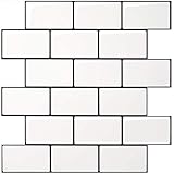
- Upgraded Thicker Build: 2–3 times thicker than regular peel and stick tiles, resistant to tearing and bending for easier installation.
- Stronger Adhesive Backing: Upgraded backing glue grips smooth, clean surfaces and lightly textured walls firmly for a more secure application.
- Classic Contrast Style: White subway tiles with contrasting black grout add crisp definition and a timeless look to your wall.
- Standard Size & Value Pack: Includes 10 ticker self-adhesive tile sheets measuring 12 x 12 inches for your wall makeover project.
- Versatile Wall Decor: Suitable for kitchen backsplashes, kitchen island walls, and other decorative wall applications.
Large-format tile or slab
Large pieces reduce joint lines and can calm a room with many cabinet doors. They demand flatter walls and careful handling, and the visual payoff depends on how seams land at outlets, corners, and the range opening. Ask the installer to map those seams before material is cut.
Homes & Gardens advises laying out tile against the measured cabinet-to-counter area before ordering so narrow cuts do not become an accidental design feature (layout guidance). Include windows, corners, the underside of cabinets, and the full width of the cooking zone in the drawing.
Use grout as part of the color decision
Grout changes how much pattern and contrast you see. A grout close to the tile color makes individual pieces recede; a darker or contrasting grout outlines every joint and can make a simple subway tile feel busier. With cherry cabinets, a warm white tile paired with a soft greige grout can bridge wood and counter without creating a grid as stark as pure white-on-white.
Do not select grout from an online color card alone. Water content, application, lighting, tile color, and site conditions can change the finished shade. Place a real grout sample beside the tile and cabinet, and if possible make a small test board using the intended joint width. Check it after it dries and again under the kitchen’s normal lights. The backsplash-selection guidance notes that the final grout appearance can differ from a card or screen (Homes & Gardens).
Coordinate paint so cherry cabinets feel intentional
Paint should support the backsplash rather than introduce a fourth competing undertone. For a warm white tile, sample soft white, light mushroom, pale greige, or muted beige on the wall outside the backsplash. Compare the paint to the tile in the same light; a wall color that looks neutral alone may turn pink beside cherry or yellow beside an ivory tile.
With muted green tile, a warm off-white or very light putty on surrounding walls lets the color remain focused. With blue tile, a neutral white, pale gray, or desaturated blue-gray can connect the cool accent without making the entire room feel cold. If you are trying to brighten a dark kitchen, prioritize light reflectance and clean sightlines: keep the backsplash value lighter than the counter when possible, avoid placing a dark accent under every cabinet, and use consistent lighting rather than relying on paint alone.
Rank #4

- Enhanced Strength – At 0.08 inches thick, these tiles are 2–3 times sturdier than standard ones, offering enhanced durability and resistance to warping
- Seamless Application – Designed for convenience, these tiles feature an intuitive peel and stick backing that allows for a smooth and effortless installation process
- Premium Quality Adhesion – Made from premium adhesive material, these tiles offer a secure and long-lasting bond to surfaces, ensuring stability and endurance over time
- Contemporary Aesthetic – With their sleek and sophisticated appearance, these tiles instantly elevate the visual appeal of any room, bringing a modern flair to kitchens and beyond
- Ideal for any Space – Engineered to withstand moisture, they are perfectly suited for damp environments such as kitchen counters, bathroom walls and so on
Reader discussions about making cherry cabinetry look less dated often focus on changing the surrounding tile and paint rather than stripping the wood (r/kitchenremodel). Those conversations are personal experiences, not measured color tests, so use them for ideas and verify every combination in your own room.
A sample-first buying process
- Record the existing finishes. Photograph the cabinet, countertop, floor, hardware, and wall in daylight and at night. Note whether the counter has warm, cool, or mixed veining.
- Order several physical samples. Include at least one warm white or ivory, one muted color, and one alternative format or texture. A product phrase such as “warm white ceramic subway tile backsplash” is a useful search starting point, but availability and suitability must be confirmed with the seller.
- Make a room-side comparison. Stand each sample vertically at the backsplash, then move it beside the counter and floor. View it from the doorway and from the main work area.
- Test grout with the tile. Use the intended grout color and approximate joint width on a sample board; wait for it to cure before judging.
- Draw the layout. Measure every wall, opening, outlet, corner, and range edge. Mark the first and last full tile, expected cuts, edge trim, and any change in pattern at a focal area.
- Confirm material and quantity. Verify tile dimensions, lot consistency, trim availability, installation requirements, and a reasonable allowance for cuts and breakage with the installer or manufacturer. Do not assume a sample represents every batch.
Installation planning and common pitfalls
Ordering before measuring
Buying based on a standard backsplash height can leave thin strips under cabinets or force a pattern to terminate in a prominent location. Measure each wall separately; older homes often have variations that are hidden by cabinets.
Ignoring outlets and edges
Switch plates, receptacles, windows, and exposed cabinet ends interrupt a repeating pattern. A centered layout at the range may produce unattractive slivers at the wall ends, so decide which locations deserve symmetry before setting tile.
Assuming every tile can use the same tools
Tile spacers and a wet saw may be appropriate for some do-it-yourself installations, but tool choice depends on tile material, thickness, edge treatment, and the project’s requirements. Follow the tile and setting-material manufacturer instructions or use a qualified installer; the available design guidance does not establish a complete installation specification.
Letting multiple patterns accumulate
Cherry grain, countertop veining, floor pattern, grout lines, and a decorative backsplash all compete at once. If you choose a bold tile, simplify paint, accessories, and textiles. If the counter already dominates, a calm tile usually produces a more coherent result.
The Tool Desk
Outbyte PC Repair FREERepair Windows errors before they cause bigger problemsFix Now →Outbyte Driver Updater FREEFix the driver behind crashes, sound loss and screen glitchesFind Drivers →Judging only from a screen
Digital images cannot show the exact undertone, gloss, texture, or grout interaction in your lighting. Keep samples until the final decision, and return them only after checking the room at different times of day.
Quick decision guide
- Want the least risky, brightest backdrop? Begin with warm white, creamy white, or soft ivory ceramic and a low-contrast grout.
- Want color without a dramatic focal wall? Try a muted sage, olive, dusty blue, or blue-gray that appears elsewhere in the room.
- Have a highly veined countertop? Use a simple tile format, restrained texture, and grout close to the tile.
- Have a quiet countertop and floor? Consider a patterned, handmade-look, or textured tile, after confirming that the cherry grain remains visible rather than overwhelmed.
- Prefer fewer joints? Investigate a slab or large-format stone-look surface, and map seams before fabrication.
- Unsure between two samples? Keep both in the kitchen for several days and choose the one that stays balanced in every lighting condition, not merely the one that looks best in a store.
What current guidance does—and does not—establish
Published design guidance supports comparing undertones, balancing countertop movement, planning the layout, and testing grout and samples in place. It does not establish a universally best backsplash color, a durability ranking, a national price, or a guaranteed way to make every cherry finish look contemporary. Product and collection pages can show that tile categories exist, but they are not independent tests of performance or value. For additional visual references, see the cherry-cabinet collection from Artistic Tile (collection page) and countertop-coordination examples from Caesarstone Canada (pairing guide); evaluate any material against your own measurements, lighting, and installation needs.
Quick Recap

Product prices and availability are accurate as of the date/time indicated and are subject to change. Any price and availability information displayed on Amazon at the time of purchase will apply.

