ThatPainter is reader-supported. When you buy through links on our site, we may earn an affiliate commission. Learn More
The most reliable way to choose paint colors is to begin with the room’s fixed elements, not a paint chart. Edward Bulmer’s method starts with a floor, beam, fireplace, stone, fabric, or piece of furniture; identifies its undertones; and then builds a restrained palette whose warmth, weight, and pigment logic fit together. A color wheel helps you add intentional contrast, while stronger colors usually work best in fabric, wallpaper, or movable pieces when a wall would overpower the room.
| # | Preview | Product | Price | |
|---|---|---|---|---|
| 1 |

|
Sherwin Williams Colors collection Deck Complete Paint Colors | $35.00 | Buy on Amazon |
| 2 |
|
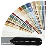
Benjamin Moore Collections Fan Deck | $33.99 | Buy on Amazon |
| 3 |
!['BENJAMIN MOORE' CLASSIC COLORS FAN DECK [CASE OF 1]](https://m.media-amazon.com/images/I/41Xq67AO80L._SL160_.jpg)
|
"BENJAMIN MOORE" CLASSIC COLORS FAN DECK [CASE OF 1] | $48.57 | Buy on Amazon |
| 4 |

|
280 Color Paint Sample Cards for Renovation Planning and Walls | $24.29 | Buy on Amazon |
As an Amazon Associate I earn from qualifying purchases.
Who Edward Bulmer is—and what his method is trying to solve
Edward Bulmer is described by Create Academy as an award-winning interior designer, architectural historian, and paint expert. He founded Edward Bulmer Natural Paint and has spent more than 30 years working on historic houses and other major projects, including Goodwood, the Tower of London, Chequers, and the Arts Club. His advice is less about finding a fashionable shade and more about making every surface in a room speak the same visual language.
Quick wins for a faster PC:
Clear out junk files and repair common Windows errorsFree Scan →Scan for outdated or missing drivers - takes under a minuteDriver Scan →Repair Windows errors before they cause bigger problemsFix Now →Bulmer summarizes that idea this way: “I see color as having its own grammar.” The grammar comes from the earth and mineral pigments used across traditional decoration. Once you understand how those pigments affect warmth, depth, and relationships, you can develop a personal color vocabulary instead of treating every paint chip as an isolated choice.
#1 Best Overall
Create Academy’s course A Guide to Pigments, Paints & Palettes contains 23 lessons and more than four hours of teaching, with a workbook and room examples. The useful takeaway for a homeowner is the sequence: identify what must remain, understand its color bias, narrow the field, and only then decide how much contrast or personality to add.
1. Treat color as a language, not a collection of swatches
A room feels coherent when its colors share an underlying logic. That logic may come from related pigments, a common degree of grayness, or a consistent balance between warm and cool surfaces. Two colors can be far apart on a chart yet live comfortably together if they have a similar visual “accent.” Conversely, two near-identical colors can clash when one is clean and bright while the other is dusty and mineral.
Translate the idea into a decorating decision
- Describe the room’s existing colors in plain language: chalky cream, honeyed timber, blue-gray stone, rusty red, or charcoal black.
- Notice whether each surface looks clear or muted, pale or deep, warm or cool.
- Choose new colors that repeat at least one of those qualities rather than introducing a completely different visual dialect.
- Use one or two deliberate exceptions—often in textiles or art—so the scheme has energy without losing its grammar.
This approach also explains why a color that looks beautiful in a showroom can fail at home. The sample may be speaking a different language from your floor, trim, upholstery, and daylight.
2. Stay close to nature’s range before you add drama
Bulmer favors a pared-back range of earthy colors over an overwhelming chart of possibilities. Natural pigments tend to have complexity: a muted green may contain a touch of yellow or black, and an ochre may shift between gold and brown as the light changes. Those small variations allow several colors to sit together without looking mechanically matched.
Build a restrained starting palette
- Pick a light, a middle, and a dark value that all relate to the room’s fixed feature.
- Keep the first pass to a handful of candidates instead of collecting dozens of unrelated samples.
- Remove colors that look artificially bright, icy, or clean beside the room’s natural materials.
- Introduce a brighter or deeper accent only after the quiet base feels right.
“Restrained” does not mean bland. A room can have saturated upholstery, patterned wallpaper, or vivid art; the restraint belongs in the underlying palette so those focal points remain legible.
3. Use a color wheel to test relationships and contrast
A physical artist’s color wheel is a practical check on heat, weight, and relationships. It does not choose a paint color for you; it shows what kind of relationship you are proposing. Adjacent hues usually create a quieter transition. Colors opposite one another on the wheel create stronger contrast.
Rank #2
- Brand: Benjamin moore
- Container type: Box
- Finish type: Opa
A simple color-wheel exercise
- Place the color of your fixed feature—such as a limestone floor or blue-gray stone—as accurately as possible on the wheel.
- Look at neighboring hues for a low-contrast family that is likely to feel calm.
- Look at the diagonally opposite hue when you want deliberate contrast.
- Before choosing the opposite hue, check that its warmth, visual weight, and level of muting suit the original color.
- Test the candidate on a large sample in the actual room; the wheel shows relationships, not the effect of your windows, bulbs, or sheen.
For example, a cool stone may invite a warm earth color as its counterpoint. The successful version is not simply “the opposite blue.” It is a warm shade with enough gray or shared pigment influence to remain connected to the stone rather than shouting over it.
4. Make the paint converse with every other material
Paint is only one surface in a room. Hard finishes, fabrics, rugs, wood, metal, art, and furniture all contribute color and reflect light differently. Bulmer’s advice is to make them share a visual grammar so the room feels harmonious and livable.
Read the room as a group
- Hard finishes: Floors, stone, tile, and marble usually occupy large areas and set the room’s baseline temperature.
- Wood: Timber can carry yellow, orange, red, gray, or nearly black undertones; compare the paint against the actual wood, not a generic “wood” sample.
- Textiles: Curtains, upholstery, and rugs can introduce stronger color in a controlled, replaceable way.
- Furniture and art: Walls should frame these pieces rather than compete with them.
- Light and sheen: A glossy surface reflects more light and can make a color feel sharper than the same hue in a matt finish.
Lay large samples beside the floor, trim, and the largest upholstered item. Move them around the room during morning, afternoon, and evening. A color that works beside one wall may look disconnected beside the fireplace or in a shaded corner.
5. Understand tonality and shared pigments
Tonality is the underlying quality that lets different colors and finishes belong to the same room language. It is broader than “warm” or “cool.” Two colors may both be warm but differ in clarity, depth, or grayness; those differences determine whether they feel related.
Bulmer links tonal connection to shared pigments. The Create Academy lesson identifies 12 essential pigments: yellow ochre, red ochre, raw umber, raw sienna, burnt umber, violet, Prussian blue, ultramarine, chromium green, lemon yellow, lamp black, and titanium white. You do not need to mix paint yourself to use the concept. Ask whether your proposed colors appear to draw from a compatible family of earth, mineral, blue, green, or neutral influences.
Questions that reveal a mismatch
- Does the new color look cleaner or more synthetic than the existing materials?
- Is it much lighter or heavier than everything around it?
- Does its undertone turn the floor or upholstery unexpectedly pink, yellow, green, or blue?
- Would a slightly grayer, browner, or deeper version connect it to the room more naturally?
Tonality is why “matching” a paint chip to one object can be less successful than choosing a color that relates to several objects at once.
Rank #3
- Very good condition
- Benjamin Moore Classic Colors Fan Deck
- Classic Colors
- Includes the American Classic Colors (AC)
6. Use red strategically instead of letting it dominate the walls
Bulmer prefers strong red in fabric or wallpaper rather than as a dominant wall color. His reason is functional as well as aesthetic: “The main job of a wall color is to know its place, to be the backdrop.” A forceful red wall can become the room’s subject, making art, furniture, and architectural details work harder to compete.
Better places for a strong red
- Upholstery on a chair or sofa that can be re-covered later.
- Curtains, cushions, or a rug that distribute the color without covering every vertical surface.
- Wallpaper on one controlled plane, where pattern breaks up the intensity.
- Small painted furniture or trim details that echo the red without turning it into the room’s background.
If you want red walls, test a muted mineral red and examine it beside the room’s largest fixed feature. The goal is not to ban strong color; it is to place it where it can be expressive without overwhelming the room’s architecture.
7. Let an existing feature choose the starting point
An inherited piece or immovable finish is not a problem to hide. It is a color cue. Bulmer specifically points to beams, stone or limestone floors, marble mantels, timber, and inherited furniture. Even when you do not love the feature, building from it usually produces a more convincing result than pretending it is not there.
Recommended Free Tools
How to extract usable color information
- Choose one defining feature that will remain in the room.
- Look at it in daylight and artificial light; note its lightest, darkest, warmest, and coolest areas.
- Separate surface color from reflected color. A limestone floor may reflect wall color, while polished marble may pick up window light.
- Collect samples that repeat one undertone without copying the feature exactly.
- Reject candidates that make the feature look dirty, overly orange, greenish, or stark by comparison.
A timber beam, for instance, does not require beige walls. It may support a soft green, mineral blue, or chalky neutral if the sample shares the beam’s degree of warmth and visual weight.
8. Take the decision step by step
Bulmer’s final principle is a process: start from a defining feature, narrow the palette by undertone and suitability, then apply personal preference and the amount of contrast you want. This prevents taste from becoming a contest between isolated favorite colors.
A complete room-color workflow
- Inventory what stays. List the floor, fireplace, beams, trim, worktops, large furniture, fabrics, and art that will remain visible.
- Choose the anchor. Pick the feature with the greatest area or emotional importance.
- Identify undertones. Decide whether the anchor leans warm, cool, yellow, red, green, blue, gray, or brown.
- Make a short list. Select a few colors with compatible tonality and natural-looking depth.
- Use the color wheel. Choose adjacent hues for calm or a diagonally opposite hue for intentional contrast, then check that the contrast is not too clean or heavy.
- Assign roles. Decide which color is the quiet wall backdrop, which belongs in trim or joinery, and which should appear in movable or patterned elements.
- Sample in place. Use large boards or painted sample areas on more than one wall. Observe them through a full day and under the lighting used at night.
- Live with the shortlist. Keep samples visible beside the anchor feature while you view the room from its normal entry points.
- Commit only after checking the whole composition. The final choice should support the room’s furniture and art, not merely look attractive as an individual swatch.
How sustainable paint fits into the decision
Sustainability is not a substitute for color compatibility, but it is a useful product-selection criterion once the palette is settled. Edward Bulmer Natural Paint describes the use of plant and mineral raw materials, color consultancy, and declared ingredients. Its 2022 technical sheet lists the emulsion’s VOC level as below 0.1 g/L (0.07%). That figure applies to the emulsion described in that sheet; it should not be generalized to every product, finish, or later formulation.
Rank #4
- Broad appeal: from professional designers to homeowners, the wall shade comparison card serves as a full spectrum palette and matching tool for diverse home decor palette sheet projects,wall coating reference sheet,residential paint Color chart
- Diverse color options: the 280 wall decoration color card is ideal for matching house coating palette, ensuring the wall tone comparison chart meets every architectural and residential requirement,exterior paint color chart,true color sample sheet
- Compact for portability: the bendable shade color card offers easy transportation and storage, making it the perfect DIY color matching card for decorators and professionals,vivid color display card,wall decoration color card
- Accurate color reproduction: crafted from paper and plastic materials, the indoor wall coating card vividly portrays each tone, providing a true color sample sheet for reliable building renovation chart use,wall coating shade chart,building wall tone Color chart
- Portable convenient: designed as a portable paint palette, this lightweight paint color chart is ideal for decorators and contractors who need paint comparison or DIY color matching card solutions,house paint selection card,house building color card
When comparing paints, check the specific product’s technical documentation, ingredient disclosure, finish, and application requirements. A low-VOC statement does not tell you whether the color will work with your floor or how a particular sheen will behave in your light. Those are separate decisions.
What’s actually slowing this PC down?
Pick the symptom - the matching free tool is one click away.
Choosing the right kind of help
| What you need | Most useful aid | What it can and cannot decide |
|---|---|---|
| To understand warm, cool, adjacent, and opposite relationships | Physical artist color wheel | Shows hue relationships; it cannot reproduce your room’s light or surface finish. |
| To evaluate ingredients and environmental information | Paint technical sheet and declared-ingredient information | Provides product-specific data; it does not establish that every color or finish has identical properties. |
| To learn pigment history and apply the method to rooms | Structured instruction such as Create Academy’s 23-lesson course | Offers lessons, a workbook, and room examples; it does not replace sampling in your own room. |
| To make the final color choice | Large samples viewed beside fixed features | Reveals undertone and light interaction in context; a small chip is too limited for this decision. |
Common mistakes this method prevents
- Starting with a favorite color: A favorite shade may fail beside the floor or fireplace. Start with the feature that cannot change.
- Choosing from a huge chart without a filter: Narrow by undertone, tonality, and visual weight before comparing shades.
- Using the color wheel mechanically: Opposite hues create contrast, but they still need compatible warmth and pigment logic.
- Matching one object too literally: A near-identical match can look flat. Repeat an undertone while varying value and depth.
- Putting the strongest color on every wall: Use fabric, wallpaper, or movable pieces when you want intensity without sacrificing the backdrop.
- Sampling only in a store: Daylight direction, shade, bulbs, and sheen can alter the result dramatically.
- Assuming “natural” means one fixed look: Plant and mineral raw materials, ingredient disclosure, and VOC data are product-specific; verify the exact finish you plan to use.
A compact checklist before you buy paint
- Have you identified the room’s anchor feature?
- Can you describe its undertone and visual weight?
- Do your finalists share a believable tonality?
- Have you used the color wheel to decide whether contrast is adjacent or opposite?
- Will the wall remain a backdrop for furniture and art?
- Have you tested large samples in the actual room, at different times of day?
- Have you checked the technical sheet for the specific paint, finish, and formulation?
FAQ
Do I have to use earthy colors to follow Bulmer’s advice?
No. The principle is to understand the grammar behind a color—its warmth, depth, clarity, and pigment relationships—then use that knowledge deliberately. Earthy colors are his preferred starting range, not a prohibition on brighter accents.
Can a color wheel tell me the exact paint to buy?
No. It helps you test relationships and identify a deliberate contrast. The final choice still depends on undertones, room light, surface, finish, and the fixed materials already present.
Where should I put a strong color if I do not want it on the walls?
Use fabric, wallpaper, upholstery, rugs, curtains, cushions, or movable furniture. These applications let you introduce intensity while keeping the walls supportive of the room’s art and furniture.
What should I sample first in a room with an unattractive existing floor?
Sample against the floor rather than ignoring it. Identify whether it leans yellow, red, gray, brown, or another direction, then choose a compatible undertone that makes the floor feel intentional.
Windows Errors? Fix Them Before They Spread
Repair common Windows errors and clear accumulated junk for a smoother, more stable PC - no reinstall needed.Free scan · no reinstallOutdated Drivers Are Slowing You Down
One free scan finds every outdated or missing driver and matches the right update for your exact hardware.Free scan · exact hardware matchFrequently Asked Questions
How many paint colors should I shortlist?
Begin with a small group of compatible candidates after identifying the room’s anchor feature; narrowing by undertone and tonality is more useful than comparing an entire chart.
Is low VOC the same as sustainable paint?
No. VOC is one product-specific measure. Also review the paint’s raw materials, ingredient disclosure, technical sheet, finish, and application requirements.
Quick Recap

Product prices and availability are accurate as of the date/time indicated and are subject to change. Any price and availability information displayed on Amazon at the time of purchase will apply.

