Quick wins for a faster PC:
Free tools Windows power users keep installed
One-click scans. No signup required.
Repair Windows errors before they cause bigger problemsFix Now →Fix the driver behind crashes, sound loss and screen glitchesFind Drivers →Clear out junk files and repair common Windows errorsFree Scan →
ThatPainter is reader-supported. When you buy through links on our site, we may earn an affiliate commission. Learn More
Paint forecasts for 2027 point in two directions at once: toward more personal, expressive color and toward natural shades that feel grounded and livable. Neither is a rulebook or a guarantee of what people will choose. The useful question is how a color’s depth, undertone, room light and surrounding finishes work in your home.
What are the paint color trends for 2027?
There is no single industry-wide list. Homes & Gardens presents seven trends of its own, while paint companies publish separate forecasts with different palettes and purposes. Across those sources, the recurring directions include muted mauves and dusty pinks, mustard yellow, rich plums, sun-faded pastels, organic greens, earthy neutrals and blue.
Sherwin-Williams describes its Rewild forecast as an open palette of 48 handpicked hues, with no prescribed pairings. Its three stories—Revive, Reignite and Reconnect—include both natural-feeling shades and more unexpected color contrasts. Emily Kantz, interior designer and Sherwin-Williams lead Colormix color strategist, calls color “deeply personal” and the forecast “a bit of a choose-your-own-adventure.” Treat these directions as inspiration, not evidence that all designers or homeowners will adopt them.
Seven color directions to consider
1. Muted mauves and dusty pinks
Homes & Gardens describes mauve moving beyond bedrooms into living spaces and cabinetry. Designer Michelle Murphy says she sees more interest in colors with depth and complexity. A subdued mauve may feel nuanced rather than sugary on cabinetry, in a powder room or in a smaller room where color can make the space feel enveloping. The result depends on its undertone and the light in the room.
#1 Best Overall
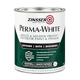
- Self-Priming formula - requires no sanding
- Mold & Mildew-Proof paint film - guaranteed for 5 years
- Resists dirt and moisture on film coating
- Finish is washable and scrubbable with soap and water
- Product contains a mildewcide to prevent the growth of mold and mildew on the paint film only
2. Mustard yellow
A brown-based mustard can bring warmth without the sharpness of a bright primary yellow. Homes & Gardens quotes designer Elizabeth Burch suggesting combinations with chocolate brown, burgundy, olive and blue. That is one designer’s palette advice, not a universal matching rule; compare the actual paint with your wood, flooring and other fixed finishes before choosing a companion color.
3. Rich plums and aubergines
For a more expressive room, consider moving from a muted mauve toward a deeper plum or aubergine. Darker purples can read differently as daylight changes and against different surrounding surfaces, so judge them in the room rather than from a small printed image or a trend label.
Rank #2

- PAINT + PRIMER IN ONE: Evolve’s paint-and-primer formula helps you get great coverage from the start, sealing your surface and reducing the extra work of multiple coats.
- AVAILABLE IN MULTIPLE SHEENS, COLORS & SIZES: Choose from a curated palette of designer colors in Flat, Eggshell, Satin, and Semi-Gloss sheens to match any style, room, or project. Available in 1-Gallons & 5-Gallons.
- EGGSHELL SHEEN – Soft, Velvety Glow: Offers a gentle sheen that balances elegance with durability. Ideal for moderate-traffic areas like dining rooms, hallways, and family rooms. Easy to clean without compromising the finish.
- STAIN & SCRUB RESISTANT: Built to last in real spaces, Evolve helps resist marks, scuffs, and water spotting, so your home continues to look polished and well-maintained.
- DESIGNED FOR MOISTURE-PRONE AREAS: Formulated to perform well in bathrooms, kitchens, entryways, laundry rooms, and other high-humidity spaces.
4. Sun-faded pastels
Weathered-looking pastels offer a gentler way to introduce color. Their undertones and the room’s natural light determine whether they appear fresh, muted or washed out. Test the shade at different times of day before deciding whether its softness suits the space.
5. Organic greens
Green forecasts cover a broad range, not one interchangeable “nature” shade. Sherwin-Williams describes Celery SW 6421 as a soft, muted green with subtle yellow undertones. Behr describes Grounded T27-01 as shifting between olive and moss, with brown undertones. Celery is the lighter, more herbal direction; Grounded is deeper and earthier. Choose by the effect you want and how the color sits with the room’s light and finishes.
Rank #3

- Use for a variety of indoor and outdoor project surfaces including wood, metal, plaster, masonry or unglazed ceramic
- Water-based acrylic formula is low odor, resist chips and provides long-lasting protection
- Covers up to 120 sq ft and dries to touch in 30 minutes for quick project completion
- Semi-gloss finish minimizes surface imperfections, goes on smoothly and provides excellent hide
- Prior to application sand surfaces with 180/200 grit sandpaper, then wash with a degreaser, allow the surface to dry and apply paint
Behr’s 2026 commissioned online survey of 1,000 U.S. adults found that 77% said they turn to nature when life feels chaotic. The survey was fielded June 23–July 2, 2026, and Behr reported a margin of error of plus or minus 3 percentage points at a 95% confidence interval. It measures reported sentiment, not paint purchases, preference for Grounded or adoption of 2027 trends. Behr’s Head of Color, Kayla Kratz, says: “Grounded is a reminder that the most meaningful spaces are the ones that help us connect with the rhythms of everyday life.”
6. A grounded earthy neutral
PPG’s Country Soil PPG15-30 is a warm blend of beige, taupe and gray. PPG positions it for interiors or exteriors and suggests using it across walls, trim and ceiling for an immersive scheme. That is the paint company’s recommendation, not independent design testing. PPG color category lead, EMEA, Architectural Coatings, Irina Hanhisalo describes the color this way: “Country Soil is designed for slowing down.”
Rank #4

- ALL-IN-1 PAINT & PRIMER: A hardy multi-purpose and multi-surface one-coat paint and primer in one for almost any indoor or outdoor surface. A wall, ceiling, floor, skirting board, cabinet, furniture and door paint for your bathroom, kitchen, home and garden.
- DURABLE & VERSATILE: A highly pigmented, thick formula available in 12 bold colors and a Matte, Satin or Gloss finish. Ideal for interior and exterior paint jobs on wood, laminate, plastic/UPVC, metal, concrete, brick, masonry, stone, glass and more.
- EFFECTIVE MONEY & TIME SAVER: A quick painting solution for DIY or professional builders and painters; our luxuriously opaque formula requires just 1 coat and is fast drying for a premium finish.
- ADVANCED ECO FORMULA: Our UK-made chalk paint is water-based, non-toxic, low odor, and has low VOCs for an environmentally friendly decorating choice.
- EASY APPLICATION: Remove dirt with a damp cloth, wipe the surface clean and dry, sand/score the surface (optional based upon the finish required), stir to mix the color and paint with a brush or roller.
7. Blue and unexpected contrast
PPG’s 2027 material also highlights Artifact, a restorative blue. Sherwin-Williams’ Rewild forecast, meanwhile, emphasizes chromatic tension and unexpected contrast. These directions suit someone who wants more color than a single quiet neutral scheme, but the sources do not prescribe one combination. Let the room’s existing materials and the relative warmth or coolness of each shade guide the pairing.
The Tool Desk
Outbyte PC Repair FREERepair Windows errors before they cause bigger problemsFix Now →Outbyte Driver Updater FREEFix the driver behind crashes, sound loss and screen glitchesFind Drivers →These seven labels belong to Homes & Gardens’ editorial list; paint companies do not all use the same categories or agree on a single set of trends. Forecasts are directional inspiration. Axios notes that predictions and actual buying can differ, and that neutrals remain common in many U.S. homes. The available sources do not establish market-wide adoption of the 2027 predictions.
Best Value

- WHAT'S IN THIS 10 PIECE PAINT KIT FOR WALLS: includes one plastic paint tray; one 9 inch roller frame; one 4 inch mini roller frame; two 9 inch microfiber roller covers (1/2 inch nap); two 4 inch microfiber roller covers (1/2 inch nap); one 1 inch flat brush; one 1.5 inch angle sash brush; one 2 inch angle sash brush
- Versatile Application: Perfect for any project, this set includes paint rollers 9 inch for large surfaces and smaller brushes for detail work
- All-in-One Kit: This paint brush set and paint tray combo ensures you have all the paint supplies needed for any home improvement task
- Professional Grade: Get a smooth, even finish with our high-quality paint roller set; ideal for applying interior paint gallon or smaller quantities
- Cost-Effective: This paint brush and roller set provides unbeatable value; includes paint pan and paint trays for easy cleanup and reuse
How to choose a 2027 color for your room
- Decide on the mood. Choose whether you want a lighter, airier effect or a deeper, more cocooning one. A pale herbal green and a deep olive-moss green, for example, will not create the same atmosphere.
- Compare undertones. Notice whether the candidate reads warm, cool, yellow-based, brown-based or gray-muted. Check it beside the room’s flooring, wood, stone, cabinetry and other fixed materials.
- Test the paint in the room. Look at it in the actual light and at different times of day. Sherwin-Williams offers peel-and-stick samples, paint samples and color chips. Behr lists a color chip and an 8-ounce Grounded sample. A screen image or color name cannot show exactly how a shade will look on your wall.
- Pick a placement that fits your appetite for change. Paint can go on walls, cabinetry, trim, ceilings, doors or a smaller accent. A color across walls, trim and ceiling creates a more enveloping treatment; a door or accent wall is a smaller commitment.
- Make permanent choices personal. Trend appeal is only one consideration for a surface you will live with for years. Murphy advises: “My rule is to bring trending colors through things that are easy to change like pillows, art, a powder room, or an accent wall.” If you want a trend color on a lasting surface, she recommends a deeper, more muted interpretation. Kantz says Sherwin-Williams’ forecast should inform a choice rather than dictate it.
Which 2027 colors does Sherwin-Williams identify for staying power?
Sherwin-Williams designates ten Rewild hues as “Continuity Colors”: Cordovan, Red Barn, High Sierra, White Duck, Celery, Icicle, Dutch Tile Blue, Roycroft Bronze Green, Clove and Forged Steel. “Staying power” is the paint company’s forecast designation, not an independently measured claim about how long a color will remain popular.
Kantz, speaking for the Sherwin-Williams Trendsight Team, describes the broader mood: “We’re seeing a blending of styles and ideas – timelines are overlapping, and there’s a real freedom in how spaces come together.” That supports mixing references and choosing a palette for the people who use the room, rather than following a forecast as a fixed scheme.
Quick Recap

Product prices and availability are accurate as of the date/time indicated and are subject to change. Any price and availability information displayed on Amazon at the time of purchase will apply.




