Crashes, No Sound, or Screen Glitches?
What’s actually slowing this PC down?
Pick the symptom - the matching free tool is one click away.
Random freezes, missing sound and display glitches usually trace back to one bad driver. Find and replace yours safely.
Find the Right Drivers →Free scan · under a minute
As an Amazon Associate I earn from qualifying purchases.
ThatPainter is reader-supported. When you buy through links on our site, we may earn an affiliate commission. Learn More
A London couple turned a rundown Edwardian house in Croydon into a connected sequence of richly colored rooms. Their organizing idea is simple: warm, earthy colors occupy the ground floor used during the day, while blues and pinkish purples move upstairs into the sleeping spaces. Every room has a dominant shade, but recurring accent colors, period details, and a mix of old and new furniture keep the house from feeling like a collection of unrelated boxes. The scheme is documented in Architectural Digest’s April 4, 2022 home tour.
#1 Best Overall
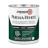
- Self-Priming formula - requires no sanding
- Mold & Mildew-Proof paint film - guaranteed for 5 years
- Resists dirt and moisture on film coating
- Finish is washable and scrubbable with soap and water
- Product contains a mildewcide to prevent the growth of mold and mildew on the paint film only
The idea: split the color spectrum between day and night
Simon and Sophia Cook did not choose a single neutral for the whole house. Instead, they treated the home’s two floors as two halves of a color story. Simon describes the ground floor as the part of the house where the family spends daytime hours, and the first floor as the place associated with sleep and night. His method was to take “the color spectrum as a line divided in two.”
That division gives the palette a clear direction. Downstairs, the colors lean toward earthy oranges, yellows, and greens. Upstairs, the atmosphere shifts to blues and pinkish purples. The rooms are individually strong, but the overall sequence is controlled because each floor draws from a related part of the spectrum rather than assigning arbitrary colors from one door to the next.
The approach also allows color to travel. A room can have one dominant wall color while furnishings, curtains, cushions, or furniture introduce another shade from the same half of the spectrum. In the living room, for example, yellow walls are paired with green furnishings. The result is contrast without abandoning the floor’s warm, daytime identity.
Recommended Free Tools
Sophia connects the brightness to the people who live there: “I love the fact that it’s brightly colored because I think it’s a real reflection on us.” The colors are therefore not presented as a universal formula. They are a personal decision that gives the house its character.
Room-by-room: the colors and materials named in the tour
The 2022 feature identifies several paint shades and furnishings. The names below are reported as they appeared in that article; they are not a current catalogue or a guarantee that a particular formulation is still sold.
Rank #2

- PAINT + PRIMER IN ONE: Evolve’s paint-and-primer formula helps you get great coverage from the start, sealing your surface and reducing the extra work of multiple coats.
- AVAILABLE IN MULTIPLE SHEENS, COLORS & SIZES: Choose from a curated palette of designer colors in Flat, Eggshell, Satin, and Semi-Gloss sheens to match any style, room, or project. Available in 1-Gallons & 5-Gallons.
- EGGSHELL SHEEN – Soft, Velvety Glow: Offers a gentle sheen that balances elegance with durability. Ideal for moderate-traffic areas like dining rooms, hallways, and family rooms. Easy to clean without compromising the finish.
- STAIN & SCRUB RESISTANT: Built to last in real spaces, Evolve helps resist marks, scuffs, and water spotting, so your home continues to look polished and well-maintained.
- DESIGNED FOR MOISTURE-PRONE AREAS: Formulated to perform well in bathrooms, kitchens, entryways, laundry rooms, and other high-humidity spaces.
| Space | Paint colors reported | Furniture, fabric, or architectural details named |
|---|---|---|
| Living room | Papavera and Golden Honey by Sanderson | George Smith chaise; Archive by Sanderson Design curtains and cushions; accent chairs from Rhubarb Homes |
| Kitchen | Matterhorn and Botanical Green by Sanderson | Pluck Kitchens cabinets in market mustard; green Esse stove |
| Children’s bedroom | Arsenic and French Rose by Sanderson | Ikea bed; Kitty Joseph x Floor_Story Chroma Pastel rug; secondhand dresser painted with leftover wall paint |
| Other spaces shown | Rhodera and Meadow Violet by Sanderson | Morris & Co’s Strawberry Thief fabric is also identified in the feature |
The list shows how the couple combines a dominant wall color with carefully chosen supporting tones. In the children’s bedroom, leftover paint was used on a secondhand dresser so the furniture joined the room instead of introducing an unrelated wood or finish. That is a small intervention, but it demonstrates the larger principle: color is applied to objects as well as walls.
The living room: yellow with green in a formal shell
The living room’s yellow walls and green furnishings make the day-side concept legible immediately. The named chaise, curtains, cushions, and accent chairs add pattern and texture, so the room is not dependent on paint alone for visual interest. Using a yellow wall with green upholstery also creates a relationship between warm and cool notes without moving outside the lower-floor palette.
The kitchen: mustard, green, and working equipment
In the kitchen, Matterhorn and Botanical Green are joined by market-mustard cabinets and a green Esse stove. The combination treats appliances and cabinetry as part of the color architecture rather than as neutral infrastructure. Because several large, permanent elements carry color, the kitchen reads as an intentional room even before accessories are added.
The children’s bedroom: a secondhand piece made to belong
Arsenic and French Rose establish the bedroom’s two-color identity. Painting the dresser with leftover paint is both economical and cohesive: the piece retains its secondhand history while visually belonging to the room. The Ikea bed and Chroma Pastel rug add a more playful layer without erasing the main wall colors.
Rhodera, Meadow Violet, and patterned fabric
Rhodera and Meadow Violet extend the upstairs range into richer purple territory. The feature also names Morris & Co’s Strawberry Thief fabric, showing that pattern is used alongside saturated paint rather than treated as a competing scheme. The exact room assignment for every named shade is not specified in the published account, so those colors should be understood as part of the home’s wider palette, not mapped to an unreported floor plan.
Rank #3

- Use for a variety of indoor and outdoor project surfaces including wood, metal, plaster, masonry or unglazed ceramic
- Water-based acrylic formula is low odor, resist chips and provides long-lasting protection
- Covers up to 120 sq ft and dries to touch in 30 minutes for quick project completion
- Semi-gloss finish minimizes surface imperfections, goes on smoothly and provides excellent hide
- Prior to application sand surfaces with 180/200 grit sandpaper, then wash with a degreaser, allow the surface to dry and apply paint
Why the house still reads as one home
A different color in every room can easily become visual noise. This house avoids that effect through three controls.
Free tools Windows power users keep installed
One-click scans. No signup required.
One dominant color per room
Each space has a clear lead shade. That gives the eye a place to settle and makes the room recognizable. Secondary colors appear in furnishings or smaller surfaces instead of competing equally across every wall.
A shared range on each floor
The lower floor stays within warm, softened oranges, yellows, and greens. The upper floor moves through blues and pinkish purples. The rooms are distinct, but neighboring spaces belong to the same family, so a view through an open doorway can feel deliberate rather than accidental.
Repeated color in movable pieces
Green furnishings support the yellow living room, while painted furniture and textiles echo wall colors elsewhere. Repetition gives the eye links between surfaces. It also makes the scheme adaptable: a cushion, chair, or dresser can carry a color relationship without requiring another structural change.
The Edwardian details were kept visible
The saturated palette sits inside an older architectural framework. The couple retained the rooms’ picture rails and original stained-glass windows instead of stripping the house back to a blank modern shell. Those details add lines, texture, and historical context around the new colors.
Rank #4

- ALL-IN-1 PAINT & PRIMER: A hardy multi-purpose and multi-surface one-coat paint and primer in one for almost any indoor or outdoor surface. A wall, ceiling, floor, skirting board, cabinet, furniture and door paint for your bathroom, kitchen, home and garden.
- DURABLE & VERSATILE: A highly pigmented, thick formula available in 12 bold colors and a Matte, Satin or Gloss finish. Ideal for interior and exterior paint jobs on wood, laminate, plastic/UPVC, metal, concrete, brick, masonry, stone, glass and more.
- EFFECTIVE MONEY & TIME SAVER: A quick painting solution for DIY or professional builders and painters; our luxuriously opaque formula requires just 1 coat and is fast drying for a premium finish.
- ADVANCED ECO FORMULA: Our UK-made chalk paint is water-based, non-toxic, low odor, and has low VOCs for an environmentally friendly decorating choice.
- EASY APPLICATION: Remove dirt with a damp cloth, wipe the surface clean and dry, sand/score the surface (optional based upon the finish required), stir to mix the color and paint with a brush or roller.
They also reused fireplace tile that had originally been installed on the kitchen floor. Simon salvaged the tile and laid it by hand around the fireplace. Reusing it connects two parts of the house and gives the fireplace a material history that new decorative tile would not provide.
The renovation began after the couple found the property in rundown condition while Sophia was six months pregnant with their first child. They had expected to work gradually and complete much of the labor themselves. Their schedule accelerated after they joined the UK renovation program Old House New Home, and the feature says the renovation was completed in November 2019. The house had been in probate, with many belongings from the previous owner still inside, adding another layer of inherited history to the project.
Furniture choices make the color scheme feel lived in
The Cooks combine new and secondhand furnishings, formal pieces and informal ones. That mix prevents the strong paint colors from becoming a showroom exercise. A room can contain a tailored chaise, a patterned textile, a salvaged architectural element, and a repainted dresser without requiring all of them to come from the same period or collection.
Longevity is part of the purchasing philosophy. Simon says, “When we can, we’ve built things or bought things that are built to last.” In practice, that means the color scheme is supported by objects intended to remain useful through changes in taste. Painting an existing dresser, salvaging tile, and retaining stained glass are consistent with that approach because they extend the life of what the house already has.
Quick wins for a faster PC:
Clear out junk files and repair common Windows errorsFree Scan →Scan for outdated or missing drivers - takes under a minuteDriver Scan →Repair Windows errors before they cause bigger problemsFix Now →How to adapt the day-and-night method in your own house
The Cooks’ home is a finished example, not a tested decorating system. If you want to borrow the logic rather than copy the exact shades, work through the following sequence.
Best Value

- WHAT'S IN THIS 10 PIECE PAINT KIT FOR WALLS: includes one plastic paint tray; one 9 inch roller frame; one 4 inch mini roller frame; two 9 inch microfiber roller covers (1/2 inch nap); two 4 inch microfiber roller covers (1/2 inch nap); one 1 inch flat brush; one 1.5 inch angle sash brush; one 2 inch angle sash brush
- Versatile Application: Perfect for any project, this set includes paint rollers 9 inch for large surfaces and smaller brushes for detail work
- All-in-One Kit: This paint brush set and paint tray combo ensures you have all the paint supplies needed for any home improvement task
- Professional Grade: Get a smooth, even finish with our high-quality paint roller set; ideal for applying interior paint gallon or smaller quantities
- Cost-Effective: This paint brush and roller set provides unbeatable value; includes paint pan and paint trays for easy cleanup and reuse
- Map the house by use. Mark rooms where people gather during the day separately from bedrooms and other night-oriented spaces. The original concept follows floor and routine, but your home may need a different boundary.
- Choose a warm or cool range for each zone. Select a limited family for the daytime area and another for the sleeping area. You do not need every color in the spectrum; the point is to create a recognizable relationship between rooms.
- Assign one lead color to each room. Decide which wall or surface will carry the strongest tone. Keep the other colors for upholstery, curtains, rugs, furniture, or smaller architectural features.
- Plan sightlines before buying paint. Stand in one room and look toward adjacent doorways. Colors that are separate on paper may meet in the same view. Choose neighboring shades that can coexist when doors are open.
- Sample under the room’s actual light. Daylight direction, electric bulbs, and the surrounding finishes can change how a saturated color appears. Paint sample boards or sample patches and observe them at different times before committing to all four walls.
- Use existing pieces as palette anchors. A stained-glass window, a tile hearth, a wood floor, or a favorite chair can supply colors to repeat. This is often more coherent than selecting paint in isolation.
- Let one small object carry the connection. If a room feels disconnected, repeat its dominant color on a dresser, cushion, lamp shade, or artwork. The children’s-bedroom dresser demonstrates how leftover paint can make a practical object part of the composition.
- Check the finish and maintenance needs. Kitchens, hallways, and children’s rooms may need a more washable finish than a low-traffic bedroom. The home tour does not compare paint technologies, so choose a finish according to the surface and use rather than assuming the named shade determines performance.
What the named paint colors can—and cannot—tell you
The Sanderson shade names are useful references for understanding the palette, but the feature does not provide paint specifications, finish levels, coverage figures, or a current availability check. It also does not establish which color performs best in a particular orientation or lighting condition. Treat the names as a record of the 2022 home tour and confirm a present-day formula, finish, and color match with the manufacturer or retailer before purchasing.
For a faithful visual effect, compare samples against your retained period features. A color that looks balanced beside one stained-glass window or tile may shift beside another. Sample the actual wall preparation and observe the color with the room’s furnishings in place; a large green sofa or patterned curtain can change the apparent intensity of a yellow wall more than a small swatch suggests.
The personal principle behind the bold choices
Sophia is explicit that the home is not designed to satisfy everyone: “It’s a really lovely house. And I’m very proud of it because it’s not something that you see every day. And not everybody likes it. It’s ours. We haven’t prescribed to somebody else’s ideal, and I’m really proud of that. It’s a very personal space.”
That statement explains why the scheme works as a home tour. The colors are memorable because they express a household’s preferences while responding to the building’s layout and history. The practical lesson is not that every house should use a different rich color in every room. It is that a bold decision becomes easier to live with when it has a clear organizing idea, repeats relationships across rooms, and respects the architecture already there.
Quick Recap

Product prices and availability are accurate as of the date/time indicated and are subject to change. Any price and availability information displayed on Amazon at the time of purchase will apply.

