The Tool Desk
Outbyte Driver Updater FREEScan for outdated or missing drivers - takes under a minuteDriver Scan →Outbyte PC Repair FREEClear out junk files and repair common Windows errorsFree Scan →
ThatPainter is reader-supported. When you buy through links on our site, we may earn an affiliate commission. Learn More
The best brown colour palette starts with the paint’s undertone, not its name. Compare whether the brown reads rusty, mossy, rosy or neutral, then balance its lightness against your room’s trim, flooring, wood, stone and furnishings. The 12 schemes below show exactly how to coordinate brown with whites, blue-grays, pink, black, clay, natural fibres and other browns.
What makes a brown paint colour work?
Brown is a mixture rather than a single colour family. A brown influenced by red and yellow can look rusty or warm; one influenced by blue and yellow may read mossy or cooler. Two paints both labelled “taupe” or “chocolate” can therefore clash when one has a pink cast and the other has a green or gray cast.

As an Amazon Associate I earn from qualifying purchases.
Crashes, No Sound, or Screen Glitches?
Random freezes, missing sound and display glitches usually trace back to one bad driver. Find and replace yours safely.Free scan · under a minuteWindows Errors? Fix Them Before They Spread
Repair common Windows errors and clear accumulated junk for a smoother, more stable PC - no reinstall needed.Free scan · no reinstallBenjamin Moore colour guidance recommends matching undertones across walls, trim, furnishings and accessories. Hold candidate swatches beside the room’s fixed materials in daylight and evening light. A brown that looks balanced on a screen or printed card can shift noticeably on the wall, so sample in the actual room before buying enough paint for the project.
Lightness matters as much as undertone. Pale mocha and tan reflect more light and usually make a kitchen or dining area feel relaxed. Espresso and chocolate create visual weight that can suit a study, bedroom or powder room, but they need lighter planes, reflective surfaces or textural variation so the room does not become flat. These are design examples rather than universal rules.
#1 Best Overall
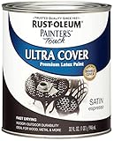
- Use for a variety of indoor and outdoor project surfaces including wood, metal, plaster, masonry or unglazed ceramic
- Water-based acrylic formula is low odor, resist chips and provides long-lasting protection
- Covers up to 120 sq ft and dries to touch in 30 minutes for quick project completion
- Satin finish minimizes surface imperfections, goes on smoothly and provides excellent hide
- Prior to application sand surfaces with 180/200 grit sandpaper, then wash with a degreaser, allow the surface to dry and apply paint
As Arianna Barone, a Benjamin Moore colour and design expert, puts it: “Sophisticated and warm, brown hues offer an elegant alternative to black paint that pairs easily with a wide range of colors.”
12 brown colour palette ideas at a glance
| Palette | Brown direction | Contrast approach | Useful room mood |
|---|---|---|---|
| Café au lait, warm white and wood | Light, tan or taupe | Soft, low contrast | Welcoming and easy |
| Espresso, cream and warm metal | Deep, warm | Controlled highlights | Grounded workspace |
| Chocolate, off-white and wood | Saturated, warm | Light trim against dark walls | Substantial and cosy |
| Brown, blue-gray and pale neutral | Warm brown | Cool, clear contrast | Fresh and balanced |
| Rosy brown, soft pink and burgundy | Red or rosy cast | Related warm accents | Layered and romantic |
| Brown and black | Medium to deep | High contrast | Polished and dramatic |
| Brown-on-brown | Several brown values | Monochromatic lightness shifts | Quietly enveloping |
| Chestnut, clay, sand and deep brown | Earthy warm-to-cool range | Natural tonal layering | Organic and collected |
| Light mocha, cream and soft gray | Light brown or taupe | Gentle neutral contrast | Calm and understated |
| Terracotta, brown and natural fibres | Clay-warm brown | Textural, earthy contrast | Handcrafted and relaxed |
| Brown cabinetry, stone and white tile | Cabinet or wood brown | Dark units with a light plane | Structured kitchen |
| Espresso-charcoal, soft neutral and one accent | Very deep, subtly cool | One restrained colour note | Contemporary and tailored |
The 12 combinations, with paint and material guidance
1. Café au lait, warm white and natural wood
Choose a light tan or taupe brown for walls, then let warm white trim and visible wood carry the room’s welcome. Benjamin Moore advises taking a light brown cue from nearby wood and selecting a shade a few steps lighter, rather than trying to match the wood exactly. Its suggested warm-white companions include Simply White OC-117, Mountain Peak White OC-121 and Mayonnaise OC-85. This low-contrast combination is practical in kitchens and dining rooms, where existing timber tables, floors or shelves can become part of the palette.
Quick wins for a faster PC:
Repair Windows errors before they cause bigger problemsFix Now →Scan for outdated or missing drivers - takes under a minuteDriver Scan →2. Espresso, cream and warm metallic accents
A deep espresso wall can anchor a desk area, library or intimate bedroom. Use soft cream on the ceiling, trim or upholstery to prevent the dark colour from swallowing the room, and repeat the warmth with restrained brass, bronze or another warm metal. Benjamin Moore’s dark-brown guidance also points to natural textures: a woven shade, leather chair, timber shelf or stone accessory gives the espresso surface something to relate to without adding another competing hue.
Rank #2

- PAINT + PRIMER IN ONE: Evolve’s paint-and-primer formula helps you get great coverage from the start, sealing your surface and reducing the extra work of multiple coats.
- AVAILABLE IN MULTIPLE SHEENS, COLORS & SIZES: Choose from a curated palette of designer colors in Flat, Eggshell, Satin, and Semi-Gloss sheens to match any style, room, or project. Available in 1-Gallons & 5-Gallons.
- FLAT SHEEN – Smooth Matte Finish: Soft, non-reflective look that hides imperfections. Ideal for bedrooms, living rooms, and low-traffic areas needing subtle elegance.
- STAIN & SCRUB RESISTANT: Built to last in real spaces, Evolve helps resist marks, scuffs, and water spotting, so your home continues to look polished and well-maintained.
- HIDES IMPERFECTIONS & EASY TOUCH-UP: High-hiding flat finish conceals surface imperfections on even walls, delivers excellent coverage, and allows seamless touch-ups for a smooth, uniform, professional-quality paint finish
3. Chocolate brown, off-white and natural wood
For a more saturated statement, use chocolate brown on a feature wall or all four walls and frame it with off-white trim. Benjamin Moore shows Wenge AF-180 as an example of a dark brown that works with off-white and natural materials. Keep the wood finish visible instead of covering every surface in paint; the variation in grain supplies relief and keeps the scheme substantial rather than heavy. This approach suits living rooms and bedrooms that need a cocooning backdrop for pale bedding, art or upholstery.
4. Brown, cool blue-gray and a pale neutral
Warm brown becomes clearer and fresher beside a cool, light blue-gray. Benjamin Moore examples include Constellation AF-540, Beacon Gray 2128-60 and Ocean Air 2123-50. Use the blue-gray on a ceiling, adjacent wall, cabinetry or large upholstered piece, then add a very pale neutral to keep the transition readable. Check the undertones together: a brown with a strong orange cast may need a quieter blue-gray, while a muted taupe can tolerate a more noticeable blue.
5. Rosy brown, soft pink and burgundy
When the brown has a rosy or red undertone, echo it instead of fighting it. Benjamin Moore’s example pairs Hearthstone Brown 2109-20 with Soft Pink 2012-70 and burgundy décor. A pale pink ceiling or small accent wall introduces lightness; burgundy cushions, a lampshade or artwork repeat the deeper warmth in controlled doses. Keep large furnishings relatively simple so the related reds feel intentional rather than themed.
Free tools Windows power users keep installed
One-click scans. No signup required.
Rank #3

- PAINT + PRIMER IN ONE: Evolve’s paint-and-primer formula helps you get great coverage from the start, sealing your surface and reducing the extra work of multiple coats.
- AVAILABLE IN MULTIPLE SHEENS, COLORS & SIZES: Choose from a curated palette of designer colors in Flat, Eggshell, Satin, and Semi-Gloss sheens to match any style, room, or project. Available in 1-Gallons & 5-Gallons.
- SEMI-GLOSS SHEEN - High-Impact Shine: Durable, reflective finish that enhances trim, doors, and cabinets. Moisture- and stain-resistant for high-traffic, high-touch areas.
- STAIN & SCRUB RESISTANT: Built to last in real spaces, Evolve helps resist marks, scuffs, and water spotting, so your home continues to look polished and well-maintained.
- DESIGNED FOR MOISTURE-PRONE AREAS: Formulated to perform well in bathrooms, kitchens, entryways, laundry rooms, and other high-humidity spaces.
6. Brown and black
Brown with black creates the sharpest scheme in this list. It can look chic in a hallway, dining room or powder room when the two dark colours are separated by lighter surfaces or contrasting textures. Use a pale rug, light stone, reflective mirror or warm-white ceiling to preserve legibility. Matte black hardware against brown cabinetry, or black furniture on a brown wall, usually gives enough definition without requiring a third bright colour.
7. A tonal brown-on-brown room
Monochromatic brown works when every surface is not the same value. Try a medium brown wall, darker cabinets or furniture, and a lighter taupe or tan ceiling and trim. Benjamin Moore describes brown cabinetry and walls in bathrooms and notes that a lighter taupe ceiling can lift a dark scheme. Vary sheen and texture as well: eggshell walls, satin joinery, woven fabric and natural wood will prevent a single-colour room from appearing like a flat block.
8. Chestnut, clay, sand and deep brown
An earth palette lets you move from pale to deep without leaving the brown family. Benjamin Moore’s Elemental palette includes Toasted Chestnut 2174-10, Fresh Clay 2093-20, Serengeti Sand 2164-40, Wenge AF-180, Maryville Brown HC-75 and Rural Earth 1239. The selection spans warm to cool notes, so place the colours according to undertone rather than arranging them randomly. Sand can occupy the largest area, chestnut or clay can define an accent, and deep brown can ground furniture or a single architectural feature.
Rank #4

- Use for a variety of indoor and outdoor project surfaces including wood, metal, plaster, masonry or unglazed ceramic
- Water-based acrylic formula is low odor, resist chips and provides long-lasting protection
- Covers up to 120 sq ft and dries to touch in 30 minutes for quick project completion
- Gloss finish provides a fresh new look for surfaces, goes on smoothly and provides excellent hide
- Prior to application sand surfaces with 180/200 grit sandpaper, then wash with a degreaser, allow the surface to dry and apply paint
9. Light mocha, cream and soft gray
Use a light mocha or taupe when you want brown’s warmth without a dramatic wall. Cream trim keeps the palette soft, while a restrained soft gray supplies a cooler counterpoint in upholstery, cabinetry or an adjoining room. Do not assume every taupe and gray will coordinate: compare their undertones under the room’s lighting. If the gray turns blue and the mocha turns pink, a small sample board will reveal the mismatch before it spreads across the walls.
10. Terracotta, brown and natural fibres
Terracotta adds a clay note that makes brown feel more sunbaked and tactile. Fresh Clay 2093-20 appears in Benjamin Moore’s earth palette; use a similar clay colour on a niche, backsplash, runner or occasional chair rather than covering every wall. Repeat the organic character with rattan, jute, linen, timber or unglazed ceramics. The fibres should support the colour relationship, not introduce a new undertone that competes with the terracotta.
11. Brown cabinetry, brown stone and white tile
In a kitchen, carry brown through the cabinetry and a brown stone or stone-look surface, then reserve white tile or another light plane for contrast. This is an example drawn from Benjamin Moore’s brown-kitchen imagery, not a mandatory material recipe. Before committing, compare the cabinet sample with the stone’s veining and the tile’s white: a blue-white tile can make a warm brown look orange, while a warmer white usually produces a quieter transition.
12. Espresso-charcoal, soft neutral and one restrained accent
Benjamin Moore named Silhouette AF-655 its 2026 Color of the Year and describes it as an espresso with subtle charcoal notes. Treat it as a starting point for a tailored contemporary scheme: pair the deep brown-charcoal with cream or another light neutral, then add one controlled accent such as muted green, rust, dusty blue or burgundy. Andrea Magno, the company’s director of colour marketing and design, said the firm had noticed renewed interest in the brown family alongside suiting, classic silhouettes and timeless pieces. That is the company’s qualitative trend observation, not a measurement of market demand.
Independent reader supportYour contribution helps us test, update, and keep practical guides available for everyone.How to choose the right palette for your room
1. Identify the undertone
Place the paint card beside the floor, largest sofa, worktop and permanent woodwork. Decide whether the brown looks rusty, mossy, rosy or close to neutral in that context. Ignore the colour name if the physical comparison says otherwise.
2. Set the lightness and contrast
Count the large light and dark planes already present. A very dark wall beside dark flooring may need a pale ceiling, trim or upholstery; a light room can carry a deeper brown with fewer corrective elements. Contrast can come from value, temperature, sheen or texture, so you do not need to add a bright colour simply to make the scheme readable.
3. Choose the intended mood
- Welcoming: café au lait, warm white and wood.
- Dramatic: espresso with cream, or brown with black.
- Fresh: brown with cool blue-gray and pale neutral.
- Romantic: rosy brown, soft pink and burgundy.
- Organic: chestnut, clay, sand, terracotta and natural fibres.
- Quiet: brown-on-brown or light mocha with cream and gray.
4. Account for fixed materials
Paint is only one layer. Existing wood, flooring, stone, metal, tile and upholstery remain in the room, so select a palette that repeats at least one of their undertones. If replacement is not planned, let those fixed materials determine whether your brown should lean warmer, cooler, pinker or more neutral.
Quick Recap
Sample brown paint before you commit
- Make large sample boards. Paint two coats on movable card or board rather than judging a tiny chip.
- Move the samples. Check them beside trim, flooring, furniture and worktops in the room where they will be used.
- Observe changing light. Look in morning daylight, afternoon light and after the room’s lamps are switched on.
- Compare adjacent colours together. Put the proposed brown, trim white and accent colour on the same board so their undertones are visible at once.
- Review the finish. Sheen changes how deep a brown appears and how much texture or wall irregularity it reveals.
- Decide only after living with it. Screen and print colours may not match the paint. Benjamin Moore’s guidance recommends sampling; its Color Portfolio app is described as a way to try colours on photos and videos, although availability can vary.
Common brown-palette mistakes and fixes
- Choosing by colour name: “Taupe” can hide green, pink or blue undertones. Fix it by comparing the card with the room’s materials.
- Matching wood too literally: An exact-looking match can make walls and furniture disappear into one mass. Benjamin Moore suggests taking the wood’s light-brown cue and going a few shades lighter.
- Using several dark surfaces with no relief: Add a pale ceiling, light textile, mirror or varied texture before abandoning the brown.
- Adding an untested white: A stark blue-white may make warm brown look orange. Test trim and wall colours side by side.
- Assuming a trend is a rule: Silhouette AF-655 is Benjamin Moore’s 2026 Color of the Year, but a dated trend announcement does not override your room’s light and materials.
Quick selection guide
| If your room needs… | Start with… | Then balance it with… |
|---|---|---|
| More warmth without heaviness | Light mocha or café au lait | Cream, warm white and pale wood |
| A dark focal wall | Espresso or chocolate | Off-white, cream and natural texture |
| Sharper contrast | Brown with black | A lighter plane and varied sheen |
| A cooler, fresher feel | Warm brown | Blue-gray and pale neutral |
| An earthy, handmade feel | Chestnut or brown | Terracotta, clay, sand and fibres |
| A coordinated kitchen | Brown cabinetry | Brown stone and white tile |
| A contemporary deep neutral | Silhouette AF-655 as a reference | Soft neutral and one accent |

Product prices and availability are accurate as of the date/time indicated and are subject to change. Any price and availability information displayed on Amazon at the time of purchase will apply.

