Crashes, No Sound, or Screen Glitches?
Do these 3 things before closing this tab:
1Scan for outdated or missing drivers - takes under a minute2Clear out junk files and repair common Windows errors3Fix the driver behind crashes, sound loss and screen glitchesRandom freezes, missing sound and display glitches usually trace back to one bad driver. Find and replace yours safely.Free scan · under a minute
PC Slower Than It Used to Be?
A free scan shows the junk files, broken settings and background clutter dragging Windows down - then fixes them in one click.Free scan · Windows 10 & 11
ThatPainter is reader-supported. When you buy through links on our site, we may earn an affiliate commission. Learn More
The best paint color for a condo with a wraparound terrace is the one that remains comfortable as the light changes around the unit. Map each room’s window exposure, identify whether its daylight is warm or cool at the hours you use it, compare undertones with your fixed finishes, and test large samples on the actual walls from morning through artificial light at night. Treat interior walls and terrace, railing, door, or building surfaces as separate decisions: condo rules may require approval for anything outside the unit.
Why a wraparound terrace makes color selection harder
A conventional room may have one dominant window direction. A wraparound terrace can put several directions around the same living area, reflect sky light into the interior, and expose connected rooms to noticeably different conditions. A color that looks balanced on the east side in the morning can look cooler on the north side or more intense after late-afternoon sun reaches the west side. The terrace also adds visible flooring, railings, masonry, plants, furniture, and neighboring buildings that can influence how your interior color is perceived.
As an Amazon Associate I earn from qualifying purchases.
That means a color card viewed in a store is only a starting point. The decision should be based on the actual walls, the actual view, and the times the room is occupied.
Map every room’s exposure
Make a simple floor-plan note for the living room, kitchen, bedrooms, hallways, and any room that opens toward the terrace. Record the direction of the largest window or glazed opening and whether another opening faces a different direction. In an open-plan condo, note both exposures rather than assigning one direction to the entire space.
#1 Best Overall
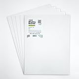
- PERFECT SAMPLES: These 12" x 9" white, styrene panels provide a smooth, warp-free surface for testing up to 5 color samples with paint, stain or other coatings.
- DURABLE MATERIAL: Made of sturdy styrene, these panels can withstand multiple coats and are non-absorbent so colors will stay true.
- CONVENIENT SIZING: At 12" x 9", the panels are just the right size for testing many common paint colors side by side before committing to a full project.
- PACKAGE INCLUDES: This value pack contains 5 white panels, enough for testing several color options on one purchase.
- VERY FLEXIBLE: Mighty Boards do not warp like foam core and you can bend them without breaking.
- North-facing openings: receive less direct sun and generally cooler daylight.
- East-facing openings: receive warmer morning light that becomes less direct later.
- West-facing openings: receive stronger, warmer late-day light after a cooler morning.
- South-facing openings: generally receive warmer, brighter light for more of the day.
These are useful tendencies, not rules that override your preference or the effect of nearby buildings. A terrace roof, overhang, adjacent tower, trees, or tinted glass can change the result. Observe the unit rather than relying on orientation alone.
Quick wins for a faster PC:
Clear out junk files and repair common Windows errorsFree Scan →Fix the driver behind crashes, sound loss and screen glitchesFind Drivers →Repair Windows errors before they cause bigger problemsFix Now →Expect the color to shift through the day
Natural light changes in both intensity and color temperature. Sherwin-Williams explains that north-facing light tends to be cooler, while east- and west-facing rooms shift between warm and cool light as the day progresses. The same neutral can therefore look gray in one hour, beige in another, and slightly green or pink when a nearby surface reflects color into it.
Artificial lighting adds another shift after sunset. Warm lamps can emphasize yellow, beige, peach, or red undertones; cooler lamps can make a neutral appear bluer or flatter. Test your finalists with the lamps and ceiling fixtures you actually use rather than assuming daylight represents the evening view.
Use LRV as a comparison aid, not a promise
Light reflectance value (LRV) describes how much visible light a surface reflects. Sherwin-Williams uses a 0-to-100 scale: 0 reflects no light and 100 reflects all light. Higher-LRV colors generally help a dim north-facing room feel lighter, while lower-LRV colors absorb more light and can create a deeper, cozier effect.
LRV cannot predict the finished appearance by itself. It does not include your room’s direction, the color temperature of your bulbs, reflected terrace surfaces, sheen, surrounding finishes, or personal tolerance for contrast. Use published LRV values to rank colors that are already compatible in undertone and mood, then verify them with samples.
Quick wins for a faster PC:
Fix the driver behind crashes, sound loss and screen glitchesFind Drivers →Repair Windows errors before they cause bigger problemsFix Now →Rank #2

- Professional Paint Color Cards Set: This bulk collection of paint colors cards features 83 standardized shades, perfect for designers and DIYers. The portable paint cards organize easily in your colors book for quick on-site matching
- Paint Chip Samples Collection: Our paint color samples cards display true-to-life hues with precise color reproduction. Use these paint chips samples to confidently select wall colors that match your vision before purchasing gallons
- Multi-Purpose Watercolor Sample Cards: Ideal for classrooms, these paint samples cards serve as both teaching tools and creative. The paper chips bulk set includes primary, secondary and specialty mixed tones
- Comprehensive Color Matching System: With 83 paint color chips covering all major brands, this set solves matching challenges between different lines. The paint chip samples withstand frequent handling in design
- Essential Color Selection Toolkit: Every professional painters needs these paint color sample cards the most reliable way to preview how colors will look in different lighting before committing to large projects
Build a shortlist before you buy paint
Start with the mood and undertone family
Decide how you want the condo to feel before selecting a named color. A quiet, continuous backdrop usually calls for restrained neutrals; a more architectural scheme may use a stronger accent or a darker room. Then identify the undertone family that can live with your fixed finishes.
- Warm undertones: yellow, beige, taupe, peach, or red. They can counteract cool, dim north light but may become overly creamy in strong southern or late-day sun.
- Cool undertones: blue, blue-gray, green, or violet. They can calm a very sunny room but may feel chilly where daylight is already cool.
- Balanced or complex neutrals: often contain several undertones and can change more dramatically across exposures. They require especially careful in-place testing.
For a north-facing room, warm neutrals are a reasonable starting point. In an east- or west-facing room, choose based on when you use the room most: a morning-focused breakfast area may be judged in warm morning light, while a west-facing sitting room should be checked during its bright late afternoon. South-facing light can make a strongly warm color read bolder than expected.
Limit the first round to a manageable set
Choose three to five candidates that differ deliberately: perhaps two warm neutrals, one balanced neutral, and one cooler option. Include a lighter and a deeper value if you are unsure about contrast. Bringing home dozens of chips makes it harder to see undertone differences and encourages choices based on names rather than appearance.
Keep the same finish and product line when comparing candidates. A change in sheen can alter perceived depth and reflection, making a fair color comparison difficult.
What’s actually slowing this PC down?
Pick the symptom - the matching free tool is one click away.
Check the condo’s fixed and outdoor surroundings
Place each candidate beside the materials that will remain: flooring, cabinets, countertops, backsplash, stone, tile, metal, upholstery, and large artwork. A neutral that looks clean on a white card may reveal a green cast beside red oak or a pink cast beside beige stone. Dulux notes that nearby brick, gardens, furniture, and artwork can bring out a paint’s undertones.
Rank #3

- Practical to use: paint color sample standard colors cards are designed for your different paint needs,color test card paint bulk,paint color samples
- Paint cards: made of plastic and paper that provides accurate colors and reliable results,paint standard samples,water color cards
- Professional: paint color standard sample cards are great for professionals and DIY enthusiasts alike,paint color cards,paint chips samples
- Paint color sample cards: suitable for various such as floor paint, paint hardware, and more,paint color sample cards,paint color cards bulk
- Comprehensive color chart: featuring multi standard colors, great for various ,paint cards,water color paint cards
Include the terrace in this check. Look at the wall from the interior, then step outside and view it against terrace flooring, planters, railings, neighboring façades, and the sky. Even when you are painting only interior walls, those visible elements can reflect color through the windows and influence the room’s overall balance.
For an open-plan space, compare candidates at the transition between rooms. A color that works beside the kitchen cabinets may appear too cool beside a bedroom carpet. If you want one color throughout, select the finalist that remains acceptable in every exposure rather than the one that is perfect in a single corner.
Test colors in the unit: a step-by-step method
- Obtain real samples. Use sample pots, A4 color swatches, paint chips, or peel-and-stick sample sheets. Dulux offers sample pots and A4 swatches; Sherwin-Williams describes paint chips and peel-and-stick options. Current sample costs and availability can change, so confirm them with the supplier.
- Prepare clean test areas. Put samples on the wall where the color will be seen, not only on a loose board. If the existing wall is strongly colored, place the sample on a primed or white test board as well so the old color does not bias the comparison.
- Use large enough patches. A small chip can hide undertones. Make each patch large enough to judge from the room’s normal viewing distance, and label it with the color name, code, and LRV when available.
- Test more than one wall. Put the same candidate on a wall facing the terrace and another wall at a right angle. Include a shaded wall if one exists. Light striking at different angles can make one color appear like several.
- Observe morning light. Record whether the color looks yellow, gray, blue, pink, or neutral when the room is first used. Note glare or reflected color from the terrace.
- Observe midday and late afternoon. East and west exposures can change substantially. Check the room at the time you normally work, relax, or entertain rather than relying on a single visit.
- Turn on the evening lighting. View the samples after sunset with every lamp and ceiling fixture normally used. If you plan to replace bulbs, test the bulbs you intend to keep before making the final choice.
- Live with the samples. Leave them in place through several days of changing weather. Dulux specifically recommends testing in natural light at various times and at night with artificial lights.
- Photograph for memory, not proof. Photos can help you compare notes, but phone cameras adjust white balance and exposure. Make the decision with your eyes in the condo.
- Remove rejected samples before the final check. Strong neighboring colors can influence your judgment. View the last two or three finalists side by side, then choose the one that works across the unit’s actual conditions.
Compare finalists on the criteria that matter
Once the samples have been observed, use a written comparison rather than a color name or online image. Score each finalist for every principal room and for the terrace view.
| Comparison axis | Questions to answer in the condo | Why it matters |
|---|---|---|
| Time-of-day appearance | Does it stay acceptable in morning, midday, late-day, and artificial light? | Wraparound exposure can produce several distinct looks in connected spaces. |
| Undertone compatibility | Does it sit cleanly beside flooring, cabinetry, stone, furniture, and artwork? | Nearby colors can reveal an undertone that was invisible on a chip. |
| Perceived lightness | Is its published LRV appropriate for the room’s brightness and the contrast you want? | LRV helps rank lightness, but the sample confirms the effect in context. |
| Terrace relationship | Does it harmonize with terrace flooring, plants, railings, exterior walls, and the view? | The terrace is part of the visual field through large openings. |
| Rule compliance | Is the proposed surface inside the unit, or is it a shared or exterior element requiring approval? | Color preference cannot override condominium governing documents. |
A simple note such as “best at 8 a.m., slightly green at 6 p.m., works with oak floor” is more useful than a generic label such as “warm white.”
Understand which surfaces you are allowed to paint
Do not assume that a terrace-facing wall belongs to the individual unit. Interior drywall may be resident-controlled, while balcony or terrace walls, railings, doors, soffits, exterior cladding, and other visible surfaces may be common property or subject to a prescribed palette.
Rank #4

- Features 216 timeless hues from the RAL CLASSIC collection with five colors per page - fan size 15.0 x 5.0 x 2.0, color display 2.0 x 5.0 cm
- Crafted with low-solvent, low-odour water-based paints for eco-friendly use
- Enhanced UV resistance provides long-lasting color protection
- Cover made from 100% recyclable post-industrial polypropylene waste
- Compact and portable design, ideal for precise color matching on the go
- Read the governing documents. Look for sections covering alterations, limited common elements, exterior appearance, architectural review, and paint or finish changes.
- List the exact surfaces. Separate interior walls from terrace walls, parapets, ceilings, railings, doors, and building façades. Rules may differ for each.
- Ask property management or the board in writing. Provide the color name, manufacturer, color code, LRV if available, finish, and photographs of the proposed location.
- Request the approved palette or color library. If the scheme is unclear, ask which version is current and whether approval is required before purchasing materials.
- Wait for written approval. Do not rely on an informal conversation with a neighbor or contractor when the documents require architectural review.
A Dunn-Edwards HOA color-library page gives the general instruction to verify final exterior choices with the community’s governing body and to contact the board or management when the scheme is unclear. That guidance is not evidence that any particular color is permitted in your condo.
Independent reader supportYour contribution helps us test, update, and keep practical guides available for everyone.What published examples can—and cannot—tell you
Terrace White is a specification, not a universal answer
Dulux Australia lists Terrace White as a grey-beige color with code Atlas SN4F1 and an LRV of 72. The specification illustrates how a named color and LRV can be documented. It does not establish that the color will look white, gray, or beige in every condo, nor that it suits every terrace view. Check the actual product availability and test the color in your unit.
HOA palette examples are community-specific
The Dunn-Edwards “The Gallery / The Terrace” HOA library includes example body colors such as Baked Potato (LRV 34) and Barnwood Gray (LRV 31), among other listed options. These values demonstrate the range that can appear in a community palette; they do not show that either color is approved for your building. Use your own association’s current documents and approval process.
Common mistakes and how to correct them
Choosing from a screen or a single chip
Digital displays and small paper chips cannot reproduce the scale, texture, glare, or changing light of a real wall. Correct this by testing physical samples on multiple walls and checking them at the times the room is occupied.
Assuming one exposure describes the whole condo
Rooms around a wraparound terrace may not share the same daylight. Correct this by mapping directions room by room and rejecting any finalist that fails in a principal space.
Best Value

- Core Color Matching: Paint color sample cards include 83 standard colors to support paint color sample cards, color matching cards for painting, and paint chips standard samples, helping users compare shades before selecting a final finish for floor paint, hardware, and other project needs
- Reliable Reference: Paint samples are made with color matching materials designed to support accurate color comparison, giving painters and DIY users a practical paint and paint color samples reference for selecting tones that fit the project surface and intended look
- Portable Format: Measuring 3.74 x 1.57 x 1.18 in and weighing 3.88 oz, this paint samples set is compact for a toolbox, work bag, or travel use, making it easier to carry color test card paint and check shades on site when planning paint work
- Wide Project Use: Paint sample cards are suitable for floor paint, paint hardware, and related color selection tasks, offering a useful paint chips samples reference for contractors, decorators, and home improvement users working on color coordination across different surfaces
- Simple Set Package: Each package includes 1 set of paint sample cards, giving users a straightforward paint sample standard cards option for daily work, project planning, and quick shade comparison when choosing among paint color cards and paint chips sample cards
Ignoring undertones in existing materials
Fresh paint can make a floor or countertop look unexpectedly pink, green, or yellow when the undertones clash. Correct this by placing samples directly beside the largest fixed finishes and viewing them under both daylight and the room’s lamps.
Using LRV as a brightness guarantee
A higher number does not automatically make a room feel brighter if the color has a strong undertone, the terrace is shaded, or the windows reflect a dark building. Correct this by treating LRV as a ranking tool and relying on in-place observation for the final decision.
Painting an exterior or shared element without permission
Unapproved work can require costly repainting or removal. Correct this by identifying ownership of each surface and obtaining the required written approval before scheduling the job.
Testing only in daylight
A color that looks calm at noon may become muddy or overly warm under evening lamps. Correct this by checking artificial light after sunset and noting the bulb type and fixture location.
When you are ready to move from selection to painting
Keep the color-selection decision separate from the work plan. For interior walls, confirm the product’s coverage, surface preparation, sheen, and compatibility with the existing coating. For an exterior or terrace project, follow the product manufacturer’s preparation and weather requirements and verify approval first.
Recommended Free Tools
BEHR’s exterior-paint guidance lists basic tools and supplies such as a brush, roller, painter’s tape, and drop cloth, and recommends primer for exterior projects. Those supplies are relevant only after the permitted surface and color have been decided; buying them does not replace the sample and approval steps.
A practical decision checklist
- Have I marked the window direction for every main room?
- Have I observed the finalist in morning, midday, late-afternoon, and evening light?
- Have I compared undertones beside flooring, cabinets, counters, stone, furniture, and artwork?
- Have I considered the terrace flooring, plants, railings, exterior walls, and neighboring buildings in the view?
- Have I recorded the manufacturer-published LRV without treating it as a guarantee?
- Have I tested physical samples on more than one wall at a useful viewing size?
- Have I checked the color with the artificial lighting that will remain after painting?
- Have I separated interior surfaces from terrace, railing, door, and building surfaces?
- Have I read the condo documents and obtained written approval wherever required?
- Can I explain why the final color works in each principal room, rather than choosing it only because its name sounds right?
The decision in one sentence
Choose the color that performs acceptably across your condo’s different exposures, fixed finishes, terrace surroundings, and evening lighting—and do not paint any terrace or exterior surface until the governing body confirms that the color and surface are allowed.
Quick Recap

Product prices and availability are accurate as of the date/time indicated and are subject to change. Any price and availability information displayed on Amazon at the time of purchase will apply.

