Do these 3 things before closing this tab:
Outdated Drivers Are Slowing You Down
One free scan finds every outdated or missing driver and matches the right update for your exact hardware.Free scan · exact hardware matchPC Slower Than It Used to Be?
A free scan shows the junk files, broken settings and background clutter dragging Windows down - then fixes them in one click.Free scan · Windows 10 & 111Clear out junk files and repair common Windows errors2Scan for outdated or missing drivers - takes under a minute3Repair Windows errors before they cause bigger problems
ThatPainter is reader-supported. When you buy through links on our site, we may earn an affiliate commission. Learn More
Choose the color for the light your room actually receives, not for the light shown on a card or screen. Map the window direction and direct-sun hours, identify whether the daylight feels cool or warm, compare undertones and Light Reflective Value (LRV), and check every candidate against your floors, cabinetry, trim, and other fixed finishes. Then paint real samples in the room and view them from morning through evening, including under the lamps you use after dark.
A north-facing room with little daylight needs a different starting point from a south-facing room flooded with sun, but orientation is only a starting point. Obstructions, glazing, trees, neighboring buildings, wall color, artificial light, and sheen can all change how a paint appears. The most dependable choice is the one that remains comfortable in your room across its actual lighting conditions.

As an Amazon Associate I earn from qualifying purchases.
What’s actually slowing this PC down?
Pick the symptom - the matching free tool is one click away.
Start by mapping the room’s real light
Before looking at paint colors, observe the room without trying to correct it. The useful question is not simply whether the windows face north, south, east, or west. It is when sunlight enters, where it lands, how much sky is visible, and what the room looks like after the sun moves away.
Record window direction and obstructions
Use a compass app or a property plan to identify each window’s direction. Note whether another building, a deep porch, an overhang, trees, blinds, or curtains block part of the sky. Two rooms with the same nominal exposure can receive very different amounts of usable daylight when one has an unobstructed view and the other does not.
#1 Best Overall

- PERFECT SAMPLES: These 12" x 9" white, styrene panels provide a smooth, warp-free surface for testing up to 5 color samples with paint, stain or other coatings.
- DURABLE MATERIAL: Made of sturdy styrene, these panels can withstand multiple coats and are non-absorbent so colors will stay true.
- CONVENIENT SIZING: At 12" x 9", the panels are just the right size for testing many common paint colors side by side before committing to a full project.
- PACKAGE INCLUDES: This value pack contains 5 white panels, enough for testing several color options on one purchase.
- VERY FLEXIBLE: Mighty Boards do not warp like foam core and you can bend them without breaking.
Watch the room at four useful times
Look at the walls in the morning, around midday, in the afternoon, and after dark with the usual lamps switched on. Write down where direct sun appears, when it disappears, and whether the room feels blue, gray, yellow, or neutral. A west-facing room may be subdued in the morning and intensely warm late in the day; an east-facing room can show the reverse pattern. The observations are more useful than a generic rule about an exposure.
Notice the light on the wall, not only through the window
Direct rays, reflected light from a lawn or neighboring wall, and light bouncing from a pale floor can each shift color. A wall in shadow may read differently from the wall opposite the window. If the room has several windows, inspect the areas between them as well as the brightest patch.
Free tools Windows power users keep installed
One-click scans. No signup required.
Decide what the room should feel like
Color selection becomes easier when you define the intended atmosphere before comparing swatches. A room can be airy, calm, cozy, grounded, crisp, or softly welcoming. The same light conditions can support several of these effects, but the undertones and depth you choose will differ.
For an airy impression
Favor colors that reflect a substantial amount of light and avoid a heavy contrast between walls and ceiling. A lighter wall can make a small space feel more open because the surfaces appear to recede visually. This is an appearance effect; paint does not increase the room’s physical dimensions or create additional daylight.
For a calm impression
Look for an undertone that relates to the room’s daylight rather than fighting it. In a cool, dim room, a restrained warm undertone can prevent the walls from looking icy. In a sunny room, a balanced neutral can keep the space from becoming overly yellow.
For a cozy or intimate impression
Deeper colors can make surfaces seem closer and can give a large room a more enclosed feeling. Strong sunlight may support more color depth than a dark room can, but sample first so the shade does not become overpowering during the brightest hours.
Use undertones and LRV as comparison tools
Understand warm and cool undertones
An undertone is the subtle color cast beneath the apparent main color. A white may lean yellow, pink, blue, or green; a gray may contain blue, violet, beige, or green. The undertone can become more visible when the color is placed beside a fixed finish or exposed to a particular light source.
Northern daylight tends to emphasize blue undertones, according to Sherwin-Williams guidance. Southern daylight can make colors appear softer. Artificial lighting can introduce another cast after sunset, so a color that looks balanced at noon may look warmer or cooler at night.
What LRV tells you
Light Reflective Value describes how much light a paint reflects. A higher-LRV color generally reflects more available light than a lower-LRV color, making it a useful way to compare candidates for a dim room. Sherwin-Williams suggests an LRV of 60 or higher as a starting range for north-facing rooms. That is the manufacturer’s guidance, not a universal cutoff and not a guarantee that a dark room will become bright.
LRV cannot predict the entire visual result. The direction and amount of light, the color’s undertone, adjacent materials, wall texture, and the finish’s sheen all influence perceived color. Treat the number as one filter for a shortlist, not as an automatic selection rule.
Recommended Free Tools
Compare candidates on the same basis
When two colors look close on a card, compare their LRV, undertone, and behavior in the room rather than relying on the card’s order or the name of the color. Keep the samples together so your eye can see the relative difference. A color that appears lighter in isolation may look darker beside a bright trim or reflective floor.
Use exposure-specific guidance as a starting point
| Exposure | Typical light pattern | What can happen to color | Useful starting approach |
|---|---|---|---|
| North-facing | Often receives the least natural light and can feel cool | Blue undertones may be emphasized | Consider warm undertones; Sherwin-Williams suggests LRV 60 or higher for this situation |
| South-facing | Can receive strong natural light for substantial parts of the day | Colors may appear softer and warm undertones can become more noticeable | Consider lower brightness and a balance of warm and cool undertones; sample in place |
| East-facing | Often brighter or warmer in the morning, with a different character later | The color can shift noticeably as direct morning light leaves | Observe the room during morning and afternoon instead of choosing from orientation alone |
| West-facing | Often subdued earlier and stronger or warmer in the afternoon and evening | Late-day direct light can change the apparent warmth and depth | Evaluate before and during late-day sun, then check the room after dark |
North-facing rooms with limited natural light
A north-facing room commonly has less daylight and may read cool. Warm undertones can counter that cast, while a higher-LRV color can help reflect more of the light that is available. Neither choice guarantees brightness: a small window, a deep overhang, or dark furnishings may still leave the room subdued.
Sample any warm neutral carefully. Too much yellow or pink can look obvious when incandescent lamps are on, while a restrained beige, greige, or warm off-white may remain more balanced. The right degree of warmth depends on the room’s flooring, wood, upholstery, and lamp color.
South-facing rooms with strong sunlight
South-facing light can be intense and can make a color look lighter, softer, or warmer than it did on the sample card. Benjamin Moore recommends considering lower brightness and balancing warm and cool undertones for these rooms. A very bright warm color may become tiring at peak sun, while a balanced neutral or a deliberately cooler undertone can moderate the effect.
The Tool Desk
Outbyte Driver Updater FREEFix the driver behind crashes, sound loss and screen glitchesFind Drivers →Outbyte PC Repair FREEClear out junk files and repair common Windows errorsFree Scan →Rank #3

- PAINT + PRIMER: KILZ TRIBUTE is a low VOC, 100% acrylic advanced technology paint and primer in one formulated for superior hide and coverage with exceptional durability. Paint and primer covers light-medium stains and light-dark color changes.
- ADVANCED FORMULA: This is our most technologically-advanced acrylic product which combines paint and primer properties with exceptional stainblocking performances. This remarkable formula can be scrubbed clean safely. GREENGUARD Certified: low emissions of VOCs
- MULTIPLE SURFACES: KILZ interior paint makes a great wall paint or cabinet paint for many home improvement needs. Use on properly prepared coated or uncoated wood, drywall, masonry and cured plaster. Surfaces should be clean and free of dust, grease, chalk, rust and peeling paint. Mix well before using.
- SUPERIOR COVERAGE: KILZ TRIBUTE interior satin paint and primer covers up to 400 sq. ft. per gallon depending on surface texture, porostiy, and application method. If desired, recoat after 2 hours. We offer an 8 oz sample size for color choosing convenience. Use with high-quality brushes or paint rollers.
- KILZ has been making premium primers and paints for 40 years and leverage this experience in every gallon of KILZ Paint. Named Paint Brand of the Year in 2015 in the Harris Poll EquiTrend Rankings. Lifetime Limited Warranty (see label for details).
Do not reject a color because it looks too strong in a single sunbeam. Inspect the wall when the sun has moved, compare it with the shaded side of the room, and check the evening lamp light before deciding.
East-facing rooms
East-facing rooms often have their strongest direct light in the morning. If the room is used mainly early in the day, give that period extra weight, but still inspect the afternoon and evening appearance. A color that looks crisp in morning light may feel flatter later, while a warm undertone can appear more pronounced at breakfast time.
West-facing rooms
West-facing rooms often gain stronger direct light later in the day. Evaluate the color during the hours when the room is occupied, especially if late afternoon is when the walls receive direct rays. A shade that seems quiet in the morning can become vivid or warm near sunset, so a single midday inspection is not enough.
Check every color against fixed finishes
Paint is rarely viewed against a blank white box. Floors, cabinets, countertops, stone, brick, wood, metal, window frames, doors, and trim remain in the room and reflect light onto the walls. Their undertones can make a nominally neutral paint look unexpectedly warm or cool.
Do these 3 things before closing this tab:
1Scan for outdated or missing drivers - takes under a minute2Repair Windows errors before they cause bigger problems3Fix the driver behind crashes, sound loss and screen glitchesMake a finish inventory
- Photograph or list the floor, cabinetry, worktops, stone, tile, upholstery, trim, and ceiling color.
- Identify which finishes will remain after painting; do not judge a wall color against items that will be removed.
- Look for hidden casts such as yellowed wood, blue-gray stone, pink-beige tile, or greenish flooring.
Place samples beside, not on top of, the finishes
Put a sample next to the floor and trim so both edges are visible. If a movable finish is available, carry it to the sample. A wall color that coordinates with a cabinet in a store can clash when the cabinet’s reflection and the room’s daylight are added.
Include the ceiling and adjacent rooms
Open doorways allow neighboring wall colors to enter the view. A ceiling with a strong warm or cool cast can also change how the wall is perceived. Judge the candidate from the room’s normal sightlines, not only from a close-up inspection.
Test real samples before committing
A printed chip or digital visualization cannot reproduce every room’s light, surrounding material, screen setting, or paint sheen. Real samples are the practical safeguard against an expensive mismatch.
Rank #4
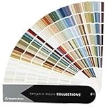
- Brand: Benjamin moore
- Container type: Box
- Finish type: Opa
- Shortlist several candidates. Begin with colors that meet the room’s exposure, desired mood, undertone, and approximate LRV needs. Keep enough variation to reveal what the room is doing, rather than choosing several nearly identical chips.
- Use a generous test area. Apply each candidate where it can be seen from the room’s usual entry and seating positions. If painting directly on the wall is unsuitable, use large primed boards that can be moved around the room.
- Place samples in different light zones. Test one near the window, one on a side wall, and one in a less-lit area when possible. A single patch can hide how the color behaves in shadow or direct sun.
- Apply the intended finish when practical. Sheen can subtly affect perceived color. A sample in a different finish may not represent the final appearance exactly.
- Leave the samples in place. Watch them in the morning, at midday, in the afternoon, and after dark with the normal lamps on. Record which shifts are pleasant and which are distracting.
- Compare with fixed finishes. View the samples beside flooring, cabinetry, trim, stone, and furniture at the same time. Remove competing temporary swatches once a candidate is eliminated so they do not confuse the comparison.
- Choose only after the full cycle. Select the color that supports the room’s purpose and remains compatible with its strongest and weakest lighting conditions, not merely the shade that wins at one hour.
Evaluate natural and artificial light separately
Daylight check
During daylight, note whether the color becomes more blue, yellow, gray, or saturated than expected. Check both direct-sun and shadowed portions of the wall. If the room receives changing light, compare the sample at the times the space is actually used.
Quick wins for a faster PC:
Fix the driver behind crashes, sound loss and screen glitchesFind Drivers →Repair Windows errors before they cause bigger problemsFix Now →Night check
After sunset, switch on the lamps normally used in the room. Daylight and incandescent light influence color differently, and other lamp types can also change the apparent warm or cool cast. A candidate that looks balanced in the afternoon may feel too yellow under warm bulbs or too blue under a cooler source.
Glare and reflection check
Stand where you normally sit or work. Glossy surfaces, glass, polished stone, and bright floors can reflect light onto the wall and make a color appear more intense. Look at the wall from several angles rather than judging only face-on.
Choose color and sheen together
Color and finish are related decisions. Sherwin-Williams notes that sheen can subtly shift color perception. A more reflective finish may catch direct sun and emphasize surface irregularities or glare, while a less reflective finish can appear quieter. The appropriate finish also depends on the room’s practical use, cleaning needs, and the condition of the walls.
When sampling, use the finish planned for the final walls whenever practical. If you must compare different finishes, record that limitation and rely on the final test panel before purchasing all the paint. Do not assume a color will look identical across finishes.
Adjust for room size without expecting paint to change it
Lighter colors can make a small room feel more open because walls appear to recede. Darker colors can make surfaces seem closer and can make a large room feel more intimate. This is a visual effect, not a physical expansion or reduction of space.
In a compact room with limited natural light, a higher-LRV candidate may preserve a sense of openness, but the undertone still matters. In a large, sunny room, a deeper or less bright color may supply the visual weight you want. Test the color on more than one wall so the result is not based on a single patch in the brightest area.
Best Value

- Core Color Matching: Paint color sample cards include 83 standard colors to support paint color sample cards, color matching cards for painting, and paint chips standard samples, helping users compare shades before selecting a final finish for floor paint, hardware, and other project needs
- Reliable Reference: Paint samples are made with color matching materials designed to support accurate color comparison, giving painters and DIY users a practical paint and paint color samples reference for selecting tones that fit the project surface and intended look
- Portable Format: Measuring 3.74 x 1.57 x 1.18 in and weighing 3.88 oz, this paint samples set is compact for a toolbox, work bag, or travel use, making it easier to carry color test card paint and check shades on site when planning paint work
- Wide Project Use: Paint sample cards are suitable for floor paint, paint hardware, and related color selection tasks, offering a useful paint chips samples reference for contractors, decorators, and home improvement users working on color coordination across different surfaces
- Simple Set Package: Each package includes 1 set of paint sample cards, giving users a straightforward paint sample standard cards option for daily work, project planning, and quick shade comparison when choosing among paint color cards and paint chips sample cards
Compare a shortlist with one consistent framework
Write the candidates across the top of a note and score each against the same questions. The purpose is not mathematical precision; it is to prevent one attractive feature from hiding a serious mismatch.
- Exposure and time: Does it remain comfortable during the room’s strongest direct sun and its dimmest period?
- Undertone: Does its warm or cool cast work with the daylight and with the fixed finishes?
- LRV: Does its reflectance support the desired sense of openness without forcing a false promise of brightness?
- Furnishings and trim: Do floors, wood, stone, cabinets, doors, and ceiling look coordinated beside it?
- Natural and artificial light: Does the color still suit the room after sunset with the normal lamps on?
- Sheen: Does the planned finish produce the visual calm or liveliness you want without distracting glare?
Troubleshoot common selection mistakes
The room still looks cold
First check whether the daylight is emphasizing a blue undertone, especially in a north-facing room. Compare a candidate with a restrained warm undertone beside the existing floor and trim. Also inspect the lamps at night; a cool lamp can preserve the blue cast even after sunset.
The sunny room looks too yellow
Strong southern or late-day western light can amplify warmth. Compare a less bright color or one with more balanced warm and cool undertones. Keep the samples in place through the strongest sun before changing direction.
The chosen color looks different from the card
This is expected when the card was viewed under different lighting or beside different surroundings. Recheck the sample in every major light zone and against the fixed finishes. A card or screen is a starting reference, not a room-specific prediction.
The sample looks right by the window but wrong elsewhere
The window area may receive direct rays while the opposite wall is lit indirectly. Move or add samples so both conditions are represented. Choose based on the areas that matter most in daily use, while ensuring the transition is acceptable throughout the room.
The walls feel too dark after painting
Confirm that the final finish matches the sample and that the room’s night lighting was considered. If the problem appears only after dark, the lamp color may be driving the shift. If it appears all day, compare a higher-LRV option, remembering that LRV is a comparison aid rather than a guarantee of brightness.
Practical decision examples
A small north-facing study
Map the limited daylight and note whether the study is used mostly during the day or under lamps. Start with warm-undertone candidates and consider the Sherwin-Williams starting suggestion of LRV 60 or higher. Test them beside the floor, desk wood, trim, and task-light glow. Reject any candidate that becomes yellow at night or blue in the daytime if either shift makes work uncomfortable.
A bright south-facing living room
Observe the walls during peak sun and when the room is shaded. Begin with colors of moderate or lower brightness and balanced undertones, following Benjamin Moore’s south-facing guidance. Place samples on both the sunny and shaded walls, then check whether the color remains compatible with upholstery, flooring, and evening lamps.
An east-facing breakfast room
If breakfast is the main use, give morning light priority but still inspect the late-day appearance. A sample that looks fresh in direct morning light may read differently once the sun has moved. Keep the candidate that supports the intended mood across that change and coordinates with cabinetry and trim.
A west-facing bedroom
Check the color in the quieter morning and in the warmer late-afternoon period when direct sun may be strongest. If the room is used for rest, evaluate whether the late-day shift feels soothing or overly intense. Include the bedside lamps in the night test before committing.
Quick Recap
Final checklist before buying all the paint
- Window direction, obstructions, and direct-sun hours are written down.
- Morning, midday, afternoon, and nighttime appearances have been observed.
- The desired mood is clear: airy, calm, cozy, crisp, or another specific goal.
- Undertones have been compared, not just the main color family.
- LRV has been used as one comparison aid, with the north-facing 60-or-higher suggestion treated as guidance rather than a rule.
- Samples have been viewed beside floors, wood, stone, cabinetry, trim, ceiling, and furniture.
- Real samples are visible in more than one light zone.
- The intended sheen has been considered and sampled when practical.
- The color works in both natural daylight and the lamps used after dark.

Product prices and availability are accurate as of the date/time indicated and are subject to change. Any price and availability information displayed on Amazon at the time of purchase will apply.

