Quick wins for a faster PC:
Scan for outdated or missing drivers - takes under a minuteDriver Scan →Clear out junk files and repair common Windows errorsFree Scan →Fix the driver behind crashes, sound loss and screen glitchesFind Drivers →
ThatPainter is reader-supported. When you buy through links on our site, we may earn an affiliate commission. Learn More
Choose paint room by room, starting with how each space is used and the mood you want. Then account for daylight, bulb temperature, fixed finishes, furnishings, room size, architecture and the colors of adjoining rooms. Compare undertones, test samples on every wall through the day, and choose a sheen only after you see the color in its real setting.
Start with the room’s job and the feeling you want
A color that works in a quiet bedroom may feel wrong in a busy kitchen because the rooms ask different things of you. Before looking at swatches, write a short brief for each space: who uses it, at what times, and how you want to feel there.
As an Amazon Associate I earn from qualifying purchases.
Social rooms
Kitchens, dining areas and living rooms often support conversation, meals or entertaining. Sherwin-Williams’ guidance uses warm yellows and reds as possible starting points for shared spaces because warm colors can feel welcoming and energetic. That is a direction, not a rule: a pale warm neutral, a muted green or a cool color can work when it suits your furnishings and light.
Private and focused rooms
Bedrooms, bathrooms and offices generally benefit from a calmer brief. Blues, greens and neutrals are common starting points in manufacturer guidance, while Benjamin Moore describes cool colors as calming and warm colors as cozy and intimate. Decide whether you want restful, fresh, soft, concentrated or expressive before choosing a hue. Personal preference and the room’s light should overrule a category.
#1 Best Overall
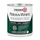
- Self-Priming formula - requires no sanding
- Mold & Mildew-Proof paint film - guaranteed for 5 years
- Resists dirt and moisture on film coating
- Finish is washable and scrubbable with soap and water
- Product contains a mildewcide to prevent the growth of mold and mildew on the paint film only
Turn the brief into a testable sentence
Use wording such as “quiet and soft after dark,” “bright family hub,” or “polished backdrop for artwork.” The sentence gives you a way to reject colors that are attractive on a card but wrong for the room’s actual use.
Inventory what will stay
Paint is only one element in a room. Start with a favorite rug, artwork, fabric, upholstery or bedding and pull possible colors from it. This gives the paint a relationship to objects you already like instead of forcing the room to conform to a color chosen in isolation.
Do these 3 things before closing this tab:
1Repair Windows errors before they cause bigger problems2Scan for outdated or missing drivers - takes under a minute3Clear out junk files and repair common Windows errorsList permanent finishes
Record the undertones and visual weight of cabinets, worktops, tile, brick, flooring, woodwork, fireplaces and other architectural details. These items are expensive or disruptive to replace, so the wall color must work with them. A white that looks neutral beside one stone may appear pink, green or blue beside another.
Separate fixed elements from changeable accents
Cushions, small accessories and seasonal decorations can move. Floors, cabinetry and tile usually cannot. Give the fixed elements priority when you narrow your shortlist, then use movable pieces to add contrast or repeat the chosen color.
Read the room’s natural and artificial light
The same paint can look substantially different from one room to another. Note which direction the windows face, how much daylight reaches the walls, and how the room looks at the times you actually use it.
Window orientation
| Light condition | Likely effect on color | What to check |
|---|---|---|
| North-facing room | Light can feel cooler | Check whether gray, blue or green undertones become more prominent than you intend. |
| South-facing room | Light is often warmer and can emphasize yellow undertones | View warm neutrals at midday and again when the sun is lower. |
| Limited or shaded daylight | Colors may appear deeper or less lively | Judge the wall under the lamps used in the evening, not only beside a window. |
These are tendencies, not guarantees. Trees, neighboring buildings, overhangs, window treatments and local weather can change the result. The practical question is not simply “What color is this?” but “What does this color become in this room at 8 a.m., noon and 8 p.m.?”
The Tool Desk
Outbyte PC Repair FREERepair Windows errors before they cause bigger problemsFix Now →Outbyte Driver Updater FREEFix the driver behind crashes, sound loss and screen glitchesFind Drivers →Check bulb temperature
Artificial light changes both hue and perceived brightness. Benjamin Moore notes that bulbs above 3500K tend to cast cooler light, while lower color temperatures tend to look warmer. Record the bulbs in ceiling fixtures, lamps and under-cabinet lights; then test samples with those lights on. If you plan to replace the bulbs, choose the paint after deciding on the lighting, because changing the bulbs later can change the wall’s appearance.
Rank #2

- PAINT + PRIMER IN ONE: Evolve’s paint-and-primer formula helps you get great coverage from the start, sealing your surface and reducing the extra work of multiple coats.
- AVAILABLE IN MULTIPLE SHEENS, COLORS & SIZES: Choose from a curated palette of designer colors in Flat, Eggshell, Satin, and Semi-Gloss sheens to match any style, room, or project. Available in 1-Gallons & 5-Gallons.
- EGGSHELL SHEEN – Soft, Velvety Glow: Offers a gentle sheen that balances elegance with durability. Ideal for moderate-traffic areas like dining rooms, hallways, and family rooms. Easy to clean without compromising the finish.
- STAIN & SCRUB RESISTANT: Built to last in real spaces, Evolve helps resist marks, scuffs, and water spotting, so your home continues to look polished and well-maintained.
- DESIGNED FOR MOISTURE-PRONE AREAS: Formulated to perform well in bathrooms, kitchens, entryways, laundry rooms, and other high-humidity spaces.
Learn to see undertones
Every paint has a visible mass tone—the color you notice first—and a subtler undertone beneath it. Undertones are easiest to miss in whites, creams, grays and other pale neutrals, yet they often determine whether a color harmonizes with a floor or looks unexpectedly pink, green or blue.
Compare, do not inspect a chip alone
Place similar chips side by side. A near-white can reveal its undertone when compared with a purer white. Sherwin-Williams Director of Color Marketing Sue Wadden explains, "If you’re just looking at a white by itself, it will probably just look white." Move farther down the same color strip as well; the stronger versions often make the underlying hue easier to identify.
Test undertones against the room
Hold the chips next to the fixed finish that matters most: a backsplash, wood floor, stone countertop or upholstery. A color that looks neutral against a white card may clash with a warm oak floor. Keep only colors whose undertones support the permanent elements and the mood you wrote down.
Recommended Free Tools
Build a palette that moves through the home
A whole-home palette does not require one wall color everywhere. It requires relationships that make connected rooms feel intentional.
Choose a dominant color in a central room
Begin with the room that anchors the layout or is seen most often. Benjamin Moore’s whole-house guidance uses that dominant color as the starting point, then develops secondary colors for connected rooms. The dominant color can be a neutral, a muted hue or a stronger shade if the architecture and furnishings can support it.
Connect adjoining rooms deliberately
Link rooms through one or more of these methods:
- Use colors with a shared undertone, such as several warm neutrals or several blue-leaning shades.
- Stay within a monochromatic family by changing value or intensity.
- Use an analogous relationship, where neighboring hues on the color wheel create a gentle transition.
- Repeat a trim or door color so separate wall colors still share an architectural constant.
- Use a neutral hallway or other transition space to separate stronger colors.
Look through open doorways and along sightlines, not just at each room in isolation. A color that is attractive alone may create a jarring stripe when seen beside the next room.
Choose continuity or contrast
Use one color across connected spaces when you want the home to feel larger and quieter. Choose related but distinct colors when you want rooms to have identities. Contrast is most successful when the undertones remain compatible and the transition is visible from a deliberate stopping point such as a doorway, corner or change in trim.
Quick wins for a faster PC:
Fix the driver behind crashes, sound loss and screen glitchesFind Drivers →Clear out junk files and repair common Windows errorsFree Scan →Rank #3

- Use for a variety of indoor and outdoor project surfaces including wood, metal, plaster, masonry or unglazed ceramic
- Water-based acrylic formula is low odor, resist chips and provides long-lasting protection
- Covers up to 120 sq ft and dries to touch in 30 minutes for quick project completion
- Semi-gloss finish minimizes surface imperfections, goes on smoothly and provides excellent hide
- Prior to application sand surfaces with 180/200 grit sandpaper, then wash with a degreaser, allow the surface to dry and apply paint
Make the decision room by room
Kitchen
First decide whether your kitchen is mainly a preparation area, a high-traffic family hub or an entertaining space. Those uses imply different demands for mood and visual energy. Warm hues can support a social atmosphere, but the final choice must also sit beside cabinets, counters, backsplash, flooring and appliances. Sample the wall near the largest fixed finish and check it under both daylight and the kitchen’s task lighting.
Living room
Define whether you want the room to feel cozy, open, refined or lively. Then look at the art, upholstery, rugs and wood tones the walls need to support. Benjamin Moore’s guidance illustrates that both warm and cool schemes can create distinct moods in the same type of room; the deciding factors are the furnishings, light and the feeling you want, not a mandatory living-room color.
Bedroom
Choose the desired experience—calm, soft, fresh or expressive—and note whether the room is a primary bedroom, child’s room or guest room. Cooler hues are one possible calming starting point, while a warm neutral can feel cocooning. Check the color under bedside lamps as well as daylight, because a shade that feels gentle in the morning may read much stronger at night.
Bathroom
Decide whether the bathroom is a private retreat, a busy family room or a guest space. Coordinate the walls with tile, stone, vanity finishes, mirrors and metalwork. Cooler colors may support a retreat-like mood, but a warm or neutral choice can be more coherent with existing finishes. Examine the sample beside the tile and under the room’s often-bright artificial lighting.
What’s actually slowing this PC down?
Pick the symptom - the matching free tool is one click away.
Home office
Use the work brief to choose between quiet concentration and more stimulating energy. Check the wall behind a monitor or video-call position, where glare and reflected color matter. The office should also connect visually to the rooms seen from the desk; a related undertone can keep the transition calm.
Hallways and connected areas
Hallways can act as a neutral reset between stronger room colors, or they can carry a deliberate accent when the rest of the palette supports it. Because hallways borrow light from adjoining rooms, sample the color at both ends and view it from the rooms that open onto it.
Use value and architecture to shape the room
Color value—the relative lightness or darkness of a paint—changes how the room is perceived. Sherwin-Williams suggests that lighter colors can make a small room feel more open, while darker colors can make a large room feel more intimate. These are visual effects, not guarantees; furniture, windows and lighting still determine the result.
Rank #4

- ALL-IN-1 PAINT & PRIMER: A hardy multi-purpose and multi-surface one-coat paint and primer in one for almost any indoor or outdoor surface. A wall, ceiling, floor, skirting board, cabinet, furniture and door paint for your bathroom, kitchen, home and garden.
- DURABLE & VERSATILE: A highly pigmented, thick formula available in 12 bold colors and a Matte, Satin or Gloss finish. Ideal for interior and exterior paint jobs on wood, laminate, plastic/UPVC, metal, concrete, brick, masonry, stone, glass and more.
- EFFECTIVE MONEY & TIME SAVER: A quick painting solution for DIY or professional builders and painters; our luxuriously opaque formula requires just 1 coat and is fast drying for a premium finish.
- ADVANCED ECO FORMULA: Our UK-made chalk paint is water-based, non-toxic, low odor, and has low VOCs for an environmentally friendly decorating choice.
- EASY APPLICATION: Remove dirt with a damp cloth, wipe the surface clean and dry, sand/score the surface (optional based upon the finish required), stir to mix the color and paint with a brush or roller.
Narrow rooms
For a long, narrow room, Sherwin-Williams suggests using darker paint on the shorter walls and lighter paint on the longer walls to make the room appear wider. Test the idea before committing, because a strong contrast can also emphasize the room’s shape if the proportions or lighting are unusual.
Trim and architectural features
Use contrast or a different sheen to call attention to trim, doors, beams, niches and other details. A lower-contrast trim can make walls and woodwork blend into a quieter envelope; a stronger contrast can outline the architecture. Decide this relationship after viewing the wall color beside the actual trim, not from separate color cards.
Test samples before buying enough paint
Manufacturer guidance consistently recommends testing a swatch on the wall and viewing it in different lighting and at different times of day. A small card cannot show how a color behaves across a large surface or beside your finishes.
- Gather the shortlist. Keep a few colors that satisfy the room brief and work with the permanent finishes. Include close alternatives so undertones are easy to compare.
- Place samples where decisions happen. Test on more than one wall, including a wall opposite a window and a wall near the dominant finish. Include the areas most visible from adjoining rooms.
- Use removable samples or paint swatches. Sherwin-Williams describes removable sample options and color chips; confirm current availability when you shop. The point is to move the comparison around without damaging the surface or trusting a single fixed location.
- Observe morning, afternoon and evening. Record what changes as daylight moves and as your normal lamps switch on. Pay special attention to the time the room is most heavily used.
- Compare with the real furnishings. Put the rug, artwork, fabric or cabinet door beside the sample. A color can shift when surrounded by a large field of wood, stone or saturated fabric.
- Check adjoining rooms. Stand in the doorway and look at the sample with the neighboring wall color. Confirm that the transition works along the sightline.
- Decide on trim and accents. Evaluate the wall, trim, doors and architectural features together. Do not finalize a trim contrast from a chip viewed alone.
- Approve the color only after the evidence agrees. If the sample works in the room’s real light, with its permanent finishes and at its normal hours, then purchase the quantity needed for the project.
Choose sheen with the color and surface
Sheen changes reflection, so it can alter how a color appears even when the pigment is identical. Sherwin-Williams describes flat paint as having little reflection and gloss as highly reflective; higher gloss can brighten or enrich a color. Choose the finish in relation to the room’s light, decor, surface condition and use rather than assigning one finish automatically to every kitchen, bedroom or hallway.
When low reflection helps
A flatter finish can reduce visual reflection where you want a quiet, soft appearance. Look at the sample across the wall’s texture and at grazing daylight, because reflection can reveal surface irregularities.
When more reflection helps
A glossier finish can add brightness or emphasis to selected surfaces and architectural details. Check it under direct lamps and near windows; reflected highlights may become more noticeable than expected.
Keep the comparison fair
Compare sheen samples under the same light and on the same type of surface. A color can seem lighter or richer because of reflection, so judge both hue and finish before ordering paint.
Best Value

- WHAT'S IN THIS 10 PIECE PAINT KIT FOR WALLS: includes one plastic paint tray; one 9 inch roller frame; one 4 inch mini roller frame; two 9 inch microfiber roller covers (1/2 inch nap); two 4 inch microfiber roller covers (1/2 inch nap); one 1 inch flat brush; one 1.5 inch angle sash brush; one 2 inch angle sash brush
- Versatile Application: Perfect for any project, this set includes paint rollers 9 inch for large surfaces and smaller brushes for detail work
- All-in-One Kit: This paint brush set and paint tray combo ensures you have all the paint supplies needed for any home improvement task
- Professional Grade: Get a smooth, even finish with our high-quality paint roller set; ideal for applying interior paint gallon or smaller quantities
- Cost-Effective: This paint brush and roller set provides unbeatable value; includes paint pan and paint trays for easy cleanup and reuse
A practical decision framework
When two colors remain, compare them on the factors that actually govern your room:
| Question | How it separates the options |
|---|---|
| Which undertone supports the fixed finishes? | Choose the color whose underlying hue harmonizes with flooring, tile, stone, cabinets and wood. |
| How does the room face? | Account for cooler-feeling north light and warmer south light that can emphasize yellow. |
| What happens under the bulbs? | Check the paint with the installed lighting; bulbs above 3500K tend cooler and lower temperatures tend warmer. |
| What is the room used for? | Match the mood to social, private, restorative or focused use instead of following a room-color rule. |
| Should the room recede or feel intimate? | Lighter values can feel more open; darker values can feel more enveloping, subject to the room’s actual light and furnishings. |
| Should adjoining rooms blend or contrast? | Use shared undertones or a related scheme for continuity; use deliberate value or hue changes for contrast. |
| How should the surface reflect light? | Balance flat or glossier finishes with the desired reflection, decor and architecture. |
Common mistakes and how to correct them
Choosing from a tiny chip
Symptom: The color looked right in the store but wrong on the wall. Correction: Test a real swatch on multiple walls and view it through the day and under normal lamps.
Free tools Windows power users keep installed
One-click scans. No signup required.
Ignoring undertones
Symptom: A “neutral” white or gray looks pink, green or blue beside the floor or counter. Correction: Compare similar chips side by side, examine stronger shades farther down the strip and test them against the permanent finish.
Using a room rule as a guarantee
Symptom: A bedroom blue or kitchen yellow feels unsuitable. Correction: Return to the room’s use, desired mood, orientation and furnishings. Warm and cool guidance is a starting point, not a prescription.
Forgetting the evening view
Symptom: The color works in daylight but feels harsh or muddy at night. Correction: Test with the actual bulbs and note their color temperature; make the decision at the hours the room is used.
Painting each room in isolation
Symptom: Open doorways create abrupt, unrelated color changes. Correction: Choose a dominant central color, connect secondary colors through undertones or a related scheme, and use hallways or trim as transition elements.
Choosing sheen by habit
Symptom: Glare, unwanted emphasis or a flatter-than-expected appearance changes the result. Correction: Compare finishes with the same color in the room’s real light and select the reflection level that suits the surface and architecture.
The complete order of operations
For a project covering several rooms, follow this sequence so later decisions do not undo earlier ones:
- Gather colors from furnishings and finishes that will remain.
- Write the use and desired mood for every room.
- Note window orientation, daylight, nighttime lighting and bulb temperature.
- Choose a dominant color in a central space.
- Select connected-room colors with shared undertones or another clear palette relationship.
- Compare chips to identify undertones and narrow the shortlist.
- Test real samples in every room at different times and under typical artificial light.
- Choose trim, accents and sheen after considering walls and architecture together.
This process gives you a palette that responds to the home you actually have: its light, fixed materials, proportions, furnishings and daily routines. It also leaves room for personal taste, which is more reliable than a universal “best” color for any room.
Quick Recap

Product prices and availability are accurate as of the date/time indicated and are subject to change. Any price and availability information displayed on Amazon at the time of purchase will apply.

