The Tool Desk
Do these 3 things before closing this tab:
1Scan for outdated or missing drivers - takes under a minute2Repair Windows errors before they cause bigger problems3Fix the driver behind crashes, sound loss and screen glitchesOutbyte Driver Updater FREEScan for outdated or missing drivers - takes under a minuteDriver Scan →Outbyte PC Repair FREEClear out junk files and repair common Windows errorsFree Scan →
ThatPainter is reader-supported. When you buy through links on our site, we may earn an affiliate commission. Learn More
The most reliable way to coordinate flowers with a painted house is to treat the exterior as part of the garden’s color composition. Start with the siding or other dominant exterior color, decide whether the planting should blend with it or contrast against it, choose a simple palette of two or three related colors, and repeat those colors in groups or bands. Then check foliage, bloom timing and local growing conditions before choosing species. A flower can match the color wheel perfectly and still fail if it cannot grow in the site.
Use the house as the garden’s fixed color
Flower color is only one part of the view. Siding, painted trim, brick, stone, fences, paths and other hard surfaces stay in place while flowers appear and disappear. Look at the bed from the locations where it will actually be seen, and identify the color that occupies the most visual area. That dominant exterior color becomes the starting point for the planting palette.
As an Amazon Associate I earn from qualifying purchases.
Windows Errors? Fix Them Before They Spread
Repair common Windows errors and clear accumulated junk for a smoother, more stable PC - no reinstall needed.Free scan · no reinstallOutdated Drivers Are Slowing You Down
One free scan finds every outdated or missing driver and matches the right update for your exact hardware.Free scan · exact hardware matchList every color that will remain visible
- Main exterior: siding, stucco, painted wood or another broad wall surface.
- Secondary trim: shutters, doors, porch posts, window trim and railings.
- Permanent site colors: brick, masonry, roofing that is visible from the bed, fencing and paving.
- Existing vegetation: evergreen foliage, tree trunks, hedges and large shrubs that will not be replaced soon.
Do not choose flowers from a small paint chip alone. A color that appears quiet on a sample may read much stronger when repeated across a bed, and a wall in shade can look different from the same wall in afternoon sun. Observe the fixed colors in the light and at the viewing distance where the planting will be judged.
Choose blending or contrast before choosing plants
| Approach | Visual effect | How to use it | What to watch |
|---|---|---|---|
| Blend | Related, calm and integrated | Echo the house color or a nearby color family in flowers and foliage. | Very close colors can disappear against the wall, especially in shade. |
| Contrast | More noticeable and energetic | Use a color family that stands apart from the dominant exterior or pair opposites on the color wheel. | High-contrast colors need repetition and restraint so the bed does not look accidental. |
Neither choice is inherently better. Blending can make a small entry garden feel settled; contrast can draw attention to a path, porch or architectural feature. The important decision is to make the relationship deliberate rather than accumulating plants one at a time.
#1 Best Overall
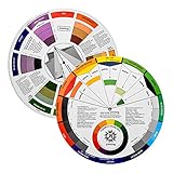
- Helps organise colours to make choices and combinations easier;Defines common terms and helps the artist to understand colour uses and interactions.
- Designed for all artists, including: Painters, crafters, interior, graphic, garden, and landscape designers;Perfect gift for creative people!
- Two-sided rotating wheel shows colour relationships;230mm diameter,2 packs Convenient and portable.
- UV coated to minimise fading and protect from moisture.Paper cover makes it;Paper evelope cover makes it difficult to break during transportation.
- Good for beginners to identify any of the colors easily and recognize the middle of the color simply.
Choose a color-wheel structure
A color wheel gives you three practical ways to organize flowers. These are relationships among color families, not guarantees that every cultivar or every paint shade will work together. Compare the actual plants and exterior in the intended location before committing.
| Palette | Structure | Likely effect | Useful situation |
|---|---|---|---|
| Monochromatic | Several values or tints within one color family | Quiet and cohesive | When the house already has a strong color or the architecture should remain the focus. |
| Analogous | Neighboring colors on the wheel | Related with more variation than a single-color scheme | When you want a gradual transition rather than a sharp focal contrast. |
| Complementary | Opposite color families | Strong contrast and visual emphasis | When the bed needs to stand out from a neutral or subdued exterior. |
Common complementary relationships
Illinois Extension identifies purple with yellow, red with green, and orange with blue as practical complementary relationships. The exact intensity matters: a soft lavender beside a pale yellow behaves differently from a saturated purple beside a bright yellow. Use the relationships as a starting point, then judge the particular paint, flower and foliage together.
Keep the palette small
UF/IFAS describes a simple theme as two or three colors. A restrained palette gives repeated groups a clear job: one relationship can dominate while another hue acts as an accent. The brightest color generally has more impact in smaller amounts and when balanced by quieter colors. This is a design guideline, not a fixed percentage or a universal planting ratio.
Repeat colors in masses or bands
Once the palette is chosen, decide how it will appear along the bed. NC State Extension recommends masses of a single color or bands of colors, and Iowa State Extension cautions against a “shotgun approach” that places one unrelated color here and another there. Repetition makes the relationship to the house legible from a distance.
Rank #2
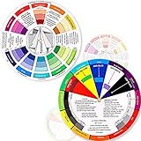
- Package include: 2 creative color wheel, 5.5 inch in diameter, the artist wheel helps show which colors are complimentary, and how they go (or don't go) together, suitable for learning how to color; Two identical color wheels, with different designs on the front and back
- Color mixing guide: the color wheel shows color, from basic principles and color mixing results on the front side; Spin around the paint wheel, then you will find the color mixture results in the windows, to learn the color theory in a fun way
- Color leaning tool: the backside of the color artist wheel that visually illustrates relationships between colors and demonstrates the results features a grayscale, and triad colors tints and tones, definitions of color terms, and illustrations of color, such as complementary colors, and triad colors
- Easy to use: this color mix guide consists of 3 layers, made of reliable cardboard with smooth surface and smooth rotation; And the size is moderate, easy to operate and carry
- Wide application: the relationship wheel is suitable to use when painting, quilting, interior design, having creative craft projects, and home decorating; Suitable for artists, teachers, kids, painters, designers, and tattoo learners
Masses
Use a group of plants carrying the same flower or foliage color, then repeat that group elsewhere in the bed or in another bed visible from the same approach. Masses are especially useful when the house has a broad, quiet exterior that needs a clear foreground shape.
Bands
Arrange colors in broad strips that follow the bed’s edge, a walkway or the lines of the architecture. Bands can move from a blended color near the wall to a contrasting accent toward the path, provided the sequence is repeated rather than interrupted by unrelated colors.
Accents
Reserve the strongest or brightest hue for a focal point such as the door, steps or a bend in the path. Repeat a small amount of that accent elsewhere so it looks intentional. If every plant is a different high-intensity color, there is no visual hierarchy.
Test the composition before planting
UF/IFAS advises trying small potted combinations in the intended location. This low-commitment test reveals whether the flowers relate to the wall, trim and hardscape under real conditions.
Rank #3
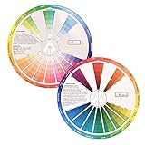
- This package include one Creative Color Mixing Board with one regular Color Wheel (9.25 inch).
- Easy-to-use tool that visually illustrates relationships between colors and demonstrates the results Features a grayscale, tints and tones, definitions of color terms, and illustrations of color.
- Color Wheel helps show which colors are complimentary, and how they go (or don't go) together.
- Some people know instinctively, and others need a visual tool to help them choose.
- Two sided wheel with indicators for complementary, split complementary and triad color schemes, how to tint and shade, primary, secondary and tertiary references, and more.
- Place the pots where the bed will be viewed. Include the wall, trim, fence and any existing shrubs that will remain in the final composition.
- Use the proposed palette, not random substitutes. If the plan is purple and yellow, place representatives of both families together so their relative strength can be judged.
- Look from several distances. Check the porch, sidewalk, driveway and the most common indoor view. A combination that works close up can merge into one dark patch from the street.
- Check different light. Observe morning, midday and late-day conditions when possible. Shade and reflected light can change how a paint color and a flower are perceived.
- Photograph the test. A photograph from the approach often exposes scattered colors or a weak focal point that is easy to miss while standing beside the pots.
- Move, remove or repeat before digging. Adjust the grouping until the dominant color relationship is obvious without explanation.
Design for foliage and the months without flowers
Flowers are temporary. UF/IFAS notes that an individual plant’s flower color may last only a few weeks in a year, while foliage commonly remains as the background. As its guide puts it, “Foliage typically provides the overall background color for the flower colors.”
Evaluate more than bloom color
- Leaf color: green, blue-green, silver, burgundy or variegated leaves can either bridge colors or intensify contrast.
- Texture: fine, grass-like foliage creates a different visual field from broad or glossy leaves.
- Form: upright, rounded, mounding and spreading shapes affect how color is distributed through the bed.
- Bark and stems: woody structure can remain visible after flowers fade.
- Fruit and seed heads: these may add color or texture late in the season.
- Seasonal leaf change: foliage may shift color or disappear, changing the relationship to the house.
Make a seasonal color plan
List what will carry the palette in each part of the year instead of planning only for peak bloom. A simple worksheet can expose a gap:
What’s actually slowing this PC down?
Pick the symptom - the matching free tool is one click away.
| Season or period | What to record | Design question |
|---|---|---|
| Early season | Emerging foliage, bulbs, bark and the first flowers | Does the bed still relate to the house before the main display begins? |
| Peak bloom | Dominant flower colors and their relative visual strength | Is the chosen blend or contrast clear, or are too many colors competing? |
| Late season | Remaining flowers, seed heads, fruit and changing leaves | What replaces the original flower color when it fades? |
| Winter or dormant period | Evergreen foliage, stems, bark, mulch and visible hardscape | Does the composition still look intentional against the painted exterior? |
UF/IFAS recommends considering bloom length and seasonal timing so flowering color has a sequence rather than a single short peak. The sequence does not have to use the same species throughout; it needs to preserve the chosen color relationship as the season changes.
Choose plants only after checking the site
Color coordination cannot determine which species will thrive. The appropriate plant list depends on growing region, sun exposure, soil, drainage, moisture, winter conditions and the amount of maintenance you can provide. Treat color as the design brief and site suitability as the selection filter.
Rank #4

- Comprehensive Color Theory Guide: This color wheel clearly organizes hues, tints, shades, and tones in a visually intuitive layout, making it easy to understand color relationships and harmonies. It includes essential color theory terms and definitions, helping users expand their knowledge while providing a practical reference for creating balanced and appealing color schemes in various projects. Tips: Instructions printed on the exterior of the product
- Enhanced Learning and Creativity Support: Designed with a detailed English-language interface, the wheel effectively illustrates color mixing results and interactions. It supports both intuitive and technical color selection, allowing artists to quickly identify complementary, split-complementary, and analogous colors. This tool helps reduce guesswork and improves accuracy in color matching
- Durable and User-Oriented Design: Made from lightweight yet durable paper material, the color wheel is resistant to frequent use and easy to clean. Its compact and portable design offers convenience for artists and instructors on the go. The clear markings and smooth spinning mechanism ensure effortless operation during creative sessions
- Suitable for Multiple Disciplines and Users: Ideal for painters, quilters, makeup artists, art students, and teachers, this color wheel is a versatile tool across various fields. It supports activities such as watercolor painting, fabric dyeing, cosmetic blending, and classroom instruction, making it an essential accessory for anyone working with color
- Package Contents and Size Details: Both wheels are designed with the same accurate color layout and sturdy construction, offering flexibility for different working environments and user preferences
Site information to gather
- Growing region and local winter conditions.
- Hours of direct sun in the planting area during the growing season.
- Soil texture, drainage and typical moisture.
- Available planting depth and competition from tree roots.
- Clearance from foundations, paths, windows and utilities.
- Expected mature height and spread so the group does not hide trim or block access.
- How often the bed can be watered, weeded or divided.
Only after these checks should you substitute locally suitable plants for a color example. A purple flower in one climate is not evidence that the same species belongs in every garden.
Color examples to adapt locally
Illinois Extension’s 2024-03-29 article, From theory to practice: Applying complementary colors in the landscape, gives specific pairings that illustrate the color relationships. The pairings below are examples of purple-yellow, red-green and orange-blue contrast, not universal planting prescriptions.
| Color relationship | Illustrative pairing | How to interpret it |
|---|---|---|
| Purple and yellow | Purple coneflower with lance-leaf coreopsis | Use as a model for a cool flower beside a yellow flower; verify regional suitability and site conditions. |
| Red and green | Cardinal flower with prairie dropseed | The red bloom contrasts with green foliage and grass form; confirm moisture, sun and climate requirements locally. |
| Orange and blue | Orange butterfly weed with cranesbill cultivar ‘Gerwat’ Rozanne | Use the orange-blue relationship as the design idea, not as proof that both plants fit every bed. |
These examples demonstrate a principle: the “opposite” may come from foliage as well as petals. A plant with a green or blue-green leaf mass can supply the counterpoint even when its flowers are brief.
Independent reader supportYour contribution helps us test, update, and keep practical guides available for everyone.Relate flowers to common house-color situations
Neutral or white exterior
A neutral wall can support either a blended scheme or a high-contrast focal bed. A monochromatic arrangement of whites and pale greens keeps the architecture quiet. Purple-yellow, orange-blue or red-green relationships make the planting more prominent, so repeat the chosen colors in groups instead of scattering isolated plants.
Best Value

- Master Color Theory Visually - This dual-sided artist color wheel makes understanding color theory effortless. The front is a dynamic spinning color wheel for instant color mixing results, while the back explains advanced relationships like complementary colors, serving as your ultimate color harmony wheel and artist mixing guide.
- Interactive Dual-Sided Learning - Simply spin the interactive color wheel to see color combinations come to life in the window. Flip it over to discover sophisticated color combinations and triad schemes, providing endless inspiration for your paintings, designs, and creative projects.
- Complete Set for Every Need (3 Sizes) - Get unmatched value with three durable color wheels in large and pocket color wheel sizes. This versatile set is perfect for the studio, classroom, or on-the-go, ensuring you always have the right paint mixing guide or color matching wheel at hand.
- Professional-Grade & Built to Last - Crafted from high-gloss, coated paper, our professional color wheel features a smooth 360-degree rotation that won't catch or tear. The laminated surface resists water and paint stains, making it a durable blending guide for everyday use.
- Your Universal Creative Companion - More than a paint color wheel, it's an essential tool for artists, makeup artists, tattoo designers, interior decorators, and teachers. This color wheel art teaching tool simplifies color theory for beginners and provides a quick reference for professionals in any field.
Warm beige, cream or tan exterior
Warm neutrals already lean toward yellow, orange or red. A closely related palette can make the planting feel integrated; a cooler neighboring family can provide separation without the full intensity of a complementary pairing. Test the actual wall and flowers because beige paint varies widely in warmth.
Green exterior or green-painted trim
Green can act as a foliage bridge, but a red flower against it creates a strong complementary statement. If that contrast is too forceful for the architecture, use a related palette and let the flower mass rather than saturation provide emphasis.
Blue, gray or blue-green exterior
Orange is the color-wheel opposite of blue and can create a clear accent. Softer orange, peach or warm yellow may produce a gentler result than a highly saturated orange. Silver or blue-green foliage can reinforce the wall while the flowers provide the contrast.
Red, terracotta or brick exterior
Green foliage naturally relates to red and brick tones, while blue or blue-violet flowers can separate the bed from a warm wall. Because brick and masonry contain multiple colors, include those visible variations when choosing the palette rather than matching a single brick.
Common coordination problems and fixes
| Problem | Why it happens | Fix |
|---|---|---|
| The bed looks busy from the street. | Many unrelated colors were added without a repeating structure. | Keep two or three main colors, remove the least useful hue and regroup the survivors in masses or bands. |
| Flowers disappear against the house. | The planting blends too closely with the wall in value or color. | Introduce a contrasting flower or foliage family and repeat it where the bed is visible. |
| The color works only for a short time. | The plan relies on one brief bloom period. | Add foliage, bark, fruit, seed heads or flowers with different timing so the relationship continues after the first display fades. |
| The display feels loud. | The brightest color occupies too much of the view or several high-intensity colors compete. | Reduce the strongest hue to accents and balance it with subdued flowers and foliage. |
| The design looks good on paper but fails in the garden. | Paint, plants and hardscape were not judged together in the actual light. | Use potted combinations in place before planting and check the view from normal approach points. |
| Plants struggle despite a good color match. | Color was used to choose species without checking regional and site requirements. | Replace the plant with a locally suitable option that occupies the same color role. |
A repeatable planning sequence
- Photograph the exterior. Include siding, trim, doors, brick, fence, paving and permanent vegetation in the frame.
- Mark the dominant fixed color. Note which surfaces occupy the largest area and which features deserve emphasis.
- Choose blend or contrast. Decide whether the bed should recede into the architecture or draw attention to it.
- Select one palette structure. Use monochromatic, analogous or complementary relationships rather than combining unrelated schemes.
- Limit the main colors. Build the plan around two or three colors, then identify any accent color separately.
- Assign a repetition pattern. Sketch masses or bands that can be seen as groups, not isolated dots.
- Plan the foliage baseline. Record leaf color, texture, form and what remains when flowers are absent.
- Map flowering sequence. Note early, peak and late-season contributors so the color story does not end after a few weeks.
- Filter by site. Check region, sun, soil, moisture, mature size and maintenance before naming species.
- Test with pots. Evaluate the proposed combination against the real house at several distances and times of day.
- Plant and repeat. Install the groups, then repeat the same color relationship where it can be seen from the main approaches.
Optional tools and references
An artist color wheel is optional, not a requirement. Iowa State University Extension and Outreach notes that color wheels are available at art-supply or paint stores and can help visualize neighboring and opposite colors. A wheel cannot account for foliage, seasonal change or whether a plant belongs in your climate, so use it alongside the site test rather than instead of one.
The design principles above draw on extension guidance from UF/IFAS, Illinois Extension, NC State Extension and Iowa State University Extension and Outreach. Illinois Extension’s complementary-color article is dated 2024-03-29. The guidance is qualitative: it supports relationships, repetition and seasonal planning, not a universal numerical formula for how many flowers of each color to plant.
Recommended Free Tools
Quick Recap
Final checklist before buying plants
- Have you identified the dominant house and hardscape colors?
- Is the intended effect clearly blended or contrasting?
- Can you name the monochromatic, analogous or complementary structure?
- Are the main colors limited to a simple, repeatable palette?
- Will the colors appear in masses or bands instead of isolated spots?
- What foliage carries the composition after flowers fade?
- What supplies color in early, peak and late season?
- Have every proposed species been checked for local climate and site conditions?
- Have you tested representative potted combinations where they will be planted?

Product prices and availability are accurate as of the date/time indicated and are subject to change. Any price and availability information displayed on Amazon at the time of purchase will apply.

