Do these 3 things before closing this tab:
1Repair Windows errors before they cause bigger problems2Fix the driver behind crashes, sound loss and screen glitches3Clear out junk files and repair common Windows errors
ThatPainter is reader-supported. When you buy through links on our site, we may earn an affiliate commission. Learn More
The most reliable paint strategy is a light, low-contrast color scheme: choose a softly tinted white, pale gray, gentle beige or airy blue with a light reflectance value (LRV) above 65, carry the color onto the trim, and paint the ceiling a little lighter. That combination reflects more light, softens visual boundaries and encourages the eye to read the room as one continuous volume.
Paint cannot add floor area or move a wall, and no independent study has measured a literal increase in room size from these choices. The result is an optical change: a brighter, calmer room that can appear wider, taller or deeper when the color, contrast and sheen are matched to the room’s proportions and natural light.
As an Amazon Associate I earn from qualifying purchases.
Quick wins for a faster PC:
Repair Windows errors before they cause bigger problemsFix Now →Scan for outdated or missing drivers - takes under a minuteDriver Scan →What paint can—and cannot—change in a small living room
Paint changes the way light is reflected and where the eye notices boundaries. Light, softly tinted colors reflect more of the available daylight and lamplight than dark colors. A continuous color story also removes some of the visual stops that make a compact room’s dimensions obvious. Those effects can make a room feel more open, but they do not change its measured length, width or ceiling height.
The recommendations below come from manufacturer color experts and optical-design principles. They are useful design guidance rather than a quantified promise that a room will gain a particular number of square feet. The final appearance depends on window direction, bulb color, furnishings, wall texture and the quality of the paint application.
#1 Best Overall
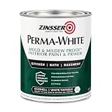
- Self-Priming formula - requires no sanding
- Mold & Mildew-Proof paint film - guaranteed for 5 years
- Resists dirt and moisture on film coating
- Finish is washable and scrubbable with soap and water
- Product contains a mildewcide to prevent the growth of mold and mildew on the paint film only
- For an airy impression: favor pale, softly tinted or neutral colors, restrained contrast and a ceiling that is lighter than the walls.
- For apparent width: use the long walls as the lightest surfaces and make the two short walls only slightly deeper in color.
- For apparent height: keep the ceiling light and avoid a strong horizontal line between wall and ceiling.
- For apparent depth: use a slightly darker complementary color on the far wall while keeping the rest of the palette related.
Before buying gallons, test the actual color on the actual walls. A sample that looks airy under a shop’s lighting can appear darker, warmer or cooler in your living room.
Choose a color family that reflects light without looking stark
Soft whites and off-whites
Soft whites are the safest starting point when the room receives limited daylight or contains dark furniture. An off-white with a subtle warm or cool undertone reflects light while avoiding the hard, blue cast that some pure whites produce. Keep the undertone consistent with the room: a warm off-white generally sits more comfortably beside warm wood and beige upholstery, while a cooler white can support gray, black and blue furnishings.
Recommended Free Tools
Pale grays and gentle beiges
Pale gray and gentle beige add enough pigment to make the walls feel intentional while retaining a light value. Sherwin-Williams’ current guidance recommends soft whites, pale grays and gentle beiges with an LRV above 65 for an open impression. LRV, or light reflectance value, describes how much visible light a surface reflects; the higher the value, the lighter the surface generally appears.
Airy blues and other pale colors
Benjamin Moore color expert Molly Lynch describes “airy blues and crisp white hues” as ideal for small spaces and notes that “Blues recede, which can give the illusion of opening up a space.” A pale blue can therefore be useful when you want color without making the walls feel close. Keep the blue muted and light; a highly saturated or very dark blue creates a stronger boundary and can make a compact room feel more enclosed.
Avoid a patchwork of strong contrasts
Several high-contrast wall colors can divide a small room into visual pieces. That choppy pattern makes corners, alcoves and changes in direction more conspicuous. If the architecture deserves emphasis, reserve contrast for one deliberate feature—such as a far wall or built-in—and keep the remaining surfaces in the same color family.
Rank #2

- PAINT + PRIMER IN ONE: Evolve’s paint-and-primer formula helps you get great coverage from the start, sealing your surface and reducing the extra work of multiple coats.
- AVAILABLE IN MULTIPLE SHEENS, COLORS & SIZES: Choose from a curated palette of designer colors in Flat, Eggshell, Satin, and Semi-Gloss sheens to match any style, room, or project. Available in 1-Gallons & 5-Gallons.
- EGGSHELL SHEEN – Soft, Velvety Glow: Offers a gentle sheen that balances elegance with durability. Ideal for moderate-traffic areas like dining rooms, hallways, and family rooms. Easy to clean without compromising the finish.
- STAIN & SCRUB RESISTANT: Built to last in real spaces, Evolve helps resist marks, scuffs, and water spotting, so your home continues to look polished and well-maintained.
- DESIGNED FOR MOISTURE-PRONE AREAS: Formulated to perform well in bathrooms, kitchens, entryways, laundry rooms, and other high-humidity spaces.
Compare the main paint approaches
| Approach | Perceived brightness | Effect on proportions | Contrast and mood | Best fit |
|---|---|---|---|---|
| Soft white or off-white, LRV above 65 | Highest light reflection among the options listed | Can make walls and ceiling feel more open | Low contrast; clean and airy | Rooms with little daylight or dark furnishings |
| Pale gray or gentle beige, LRV above 65 | Light-reflecting while adding subtle pigment | Supports a unified, spacious reading | Low contrast; gray feels cooler, beige warmer | Readers who want neutral color rather than plain white |
| Muted, airy blue | Light when kept pale and softly tinted | Blue can visually recede and suggest more depth | Low to moderate contrast; calm and light | Rooms where a cool, colored wall is preferred |
| Monochromatic tints and shades | Depends on the chosen base color and values | Consistent boundaries can make the room feel larger | Controlled contrast; cohesive | Awkward rooms with several corners or openings |
| Dark or strongly contrasting feature wall | Lower on the darker surface | Can create depth on a far wall but may emphasize a boundary | Higher contrast; more dramatic or enveloping | Rooms where a single architectural feature should recede or stand out |
The table describes visual tendencies, not measured changes in room dimensions. Window exposure and surface condition can reverse your first impression, which is why sampling in place matters.
Outdated Drivers Are Slowing You Down
One free scan finds every outdated or missing driver and matches the right update for your exact hardware.Free scan · exact hardware matchPC Slower Than It Used to Be?
A free scan shows the junk files, broken settings and background clutter dragging Windows down - then fixes them in one click.Free scan · Windows 10 & 11Use paint to correct an awkward floor plan
Make a narrow room look wider
In a long, narrow living room, paint the two long walls the lightest color in the scheme. Make the shorter end walls only slightly darker. Sherwin-Williams recommends this relationship because the darker short walls appear to advance while the lighter long walls recede, reducing the tunnel effect. Keep the difference modest; a dramatic dark end wall can become a visual stop that makes the room feel even longer.
Carry the long-wall color onto the trim and, where practical, the doors. Fewer contrasting vertical lines allow the eye to travel across the room instead of measuring each edge.
Create depth on the far wall
If the room feels shallow, a slightly darker complementary color on the far wall can create depth without breaking the palette. “Complementary” here means related to the main color rather than an unrelated accent. For example, a pale blue room might use a deeper, muted blue-gray at the far end; a gentle beige room might use a slightly richer sand tone.
Use this technique only when the far wall is clearly defined. Painting several nonadjacent walls darker creates competing endpoints and can make the room feel segmented.
Rank #3

- Use for a variety of indoor and outdoor project surfaces including wood, metal, plaster, masonry or unglazed ceramic
- Water-based acrylic formula is low odor, resist chips and provides long-lasting protection
- Covers up to 120 sq ft and dries to touch in 30 minutes for quick project completion
- Semi-gloss finish minimizes surface imperfections, goes on smoothly and provides excellent hide
- Prior to application sand surfaces with 180/200 grit sandpaper, then wash with a degreaser, allow the surface to dry and apply paint
Lift a low ceiling
Paint the ceiling a lighter color than the walls, or use a very light version of the wall color. The brighter plane catches more light and encourages the eye upward. Benjamin Moore color and design expert Arianna Cesa describes the principle this way: “With a low ceiling, the trick is to draw the eye up to create a sense of openness with an engaging, light color.”
Avoid a dark ceiling paired with a sharp white crown molding line when the goal is height; that combination emphasizes the ceiling’s boundary. If the ceiling is in good condition, a higher-gloss finish can add reflected light, but it will also reveal flaws.
Unify irregular corners, alcoves and openings
For a room with several jogs, niches or open doorways, use one wall color across the main surfaces and repeat it on the trim. The consistent field reduces the number of apparent edges. If an alcove is a useful focal point, a related tint or shade can identify it without introducing a new color family.
Should the ceiling and walls be the same color?
They do not have to be identical, but the lowest-contrast treatment is usually the most space-expanding. A ceiling that is slightly lighter than the walls provides gentle lift while preserving continuity. In a very small room, using the wall color on the ceiling can also work when the color is light and softly tinted; the boundary becomes less obvious because the eye does not encounter a stark change.
Trim is equally important. Sherwin-Williams Director of Color Marketing Sue Wadden says, “Painting the walls and trim the same color will make small rooms feel larger. Your eye won’t have a marked ‘ending’ spot like it does when your walls are one color and your trim is another.” Matching trim to walls is therefore the safer choice when the priority is visual space. Use a different trim color only when you deliberately want to outline windows, doors or architectural details.
Rank #4

- ALL-IN-1 PAINT & PRIMER: A hardy multi-purpose and multi-surface one-coat paint and primer in one for almost any indoor or outdoor surface. A wall, ceiling, floor, skirting board, cabinet, furniture and door paint for your bathroom, kitchen, home and garden.
- DURABLE & VERSATILE: A highly pigmented, thick formula available in 12 bold colors and a Matte, Satin or Gloss finish. Ideal for interior and exterior paint jobs on wood, laminate, plastic/UPVC, metal, concrete, brick, masonry, stone, glass and more.
- EFFECTIVE MONEY & TIME SAVER: A quick painting solution for DIY or professional builders and painters; our luxuriously opaque formula requires just 1 coat and is fast drying for a premium finish.
- ADVANCED ECO FORMULA: Our UK-made chalk paint is water-based, non-toxic, low odor, and has low VOCs for an environmentally friendly decorating choice.
- EASY APPLICATION: Remove dirt with a damp cloth, wipe the surface clean and dry, sand/score the surface (optional based upon the finish required), stir to mix the color and paint with a brush or roller.
Pick a sheen that supports light and hides flaws
Walls
Benjamin Moore notes that semi-gloss and high-gloss finishes are more reflective and can give the illusion of more light. Sherwin-Williams recommends pearl or satin when you want a luminous effect. These finishes can be useful in a dim room, but the extra reflection makes dents, patched seams and uneven drywall easier to see.
For walls with visible texture or imperfect preparation, a matte or flat finish is more forgiving. Sherwin-Williams’ monochromatic guidance pairs matte or flat walls with semi-gloss trim and a higher-gloss ceiling to add reflected light and textural depth without turning every wall defect into a highlight.
Trim and ceiling
Semi-gloss is a practical trim choice because it reflects more light and is easier to wipe than a flat finish. A higher-gloss ceiling can brighten a smooth, well-prepared surface. Do not raise the sheen simply because the room is small; repair and prime first, since sheen cannot conceal poor preparation.
Recommended Free Tools
Test colors in the room’s real light
- Collect several close options. Include a soft white, a pale neutral and, if desired, a muted blue or another pale color. Keep the options within a similar light range so you compare undertones rather than only brightness.
- Apply large samples to multiple walls. Paint the actual living-room walls, including one long wall, one short wall and the far wall. Small cards do not show how the color behaves over a broad surface.
- Leave the samples in place through a full day. View them in morning, midday and evening natural light, then turn on the room’s regular lamps. The same paint can shift as daylight changes.
- Check furnishings beside the samples. Hold upholstery, flooring and curtains near the painted areas. A neutral that looks balanced against the wall can reveal a green, pink, yellow or blue undertone beside a specific fabric.
- Test the sheen on a smooth, prepared patch. Compare the intended wall sheen with a trim or ceiling sample so you can judge reflection and surface imperfections before committing.
- Choose the color relationship, not just one favorite chip. Decide whether the long walls, short walls, far wall, ceiling and trim will use the same color, a lighter tint or a slightly darker companion.
Both manufacturers offer sample or visualization options, but an in-room painted sample remains the decisive check because digital and store lighting cannot reproduce every window, bulb and surface condition.
Independent reader supportYour contribution helps us test, update, and keep practical guides available for everyone.Prepare and paint for the cleanest spacious effect
Gather the basic materials
- Painter’s tape
- A 2-inch angled sash brush
- Rollers and suitable roller covers
- Wall paint in the chosen finish
- Semi-gloss or high-gloss trim paint when that contrast is part of the plan
- Cleaning, patching and priming materials appropriate for the wall surface
Sherwin-Williams’ room-painting guide specifically names painter’s tape, a 2-inch angled sash brush, rollers and roller covers. The exact roller nap depends on the wall texture; choose a cover intended for that surface rather than assuming one nap fits every wall.
Best Value

- WHAT'S IN THIS 10 PIECE PAINT KIT FOR WALLS: includes one plastic paint tray; one 9 inch roller frame; one 4 inch mini roller frame; two 9 inch microfiber roller covers (1/2 inch nap); two 4 inch microfiber roller covers (1/2 inch nap); one 1 inch flat brush; one 1.5 inch angle sash brush; one 2 inch angle sash brush
- Versatile Application: Perfect for any project, this set includes paint rollers 9 inch for large surfaces and smaller brushes for detail work
- All-in-One Kit: This paint brush set and paint tray combo ensures you have all the paint supplies needed for any home improvement task
- Professional Grade: Get a smooth, even finish with our high-quality paint roller set; ideal for applying interior paint gallon or smaller quantities
- Cost-Effective: This paint brush and roller set provides unbeatable value; includes paint pan and paint trays for easy cleanup and reuse
Prepare before opening the paint
- Move furniture away from the walls and protect the floor.
- Clean dust and greasy marks so the paint can bond evenly.
- Fill holes, sand repairs smooth and spot-prime patched areas. Uneven absorption can create flashing that is especially visible under satin or glossier finishes.
- Remove or protect switch plates, hardware and removable fixtures.
- Apply painter’s tape along trim, windows and edges that will remain a different color. Press the tape firmly enough to prevent seepage without damaging the surface.
Paint in an order that preserves wet edges
- Cut in the ceiling and wall edges with the angled sash brush.
- Roll the broad wall areas while the cut-in paint is still workable. Sherwin-Williams recommends maintaining a wet edge and using careful taping for even lines.
- Keep the roller loaded consistently and finish each section with light, parallel passes in the same direction.
- Allow the first coat to dry according to the product label before deciding whether coverage is complete. Judging color while the film is wet can be misleading.
- Remove tape carefully after the final coat has set enough to hold a clean edge but before the paint forms a hard bridge, following the paint manufacturer’s directions.
- Paint trim after the wall color is complete, unless your chosen workflow and product labels specify otherwise. Use the planned sheen rather than adding contrast by accident.
Troubleshoot the most common visual problems
The room still feels narrow
- Confirm that the long walls are lighter than the short walls; reversing that relationship can emphasize length.
- Reduce contrast between wall and trim so the eye is not stopped by repeated vertical borders.
- Check whether a dark far wall is functioning as a strong endpoint. If it is, repaint it in a lighter companion color.
The color looks darker than expected
- Compare the sample at night with the room’s actual lamps, not only in daylight.
- Look for a low-LRV choice, heavy shadows or dark furnishings that absorb light.
- Test a lighter tint or an option with an LRV above 65 before repainting the whole room.
The walls look cold or too blue
- Place the sample beside flooring and upholstery; their undertones may be amplifying the coolness.
- Compare it with a softly warmed off-white or gentle beige in the same light.
- Do not assume a blue must be rejected: a pale, muted blue can recede effectively when the room’s furnishings and bulbs support it.
The finish highlights every flaw
- Inspect the wall under raking light before choosing pearl, satin or gloss.
- Patch, sand and prime visible defects.
- Use matte or flat walls if the surface cannot be made smooth, reserving semi-gloss for trim and a higher gloss for a well-prepared ceiling.
The room feels disjointed after painting
- Look for too many unrelated accent colors.
- Return the main walls, trim and ceiling to a related color story.
- Keep any darker feature to one clearly defined surface, such as the far wall.
Decision guide for common living-room situations
Small room with little natural light
Start with a soft white or pale neutral above LRV 65. Match the trim to the walls, use a ceiling that is slightly lighter, and sample under the lamps that will be used every evening. A pearl or satin wall can add reflected light if the drywall is smooth; otherwise choose matte and improve the surface first.
Long room that feels like a corridor
Use the lightest color on the long walls and a slightly deeper related color on the two short walls. Keep the ceiling light and avoid strong trim contrast. If the far end still feels too close, test a modestly darker complementary far-wall color rather than darkening every end surface.
Low-ceiling room
Choose a light ceiling or a very light version of the wall color. Keep the upper wall and ceiling visually connected, and avoid a dark horizontal band at the crown molding. Test the ceiling finish on a smooth area because higher gloss reflects more light but exposes flaws.
Awkward room with many openings
Use a monochromatic scheme of tints and shades. Paint the walls and trim the same color to remove marked stopping points, then use one related shade only where a niche or far wall needs definition. This approach is more forgiving than assigning a separate color to every plane.
Room where you want a cozy, enveloping mood
The brightest possible palette is not mandatory. You can choose a deeper color on a single far wall or use a more saturated related shade, accepting that stronger contrast and lower reflectance may reduce the airy effect. Keep the remaining surfaces coordinated so the room feels intentional rather than chopped up.
Final checklist before you commit
- Is the primary wall color softly tinted, pale or neutral, with an LRV above 65 when maximum openness is the goal?
- Are the long walls lighter than the short walls in a narrow room?
- Is any darker color limited to a purposeful far wall or architectural feature?
- Is the ceiling lighter than, or closely related to, the walls?
- Will matching the trim to the walls remove an unwanted visual boundary?
- Have you tested large samples on several actual walls from morning through evening?
- Does the selected sheen suit the wall’s preparation and texture?
- Do you have painter’s tape, a 2-inch angled sash brush, rollers and the correct roller covers ready?
- Will you maintain a wet edge and protect the surface while each coat dries?
When these decisions align, paint gives a small or awkward living room the best available visual advantage: more reflected light, fewer hard boundaries and proportions that read as calmer and more open.
What’s actually slowing this PC down?
Pick the symptom - the matching free tool is one click away.
Quick Recap

Product prices and availability are accurate as of the date/time indicated and are subject to change. Any price and availability information displayed on Amazon at the time of purchase will apply.

