The Tool Desk
Outbyte PC Repair FREERepair Windows errors before they cause bigger problemsFix Now →Outbyte Driver Updater FREEFix the driver behind crashes, sound loss and screen glitchesFind Drivers →
ThatPainter is reader-supported. When you buy through links on our site, we may earn an affiliate commission. Learn More
The safest way to use a 1960s kitchen color today is to make it a deliberate focal point, not an all-over time capsule. Put one period hue on the cabinets, island, or pantry, then balance it with warm wood, earthy supporting colors, and a lighter surface such as tile or a restrained wall color. In an open-plan home, repeat a compatible note in the adjoining room so the palette feels continuous rather than themed.
The decade was never one universal scheme. Your kitchen’s architecture, region, surviving materials, and the strength of the chosen color should determine how much history you show.
As an Amazon Associate I earn from qualifying purchases.
What’s actually slowing this PC down?
Pick the symptom - the matching free tool is one click away.
What “1960s kitchen color” actually means
Several appliance colors that now read as unmistakably mid-century arrived in the middle and late 1960s. GE Appliances’ color-history timeline places Coppertone in 1964, Avocado in 1966, and Harvest Gold in 1968. Those dates are product-introduction years, not a survey showing that every kitchen used the colors, but they explain why the hues are associated with late-decade Danish modern and ranch-house interiors.
A period palette also depended on place and architecture. Michelle Gringeri-Brown describes modernist homes with earthy greens, browns, avocado, harvest gold, and copper. In Florida and Southern California, brighter turquoise, hot pink, and yellow accents could appear instead. Treat “1960s” as a family of regional and architectural possibilities rather than a single approved chart.
#1 Best Overall
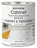
- CABINET TRANSFORMATION: Refresh outdated cabinets, vanities, furniture and trim with rich Pure White color and a smooth semi-gloss finish
- DURABLE PERFORMANCE: Easy-to-clean finish resists dirt and grime while standing up to household chemicals
- SMOOTH APPLICATION: Outstanding flow and leveling help create a beautiful finish with brush, roller, pad applicator or airless sprayer
- FAST PROJECT COMPLETION: Dries to touch in 30 minutes, recoats in 2 hours and is ready for normal use after 24 hours
- INTERIOR CABINET COATING: Ideal for kitchens, bathrooms, laundry rooms and other interior cabinet and trim applications
Sherwin-Williams groups avocado green and harvest gold together in a historical summary. Because that summary acknowledges a 1999 source article, use the pairing as a useful shorthand for the era, not as proof that every kitchen combined the two colors. Scottsdale’s historic-preservation palette includes Cool Avocado SW 9029 and other references; the city presents those colors as inspiration, not as a mandatory scheme or endorsement.
Choose how much history you want to show
Before selecting paint, decide whether you are preserving a period feature, borrowing a visual cue, or recreating a fuller historical atmosphere. The three approaches below are all legitimate; the mistake is allowing a strong color to spread farther than the room can support.
The Tool Desk
Outbyte Driver Updater FREEFix the driver behind crashes, sound loss and screen glitchesFind Drivers →Outbyte PC Repair FREEClear out junk files and repair common Windows errorsFree Scan →| Approach | Color intensity | Where the color sits | Balancing material | Historical fidelity | Room continuity |
|---|---|---|---|---|---|
| Modern interpretation | Muted or earthy version of a period hue | Cabinet fronts, island, or pantry | Warm timber, earthy tones, or lighter tile | Uses the era as a reference | Connects to adjacent rooms with compatible colors |
| Period-forward accent | Clearer avocado, harvest gold, copper, turquoise, or yellow | One defined cabinet run, island, appliance, or artwork zone | Quiet walls and natural materials | Signals the decade without reproducing every detail | Repeats a small color note outside the kitchen |
| Historical preservation | Existing original color retained at its present strength | Original tile, counter, appliance, or cabinetry | Materials selected to work with the surviving feature | Highest fidelity to the house | Uses less contrast between connected spaces |
For most contemporary remodels, the first two approaches are easier to live with. They let the color carry personality while modern lighting, appliances, and circulation remain visually calm.
Start with one focal color
Choose the element you want people to notice first. Cabinetry creates the largest, most coherent field of color; an island gives you a strong center without committing every wall; a pantry or tall cabinet run supplies a smaller block; artwork or a single appliance can provide the lightest touch.
Cabinetry as the main field
Colored cabinet fronts make avocado, olive, mustard, or a copper-related brown feel intentional because the hue follows a clear architectural boundary. Keep the backsplash and walls quieter so the doors read as one shape rather than a collection of competing rectangles. Warm oak, walnut, or another honey-toned timber can soften a green or gold without making the room look rustic by accident.
An island as a controlled dose
An island is useful when the perimeter cabinets, walls, or existing tile already have visual weight. A deep olive or muted avocado island against lighter perimeter cabinetry gives the room a period reference while preserving flexibility if you repaint later. Balance the island with a lighter floor or backsplash so the center does not become a dark block.
Recommended Free Tools
A small accent for cautious updates
If you rent, plan to sell, or are unsure about saturation, use a colored pantry door, open-shelf backing, stool upholstery, framed art, or one appliance. The accent should be large enough to look deliberate and repeated once elsewhere, but not scattered through every accessory.
Rank #2

- Includes 30 featured and newest released color card. Sprayed on color to see our colors in your homes lighting for more accurate color choices.
- ALL-IN-ONE Paint - NO Sanding, NO Priming, NO Top Coat Required, Low Luster, Velvet Sheen Finish
- Interior/Exterior - Paint your whole house - Ideal for hard surfaces including walls, doors, cabinets, counters, furniture, metal, glass, ceramics and floor and wall tile
- Durable yet stretches to paint smooth fabrics, vinyl and leather
- Results cannot be guaranteed. Digital screens may not show color accurately. Product search "ALL-IN-ONE PAINT by Heirloom Traditions, Color Confidence Card", for an accurate color choice.
Build the supporting palette
Period colors feel current when their neighbors explain why they belong together. Use a simple hierarchy: one dominant color, one material that warms it, and one light surface that gives the eye rest.
Warm wood
Timber is the most direct counterweight to avocado, olive, harvest gold, and copper-related tones. Use it on cabinet fronts, a range hood, open shelving, stools, or a dining table. Match undertones rather than forcing an exact species match: yellow-leaning wood can reinforce gold, while a deeper brown can ground green. Too many unrelated wood stains, however, turn a carefully chosen color into visual noise.
Earthy secondary colors
Earthy brown, clay, terracotta, sand, and muted tan keep a 1960s reference connected to nature-based modernist palettes. They are especially useful when a bright hue feels theatrical. Repeat one earthy note in a runner, ceramic ware, or adjacent dining furniture rather than creating a second wall-color event.
Outdated Drivers Are Slowing You Down
One free scan finds every outdated or missing driver and matches the right update for your exact hardware.Free scan · exact hardware matchWindows Errors? Fix Them Before They Spread
Repair common Windows errors and clear accumulated junk for a smoother, more stable PC - no reinstall needed.Free scan · no reinstallLighter tile and quiet surfaces
Lighter tile can counterbalance deep olive or a saturated cabinet color. Cream, warm white, pale beige, or another light neutral gives the eye a break without turning the kitchen stark. Keep grout and surface contrast restrained if the cabinets already have a strong pattern or color.
Metal and hardware
Copper is historically plausible within the decade’s earthy palette, but it does not have to appear on every handle and light fixture. A single copper-toned pendant, cookware display, or hardware set can echo the color family. If you use several metals, let one remain dominant so the period reference does not become a collection of unrelated finishes.
Match color intensity to the architecture
Color intensity should respond to the room’s size, daylight, ceiling height, and existing materials. A muted or gray-influenced green usually integrates more easily with contemporary surfaces than a highly saturated version. That does not make bright color wrong; it means bright color needs a smaller area and quieter surroundings.
For a compact or low-light kitchen
Use the period hue on an island, lower cabinets, or a single tall run, and keep upper cabinets or walls light. Warm wood can prevent the room from feeling cold, while a lighter backsplash reflects more of the available light. Sample the color at different times of day before committing because green and gold can shift noticeably under artificial lighting.
Quick wins for a faster PC:
Fix the driver behind crashes, sound loss and screen glitchesFind Drivers →Repair Windows errors before they cause bigger problemsFix Now →Scan for outdated or missing drivers - takes under a minuteDriver Scan →Rank #3

- Ultra-White Brilliance: Experience the transformative power of Titanium Infusion, an ultra-white hue inspired by the artist’s palette – perfect for a modern, timeless look.
- One-Day Transformation: Redefine your kitchen cabinets in a single day with our brush-and-roll application - no professional help needed.
- All-Inclusive Kit: Each package covers 100 square feet, ideal for the typical kitchen, and includes all the necessary tools for a flawless finish.
- Eco-Friendly & Safe: Enjoy the peace of mind with our low-VOC, water-based formula, ensuring a safer painting experience.
- Effortless Transformation: No stripping or priming required; our paint adheres beautifully to wood, laminate, and metal cabinets with minimal preparation.
For a large, open kitchen
A larger room can carry a full cabinet run in a muted avocado, olive, or harvest-gold family, especially when the ceiling, floor, and backsplash provide visual breathing room. Resist the temptation to add a second saturated wall color simply because the room is large; scale does not remove the need for hierarchy.
For a modernist or ranch-style house
Use the home’s horizontal lines and connected sightlines to your advantage. Gringeri-Brown’s guidance for updating ranch homes emphasizes less contrast and stronger continuity. A color that travels from kitchen cabinetry into a dining-room chair, artwork, or a small textile will feel more architectural than a series of isolated feature walls.
Use geography and era as inspiration, not a costume
Earthy greens, browns, avocado, harvest gold, and copper suit a nature-based modernist or ranch interpretation. Turquoise, hot pink, and yellow accents can suggest the brighter coastal vocabulary associated with Florida and Southern California. They work best as a controlled accent unless the architecture already supports a more playful palette.
Do not combine every color associated with the decade. Select one regional direction, then edit. An avocado-and-wood kitchen reads differently from a turquoise-and-yellow coastal accent, even though both can be historically defensible. The goal is a coherent room, not a checklist of period names.
Plan the palette step by step
- Record what cannot easily change. Photograph original tile, counters, flooring, trim, and appliances in daylight. Note undertones and reflective surfaces before choosing paint.
- Choose the focal element. Decide whether cabinets, an island, a pantry, an appliance, or artwork will carry the strongest period color.
- Select the color family. Start with avocado, olive, harvest gold, copper-related brown, turquoise, hot pink, or yellow, then move toward a muted or earthy interpretation if the room needs restraint.
- Pick the balancing material. Identify one warm timber or earthy finish that will sit next to the focal color. Avoid collecting several competing wood tones.
- Add a light counterweight. Use lighter tile, a quiet wall color, or another pale surface where the eye needs relief.
- Check adjacent rooms. Look through doorways and along open-plan sightlines. Choose a compatible color note or maintain a continuous wall color rather than introducing a competing backdrop.
- Make large samples. Paint sample boards or removable panels in the proposed color and view them beside the actual countertop, floor, and backsplash in morning, afternoon, and evening light.
- Test the proportion. Temporarily tape the sample to the intended cabinet run or island. A color that looks attractive on a small card may dominate when repeated across dozens of doors.
- Confirm the coating and substrate. For cabinet painting, use a product labeled for the specific surface and follow its preparation, drying, and recoat instructions. Existing laminate, previously painted wood, and other substrates can require different preparation.
- Repeat one connection outside the kitchen. Carry the color into a dining chair, artwork, runner, or small accessory so the focal color feels related to the rest of the home.
Palette recipes that keep the decade readable
These combinations are design frameworks, not universal formulas. Adjust saturation and area to your room and to the materials already present.
Muted avocado, walnut, and light tile
Use an avocado-leaning green on the island or lower cabinets, warm walnut on open shelving or furniture, and a light backsplash. The wood supplies the era’s natural warmth while the tile prevents the green from becoming heavy. Keep walls quiet and let the island remain the visual anchor.
Harvest gold, oak, and warm neutral walls
A softened harvest gold on cabinet fronts can feel sophisticated beside honey-toned oak and a warm off-white wall. Because gold reflects light strongly, limit additional yellow accessories. A single earthy brown or clay note is enough to connect the scheme to the late-1960s palette.
Rank #4
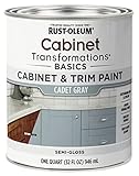
- CABINET TRANSFORMATION: Refresh outdated cabinets, vanities, furniture and trim with rich Cadet Gray color and a smooth semi-gloss finish
- DURABLE PERFORMANCE: Easy-to-clean finish resists dirt and grime while standing up to household chemicals
- SMOOTH APPLICATION: Outstanding flow and leveling help create a beautiful finish with brush, roller, pad applicator or airless sprayer
- FAST PROJECT COMPLETION: Dries to touch in 30 minutes, recoats in 2 hours and is ready for normal use after 24 hours
- INTERIOR CABINET COATING: Ideal for kitchens, bathrooms, laundry rooms and other interior cabinet and trim applications
Deep olive, timber, and pale tile
Deep olive on cabinetry or an island gives the period reference a more contemporary, refined character. Balance it with timber and lighter tile, as current design coverage demonstrates. Use this approach when you want depth without the brighter look of classic avocado.
Copper-related brown, cream, and natural wood
Reference Coppertone through a copper-brown cabinet color, backsplash detail, or appliance rather than coating every surface. Cream and natural wood keep the room warm but not dark. Repeat the copper note once in lighting or hardware, then stop.
Turquoise with restrained yellow
For a coastal interpretation, place turquoise on a small, clearly defined feature and use yellow as a minor accent in artwork or textiles. Keep the main walls and large surfaces light. This preserves the Florida and Southern California spirit without turning the kitchen into a theme set.
Keep an open-plan kitchen connected
In a kitchen that opens to dining or living areas, color continuity matters more than matching every surface. Michelle Gringeri-Brown advises looking for continuity between spaces such as the kitchen and dining room. You can achieve that in several ways:
- Continue the same wall color through the connected rooms.
- Repeat a compatible hue in a dining chair, rug, artwork, or cabinet interior.
- Use the kitchen cabinetry as the sole strong color and keep adjoining walls related and quiet.
- Echo the kitchen’s warm wood in the dining table, shelving, or trim.
- Reserve competing accent walls for rooms that are visually separate.
Cabinet fronts and artwork are especially useful for adding variety without introducing another large field of wall color. Stand at the entry to the open area and check whether your eye lands on one intentional focal point or several unrelated ones.
Do these 3 things before closing this tab:
1Clear out junk files and repair common Windows errors2Fix the driver behind crashes, sound loss and screen glitches3Repair Windows errors before they cause bigger problemsWork with original 1960s features before replacing them
Original colored tile, counters, or appliances may be difficult or impossible to replace with an exact match. Before removing them, test how they interact with the proposed cabinet and wall colors. A dated-looking feature can become an asset when the surrounding palette is edited around it.
Original colored tile
Pull a supporting neutral or earthy tone from the tile for walls and textiles. Avoid choosing a new cabinet color that sits at the opposite end of the color wheel unless you deliberately want high contrast. If the tile is the strongest surviving element, let it remain the focal point and use quieter cabinetry.
Best Value

- Includes 30 featured and newest released color card. Sprayed on color to see our colors in your homes lighting for more accurate color choices.
- ALL-IN-ONE Paint - NO Sanding, NO Priming, NO Top Coat Required, Low Luster, Velvet Sheen Finish
- Interior/Exterior - Paint your whole house - Ideal for hard surfaces including walls, doors, cabinets, counters, furniture, metal, glass, ceramics and floor and wall tile
- Durable yet stretches to paint smooth fabrics, vinyl and leather
- Results cannot be guaranteed. Digital screens may not show color accurately. Product search "ALL-IN-ONE PAINT by Heirloom Traditions, Color Confidence Card", for an accurate color choice.
Colored appliances
Coppertone, avocado, and harvest-gold appliances can anchor a room by themselves. Treat the appliance as the color source, then select cabinet and wall colors that support it rather than trying to duplicate the exact hue everywhere. A small repeat in art or upholstery can make the appliance look integrated.
Existing counters and woodwork
Countertops and trim occupy large visual areas, so sample beside them. Warm woodwork may make a cool green look harsher, while a yellow-leaning counter can intensify harvest gold. The right response may be changing the cabinet value or saturation rather than replacing the original material.
Common ways a period palette becomes dated
- Every surface carries a strong color. Saturated cabinets, walls, backsplash, and appliances leave no visual resting place. Keep the strongest hue to one defined area.
- The palette is historically correct but architecturally disconnected. A vintage color in an open-plan home can look pasted on if the dining and living areas use unrelated colors. Add continuity through walls, wood, or a small repeated accent.
- Too many “period” colors compete. Avocado, harvest gold, turquoise, pink, and copper can all be historically plausible, but they do not need to appear together. Choose one primary family and one restrained accent.
- Neutral means stark white by default. Bright, cool white may make earthy greens and golds look muddy or harsh. A warmer light surface usually supports the palette more naturally.
- Small samples hide scale problems. View large samples where the color will live and under the room’s actual lighting.
- New finishes ignore old materials. Replacing an original tile or appliance before testing the surrounding palette can remove the feature that gave the kitchen its character. Evaluate first.
- Hardware and accessories create a second focal point. If the cabinets are bold, keep hardware, lighting, and decor disciplined so they reinforce rather than compete.
How to adjust the scheme if it feels wrong
The color feels too bright
Reduce its visual area before abandoning it. Move the hue from all cabinets to an island or lower run, or choose a more muted version in the same family. Add warm wood and a lighter backsplash rather than piling on another accent color.
The kitchen feels too dark
Increase the amount of light tile or a pale wall surface, and reserve the deepest color for the island or lower cabinets. Check the color at night under the installed lighting; a sample that works in daylight may need a lighter value after sunset.
The green looks cold
Introduce warm timber or an earthy brown and check whether nearby flooring or counters have cool undertones. A warmer, more olive interpretation can retain the period reference without looking gray.
The gold looks too yellow
Use it on a smaller cabinet zone, pair it with natural wood and a quiet warm neutral, and remove extra yellow accessories. A softer harvest-gold interpretation usually needs less editing than a highly saturated yellow.
The room looks like a theme
Remove duplicated motifs before repainting. Keep the focal color, but simplify signage, novelty accessories, and multiple retro patterns. Let the architecture, materials, and one color field carry the reference.
Painting cabinet faces or an island
Cabinet paint is a practical category for applying a 1960s-inspired color, but the correct preparation depends on the existing substrate and coating. Remove or mask hardware, clean and prepare the surface according to the product instructions, and test adhesion and appearance on an inconspicuous door or sample board. Confirm that the selected product is intended for cabinetry and follow its labeled cure and recoat guidance.
Paint doors and drawer fronts in a controlled, dust-free area when possible, and judge the color after the coating has fully dried. Reinstalling hardware before the finish has cured can mark the surface. If the cabinetry is laminate, heavily varnished, or previously coated with an unknown product, obtain substrate-specific guidance rather than assuming a standard wood-paint process will work.
A practical decision checklist
- Is there one obvious focal element carrying the period color?
- Does a warm wood or earthy tone balance it?
- Is at least one large surface light enough to give the eye a break?
- Have you sampled beside the actual counter, floor, tile, and trim?
- Does the color make sense from the adjoining dining or living room?
- Are you preserving an original feature that could guide the rest of the scheme?
- Have you limited bright coastal accents to a scale the architecture can support?
- Are cabinet-paint products and preparation matched to the existing substrate?
The guiding principle
A convincing 1960s-inspired kitchen does not depend on reproducing an entire catalog of decade colors. It depends on proportion and connection: one confident period hue, warm material beside it, a lighter counterweight, and a visual link to the rooms around it. Preserve original features when they have value, soften the color when the room needs calm, and let the architecture decide how much history to reveal.
Free tools Windows power users keep installed
One-click scans. No signup required.
Quick Recap

Product prices and availability are accurate as of the date/time indicated and are subject to change. Any price and availability information displayed on Amazon at the time of purchase will apply.

