Windows Errors? Fix Them Before They Spread
Free tools Windows power users keep installed
One-click scans. No signup required.
Repair common Windows errors and clear accumulated junk for a smoother, more stable PC - no reinstall needed.Free scan · no reinstall
Crashes, No Sound, or Screen Glitches?
Random freezes, missing sound and display glitches usually trace back to one bad driver. Find and replace yours safely.Free scan · under a minute
ThatPainter is reader-supported. When you buy through links on our site, we may earn an affiliate commission. Learn More
Use color psychology as a way to shape and test a brand impression—not as a fixed code in which one hue always means one thing. Start with the voice you want people to recognize, build several palettes that express it alongside typography and shape, then test those palettes in real brand applications. Check readability separately, and specify screen and print colors for the conditions in which they will be used.
How do I choose brand colors that match my brand personality?
Write down the personality before opening a color picker. Choose a few traits that are meaningful to your audience and specific enough to guide design. “Warm and approachable,” for example, points in a different direction from “playful and irreverent.” Add what the brand should not feel like, such as formal, clinical, or loud, to make the brief more useful.
The Tool Desk
Outbyte PC Repair FREEClear out junk files and repair common Windows errorsFree Scan →Outbyte Driver Updater FREEFix the driver behind crashes, sound loss and screen glitchesFind Drivers →
Think of each palette as a hypothesis: these colors, used with this type and these shapes, may communicate the intended voice. Color is one cue in a larger visual identity. A 2024 framework considered color together with typography and shape in relation to five familiar brand-personality dimensions—sincerity, excitement, competence, sophistication, and ruggedness. Its authors described their questionnaire-based findings as preliminary, so they are a design prompt, not a formula for guaranteed results. Read the 2024 framework.
What do my brand colors say about my business?
They can contribute to an impression, but the impression depends on the colors’ qualities, their relationships, the category, and what audiences have already learned to associate with a brand. Research on hue, saturation, and value studies associations with brand-personality traits; it does not establish a universal hue-to-trait lookup table. Labrecque and Milne’s study is useful background for treating color as a set of design variables rather than a symbolic code.
#1 Best Overall

- SOFT SUMMER COLOR SEASON: Designed specifically for the Soft Summer palette, helping you identify your most flattering colors.
- PERSONAL SWATCH CARD: A compact, portable card featuring fabric swatches tailored to the Soft Summer color season.
- EASY COLOR MATCHING: Take the swatch card shopping to match clothing, accessories, and makeup to your ideal color palette.
- SOFT, MUTED TONES: Features the cool, muted, and blended hues characteristic of the Soft Summer seasonal color analysis.
- CONVENIENT AND PORTABLE: Lightweight swatch card fits easily in a wallet or purse for on-the-go color reference.
Learned brand meaning can matter too. In three experiments, Baxter, Ilicic, and Kulczynski reported that iconic colors could prime personality perceptions: Cadbury purple was associated with sincerity in one study, while Apple gray influenced excitement perceptions for an unknown brand in another. The effect weakened when the iconic color conflicted with expectations for the product category. These are findings from specific experimental settings, not predictions for every audience or business. See the 2018 study. A 2025 research summary by marketing professors Jonathan Luffarelli and Franck Celhay also emphasizes the importance of context when interpreting logo color. Read the HBR summary.
That is why a color-symbolism chart is a poor substitute for judgment. Ask whether the palette fits both the desired personality and the setting in which people will encounter it. A color that feels distinctive in one category may feel familiar, confusing, or out of place in another.
Rank #2
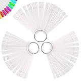
- PREMIUM QUALITY: 150 Pcs nail swatches sticks made of high quality acrylic, it's sturdy and durable, with smooth surface and transparent design, using clear swatches helps you to get accurate pigmentation of colors more easier and shows the true color of the polish
- MULTIPE USEAGE: Maybe you like knowing at a glance what all your nail dip colors and gel pots look like when applied, our clear nail tester board meet your need, they are awesome for showing the color and display nail gel colors, perfect for nail trial or to showcase colors
- CONVENIENT TO STORAGE: Our nail tip display with sturdy rings, easier to organize and carry, you will have a lot of fun painting the different colors on these and practicing new designs and nail art, number these for all of the colors and it makes it so much easier to see what all you have
- EASIER TO PICK A COLOR: If you have so many nails polish, swatches sticks perfect to be able to see colors without opening all of the bottles, makes for a quick chioce of what you have and what you don't, really very practical
- 100% SATISFACTION GUARANTEED – Treamlyn Team strives for 100% customer satisfaction for you. If there are any problems with our products, contact us and we would be very happy to solve your problems
How can I make my brand colors match my brand voice?
- Translate voice into visual hypotheses. Explore hue, saturation, lightness or value, and color combinations. Consider what typography and shape add to the impression instead of asking color to carry the entire identity.
- Build more than one palette direction. Give each option a clear rationale tied to the voice—for example, one direction might feel restrained and assured, while another feels energetic and expressive. Treat these as options to compare, not as conclusions drawn from color meanings.
- Compare the options on useful criteria.
- Personality fit: Does the full palette plausibly support the intended voice?
- Category fit and distinctiveness: Does it make sense beside the visual cues people expect in the category, while still being recognizable?
- Harmony and energy: Do the colors work together in a way that suits the brand?
- Legibility: Can people readily read text and distinguish important interface elements?
- Reproduction: Can the colors be specified for the materials and production methods you will actually use?
- Compare colors in combinations, not isolation. A 2025 study by Hisashi Kawamata and Soonho Kwon compared analogous and complementary logo color schemes across four experiments. In that study, analogous schemes were associated with sophistication and complementary schemes with excitement; alignment between a scheme and the intended personality was associated with stronger brand attitude. These results are context-specific, not a rule that dictates which scheme your brand should use. Read the study.
- Place candidate palettes in real applications. Use the actual logo, page, package, social post, or interface layout. Compare how each option works with the brand name, typography, imagery, background, and category conventions. Seek feedback from the intended audience if you can; no palette can be validated for your audience by symbolism alone.
How do I keep my brand colors consistent online and in print?
Define a usable color system
Document the primary and supporting colors, the backgrounds they can appear on, approved text combinations, and where each color belongs. Include digital color specifications for screen use and practical examples, such as a button, a heading, and a social graphic. Consistency means applying clear rules across touchpoints, not using every brand color in every element.
For apps and interfaces, use accent color purposefully rather than covering every control with it. Apple’s Human Interface Guidelines recommend judicious accent-color use and consistency with the brand voice in displayed writing. See Apple’s guidance.
Rank #3

- Easily mix, match, and plan flawless color schemes with this expansive card deck featuring 200 colors
Check screen colors for readability
Evaluate text and background pairs against the applicable contrast guidance; personality fit does not make low-contrast text easier to read. W3C’s WCAG 2.2 guidance explains minimum contrast expectations and notes a narrow exception for text that is part of a logo or logotype. That exception does not generally cover branded interface or marketing text. Read W3C’s contrast guidance.
Specify print colors for the production context
Screen values alone do not ensure that printed colors will look the same. Stock, material, finish, and production process can affect appearance. Pantone’s guides distinguish coated from uncoated references and spot from process printing, so the right reference depends on the job. See Pantone’s color-system information and its graphics guides.
Rank #4

- 【Package Include】-- Pack of 30 Strands of Hair Swatches in Lightest Blonde, each hair piece is 23cm / 9 inches in length, which allows stylist to test or practice hair coloring techniques
- 【Pure Human Hair Color Ring】-- Our hair coloring samples are made of real human hair, soft & tangle free, which can be dyed and bleached for multiple times. Easily test hair color application and development on various human hair shades
- 【Easy to Mark & Convnient Adjustment Joint】-- You may mark on the blank white buckle to label the tested color, while the stainless steel ring is easy to open and close for organising. Quickly remove samples for testing
- 【Quick Test】-- As a salon stylist, you need to do a lot of color testing and make different shades. This blonde hair color sample can quickly get bright and fashionable colors. It can be dyed, curled, straightened, washed, cut and bleached many times
- 【Train & Test Hair Colouring Skills】-- Keep up to date with the latest hair colouring trends with our test swatches, they're suitable for busy salons and hairdressing academies, helping stylists choose the right shade for clients
If you regularly specify print or materials, a physical reference such as a Pantone Color Bridge or comparable print guide can help you compare and communicate color for the relevant workflow. It is not essential for every screen-first business; check that a guide’s current edition and reference type suit your materials and printer. For a wider identity project, a brand identity specialist can help develop the system; Pantone describes brand identity and product-color consulting, and Adobe’s guide discusses visual identity design.
Quick Recap
Best Value

Product prices and availability are accurate as of the date/time indicated and are subject to change. Any price and availability information displayed on Amazon at the time of purchase will apply.




