Crashes, No Sound, or Screen Glitches?
Quick wins for a faster PC:
Repair Windows errors before they cause bigger problemsFix Now →Scan for outdated or missing drivers - takes under a minuteDriver Scan →Outbyte Driver Updater · freeRandom freezes, missing sound and display glitches usually trace back to one bad driver. Find and replace yours safely.
Find the Right Drivers →ThatPainter is reader-supported. When you buy through links on our site, we may earn an affiliate commission. Learn More
Yes—grey is a color in ordinary language, art and design. In color science, it is more precisely an achromatic or neutral color: its appearance is organized mainly by lightness, with little or no chroma. Grey does not have a stable hue in the strict technical sense. Both statements are correct because “color” can mean either a visual color category or the narrower chromatic dimension called hue.
Why grey can be both a color and not a hue
Everyday color names include grey alongside red, blue, green and other basic terms. Artists, designers and paint makers also treat grey as a usable color with many values and temperatures. In a hue-based classification, however, grey has no meaningful chromatic direction. It sits on the neutral axis between black and white rather than around the circular sequence of hues.
| Question | Most accurate answer |
|---|---|
| Is grey a color in ordinary speech? | Yes. It is a conventional color term. |
| Is grey a hue? | No, not in the strict sense; neutral grey has no stable chromatic direction. |
| What kind of color is grey? | An achromatic or neutral color whose primary variation is lightness. |
| Can grey look slightly colored? | Yes. Lighting, neighboring colors, displays and visual adaptation can make it appear warm, cool, greenish or bluish. |
This is a classification difference, not a contradiction. A color can be a recognized visual category without being a hue.
What’s actually slowing this PC down?
Pick the symptom - the matching free tool is one click away.
What “achromatic” means
Achromatic means that chroma is absent or effectively negligible. Chroma describes how far a color is from a neutral grey at the same lightness. Hue identifies its chromatic direction, such as red or blue. Lightness describes how light or dark a surface appears relative to a reference. Brightness is a related perceptual term often used for self-luminous sources, but it is not interchangeable with lightness.
#1 Best Overall
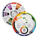
- Helps organise colours to make choices and combinations easier;Defines common terms and helps the artist to understand colour uses and interactions.
- Designed for all artists, including: Painters, crafters, interior, graphic, garden, and landscape designers;Perfect gift for creative people!
- Two-sided rotating wheel shows colour relationships;230mm diameter,2 packs Convenient and portable.
- UV coated to minimise fading and protect from moisture.Paper cover makes it;Paper evelope cover makes it difficult to break during transportation.
- Good for beginners to identify any of the colors easily and recognize the middle of the color simply.
Black, white and grey are therefore commonly called achromatic colors. Grey occupies the middle range of the neutral lightness scale, although a particular grey may be very dark or very pale.
The CIELAB description
ISO/IEC 17823:2024 gives a theoretical CIELAB definition of grey in which a* = 0 and b* = 0. Those coordinates place the color on the neutral axis: there is no red–green or yellow–blue displacement. Its lightness value can still change, producing darker or lighter grey.
This mathematical condition describes an ideal neutral under the specified model. It does not mean that every physical grey object has an identical spectrum or will look neutral under every illuminant.
Windows Errors? Fix Them Before They Spread
Repair common Windows errors and clear accumulated junk for a smoother, more stable PC - no reinstall needed.Free scan · no reinstallOutdated Drivers Are Slowing You Down
One free scan finds every outdated or missing driver and matches the right update for your exact hardware.Free scan · exact hardware matchRank #2
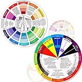
- Package include: 2 creative color wheel, 5.5 inch in diameter, the artist wheel helps show which colors are complimentary, and how they go (or don't go) together, suitable for learning how to color; Two identical color wheels, with different designs on the front and back
- Color mixing guide: the color wheel shows color, from basic principles and color mixing results on the front side; Spin around the paint wheel, then you will find the color mixture results in the windows, to learn the color theory in a fun way
- Color leaning tool: the backside of the color artist wheel that visually illustrates relationships between colors and demonstrates the results features a grayscale, and triad colors tints and tones, definitions of color terms, and illustrations of color, such as complementary colors, and triad colors
- Easy to use: this color mix guide consists of 3 layers, made of reliable cardboard with smooth surface and smooth rotation; And the size is moderate, easy to operate and carry
- Wide application: the relationship wheel is suitable to use when painting, quilting, interior design, having creative craft projects, and home decorating; Suitable for artists, teachers, kids, painters, designers, and tattoo learners
Why some definitions say grey is “not a color”
A narrower theoretical tradition defines color only through non-neutral, chromatic properties of light. In a 1949 Journal of the Optical Society of America paper, Ralph M. Evans argued that white, grey and black are not colors under such a definition. That position illustrates how the word color changes meaning between a strict physical model and ordinary visual language.
Current colorimetry practice generally handles the issue by calling grey neutral or achromatic while still discussing it within color science. CIE 015:2018 provides the broader framework for colorimetry, including color appearance, observers, illuminants and color differences.
Does grey have a hue?
A theoretically neutral grey has no stable hue because its chroma is zero. Hue angle becomes undefined or practically uninformative at the neutral axis. If a sample shifts slightly toward blue, green, yellow or red, it is no longer perfectly neutral, even though people may still call it grey.
Rank #3
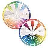
- This package include one Creative Color Mixing Board with one regular Color Wheel (9.25 inch).
- Easy-to-use tool that visually illustrates relationships between colors and demonstrates the results Features a grayscale, tints and tones, definitions of color terms, and illustrations of color.
- Color Wheel helps show which colors are complimentary, and how they go (or don't go) together.
- Some people know instinctively, and others need a visual tool to help them choose.
- Two sided wheel with indicators for complementary, split complementary and triad color schemes, how to tint and shade, primary, secondary and tertiary references, and more.
Paint labels such as “blue-grey” or “warm grey” acknowledge these small departures from neutrality. They describe a grey appearance with a directional bias, not a new claim that all greys possess a strong hue.
Why a neutral grey can look blue, green or warm
Perception is relative. The same measured or digital grey can be judged differently when its surroundings, illumination or display changes.
- Surrounding colors: A grey beside orange may appear cooler; beside blue it may appear warmer through simultaneous-contrast effects.
- Lighting: Daylight, incandescent light and LED sources have different spectral distributions, shifting the apparent balance of a neutral surface.
- White point and display settings: Two screens can render the same RGB value with different apparent warmth or coolness.
- Adaptation: The visual system adjusts to the prevailing illumination, altering judgments of neutrality.
- Luminance and contrast: A grey against a bright or dark field can seem to change in value and temperature.
The peer-reviewed study Does hue affect the perception of grayness? (first published 13 May 2014) found that observers’ preferred judgements of grey were influenced by hue. In its reported CIELAB range, greenish-blue greys were selected as most grey. The result shows that perceived grey is context-sensitive; it does not redefine neutral grey as a chromatic hue.
Rank #4

- Comprehensive Color Theory Guide: This color wheel clearly organizes hues, tints, shades, and tones in a visually intuitive layout, making it easy to understand color relationships and harmonies. It includes essential color theory terms and definitions, helping users expand their knowledge while providing a practical reference for creating balanced and appealing color schemes in various projects. Tips: Instructions printed on the exterior of the product
- Enhanced Learning and Creativity Support: Designed with a detailed English-language interface, the wheel effectively illustrates color mixing results and interactions. It supports both intuitive and technical color selection, allowing artists to quickly identify complementary, split-complementary, and analogous colors. This tool helps reduce guesswork and improves accuracy in color matching
- Durable and User-Oriented Design: Made from lightweight yet durable paper material, the color wheel is resistant to frequent use and easy to clean. Its compact and portable design offers convenience for artists and instructors on the go. The clear markings and smooth spinning mechanism ensure effortless operation during creative sessions
- Suitable for Multiple Disciplines and Users: Ideal for painters, quilters, makeup artists, art students, and teachers, this color wheel is a versatile tool across various fields. It supports activities such as watercolor painting, fabric dyeing, cosmetic blending, and classroom instruction, making it an essential accessory for anyone working with color
- Package Contents and Size Details: Both wheels are designed with the same accurate color layout and sturdy construction, offering flexibility for different working environments and user preferences
Grey in paint, pigments and reflected surfaces
Artists use grey as a practical color for value studies, mixing, shading and composition. A neutral can be made by combining black and white, or by mixing complementary pigments, but the result depends on the pigments’ undertones, proportions, surface finish and illumination.
Two paints that look equally grey in a shop can differ under daylight or warm indoor light because their spectral reflectances are different. Conversely, different reflectance spectra can produce the same perceived neutral under one viewing condition. For reliable matching, compare samples under the lighting in which the finished work will be seen.
Recommended Free Tools
Warm and cool greys
A warm grey usually contains a subtle red, yellow or brown bias; a cool grey tends toward blue or green. These descriptions are useful in painting because neighboring colors can amplify the undertone. A nominally neutral wall may therefore read warm beside a cool white trim and cooler beside a yellowed surface.
Best Value

- Master Color Theory Visually - This dual-sided artist color wheel makes understanding color theory effortless. The front is a dynamic spinning color wheel for instant color mixing results, while the back explains advanced relationships like complementary colors, serving as your ultimate color harmony wheel and artist mixing guide.
- Interactive Dual-Sided Learning - Simply spin the interactive color wheel to see color combinations come to life in the window. Flip it over to discover sophisticated color combinations and triad schemes, providing endless inspiration for your paintings, designs, and creative projects.
- Complete Set for Every Need (3 Sizes) - Get unmatched value with three durable color wheels in large and pocket color wheel sizes. This versatile set is perfect for the studio, classroom, or on-the-go, ensuring you always have the right paint mixing guide or color matching wheel at hand.
- Professional-Grade & Built to Last - Crafted from high-gloss, coated paper, our professional color wheel features a smooth 360-degree rotation that won't catch or tear. The laminated surface resists water and paint stains, making it a durable blending guide for everyday use.
- Your Universal Creative Companion - More than a paint color wheel, it's an essential tool for artists, makeup artists, tattoo designers, interior decorators, and teachers. This color wheel art teaching tool simplifies color theory for beginners and provides a quick reference for professionals in any field.
Grey in RGB and greyscale images
In an additive RGB system, a neutral digital grey has equal red, green and blue channel values. Examples include rgb(128,128,128) for a middle grey and #808080 in hexadecimal notation. Lowering all three channels makes the grey darker; raising them makes it lighter. Unequal channel values introduce a color cast.
A greyscale image stores one sample per pixel representing overall luminance or lightness on a black-to-white scale, rather than separate hue information. ISO/IEC 17823:2024 describes greyscale in these terms. A greyscale file can still look different across displays because screen luminance, white point, contrast and viewing conditions vary.
Equal RGB numbers are a recipe for neutral encoding in a standard color space, not a guarantee that every viewer will perceive the patch as perfectly neutral. Display calibration and the surrounding interface matter.
Do these 3 things before closing this tab:
1Repair Windows errors before they cause bigger problems2Fix the driver behind crashes, sound loss and screen glitches3Clear out junk files and repair common Windows errorsGrey versus gray
Grey and gray are regional spellings of the same color word. “Grey” is more common in British and many other varieties of English; “gray” is standard in American English. They do not identify different colors or different technical categories.
How standards and research use the term
ISO/IEC 17823:2024 supplies the explicit neutral-axis definition and the greyscale description. CIE 015:2018 gives the general colorimetry background needed to discuss tristimulus values, chromaticity and appearance. CIE 228:2018 addresses neutral or grey scales for self-luminous media such as LED and LCD displays, where matching grey appearance requires attention to luminance and viewing conditions.
Color-naming work also treats grey as an achromatic and basic English color category. That reflects how people actually organize color words, even while colorimetry distinguishes hue, chroma and lightness more narrowly.
Quick Recap
A practical way to answer the question
- For conversation, art or design: Call grey a color. That is the normal and useful usage.
- For color science: Describe it as an achromatic or neutral color with chroma near zero.
- When discussing hue: Say that ideal grey has no defined hue, while real samples may carry small hue biases.
- For digital work: Use equal RGB channels for neutral encoding, then check the result on the intended display.
- For paint matching: Evaluate samples under the project’s actual lighting and beside the surrounding colors.

Product prices and availability are accurate as of the date/time indicated and are subject to change. Any price and availability information displayed on Amazon at the time of purchase will apply.
Free tools Windows power users keep installed
One-click scans. No signup required.




