Recommended Free Tools
Crashes, No Sound, or Screen Glitches?
The Tool Desk
Outbyte Driver Updater FREEFix the driver behind crashes, sound loss and screen glitchesFind Drivers →Outbyte PC Repair FREEClear out junk files and repair common Windows errorsFree Scan →Free scan · under a minute
PC Slower Than It Used to Be?
Free scan · Windows 10 & 11
Outdated Drivers Are Slowing You Down
Free scan · exact hardware match
ThatPainter is reader-supported. When you buy through links on our site, we may earn an affiliate commission. Learn More
Choose a light, cohesive paint scheme when your priority is making a small bathroom feel brighter and more open. Soft whites, pale grays, gentle beiges, pale blues, and muted greens reflect more of the available light and are the safest starting point, particularly in a windowless or dim room. Sherwin-Williams suggests looking at colors with a light reflective value (LRV) above 65 as a general design guideline.
As an Amazon Associate I earn from qualifying purchases.
Recommended Free Tools
Dark paint is not automatically a mistake. With strong, even lighting and crisp white fixtures, dark walls can create depth, drama, or a cocooning mood; Dulux Canada notes that contrast can make the walls appear to recede. That is a conditional visual effect, not a guaranteed increase in perceived size. The ceiling, lighting, existing finishes, and paint sheen often matter as much as the wall color.
Light or dark: the quick decision
Use light walls and a light ceiling if you want the room to read as airy, clean, and spacious. This approach is especially reliable when the bathroom has no window, a small window, weak fixtures, or dark tile. A limited palette—one main color or two closely related tones—helps the walls, ceiling, and permanent fixtures read as one continuous envelope instead of a collection of competing surfaces.
#1 Best Overall
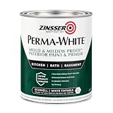
- Self-Priming formula - requires no sanding
- Mold & Mildew-Proof paint film - guaranteed for 5 years
- Resists dirt and moisture on film coating
- Finish is washable and scrubbable with soap and water
- Product contains a mildewcide to prevent the growth of mold and mildew on the paint film only
Choose dark walls only when mood and contrast matter more to you than maximum brightness. Dark colors can look sophisticated in a compact room, but they need deliberate lighting, light-colored fixtures, and careful sampling. A dark ceiling usually works against a sense of height: Behr says it typically makes a compact bathroom feel lower and smaller.
| Decision point | Light colors | Dark colors |
|---|---|---|
| Brightness in a dim or windowless room | Safer default; reflects more available light | Requires sufficient, evenly distributed artificial light |
| Perceived ceiling height | Light ceiling supports an open impression | Dark ceiling can feel lower in a compact room |
| Visual depth | Creates continuity and reduces visual fragmentation | Can add drama; dark walls may recede against white fixtures |
| Mood | Airy, calm, fresh | Rich, intimate, dramatic |
| Palette strategy | One color or two close tones are easy to coordinate | Needs deliberate contrast with tile, fixtures, and lighting |
| Surface and sheen considerations | Higher sheen can bounce light but may reveal flaws | Higher sheen can reveal flaws while helping prevent a flat, heavy look |
Why light paint usually makes a small bathroom feel larger
It reflects the light you already have
Paint cannot add windows or increase the wattage of a fixture, but a lighter surface sends more of that existing light back into the room. Soft white, pale gray, gentle beige, light blue, and muted green are common starting points because they keep shadows from becoming the dominant visual feature. Behr describes light, airy shades as particularly useful in windowless bathrooms because they reflect artificial light and make the space feel brighter and larger.
The effect is perceptual rather than a measured change in floor area. No controlled study in the cited manufacturer guidance establishes a percentage increase in perceived bathroom size. LRV above 65 is Sherwin-Williams’ color-selection recommendation, not a scientific threshold at which a room suddenly becomes larger.
They create visual continuity
Small rooms show every boundary: the edge of the vanity, the top of the backsplash, the shower enclosure, the ceiling line, and the door casing. A tightly related color story reduces the number of abrupt stops, so the eye can travel farther before it encounters contrast. Behr recommends one primary color or, at most, two closely related tones for a small bathroom. Sherwin-Williams likewise recommends a cohesive color story.
This does not mean every surface must be identical. You can use a pale wall color with a slightly lighter ceiling, or a pale wall with a closely related shade on a far wall. The goal is controlled variation rather than a patchwork of unrelated colors.
They make limited daylight easier to use
In a bathroom with one small window, daylight may reach only part of the room. Light walls help distribute the impression of that daylight around the remaining surfaces. In a windowless room, the same principle applies to overhead, vanity, and shower lighting. The paint is most effective when the fixtures are arranged so that no major wall is left in deep shadow.
When dark paint can work in a small bathroom
Use it for atmosphere, not as a brightness shortcut
Deep blue, charcoal, forest green, brown, and other dark shades can make a small bathroom feel intentional and enveloping. They are appropriate when you want a jewel-box, dramatic, or intimate mood. Glidden advises using sufficient light and white fixtures when choosing a dark color. If the room is already poorly lit, dark paint will generally make it feel moodier rather than more open.
Rank #2

- 【TUB & TILE REFINISHING KIT】 Our tub and tile paint boasts an advanced acrylic formula designed for durability and longevity. The high-quality acrylic resin ensures a strong, resistant finish that combats flaking and wear, providing a lasting transformation for your tiles. This tub and tile paint is engineered to deliver professional-looking results.
- 【Low Odor】 Breathe easy while renovating! Our water-based bathtub paint minimizes harsh fumes and volatile organic compounds (VOCs), making it safe for indoor use in bathrooms, kitchens, and living spaces, ideal for homes with children, pets, or allergy sufferers. This bathtub refinishing kit is designed for a more comfortable DIY experience.
- 【Effortless Cleanup】 Our tub and tile paint can be cleaned up in seconds! Accidental drips or spills? Just wipe with water. No solvents, scrubbers, or specialized cleaners needed. This feature saves time, reduces mess, and eliminates exposure to toxic chemicals during and after application.
- 【Wide Coverage】 Maximize efficiency with a 16.5oz bottle covering 25–30 sq.ft. per coat (2 or more coats recommended for dark tiles). Remove tape & enjoy your tub after 24–36 hours (once dry to the touch). Fully cured in 7 days. (No scrubbing or heavy cleaning for 7 days.) This tub and tile refinishing kit helps you achieve smooth, even coverage with less effort.
- 【Versatile Application】 Choose from 5 colors: white, black, light/dark gray, and vanilla white to complement your space. Our semi-gloss tile paint is suitable for bathtubs, sinks, countertops, floors, backsplashes, etc., adding sophistication, complementing both modern and traditional decor. Whether you need tub paint, bathtub paint, or a complete bathtub refinishing kit, this product is a versatile choice for your renovation.
Contrast can make walls appear to recede
Dulux Canada describes an exception to the usual light-color advice: dark walls paired with sharp white fixtures can create contrast that makes the walls seem to recede visually. The result depends on the room’s proportions, the amount of white, and the quality of the lighting. A dark wall next to off-white tile may not produce the same crisp edge as a dark wall against bright white porcelain.
Think of this as a composition technique. The dark color supplies a continuous background while the white basin, toilet, tub, trim, or towels become bright foreground shapes. If the fixtures, floor, and accessories are also dark, that contrast disappears and the room can feel compressed.
Keep the ceiling light when height matters
Even if you paint the walls dark, a light ceiling usually preserves more visual height. Behr’s bathroom guidance says dark ceilings typically feel lower and can make the overall space appear smaller. A white or very pale ceiling also helps overhead light spread through the room. If you want a fully immersive dark scheme, use it because you value the mood and accept that it may not maximize apparent height.
Color families that suit a small bathroom
Soft whites
Soft white is often the most forgiving choice for a room with limited light. It keeps the ceiling and walls visually connected while avoiding the starkness that some pure whites create beside warm tile or beige counters. Compare several whites against the permanent finishes; undertones can look yellow, pink, blue, or gray depending on the room.
Pale grays
Pale gray can provide a little more definition than white while remaining reflective. In a north-facing room or under cool bulbs, a blue-gray may feel chilly. A warmer gray can harmonize with wood, brass, cream tile, or beige stone. Use the actual light sources in the room when judging the undertone.
Gentle beiges and pale neutrals
Gentle beige works well when the bathroom already contains warm stone, tan grout, wood cabinetry, or brushed brass. Keep the value light enough that the color does not become muddy in shadow. A neutral that looks bright on a large card can appear noticeably darker once it covers several walls.
Light blues and muted greens
Pale blue can reinforce a clean, watery feeling, while a muted green can connect the room to natural materials. Both can remain light and reflective without forcing an all-white scheme. Test them beside the tile and metal finishes because green and blue undertones can clash with strongly warm or cool materials.
Rank #3

- TUB & TILE REFINISHING KIT: Renews ceramic tile, porcelain, fiberglass, acrylic, cast iron, and steel tubs and sinks without costly replacement.
- TWO-PART EPOXY ACRYLIC: Combine the base and activator to create a durable coating with excellent adhesion and color retention.
- IDEAL FOR HIGH-MOISTURE AREAS: Provides a durable, washable finish designed to refresh worn bathroom surfaces.
- SMOOTH, EVEN APPLICATION: Apply with a fine-bristle brush or 1/4-inch short-nap roller; use two coats for a uniform, porcelain-like appearance.
- DRY & RECOAT TIME: Dries to the touch in 1 hour, can be recoated after at least 1 hour, and must cure for 3 days before water exposure.
Dark blue, green, charcoal, and brown
These colors are strongest when the bathroom has enough illumination and a clear contrast plan. Use white or very light fixtures, keep the ceiling light if openness is important, and avoid adding several unrelated dark materials. A dark far wall can become an intentional focal point, but the rest of the palette should support it.
Plan the ceiling, far wall, and trim separately
Ceiling
For the most open impression, use a light ceiling that is white or closely related to the wall color. This keeps the upper plane from visually dropping toward you and helps reflect light from ceiling fixtures. A dark ceiling can be attractive in a dramatic design, but it is a deliberate trade-off against perceived height.
Far wall
Sherwin-Williams suggests a slightly darker far wall as an optional way to add depth. In a narrow bathroom, this can give the end wall more visual weight without surrounding the entire room in a dark color. It is not a universal prescription: if the far wall contains a bulky shower surround or receives little light, darkening it may emphasize those limitations.
Trim, doors, and cabinetry
Keeping trim and doors close to the wall value reduces visual interruptions. If the fixtures are white, a light trim color can extend that clean contrast. For dark walls, white trim and cabinetry can provide the crisp edge that makes the scheme feel intentional rather than cave-like.
What’s actually slowing this PC down?
Pick the symptom - the matching free tool is one click away.
Lighting determines whether the color succeeds
Windowless bathrooms
Start with a light, airy color and make the artificial lighting as even as possible. A single bright ceiling fixture can leave the mirror wall or shower wall in shadow, so consider layered illumination: general ceiling light, face-level vanity light, and adequate shower lighting where permitted by local electrical rules. The paint should support the lighting plan, not compensate for a badly distributed one.
Bathrooms with daylight
Observe the room in the morning, afternoon, and after sunset. Daylight changes direction and intensity, while artificial lamps can shift a neutral toward yellow, blue, or green. A color that feels spacious at noon may look noticeably deeper under the evening fixture.
Color temperature and glare
Use the bulbs that will actually remain in the room when you test samples. A high-sheen surface may bounce light and create glare around a mirror or wet area. More sheen is not automatically better: Sherwin-Williams notes that higher sheen can reveal surface flaws even as it reflects more light.
Rank #4

- Use for a variety of indoor and outdoor project surfaces including wood, metal, plaster, masonry or unglazed ceramic
- Water-based acrylic formula is low odor, resist chips and provides long-lasting protection
- Covers up to 120 sq ft and dries to touch in 30 minutes for quick project completion
- Semi-gloss finish minimizes surface imperfections, goes on smoothly and provides excellent hide
- Prior to application sand surfaces with 180/200 grit sandpaper, then wash with a degreaser, allow the surface to dry and apply paint
How to test paint before committing
- List the permanent finishes. Note the shower tile, floor, vanity, countertop, toilet, tub, grout, hardware, mirror frame, and light fixtures. These elements stay in place longer than paint and should set the undertone direction.
- Choose several related samples. Include at least one soft white or pale neutral, one slightly deeper version, and any dark option you are seriously considering. Use manufacturer sample cards or actual paint samples rather than relying on a phone or monitor.
- Place samples on more than one wall. A wall beside the window, a wall opposite the light, and the shower or vanity wall can show very different results. Keep the samples large enough to judge the overall effect.
- View them in daylight and artificial light. Check the samples at morning, midday, evening, and with the normal bathroom lights on. Record which colors become too gray, yellow, blue, or muddy.
- Compare against finishes at eye level. Hold the sample beside the tile, counter, cabinet, metal finish, and white fixtures. A color that looks attractive alone may expose an unwanted undertone next to the countertop.
- Check the ceiling relationship. Place the selected wall color beside the proposed ceiling color. Decide whether the ceiling should be the same, lighter, or a closely related tone; do not choose it as an afterthought.
- Review the whole palette. Add towels, bath mat, artwork, and accessories only after the large surfaces work together. Too many accent colors can undo the continuity that makes a small room feel calmer.
Behr and Dulux caution that on-screen colors can differ from actual paint. A physical sample viewed in the installed lighting is the safer basis for the final decision.
Free tools Windows power users keep installed
One-click scans. No signup required.
Choose a bathroom-appropriate finish
Satin for practical walls
Behr describes satin as a practical wall finish for washability and durability in a bathroom. It offers some light reflection without the pronounced shine of semi-gloss, making it a common compromise for walls that need regular cleaning.
Semi-gloss for trim and cabinetry
Semi-gloss is suited to trim, doors, and cabinets where frequent wiping and a harder surface are useful. Its stronger reflection can outline architectural details, but it may draw attention to dents, uneven patching, or rough drywall.
Prepare the surface first
Color cannot hide moisture damage, peeling paint, failed caulk, or an uneven repair. Clean soap residue and mildew according to the coating manufacturer’s directions, allow the surface to dry, repair defects, and prime where the label calls for it. In humid conditions, use a product labeled for bathroom or interior high-moisture use and follow its ventilation and curing instructions.
A practical light-color plan
- Set the target. Decide that brightness and openness outrank drama.
- Start with a high-value family. Consider soft white, pale gray, gentle beige, pale blue, or muted green; Sherwin-Williams’ general guidance places the starting point above LRV 65.
- Keep the ceiling light. Match it to the walls or choose a lighter related shade.
- Limit variation. Use one dominant color or two close tones, with a slightly darker far wall only if it improves the room’s depth.
- Coordinate undertones. Match the paint to tile, counters, cabinetry, fixtures, and bulb color.
- Select the finish. Use a washable bathroom-appropriate wall finish, commonly satin, and reserve semi-gloss for trim, doors, or cabinets when appropriate.
A practical dark-color plan
- Confirm the goal. Choose dark paint for drama, richness, or intimacy—not because it is expected to brighten the room.
- Audit the light. Make sure the mirror, ceiling, and shower areas receive even illumination. Improve the lighting before judging the paint.
- Build in white contrast. White or very light fixtures, trim, towels, or tile can create the receding-wall effect described by Dulux Canada.
- Protect perceived height. Keep the ceiling light unless a lower, enclosed mood is intentional.
- Control the number of dark surfaces. A dark wall with a light ceiling and light fixtures is easier to balance than dark walls, dark ceiling, dark floor, and dark cabinetry together.
- Sample at night. The scheme must work under the room’s artificial light, not only in a bright showroom or on a daylight sample card.
Common mistakes and corrections
Painting the ceiling dark by default
Problem: The room feels lower and more enclosed.
Correction: Use a light ceiling or a pale version of the wall color. Reserve a dark ceiling for a deliberate, mood-first design.
Quick wins for a faster PC:
Fix the driver behind crashes, sound loss and screen glitchesFind Drivers →Repair Windows errors before they cause bigger problemsFix Now →Choosing a color from a screen
Problem: The installed paint looks more saturated or has a different undertone than expected.
Correction: Use physical samples on multiple walls and check them in both daylight and artificial light.
Best Value

- WHAT'S IN THIS 10 PIECE PAINT KIT FOR WALLS: includes one plastic paint tray; one 9 inch roller frame; one 4 inch mini roller frame; two 9 inch microfiber roller covers (1/2 inch nap); two 4 inch microfiber roller covers (1/2 inch nap); one 1 inch flat brush; one 1.5 inch angle sash brush; one 2 inch angle sash brush
- Versatile Application: Perfect for any project, this set includes paint rollers 9 inch for large surfaces and smaller brushes for detail work
- All-in-One Kit: This paint brush set and paint tray combo ensures you have all the paint supplies needed for any home improvement task
- Professional Grade: Get a smooth, even finish with our high-quality paint roller set; ideal for applying interior paint gallon or smaller quantities
- Cost-Effective: This paint brush and roller set provides unbeatable value; includes paint pan and paint trays for easy cleanup and reuse
Using too many accent colors
Problem: Every fixture, wall, and accessory becomes a separate visual stop, making the room feel busy.
Correction: Return to one primary color or two closely related tones, then add accents through replaceable textiles and accessories.
Expecting dark paint to solve poor lighting
Problem: The bathroom looks dimmer and the mirror area is difficult to use.
Correction: Improve fixture placement and evenness first. Keep the walls light if brightness remains the main objective.
Ignoring surface condition
Problem: A reflective finish highlights patches, ridges, or peeling areas.
Correction: Repair, clean, dry, and prime as needed before applying the finish; choose sheen with the wall’s condition in mind.
Crashes, No Sound, or Screen Glitches?
Random freezes, missing sound and display glitches usually trace back to one bad driver. Find and replace yours safely.Free scan · under a minutePC Slower Than It Used to Be?
A free scan shows the junk files, broken settings and background clutter dragging Windows down - then fixes them in one click.Free scan · Windows 10 & 11Matching paint to an isolated sample
Problem: The color clashes with the countertop, tile, grout, or metal finish.
Correction: Judge the sample beside every permanent finish and under the actual room lighting.
How to decide in five minutes
- If the bathroom is windowless or genuinely dim, begin with a light color and a light ceiling.
- If openness is the top priority, favor soft white, pale gray, gentle beige, pale blue, or muted green and keep the palette cohesive.
- If drama is the top priority, a dark wall can work when lighting is sufficient and white fixtures provide clear contrast.
- If the ceiling is low or the room is narrow, avoid a dark ceiling.
- If the existing tile or counter is visually strong, choose a paint color that supports its undertone rather than adding another competing statement.
- If the walls are imperfect, avoid selecting a high sheen solely to gain more reflected light.
What the guidance does—and does not—prove
Manufacturer recommendations consistently favor light colors for brightness and openness, while allowing dark schemes as a conditional design choice. They do not establish a universal optical law, a guaranteed size increase, or a percentage improvement in perceived area. The most dependable conclusion is practical: light, continuous surfaces make a small bathroom easier to read as open, while dark paint can succeed when contrast, lighting, ceiling treatment, and mood are planned together.
Quick Recap

Product prices and availability are accurate as of the date/time indicated and are subject to change. Any price and availability information displayed on Amazon at the time of purchase will apply.
Do these 3 things before closing this tab:
1Repair Windows errors before they cause bigger problems2Scan for outdated or missing drivers - takes under a minute3Clear out junk files and repair common Windows errors
