Free tools Windows power users keep installed
One-click scans. No signup required.
What’s actually slowing this PC down?
Pick the symptom - the matching free tool is one click away.
ThatPainter is reader-supported. When you buy through links on our site, we may earn an affiliate commission. Learn More
Choose navy when you want a deep, confident focal point and have enough light or warm, pale finishes to balance it. Choose light blue when you want color with a softer, airier presence. Neither shade is automatically better. The right result depends on the exact paint color, how much cabinetry it covers, your counters and floors, and the light your kitchen receives. Test real samples in the room before ordering paint or cabinets.
As an Amazon Associate I earn from qualifying purchases.
The short answer: match the color’s visual weight to the room
Navy and light blue can both work beautifully on kitchen cabinets, but they make different promises. Deep navy gives cabinetry visual weight and tends to become the room’s anchor. Light blue contributes color while keeping the composition gentler and less dense. Paint manufacturers describe these effects as design guidance rather than measured psychological outcomes, so treat them as useful tendencies, not guarantees.
Outdated Drivers Are Slowing You Down
One free scan finds every outdated or missing driver and matches the right update for your exact hardware.Free scan · exact hardware matchPC Slower Than It Used to Be?
A free scan shows the junk files, broken settings and background clutter dragging Windows down - then fixes them in one click.Free scan · Windows 10 & 11| Question | Navy | Light blue |
|---|---|---|
| Primary impression | Deep, sophisticated and focal | Soft, airy and relaxed |
| Best starting point | A kitchen with light counters, pale walls, warm wood or strong natural light | A kitchen seeking color without the visual weight of a dark shade |
| Contrast | Creates a pronounced cabinet-to-wall or cabinet-to-counter boundary | Creates a gentler boundary; contrast depends more on the undertone and adjacent finishes |
| Small or dim room | Can feel visually heavy if used everywhere; balance with bright surrounding surfaces | Often easier to keep visually light, but the exact blue and lighting still matter |
| Maintenance visibility | Benjamin Moore says dark colors can hide dirt better than lighter colors; this does not mean less cleaning or invisibility of every mark | Lighter paint may show some dirt or splashes sooner, depending on sheen, undertone and the type of mark |
If your priority is a bold, grounded focal point, begin with navy samples. If your priority is a gentler, more open-feeling palette, begin with light-blue samples. Then let the fixed elements in your kitchen make the final decision.
#1 Best Overall
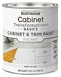
- CABINET TRANSFORMATION: Refresh outdated cabinets, vanities, furniture and trim with rich Pure White color and a smooth semi-gloss finish
- DURABLE PERFORMANCE: Easy-to-clean finish resists dirt and grime while standing up to household chemicals
- SMOOTH APPLICATION: Outstanding flow and leveling help create a beautiful finish with brush, roller, pad applicator or airless sprayer
- FAST PROJECT COMPLETION: Dries to touch in 30 minutes, recoats in 2 hours and is ready for normal use after 24 hours
- INTERIOR CABINET COATING: Ideal for kitchens, bathrooms, laundry rooms and other interior cabinet and trim applications
What navy cabinets do to a kitchen
Navy creates depth and a deliberate focal point
Deep blue cabinetry attracts attention because it occupies a large, continuous area. Benjamin Moore’s cabinet guidance places navy among shades that can create a sophisticated or elegant space. In practical terms, navy is useful when the cabinets should read as architecture rather than background: an island can become a strong centerpiece, and a full run of base cabinets can ground pale walls and counters.
That strength is also the main risk. If every cabinet, wall and large surface is dark, the room may lose visual separation. The issue is not that navy universally makes a kitchen “small”; the effect depends on light, cabinet coverage and surrounding reflectance. A dark color covering only an island behaves differently from the same color on tall cabinets, uppers and lowers.
Use contrast to keep navy intentional
Contrast gives the eye a place to rest around a dark cabinet color. A concrete example from Dunn-Edwards pairs a navy called Dark & Stormy with warm wood accents and light countertops. The combination works as a model of contrast: the wood supplies warmth, while the pale counter keeps the navy from becoming one uninterrupted dark mass. It is an example, not a rule that every navy kitchen must contain wood or white counters.
Recommended Free Tools
Hardware, backsplash and wall color can provide smaller contrast steps. Brushed metals, pale stone and creamy paint create a different result from stark optic white and polished chrome. Before choosing any accent, look at the undertone of the navy: a blue with gray or green influence may sit more comfortably beside natural materials than a highly saturated, violet-leaning blue.
Where navy is a sensible first test
- An island that needs to read as the room’s visual anchor.
- Lower cabinets beneath a pale countertop, with lighter uppers or walls.
- A kitchen with substantial daylight or strong, layered artificial lighting.
- A room containing warm wood, brass-toned details or other finishes that can offset a cool, deep color.
Sherwin-Williams includes In the Navy SW 9178 among its cabinet-color options, while Benjamin Moore features Hale Navy HC-154. Those names identify starting points, not guarantees that either color will suit your particular light or materials.
Rank #2

- Includes 30 featured and newest released color card. Sprayed on color to see our colors in your homes lighting for more accurate color choices.
- ALL-IN-ONE Paint - NO Sanding, NO Priming, NO Top Coat Required, Low Luster, Velvet Sheen Finish
- Interior/Exterior - Paint your whole house - Ideal for hard surfaces including walls, doors, cabinets, counters, furniture, metal, glass, ceramics and floor and wall tile
- Durable yet stretches to paint smooth fabrics, vinyl and leather
- Results cannot be guaranteed. Digital screens may not show color accurately. Product search "ALL-IN-ONE PAINT by Heirloom Traditions, Color Confidence Card", for an accurate color choice.
What light-blue cabinets do to a kitchen
Light blue adds color without the same density
Benjamin Moore describes lighter blues as airy and beach-inspired in its cabinet guidance. A pale blue can make a kitchen feel calm and informal while preserving more visual separation between cabinet faces. This is why light blue is a strong direction for someone who wants a noticeable color but does not want cabinetry to dominate every sightline.
“Airy” is not the same as “larger.” Light blue cannot guarantee that a kitchen will look bigger, and a muddy or overly gray blue can appear dull in weak light. The wall, ceiling, counter and floor still determine how much reflected light the room has. Sample the actual color before assuming that a pale swatch will remain bright on a large cabinet elevation.
Crashes, No Sound, or Screen Glitches?
Random freezes, missing sound and display glitches usually trace back to one bad driver. Find and replace yours safely.Free scan · under a minuteWindows Errors? Fix Them Before They Spread
Repair common Windows errors and clear accumulated junk for a smoother, more stable PC - no reinstall needed.Free scan · no reinstallBuild a cohesive palette around the undertone
Light blues range from clean, almost icy colors to blue-gray, green-leaning and slightly muted shades. A crisp light blue may suit bright white counters and brushed metal. A muted steel-blue can work with natural textures and warmer neutrals. Dunn-Edwards gives Blue Print with crisp whites, brushed metals and natural textures as an example of that approach. Again, use the pairing as a reference for relationships among colors and materials, not as a mandatory formula.
Because light blue has less visual weight, contrast can disappear if the backsplash, walls and counters are all nearly the same value. You may need a darker grout, warmer wood, distinct hardware or a slightly deeper wall tone to define the cabinet edges. Conversely, very high contrast can make a pale blue feel more graphic than relaxed, so judge the complete sample board rather than the paint chip alone.
Where light blue is a sensible first test
- A kitchen where you want color but prefer a softer backdrop for artwork, textiles or open shelving.
- Rooms with limited daylight where a dark, full-height cabinet scheme could feel visually dense.
- Cabinet layouts with many doors and drawers, where a lighter value keeps the repeated fronts from dominating.
- Spaces built around natural textures, creamy whites or a relaxed coastal-inspired palette.
How room brightness changes the decision
Light is the variable that most often makes a sample surprise you. A north-facing room, a shaded apartment kitchen and a sunlit room can make the same blue appear materially different. The paint color does not change, but the amount and quality of light reaching it does.
Rank #3

- Ultra-White Brilliance: Experience the transformative power of Titanium Infusion, an ultra-white hue inspired by the artist’s palette – perfect for a modern, timeless look.
- One-Day Transformation: Redefine your kitchen cabinets in a single day with our brush-and-roll application - no professional help needed.
- All-Inclusive Kit: Each package covers 100 square feet, ideal for the typical kitchen, and includes all the necessary tools for a flawless finish.
- Eco-Friendly & Safe: Enjoy the peace of mind with our low-VOC, water-based formula, ensuring a safer painting experience.
- Effortless Transformation: No stripping or priming required; our paint adheres beautifully to wood, laminate, and metal cabinets with minimal preparation.
Sherwin-Williams recommends a bright, creamy white such as Alabaster for opening up a smaller kitchen. That advice supports a broader planning move: if you choose a dark cabinet color, use light surrounding surfaces where they help reflect and distribute available light. It does not prove that navy itself enlarges or shrinks a room. The practical question is how much dark area you are introducing and what remains light around it.
Check daylight and evening light separately
Daylight can reveal a blue’s undertone and saturation. Evening lamps may make the same paint look grayer, greener or more muted. A color that feels balanced at noon may become too cold under cool-white LEDs or too saturated beneath warm lamps. Plan to view samples at more than one time of day before committing.
Account for cabinet position
An island often receives light from several directions and is seen against the floor. Wall cabinets sit closer to eye level and may be shaded by a soffit or ceiling. Tall pantry units create a large vertical block. Test the paint on the same type of surface and orientation you intend to use, or place a large sample board beside the cabinets rather than relying on a small card.
Decide how much cabinetry should be blue
The navy-versus-light-blue choice is only half the decision. Coverage changes the perceived intensity of either color.
| Coverage plan | How it behaves | When to consider it |
|---|---|---|
| All cabinets in one blue | Most unified and most visually committed; the value of the blue sets the room’s overall weight | When the surrounding walls, counters and floor provide deliberate contrast |
| Blue island only | Creates a focal point while leaving the perimeter lighter or more neutral | When you want to experiment with navy or add color without repainting every box |
| Blue lower cabinets, light uppers | Places depth below eye level and keeps the upper half of the room brighter | When you like navy’s grounding effect but want less visual mass |
| Light blue everywhere | Provides a continuous color field with a gentler value shift than navy | When the goal is a soft, cohesive backdrop rather than a high-contrast focal point |
Using a darker shade on an island or lower cabinets with a light neutral elsewhere is an editorial design option, not a tested outcome. It is useful because it lets you control the amount of visual weight, but your samples still need to be judged in context.
Rank #4
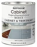
- CABINET TRANSFORMATION: Refresh outdated cabinets, vanities, furniture and trim with rich Cadet Gray color and a smooth semi-gloss finish
- DURABLE PERFORMANCE: Easy-to-clean finish resists dirt and grime while standing up to household chemicals
- SMOOTH APPLICATION: Outstanding flow and leveling help create a beautiful finish with brush, roller, pad applicator or airless sprayer
- FAST PROJECT COMPLETION: Dries to touch in 30 minutes, recoats in 2 hours and is ready for normal use after 24 hours
- INTERIOR CABINET COATING: Ideal for kitchens, bathrooms, laundry rooms and other interior cabinet and trim applications
Match blue cabinets to counters, walls and hardware
Countertops
Light counters provide the clearest value contrast with navy and can prevent a deep blue from reading as a solid block. Creamy or softly veined surfaces generally produce a gentler result than a stark, high-contrast white. With light blue, a counter that is too close in value can erase the cabinet edge; a modest value difference or a warm material can restore definition.
Walls and backsplash
A light wall does not have to be pure white. Creamy whites can support a dark palette while avoiding a sharp, cool split. If your blue has a gray undertone, a warm gray or natural stone may harmonize better than a yellowed beige. Place wall and backsplash samples beside the cabinet sample, because the same white can appear different next to navy than next to pale blue.
Wood and natural textures
Warm wood is a documented pairing example for navy, and natural textures are shown with a muted steel-blue example. Wood shelves, a butcher-block section or woven accents can add warmth, but they should relate to the existing floor and furniture rather than be added solely to follow a trend.
Metals
Brushed metals are used in the Blue Print example with crisp whites and natural textures. Test hardware on the actual blue: a finish that disappears on a pale blue may stand out strongly against navy. Samples should include the sheen and shape of the proposed hardware, not just a loose color chip.
A reliable sample test before you commit
Do not choose from a phone screen, a printer page or a tiny store chip alone. Benjamin Moore warns that on-screen and printed color representations may vary from the actual paint. Commercial Standard CS62-38, a historical U.S. government standard from 1938, gives useful general advice for visual comparisons: “The objects being compared should be illuminated with the same amount of light of the same quality.” The standard is not a modern cabinet-paint specification, but its comparison method is still practical.
Best Value

- Includes 30 featured and newest released color card. Sprayed on color to see our colors in your homes lighting for more accurate color choices.
- ALL-IN-ONE Paint - NO Sanding, NO Priming, NO Top Coat Required, Low Luster, Velvet Sheen Finish
- Interior/Exterior - Paint your whole house - Ideal for hard surfaces including walls, doors, cabinets, counters, furniture, metal, glass, ceramics and floor and wall tile
- Durable yet stretches to paint smooth fabrics, vinyl and leather
- Results cannot be guaranteed. Digital screens may not show color accurately. Product search "ALL-IN-ONE PAINT by Heirloom Traditions, Color Confidence Card", for an accurate color choice.
- Reduce the field to real paint colors. Start with several actual navy and light-blue candidates from cabinet color collections, rather than comparing the labels “navy” and “light blue” in the abstract. Include at least one color that is slightly grayer, warmer or lighter than your first choice so you can see how undertone changes the result.
- Make large, portable samples. Paint sample boards with the intended number of coats and finish, or use large manufacturer samples. A small square can hide how a color behaves across a run of doors and beside a countertop.
- Put every fixed finish next to the samples. Include the counter, flooring, backsplash, wall color, existing wood and hardware. A blue that looked perfect in isolation may clash with a floor undertone or make a stone vein look more prominent.
- View samples simultaneously. Keep the navy and light-blue boards side by side under the same light and against a uniform background. Comparing one from memory after viewing another makes small value and undertone differences harder to judge.
- Check daylight and lamplight. Move the boards to the cabinet location and view them during daylight and in the evening with the lights you normally use. Note whether either blue becomes too gray, too green, too purple or too dark.
- Test the intended coverage. Hold the board against an island, lower cabinet and tall unit if those areas will differ. A color can look appropriate on one elevation and overwhelming on another because the surrounding field changes.
- Live with the finalists. Leave the boards in place through several lighting conditions and look at them from the doorway, work zones and adjacent rooms. Choose the shade that continues to work with the fixed finishes, not the one that wins in a single close-up view.
If you are repainting existing cabinets
Color choice cannot compensate for a coating system that is incompatible with the cabinet substrate or poorly prepared. Follow the paint manufacturer’s current directions for cleaning, deglossing or sanding, priming, dry times and reassembly. Confirm whether your doors are solid wood, veneer, laminate or a factory finish before selecting products; compatibility varies by substrate.
Sherwin-Williams names Emerald Urethane Trim Enamel as a cabinet-paint option and describes a silky finish that resists yellowing and block stains and wipes down with ease. Those are the manufacturer’s product claims, not an independent test. Check the current label, technical data and substrate compatibility before purchase, and do not assume that a product’s suitability for trim automatically covers every cabinet surface.
A practical repaint sequence
- Remove doors, drawers and hardware, and label each piece so it returns to its original position.
- Clean away grease and residue; allow the surfaces to dry fully.
- Prepare the existing finish exactly as directed for the substrate and product system, including sanding or deglossing where required.
- Prime when the system calls for it, observing the specified recoat window.
- Apply thin, even coats of the chosen cabinet coating. Avoid closing doors or reinstalling hardware before the stated cure time.
- Inspect edges, profiles and high-touch areas under the kitchen’s actual lighting before reassembly.
Do not use a paint color sample as a durability test. A successful color comparison tells you how the blue looks; it does not establish adhesion, hardness or resistance to wear.
Quick wins for a faster PC:
Fix the driver behind crashes, sound loss and screen glitchesFind Drivers →Repair Windows errors before they cause bigger problemsFix Now →Common mistakes and how to avoid them
- Choosing by color name. “Navy” can include colors with very different undertones and values. Compare actual paint samples.
- Assuming a dark color automatically makes the room smaller. Evaluate the amount of dark cabinetry, the light surfaces around it and the room’s lighting instead of applying a universal rule.
- Assuming light blue always makes the room larger. A pale color can still look dull or heavy if its undertone fights the light and fixed finishes.
- Ignoring the evening view. Artificial light can change how blue reads. Check the room after sunset.
- Using a tiny sample. Large cabinet areas can reveal shifts that are invisible on a small card.
- Calling “hides dirt” the same as “easy to clean.” Benjamin Moore’s statement concerns visibility of dirt on dark colors; cleaning effort, stain resistance and every type of mark require separate evidence.
- Copying a photographed kitchen exactly. Camera exposure, filters, surrounding finishes and the photograph’s light can differ from your room.
- Skipping substrate checks during a repaint. A cabinet’s existing coating and material determine which preparation and primer steps are appropriate.
Choose by scenario
Choose navy when…
- You want the cabinets to be the strongest visual feature.
- Your counters, walls or backsplash can provide a clear light contrast.
- Warm wood or other natural finishes can balance the depth.
- You are comfortable testing how much cabinet coverage the room can carry.
Choose light blue when…
- You want a softer, more relaxed color statement.
- You prefer less visual weight across a large run of doors and drawers.
- Your palette already includes creamy whites, brushed metals or natural textures.
- You want the blue to support, rather than dominate, other focal points.
Use a split-color plan when…
- You like navy but are concerned about using it on every cabinet.
- You want the island or lower cabinets to anchor the room while uppers remain light.
- You need a way to compare a deeper and lighter blue in the actual kitchen before a full commitment.
Final decision checklist
Before buying paint or approving a cabinet order, confirm each item:
- The exact paint color and finish are identified, not just a color family.
- Large samples have been viewed beside the counter, floor, backsplash, walls, wood and hardware.
- Samples have been checked in daylight and evening light at the cabinet locations.
- You have decided whether the blue covers all cabinets, the island, lowers or another defined area.
- The surrounding surfaces provide the amount of contrast and brightness you actually want.
- If repainting, the coating system is compatible with the cabinet substrate and current product directions.
The practical winner is the blue that meets your intended mood while cooperating with the finishes and light you cannot easily change. Navy is the better starting point for a bold, grounded focal effect; light blue is the better starting point for softness and airiness. Let the sample test—not the color name—make the final call.
Quick Recap

Product prices and availability are accurate as of the date/time indicated and are subject to change. Any price and availability information displayed on Amazon at the time of purchase will apply.

