Outdated Drivers Are Slowing You Down
One free scan finds every outdated or missing driver and matches the right update for your exact hardware.Free scan · exact hardware matchPC Slower Than It Used to Be?
A free scan shows the junk files, broken settings and background clutter dragging Windows down - then fixes them in one click.Free scan · Windows 10 & 11ThatPainter is reader-supported. When you buy through links on our site, we may earn an affiliate commission. Learn More
Molding does not have to match the walls. Match it when you want a quiet, continuous envelope; contrast it when you want baseboards, casings, crown molding, or doors to frame the room; or choose a related wall color with a different shade or sheen for definition without a hard color break. The best choice depends on the room’s architecture, light, existing finishes, and the visual job you want the trim to perform.

As an Amazon Associate I earn from qualifying purchases.
Three valid ways to paint molding
There is no universal rule that requires white trim, matching trim, or contrasting trim. Paint the wall and molding as a pair, then decide whether the molding should disappear into the background, outline the architecture, or sit between those extremes.
Recommended Free Tools
Match the molding to the wall
Using one hue on the walls and molding reduces the visible color break. The result is a more continuous visual envelope, with less interruption around doors, windows, baseboards, and the ceiling line. Sherwin-Williams describes painting walls, doors, and trim in one hue as a single-hue or “color drenching” approach.
#1 Best Overall
This treatment is useful when the room already contains prominent flooring, furniture, artwork, tile, or patterned fabric. Because the trim does not introduce another strong band of color, those elements can carry more of the visual emphasis. Matching can also make unusually shaped or patched trim feel less conspicuous.
Color drenching is a description of a single-color treatment, not a promise that the room will look larger. The sources do not establish a measured room-size effect, so judge it by the continuity you see in your own space.
Contrast the molding with the wall
A lighter or darker trim color creates a visible boundary. That boundary can make crown molding, deep window casings, paneled doors, wainscoting, or carefully proportioned baseboards read as deliberate architectural features. Sherwin-Williams specifically identifies contrasting paint and a glossy finish as ways to emphasize architectural details.
Contrast works best when the molding is in good condition and its profile is worth displaying. A strong color change will also expose uneven caulk lines, dents, gaps, and inconsistent transitions more readily than a close color match. Plan for the preparation that a highlighted finish demands.
Use a related color or a sheen change
A third option is a lighter or darker version of the wall color. The hue remains related, so the room avoids a sharp two-color division, but the molding still has enough value difference to be legible. This is often a practical middle ground when pure matching feels flat and a high-contrast trim feels too formal.
Rank #2

- Practical to use: paint color sample standard colors cards are designed for your different paint needs,color test card paint bulk,paint color samples
- Paint cards: made of plastic and paper that provides accurate colors and reliable results,paint standard samples,water color cards
- Professional: paint color standard sample cards are great for professionals and DIY enthusiasts alike,paint color cards,paint chips samples
- Paint color sample cards: suitable for various such as floor paint, paint hardware, and more,paint color sample cards,paint color cards bulk
- Comprehensive color chart: featuring multi standard colors, great for various ,paint cards,water color paint cards
You can also keep the hue essentially the same and change the sheen. A different sheen catches light differently and can bring attention to trim without introducing another color family. The effect depends on the actual light in the room, so a sheen sample viewed beside the wall is more useful than a label alone.
How the choices compare
| Approach | Visual effect | Architectural emphasis | Color relationship | Typical finish treatment |
|---|---|---|---|---|
| Matching wall and molding | Blended, continuous envelope | Subtle; the trim recedes | Same hue and usually the same value | Same sheen or a restrained sheen difference |
| Contrasting molding | Clearly framed edges | Highlighted; profiles become a feature | Distinctly lighter, darker, or otherwise contrasting hue | Same sheen for a clean color statement, or glossier trim for extra emphasis |
| Related tone or sheen | Defined but not sharply divided | Moderate; detail is visible on close inspection | Lighter or darker version of the wall color, or closely related hue | Different sheen can supply definition without a major hue change |
This table summarizes design guidance from Sherwin-Williams, Dulux, and contractor advice; it is not a controlled comparison of rooms or paint products.
Start with the effect you want
Choose blending when continuity matters most
Ask whether you want the eye to travel across the wall with minimal interruption. Matching is a logical starting point for rooms with many competing finishes, irregular trim, or a relaxed, enveloping style. It can also make a collection of different trim profiles feel more unified when they meet in the same room.
Choose framing when the architecture deserves attention
Contrast is more purposeful when the room has substantial crown molding, tall casings, built-ins, panel molding, or doors that you want to read as part of the design. Consider the sight lines from the entry and from adjacent rooms: a contrasting band can connect those views, while a strong contrast in only one doorway may feel abrupt.
Choose the middle ground when you want definition without a hard break
A related tone or sheen is appropriate when you want to see the trim but do not want it to become the room’s dominant pattern. It is especially useful when the walls and furnishings are already colorful or when a high-contrast border would compete with artwork.
Rank #3

- Professional Paint Color Cards Set: This bulk collection of paint colors cards features 83 standardized shades, perfect for designers and DIYers. The portable paint cards organize easily in your colors book for quick on-site matching
- Paint Chip Samples Collection: Our paint color samples cards display true-to-life hues with precise color reproduction. Use these paint chips samples to confidently select wall colors that match your vision before purchasing gallons
- Multi-Purpose Watercolor Sample Cards: Ideal for classrooms, these paint samples cards serve as both teaching tools and creative. The paper chips bulk set includes primary, secondary and specialty mixed tones
- Comprehensive Color Matching System: With 83 paint color chips covering all major brands, this set solves matching challenges between different lines. The paint chip samples withstand frequent handling in design
- Essential Color Selection Toolkit: Every professional painters needs these paint color sample cards the most reliable way to preview how colors will look in different lighting before committing to large projects
Evaluate the room before choosing a color relationship
Room size and proportions
Size alone does not dictate the answer. Instead, look at how much molding is present and how many transitions it creates. A narrow room with door and window casings on every wall may feel visually busy with several high-contrast borders. A large room with plain walls may benefit from a clearer frame around openings. Treat this as a design judgment, not a measured rule about perceived dimensions.
The Tool Desk
Outbyte PC Repair FREERepair Windows errors before they cause bigger problemsFix Now →Outbyte Driver Updater FREEScan for outdated or missing drivers - takes under a minuteDriver Scan →Natural and artificial light
Light changes the apparent relationship between wall and trim. North-facing, shaded, or evening-lit rooms can make close colors look more alike, while direct sunlight may exaggerate value differences. Check the pair on the walls where the molding actually sits, and view it in morning, afternoon, and artificial light before committing.
Existing finishes
Flooring undertones, stone, tile, cabinetry, metal hardware, upholstery, and window treatments all influence whether a trim color feels connected. Compare a proposed molding color with the largest fixed finishes, not just with a small wall swatch. If those finishes already supply several strong lines or colors, a quieter trim treatment may produce a more coherent result.
Architectural condition and profile
Contrast draws attention to both the shape and the workmanship of molding. Repair nail holes, open joints, damaged edges, and uneven caulk before using a high-contrast color. If the trim is shallow, inconsistent, or visually insignificant, matching or a close related tone may be more forgiving.
Overall style
Use style as a filter rather than a rule. A single-hue treatment can support an enveloping, contemporary, or deliberately monochromatic room. Contrasting trim can support a more outlined, traditional, or graphic composition. Related tones can bridge the two. The same architectural profile can work with all three approaches when the surrounding finishes are considered.
Rank #4
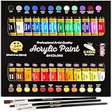
- Premium Artist quality Acrylic paints with a wide range of vivid & vibrant colors that are uniquely formulated with high quality pigments to bring out the maximum brilliance and color clarity with a buttery consistency and offer great covering power for large areas and fine details. These paints dry to a beautiful gloss finish
- Our acrylic paints have a premium consistency, perfect for blending, layering, and creating texture. Along with your 24-pack of paints, you’ll also receive 3 professional brushes.
- High Quality, Rich Pigments, Certified Safe & Non-Toxic .We are not just Premium and Art Friendly but Environment friendly too; ASTM D-4236 and EN71-3 (CE) certified
- Versatile for most art and craft techniques and suitable for most painting surfaces including Canvas, Paper, Wood, Fabric, Leather, Cardboard, ceramic,MDF and Crafts.
Should doors, casings, baseboards, and crown molding all match?
They do not have to, but changing each component independently can create visual noise. Decide first whether the room has one trim family or several intentional zones.
- One continuous treatment: Paint doors, casings, baseboards, and crown molding with the wall color when you want the room to read as one envelope.
- One trim color: Keep all molding and doors in a contrasting or related color when you want a consistent frame around every opening.
- Selective emphasis: Use a related tone or sheen across most trim, then reserve a stronger contrast for a feature such as a paneled door or a substantial fireplace surround.
Before separating components, look at where two treatments meet. A baseboard that changes color at a doorway, or crown molding that stops at a different-colored casing, needs a clear architectural reason to avoid appearing accidental.
A practical sampling process
Do not choose from a wall color card alone. The contractor guidance and Sherwin-Williams both support comparing wall and trim colors together; Sherwin-Williams also offers color chips for mixing and matching shades.
- Identify the actual surfaces. List the wall, baseboard, casing, crown molding, door, and ceiling surfaces that will be painted. Note which pieces are continuous and which stop at corners or openings.
- Select three relationships. Prepare one same-color option, one clearly lighter or darker option, and one related-tone or sheen option. Keep the candidate colors tied to the undertones already present in flooring and furnishings.
- Place samples side by side. Put the wall sample immediately next to the trim sample, at the height and orientation where each will be seen. A trim chip floating on a table cannot show the boundary effect of a vertical casing or horizontal baseboard.
- Check more than one location. Test an exterior wall, an interior wall, a doorway, and the most prominent architectural feature. A color relationship that works beside a window may look different in a darker hallway.
- View the samples at different times. Check daylight and the room’s normal evening lighting. Record which option still gives the intended effect when the light source changes.
- Inspect the finish as well as the hue. If the colors are close, compare the proposed sheen difference directly. If the molding will contrast strongly, inspect the sample for visible surface defects and edge quality.
- Live with the finalists. Leave the samples in place while looking from the room entrance, from adjacent rooms, and from normal seating positions. Choose only after the relationship works from the viewpoints that matter in daily use.
Common mistakes and how to correct them
Assuming white trim is mandatory
White is one option, not a requirement. If a white band feels disconnected from warm flooring or colored walls, test a related neutral, a lighter version of the wall color, or a same-hue sheen change.
Choosing a contrast that is too weak to look intentional
A tiny value difference may disappear in the room’s lighting while still creating extra brushwork and cutting lines. If you want visible framing, sample a difference that remains legible beside the actual wall; if you want blending, match more deliberately rather than relying on an almost-match.
Best Value
- Bulk paint sample cards-- with its wide range of colors, this color sample card set is ideal for matching and selecting its shade for any project.
- Paint color samples-- paint color standard sample cards are for professionals and DIY enthusiasts alike.
- Paint color sample cards paper-- a comprehensive color chart featuring multi standard colors, for various applications.
- Paint color standard sample cards-- paint color sample standard colors cards are designed for your different paint needs.
- Paint chips standard samples-- the portable and easy-to-use design of this color sample card set makes it convenient to carry and use in different settings.
Choosing contrast before checking the architecture
Strong trim color cannot compensate for damaged or poorly joined molding. Complete repairs and caulking first, then reassess whether the profile merits emphasis.
Ignoring transitions to adjacent rooms
A trim color that works in one room may stop abruptly at an open doorway. View the proposed treatment from the neighboring space and decide whether the transition should continue, change at a natural architectural break, or remain visually quiet.
Judging from a single light source
A color pair can look balanced in daylight and overly separated under warm lamps. Keep samples up through the lighting conditions in which the room is actually used.
Do these 3 things before closing this tab:
1Scan for outdated or missing drivers - takes under a minute2Repair Windows errors before they cause bigger problems3Fix the driver behind crashes, sound loss and screen glitchesWhat the available guidance can—and cannot—tell you
Sherwin-Williams, Dulux, and practical contractor guidance agree on the core options: matching reduces separation, contrast emphasizes architectural features, and related tones or sheen changes provide intermediate definition. The contractor article was published September 16, 2026. These are professional and manufacturer recommendations, not results from a controlled study measuring room size, resale value, or universal style outcomes. No reliable statistic establishes that one molding treatment is best for every room.
That limitation is useful rather than restrictive: the decision is visual and site-specific. A sample viewed on your wall, beside your finishes, and under your lighting provides more relevant evidence than a general rule.
Quick Recap
A simple decision rule
- Want the trim to recede? Match the wall color.
- Want doors, windows, or profiles to read as architecture? Use a deliberate contrast, after repairing the trim.
- Want definition without a sharp border? Try a related lighter or darker tone, or a sheen change.
- Unsure? Sample all three relationships together and choose the one that works from the room’s real viewpoints and lighting.

Product prices and availability are accurate as of the date/time indicated and are subject to change. Any price and availability information displayed on Amazon at the time of purchase will apply.

