The Tool Desk
Outbyte PC Repair FREEClear out junk files and repair common Windows errorsFree Scan →Outbyte Driver Updater FREEFix the driver behind crashes, sound loss and screen glitchesFind Drivers →
ThatPainter is reader-supported. When you buy through links on our site, we may earn an affiliate commission. Learn More
The United Airlines logo changed decisively in 2010: the airline kept the United name but adopted Continental’s globe mark after the companies combined. That globe remains on aircraft tails, including the blue-focused fleet design introduced in 2019. Before the merger, United’s best-known identity was Saul Bass’s tulip, introduced in 1974 and used, with revisions, until the combined-company rebrand.
What is the history of the United Airlines logo?
United’s logo history is best understood as a sequence of corporate identities rather than a single uninterrupted design. The major modern transitions are the 1974 tulip, the 2010 merger identity, and the 2019 aircraft-paint refresh.
| Period | Mark and identity | What changed |
|---|---|---|
| 1974–2010 | Saul Bass’s tulip | Established United’s pre-merger visual identity; versions and liveries changed over time. |
| 2010 onward | Continental globe with the United name | Combined the United wordmark with Continental’s globe after the merger. |
| 2019 onward | Globe retained in a blue-oriented fleet palette | Refreshed aircraft paint design rather than announcing a wholly new logo system. |
Who designed the United Airlines tulip logo?
Designer Saul Bass created United’s tulip identity, which was introduced in 1974. Northwestern University’s design-history overview dates the introduction to that year and describes the mark as continuing in some form until the 2010 merger.
Recommended Free Tools
“In some form” matters: the tulip’s use did not mean that every aircraft, color treatment, or wordmark looked identical throughout 1974–2010. United revised its applications and liveries while retaining the tulip as its recognizable pre-merger symbol.
#1 Best Overall
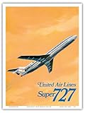
- Matte-finish art print on smooth heavyweight paper with printed artwork. Unframed.
- Printed using a digital process to produce clear detail and balanced color on art paper. Suitable for display in indoor environments.
- Unframed print in a standard size compatible with many ready-made frames. Check frame opening and mat size before purchase to confirm fit.
- The artwork is printed on 9 x 12 in (23 x 31 cm) paper. The image area measures 8.5 x 11.5 in (22 x 29 cm) and is centered with a surrounding white border to accommodate standard framing requirements.
- Each print is produced individually for consistent output and accurate color. Packaged with protective materials to help maintain condition during handling and transit.
Why did United change its logo in 2010?
United and Continental announced a new visual identity for their combined airline on August 11, 2010. The identity kept the United name, set in a custom sans-serif wordmark, and paired it with Continental’s globe. The companies said Continental had used that globe since 1991.
The aircraft scheme followed Continental’s livery, colors, and design, updated with the UNITED name. In their announcement, the companies said: “The new visual identity builds upon the significant value of each airline’s current brand, while advancing the combined airline’s future brand image.” That is the companies’ stated merger rationale, not an independent measurement of which mark customers preferred or recognized more.
Rank #2

- Wall Art Decor: Printed artwork on lightweight tin metal with a matte surface.
- Printed using pigmented inks selected for reliable color performance. These inks support long-lasting image clarity, helping the artwork retain definition over time when displayed indoors.
- Ready to Hang: Features four pre-drilled mounting holes that allow for straightforward installation on most wall surfaces. The sign includes rounded edges designed for comfortable handling during placement.
- Print Size: 8 x 12 inches (20 x 31 cm). This commonly used metal sign size offers flexible placement options in home décor, office décor, studio spaces, and themed wall arrangements. The format is suitable for both portrait and landscape display.
- Each print is produced individually for consistent output and accurate color. Packaged with protective materials to help maintain condition during handling and transit.
How did the globe become United’s logo?
The globe was not newly invented for United in 2010. It originated as Continental’s mark and was selected for the combined company when United and Continental joined identities. The decision therefore preserved the United corporate name while carrying forward a major visual element associated with Continental.
On aircraft, the globe became especially visible on the tail. The 2010 identity announcement described the combined wordmark and livery; it did not establish that every historical United touchpoint changed simultaneously or that all digital and printed applications used identical specifications.
Rank #3

- Matte-finish art print on smooth heavyweight paper with printed artwork. Unframed.
- Printed using a digital process to produce clear detail and balanced color on art paper. Suitable for display in indoor environments.
- Unframed print in a standard size compatible with many ready-made frames. Check frame opening and mat size before purchase to confirm fit.
- The artwork is printed on 9 x 12 in (23 x 31 cm) paper. The image area measures 8.5 x 11.5 in (22 x 29 cm) and is centered with a surrounding white border to accommodate standard framing requirements.
- Each print is produced individually for consistent output and accurate color. Packaged with protective materials to help maintain condition during handling and transit.
What does the United globe logo represent?
United’s public announcements describe the globe’s adoption and its place in the livery, but they do not provide a detailed official explanation assigning a fixed meaning to every line, band, or geometric feature. It is reasonable to read a globe as suggesting worldwide service or a connected network, but that is design interpretation rather than a documented, element-by-element company definition.
United’s 2019 announcement linked the globe with a route network reaching 355 destinations in nearly 60 countries at that time. That statement was contemporaneous network positioning, not evidence that the logo had a measured level of public recognition or a literal geographic encoding.
Rank #4

- Matte-finish art print on smooth heavyweight paper with printed artwork. Unframed.
- Printed using a digital process to produce clear detail and balanced color on art paper. Suitable for display in indoor environments.
- Unframed print in a standard size compatible with many ready-made frames. Check frame opening and mat size before purchase to confirm fit.
- The artwork is printed on 9 x 12 in (23 x 31 cm) paper. The image area measures 8.5 x 11.5 in (22 x 29 cm) and is centered with a surrounding white border to accommodate standard framing requirements.
- Each print is produced individually for consistent output and accurate color. Packaged with protective materials to help maintain condition during handling and transit.
What changed in United’s 2019 logo and aircraft design?
On April 24, 2019, United announced an updated aircraft paint design. The airline retained the globe logo on aircraft tails and shifted the palette toward blue, while keeping core colors from an updated scheme. The announcement concerned fleet paint and tail treatment; it does not by itself establish a complete technical brand manual, exact digital color values, or a universal date by which every aircraft and brand application changed.
United tulip vs. globe: the key differences
| Comparison | Tulip | Globe |
|---|---|---|
| Origin and designer | Designed by Saul Bass; introduced for United in 1974. | Continental mark; the 2010 announcement said it had represented Continental since 1991. |
| Corporate context | United’s principal pre-merger identity. | Chosen for the combined United–Continental identity in 2010. |
| Period of use | Used, with revisions, until the 2010 merger identity replaced it as the combined company’s mark. | Retained by United after 2010 and through the 2019 fleet refresh. |
| Aircraft application | Appeared in United’s pre-merger liveries and related applications. | Displayed on United aircraft tails in the post-merger identity and 2019 refresh. |
The available sources do not establish a reliable consumer-preference or recognition winner between the two marks, so a historical comparison should not present one as objectively more successful.
Why the sequence matters
- 1974: Saul Bass’s tulip gave United a distinctive modern identity.
- 2010: The merger combined the United name with Continental’s existing globe rather than creating an entirely unrelated symbol.
- 2019: United refreshed its aircraft appearance, retained the globe on tails, and made blue more prominent.
This chronology explains why older United aircraft imagery often shows a tulip while current fleet imagery shows a globe, and why the globe’s appearance should be understood first as a merger and livery decision before assigning broader symbolic claims.
Quick Recap

Product prices and availability are accurate as of the date/time indicated and are subject to change. Any price and availability information displayed on Amazon at the time of purchase will apply.




