Crashes, No Sound, or Screen Glitches?
Outbyte Driver Updater · freeRandom freezes, missing sound and display glitches usually trace back to one bad driver. Find and replace yours safely.
Find the Right Drivers →ThatPainter is reader-supported. When you buy through links on our site, we may earn an affiliate commission. Learn More
The best dining-room wall color depends on the mood you want and the room you already have. Start with one of three directions: a light warm neutral for brightness and flexibility, a muted earthy mid-tone for a calm, grounded feel, or a deeper hue for intimacy and drama. Then test real samples in your dining room under both daylight and the artificial lighting you use for meals before committing.
Choose a direction before choosing a shade
Paint names can narrow your search, but they cannot decide the right color for a room they have never seen. Dining-table wood, upholstery, flooring, artwork, window exposure, light fixtures, room dimensions and the colors in adjoining spaces all affect how a wall color reads. Benjamin Moore recommends analyzing those existing elements before selecting an interior color, while Sherwin-Williams emphasizes that color changes with the light source and time of day. Benjamin Moore’s room-analysis guidance and Sherwin-Williams’ color-selection guide both support treating the room—not a catalog chip—as the decision-making context.
As an Amazon Associate I earn from qualifying purchases.
What’s actually slowing this PC down?
Pick the symptom - the matching free tool is one click away.
Use the three options below as mood-based starting points. The named colors are examples from manufacturers, not guarantees that a particular shade will suit your dining room.
| Direction | Typical mood | When to consider it | Potential issue to check |
|---|---|---|---|
| Light warm neutral | Bright, relaxed and flexible | Small or darker rooms, changing décor, open plans | A cool or overly stark cast under your evening lights |
| Muted earthy mid-tone | Calm, grounded and connected to nature | Rooms with warm wood, soft whites or an adjacent neutral palette | Undertones clashing with flooring, furniture or nearby rooms |
| Deeper dramatic hue | Intimate, formal and visually memorable | Rooms where you want stronger contrast or a cocooning effect | The color feeling too heavy across every wall |
This is a comparison of design approaches, not a ranking. There is no universally correct dining-room color; the right choice is the one that supports your furnishings, lighting and intended atmosphere.
#1 Best Overall
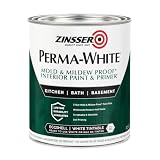
- Self-Priming formula - requires no sanding
- Mold & Mildew-Proof paint film - guaranteed for 5 years
- Resists dirt and moisture on film coating
- Finish is washable and scrubbable with soap and water
- Product contains a mildewcide to prevent the growth of mold and mildew on the paint film only
Option 1: Light warm neutral for brightness and flexibility
A creamy white, warm greige or soft taupe creates a quiet backdrop that can accommodate different table finishes, textiles and artwork. Dunn-Edwards presents light warm neutrals such as Swiss Coffee and Ball of String as options for smaller dining rooms, and Sherwin-Williams describes Agreeable Gray as a versatile greige that can make a room feel more open and brighter. Those are manufacturer recommendations, so use them as examples of the direction rather than as a promise about your room. See Dunn-Edwards’ dining-room color guide and Sherwin-Williams’ guidance on room size and color.
Why this direction works
- It keeps attention on the table, chairs, artwork or a statement light fixture instead of making the walls the dominant feature.
- It can help a compact room feel less visually crowded, especially when the surrounding palette is also light.
- It gives you more freedom to change linens, centerpieces and upholstery without repainting.
What to inspect before choosing
Warm neutrals still have undertones. A creamy white may look yellow beside a blue-gray floor; a greige can appear pink, green or beige depending on neighboring surfaces and light. Place samples beside the actual floor, trim, table and largest upholstered pieces. If the dining room opens directly into another room, compare the candidate against that room’s wall color as well. Sherwin-Williams advises considering the flow between connected spaces rather than selecting each room in isolation. Read its connected-space guidance.
The Tool Desk
Outbyte Driver Updater FREEFix the driver behind crashes, sound loss and screen glitchesFind Drivers →Outbyte PC Repair FREEClear out junk files and repair common Windows errorsFree Scan →Option 2: Muted earthy mid-tone for a calm, grounded room
Gray-green, soft olive and warm taupe add more character than a pale neutral while remaining restrained. Sherwin-Williams highlights Sensible Hue, a gray-green, as a cozy possibility. Dunn-Edwards recommends cohesive undertones with nearby rooms and describes earthy greens working alongside warm woods and soft whites. Explore the examples in Sherwin-Williams’ color guidance and Dunn-Edwards’ dining-room palettes.
Rank #2

- PAINT + PRIMER IN ONE: Evolve’s paint-and-primer formula helps you get great coverage from the start, sealing your surface and reducing the extra work of multiple coats.
- AVAILABLE IN MULTIPLE SHEENS, COLORS & SIZES: Choose from a curated palette of designer colors in Flat, Eggshell, Satin, and Semi-Gloss sheens to match any style, room, or project. Available in 1-Gallons & 5-Gallons.
- EGGSHELL SHEEN – Soft, Velvety Glow: Offers a gentle sheen that balances elegance with durability. Ideal for moderate-traffic areas like dining rooms, hallways, and family rooms. Easy to clean without compromising the finish.
- STAIN & SCRUB RESISTANT: Built to last in real spaces, Evolve helps resist marks, scuffs, and water spotting, so your home continues to look polished and well-maintained.
- DESIGNED FOR MOISTURE-PRONE AREAS: Formulated to perform well in bathrooms, kitchens, entryways, laundry rooms, and other high-humidity spaces.
How to coordinate an earthy mid-tone
- Identify the dominant fixed finish in the room—often the floor, built-in cabinetry or dining table.
- Determine whether it reads warm, cool or mixed in the light you actually use.
- Choose a green, taupe or gray-green whose undertone does not fight that finish.
- Check the color against the adjoining room so the transition feels intentional.
Earthy colors are especially sensitive to surrounding materials. A gray-green beside honey oak may feel different from the same sample beside pale ash or walnut. Soft white trim and textiles can keep the scheme from becoming muddy, but the sample—not a color name—must confirm the relationship.
When this is the safest middle ground
Choose this direction when a white room feels too plain but a dark room feels too assertive. A mid-tone can define the dining area in an open plan without requiring a high-contrast accent wall. It also provides enough color to support natural textures, ceramics and greenery while remaining adaptable to seasonal table settings.
Option 3: Deeper hue for intimacy and drama
Forest green, navy or another deep blue, charcoal, and a muted deep red can make a dining room feel more enveloping and deliberate. Sherwin-Williams suggests using an accent wall as a way to ease into a bold color, while Dunn-Edwards describes pairing a deeper accent wall with lighter remaining walls. Their recommendations are available at Sherwin-Williams and Dunn-Edwards.
Free tools Windows power users keep installed
One-click scans. No signup required.
Rank #3

- Use for a variety of indoor and outdoor project surfaces including wood, metal, plaster, masonry or unglazed ceramic
- Water-based acrylic formula is low odor, resist chips and provides long-lasting protection
- Covers up to 120 sq ft and dries to touch in 30 minutes for quick project completion
- Semi-gloss finish minimizes surface imperfections, goes on smoothly and provides excellent hide
- Prior to application sand surfaces with 180/200 grit sandpaper, then wash with a degreaser, allow the surface to dry and apply paint
Decide between all-over color and an accent wall
All-over deep color gives the strongest visual effect and can suit a room intended for evening entertaining. It requires checking the ceiling, trim, floor and furniture together so the room does not feel unintentionally compressed. If that feels like too much commitment, use the color on one wall, a dining nook or another architectural focal point and keep the remaining walls lighter. An accent approach lets you evaluate the mood at full scale while limiting the amount of bold color.
Check contrast with furnishings
Dark walls can either frame furniture beautifully or reduce contrast until the table and chairs disappear. Hold the sample next to the largest pieces, not just a small decorative object. Pale upholstery, light artwork or warm metallic accents may read very differently against navy than against charcoal. The same deep hue can also shift substantially between a sunlit afternoon and a dinner lit primarily by lamps.
Compare the room in both kinds of light
Dining rooms are often used after sunset, so a color that looks balanced in daylight may look noticeably different at dinner. BEHR specifically recommends evaluating a dining room in natural and artificial light, and Sherwin-Williams notes that color shifts with different light sources and times of day. See BEHR’s dining-room guidance and Sherwin-Williams’ explanation of changing light.
Rank #4

- ALL-IN-1 PAINT & PRIMER: A hardy multi-purpose and multi-surface one-coat paint and primer in one for almost any indoor or outdoor surface. A wall, ceiling, floor, skirting board, cabinet, furniture and door paint for your bathroom, kitchen, home and garden.
- DURABLE & VERSATILE: A highly pigmented, thick formula available in 12 bold colors and a Matte, Satin or Gloss finish. Ideal for interior and exterior paint jobs on wood, laminate, plastic/UPVC, metal, concrete, brick, masonry, stone, glass and more.
- EFFECTIVE MONEY & TIME SAVER: A quick painting solution for DIY or professional builders and painters; our luxuriously opaque formula requires just 1 coat and is fast drying for a premium finish.
- ADVANCED ECO FORMULA: Our UK-made chalk paint is water-based, non-toxic, low odor, and has low VOCs for an environmentally friendly decorating choice.
- EASY APPLICATION: Remove dirt with a damp cloth, wipe the surface clean and dry, sand/score the surface (optional based upon the finish required), stir to mix the color and paint with a brush or roller.
A practical light-check schedule
- Morning or strongest daylight: Look for unwanted blue, yellow or green casts and check the sample against the floor and trim.
- Late afternoon: Notice whether the color becomes dull, overly warm or unexpectedly saturated as daylight fades.
- Meal-time lighting: Turn on the actual chandelier, pendants, sconces or lamps you use. Evaluate the walls from seated eye level.
- Low-light corner: Inspect the wall farthest from the windows; a color that works near glass may appear heavier in shadow.
Do not make the final decision from a phone image, a monitor or a printed page. Benjamin Moore warns that screen and printer representations can differ from actual paint, even though digital previews and store chips are useful for narrowing the field. Review Benjamin Moore’s sample-testing advice.
Sample the three directions at full scale
Shortlist one or two shades within each direction, then test the actual products in the room. Benjamin Moore recommends painting samples on poster board so they can be moved around, while Dunn-Edwards and Sherwin-Williams also advise testing in the intended space and observing changing light. Use the guidance from Benjamin Moore, Dunn-Edwards and Sherwin-Williams.
- Make a three-direction shortlist. Select a light warm neutral, an earthy mid-tone and a deeper hue that each relate to your existing finishes.
- Obtain real paint samples. Chips and digital tools can eliminate obvious mismatches, but they are not substitutes for physical paint.
- Paint large poster boards. Cover enough area to judge the color from across the room. Poster board lets you move each sample without painting multiple permanent patches.
- Place samples on more than one wall. Check a window wall, a shaded wall and the wall nearest the adjoining room. Keep samples beside trim, flooring and furniture.
- Move them through the room. Observe each board in morning light, afternoon light and the artificial lighting used during meals.
- Live with the finalists. Remove options that only work from one angle or at one time of day. Keep the shade that remains compatible with the room’s fixed finishes and desired mood.
- Test the bold option as an accent if needed. If the deeper hue overwhelms the room on several boards, evaluate it on one focal wall rather than rejecting the entire direction.
Match the color to your dining room’s conditions
For a small or dim room
Begin with the light warm-neutral direction because Dunn-Edwards specifically identifies examples in that family for smaller dining rooms. Still, verify brightness in your own room; a warm neutral can become heavy if the space receives little daylight or has dark flooring and furniture.
Best Value

- WHAT'S IN THIS 10 PIECE PAINT KIT FOR WALLS: includes one plastic paint tray; one 9 inch roller frame; one 4 inch mini roller frame; two 9 inch microfiber roller covers (1/2 inch nap); two 4 inch microfiber roller covers (1/2 inch nap); one 1 inch flat brush; one 1.5 inch angle sash brush; one 2 inch angle sash brush
- Versatile Application: Perfect for any project, this set includes paint rollers 9 inch for large surfaces and smaller brushes for detail work
- All-in-One Kit: This paint brush set and paint tray combo ensures you have all the paint supplies needed for any home improvement task
- Professional Grade: Get a smooth, even finish with our high-quality paint roller set; ideal for applying interior paint gallon or smaller quantities
- Cost-Effective: This paint brush and roller set provides unbeatable value; includes paint pan and paint trays for easy cleanup and reuse
For a room with warm wood
Test earthy greens, soft olives and warm taupes against the wood itself. Dunn-Edwards’ guidance pairs earthy greens with warm woods and soft whites, but the exact undertone must remain cohesive with your particular finish.
For an open-plan layout
Compare the dining-room candidates with the colors in connected spaces. Sherwin-Williams advises thinking about how rooms flow together, and a mid-tone or carefully chosen neutral may create definition without an abrupt visual break.
Quick wins for a faster PC:
Clear out junk files and repair common Windows errorsFree Scan →Scan for outdated or missing drivers - takes under a minuteDriver Scan →For a formal or evening-focused dining room
Consider the deeper direction if you want more intimacy and drama. Evaluate it primarily under the lighting used at dinner, and use an accent wall or nook when an all-over application feels overpowering.
Quick Recap
Common selection mistakes and their fixes
- Choosing from a tiny chip: Small cards hide undertones and do not show how the color behaves across a wall. Use large, movable poster-board samples.
- Relying on a screen: Digital and printed colors may not match actual paint. Treat them as shortlisting tools only.
- Testing only in daylight: Evening lighting can change the apparent color. Turn on the fixtures used during meals before deciding.
- Ignoring adjoining rooms: A shade can look attractive alone but clash at the doorway. Compare it with connected wall colors and shared finishes.
- Assuming a manufacturer example is universal: Swiss Coffee, Ball of String, Agreeable Gray and Sensible Hue illustrate directions; they are not room-specific prescriptions.
- Going all-in on a dark color immediately: Test the shade as an accent wall or in a nook first if you are uncertain about covering every wall.
A final decision checklist
- Does the color create the mood you want: bright and flexible, calm and grounded, or intimate and dramatic?
- Does its undertone cooperate with the table, chairs, floor, trim and artwork?
- Does it transition comfortably into adjoining rooms?
- Does it still look right in both daylight and your actual meal-time lighting?
- Have you judged a real paint sample at a useful scale rather than relying on a screen or tiny chip?
- If it is a deep shade, have you compared all-over coverage with an accent-wall application?

Product prices and availability are accurate as of the date/time indicated and are subject to change. Any price and availability information displayed on Amazon at the time of purchase will apply.

