Crashes, No Sound, or Screen Glitches?
Random freezes, missing sound and display glitches usually trace back to one bad driver. Find and replace yours safely.
Find the Right Drivers →Free scan · under a minute

As an Amazon Associate I earn from qualifying purchases.
ThatPainter is reader-supported. When you buy through links on our site, we may earn an affiliate commission. Learn More
The Tool Desk
Outbyte PC Repair FREEClear out junk files and repair common Windows errorsFree Scan →Outbyte Driver Updater FREEScan for outdated or missing drivers - takes under a minuteDriver Scan →Cornflower-blue walls work especially well with warm whites, natural wood, natural stone, and brass. For stronger contrast, add small amounts of rust, terracotta, peach, or muted orange. For a quieter room, layer lighter and darker blue-family shades. The right choice depends on the paint’s undertone, the room’s daylight and artificial light, and the furnishings already in it, so test samples in the actual space before committing.
#1 Best Overall
Why the same cornflower blue can look different from room to room
“Cornflower blue” describes a color family rather than one universally standardized paint formula. One version may lean slightly gray, another may look clearer and brighter, while a third may carry a subtle green or violet undertone. Sheen also changes the impression: a matte surface usually looks softer, whereas eggshell or satin can make the color appear more reflective and intense.
Light is equally important. North-facing rooms often make blue look cooler and more subdued; warm afternoon sun can pull out a livelier, clearer side. LED bulbs with a warm color temperature may make neighboring whites and stones look creamier, while cooler bulbs can emphasize blue’s crispness. The colors below are therefore starting points, not guaranteed matches.
Color pairings that work with cornflower-blue walls
| Pairing | Contrast level | What it contributes | Best way to use it | Potential issue |
|---|---|---|---|---|
| Warm white or softened white | Low to medium | Brightness without a hard, icy edge | Trim, ceiling, upholstery, curtains, bedding | A very yellow white can make a clean blue look greenish or muddy |
| Natural wood | Material contrast rather than hue contrast | Warmth, grain and visual texture | Flooring, furniture, shelves, frames | Several unrelated wood stains can make the room feel busy |
| Natural stone | Low to medium | Quiet variation and an earthy counterpoint | Fireplace surrounds, worktops, side tables, accessories | Strongly orange or heavily veined stone can compete with the wall |
| Brass or other warm metal | Small, high-impact contrast | Warm highlight and a slightly dressier finish | Lighting, cabinet hardware, mirrors, frames | Too much polished metal can look themed rather than layered |
| Rust, terracotta or muted orange | High | Energy and a complementary color note | Pillows, art, a chair, ceramics or a rug border | A large saturated area can overpower the blue |
| Peach | Medium to high | Soft warmth with less visual weight than rust | Textiles, small painted furniture, artwork | Very pastel peach may look chalky beside a deep blue |
| Lighter or darker blues | Low | A calm, coordinated tonal scheme | Upholstery, curtains, bedding, cabinetry and artwork | Without a warm texture, the room may feel flat or cool |
| Soft beige, taupe or mushroom | Low to medium | Neutral continuity and a grounded backdrop | Large furniture, rugs and woven accessories | Gray-beige with a blue undertone can make the whole room colder |
Warm whites and soft neutrals
Choose a softened white for trim and ceilings
A warm or softened white keeps a blue room light while reducing the sharp border created by a brilliant, high-blue white. This is particularly useful when the walls are saturated and the trim occupies a lot of visual area. Sample the white beside the wall, not on a separate card, because the blue will influence how the white appears.
Free tools Windows power users keep installed
One-click scans. No signup required.
A designer quoted by Homes & Gardens on October 9, 2026 advised against bright white with the strong blue in that specific project, saying the contrast could feel too stark. That is project-specific guidance, not a universal prohibition. If your blue is pale, grayish or heavily softened, a clean white may work well; if it is deep and vivid, a warmer white is usually easier to balance.
Use beige and taupe to make the room feel settled
Soft beige, taupe and mushroom tones are useful when you want the walls to recede slightly. Choose upholstery, a rug or woven shades in one of these neutrals, then add a small amount of wood or brass so the scheme does not become a blue-and-gray stack of flat surfaces. Keep the neutral’s undertone consistent: a pink-beige can look disconnected from a green-leaning blue, while a blue-gray beige may drain warmth from the room.
Rank #2

- Features 216 timeless hues from the RAL CLASSIC collection with five colors per page - fan size 15.0 x 5.0 x 2.0, color display 2.0 x 5.0 cm
- Crafted with low-solvent, low-odour water-based paints for eco-friendly use
- Enhanced UV resistance provides long-lasting color protection
- Cover made from 100% recyclable post-industrial polypropylene waste
- Compact and portable design, ideal for precise color matching on the go
Natural wood, stone and brass
Let wood supply everyday warmth
Natural oak, walnut, ash and similar woods bring warmth without introducing another strong paint color. A wood coffee table, dining set, picture frame or exposed shelf can be enough; you do not need to replace every surface. Repeating one or two wood tones is more cohesive than mixing many finishes.
Use stone for quiet texture
Natural stone works because its variation bridges the blue wall and the warmer parts of a room. A limestone-look surface, muted marble, soapstone or a neutral stone accessory can add interest without competing for attention. Inspect a real sample under the room’s lighting: photographs often exaggerate veining and warmth.
Free tools Windows power users keep installed
One-click scans. No signup required.
Add brass as an accent, not a requirement
Brass hardware, a lamp, picture frame or mirror edge can provide a controlled warm note. The same Homes & Gardens feature shows cornflower-blue cabinetry balanced with warm woods, natural stone, brass and quieter tones. Treat that as a useful example of material contrast rather than a rule that every cornflower-blue room needs metallic decoration. Aged or satin brass generally reads more softly than a room filled with highly polished gold.
Rust, terracotta, peach and muted orange for contrast
Blue and orange sit opposite one another in the traditional color-wheel pairing. Sherwin-Williams explains the distinction between complementary colors, which create stronger contrast, and analogous colors, which sit next to one another and create less contrast, in its Paint Color Theory guide. Rust, terracotta, peach and muted orange use that warm-versus-blue relationship without requiring a vivid orange wall.
Start with a small, reversible accent
Try one rust throw pillow, a terracotta vase, a peach lampshade or artwork with a muted orange detail. Live with it for a few days before adding more. If the accent attracts attention before the architecture or furniture does, reduce its size or saturation. A rust-colored chair or rug border can be the next step when a single accessory feels too tentative.
Rank #3

- Practical to use: paint color sample standard colors cards are designed for your different paint needs,color test card paint bulk,paint color samples
- Paint cards: made of plastic and paper that provides accurate colors and reliable results,paint standard samples,water color cards
- Professional: paint color standard sample cards are great for professionals and DIY enthusiasts alike,paint color cards,paint chips samples
- Paint color sample cards: suitable for various such as floor paint, paint hardware, and more,paint color sample cards,paint color cards bulk
- Comprehensive color chart: featuring multi standard colors, great for various ,paint cards,water color paint cards
Match the intensity of the blue
A dusty, gray-influenced cornflower blue usually pairs more comfortably with weathered terracotta, cinnamon or clay than with a clear, neon orange. A stronger blue can support a more vivid accent, but the safest approach is still to test fabric or paint samples together. Warm accents look different in direct sun and under evening lamps.
What’s actually slowing this PC down?
Pick the symptom - the matching free tool is one click away.
Layer neighboring blues for a quieter scheme
Use the blue family when you want low contrast and a restful result. Pair the wall with a lighter blue ceiling or textile, a deeper navy cushion, or a blue-gray sofa. Vary value and texture so the room does not become a single unbroken field of color: linen, wool, rattan and wood prevent a tonal palette from looking sterile.
Analogous colors create less contrast than complementary colors, according to Sherwin-Williams’ color-theory explanation. In practice, that means a nearby blue is easier to live with than a large orange surface, but it still needs a neutral or warm material to provide definition.
Palette plans by mood
Relaxed and natural
- Cornflower-blue walls
- Soft warm-white trim
- Natural oak or walnut furniture
- Limestone, woven fiber or jute texture
- A small aged-brass detail
This combination keeps the wall as the color statement while relying on grain and texture for interest.
Warm and collected
- Cornflower-blue walls
- Mushroom or taupe upholstery
- Rust or terracotta in one or two small accents
- Medium-tone wood
- Brass lighting or hardware
Use the warm accent selectively; repeating it in two places is usually enough to make it feel intentional.
Recommended Free Tools
Rank #4

- Core Color Matching: Paint color sample cards include 83 standard colors to support paint color sample cards, color matching cards for painting, and paint chips standard samples, helping users compare shades before selecting a final finish for floor paint, hardware, and other project needs
- Reliable Reference: Paint samples are made with color matching materials designed to support accurate color comparison, giving painters and DIY users a practical paint and paint color samples reference for selecting tones that fit the project surface and intended look
- Portable Format: Measuring 3.74 x 1.57 x 1.18 in and weighing 3.88 oz, this paint samples set is compact for a toolbox, work bag, or travel use, making it easier to carry color test card paint and check shades on site when planning paint work
- Wide Project Use: Paint sample cards are suitable for floor paint, paint hardware, and related color selection tasks, offering a useful paint chips samples reference for contractors, decorators, and home improvement users working on color coordination across different surfaces
- Simple Set Package: Each package includes 1 set of paint sample cards, giving users a straightforward paint sample standard cards option for daily work, project planning, and quick shade comparison when choosing among paint color cards and paint chips sample cards
Quiet and tonal
- Cornflower-blue walls
- A lighter blue curtain or bedcover
- A deeper blue chair, cushion or cabinet
- Soft white or pale stone neutral
- Natural wood to keep the scheme from feeling cold
Light and airy
- Cornflower-blue walls
- Softened white ceiling and trim
- Pale wood
- Peach or muted coral in artwork or a single textile
- Unpatterned linen to preserve visual space
How to use the palette in different rooms
Living room
Anchor large seating in a soft neutral, then introduce the accent color through pillows, art or a small ottoman. A wood coffee table and brass or bronze lamp connect the warm elements. If the room already has a patterned rug, pull one quiet warm tone from that rug rather than adding a new accent color.
Bedroom
Layer white, cream or pale blue bedding against the walls. Add a deeper blue at the foot of the bed or in a cushion for tonal depth. Rust or peach works best in a limited textile area so the room remains restful at night.
Kitchen and dining area
Cornflower blue can support natural wood stools, stone worktops and warm metal hardware. Keep the countertop and backsplash quieter if the cabinetry or walls are strongly colored. A single terracotta vessel or rust seat cushion supplies contrast without turning the kitchen into a two-color pattern.
Bathroom
Warm white tile, pale stone and brushed brass can soften the coolness of blue walls. Check grout and metal samples together; a very blue-gray grout can make the entire room feel colder than the paint chip suggested.
Hallway or small room
In a dim or narrow space, use the warmest acceptable white and reflective but not overly glossy finishes to preserve light. Keep strong orange accents small because a compact room gives every saturated object more visual weight.
Best Value
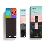
- COMPLETE FASHION, HOME & INTERIORS COLOR SYSTEM Access 2,800+ Pantone FHI colors, including 175 new shades from the Dualities collection—an essential Pantone color guide for fashion, textiles, interiors, and product design.
- DUALITIES COLLECTION – TREND-DRIVEN COLORS Explore curated palettes including New Age pastels and monochromatic Shadows, designed to reflect modern trends across apparel, home décor, and lifestyle products.
- DESIGNED FOR TEXTILES & MATERIALS Features TPG (Textile Paper – Green) colors that align with the Pantone Textile Cotton System (TCX)—ensuring accurate color development across fabrics, soft goods, and hard surfaces.
- CONNECTED TO THE FHI COTTON SYSTEM Works seamlessly with tools like the Cotton Passport, Cotton Planner, Cotton Chip Set, and FHI Cotton Library, supporting complete color development, sampling, and production workflows.
- PORTABLE FAN DECK FOR DESIGNERS ON THE GO Includes three handheld Pantone color fan decks in a compact, collector-style package, ideal for design studios, client meetings, and on-site color selection.
Curtains, trim and ceiling decisions
For curtains, warm white, flax, oatmeal, natural linen and a quieter blue are dependable starting points. Choose rust, terracotta or peach curtains only when you want the window treatment to become a major focal point. If the walls are patterned or highly saturated, a plain fabric usually provides better balance.
Ceilings do not have to be stark white. A softened white, very pale blue or light neutral can make the transition gentler. Paint a sample board with the candidate ceiling color and hold it vertically against the wall; viewing it flat on a desk hides the way light changes the relationship.
A sample-testing process that prevents expensive mistakes
- Obtain sample cards or small paint quantities for the wall color, proposed white, neutral and accent.
- Paint large boards rather than relying on tiny chips. Put the boards beside trim, flooring, counters and major furniture.
- Move the boards around the room. Check the brightest window area, a shaded corner and the wall opposite the window.
- View them in morning, afternoon and evening light, with the artificial bulbs normally used in the room.
- Test textiles and metal finishes next to the painted boards. A fabric that looks compatible alone may clash beside the blue.
- Leave the boards in place for several days. Choose the combination that remains comfortable across changing light, not the one that looks best for five minutes.
Common mistakes and how to correct them
Using brilliant white everywhere
If trim looks glaring, replace or soften the white rather than repainting the blue immediately. A warmer white on selected trim can reduce the edge contrast while keeping the room bright.
The Tool Desk
Outbyte PC Repair FREERepair Windows errors before they cause bigger problemsFix Now →Outbyte Driver Updater FREEFix the driver behind crashes, sound loss and screen glitchesFind Drivers →Adding too many warm accents
When rust, brass, orange wood and terracotta all appear in large quantities, the room can lose hierarchy. Keep one warm accent dominant and let the others repeat it quietly.
Ignoring existing undertones
Flooring, stone, upholstery and adjacent rooms remain visible. Compare samples with those fixed elements; a color that coordinates with the blue alone may fight a pinkish carpet or greenish tile.
Choosing from a screen
Digital images and online color cards cannot reproduce your paint, finish or lighting exactly. Use them for direction, then make the decision from physical samples in the room.
Making every surface blue
A tonal scheme still needs contrast in value, texture or material. Add wood, stone, woven fibers or a warm neutral so the blue layers remain legible.
Outdated Drivers Are Slowing You Down
One free scan finds every outdated or missing driver and matches the right update for your exact hardware.Free scan · exact hardware matchWindows Errors? Fix Them Before They Spread
Repair common Windows errors and clear accumulated junk for a smoother, more stable PC - no reinstall needed.Free scan · no reinstallPutting the decision in order
First identify whether you want low contrast, material warmth or a noticeable complementary accent. Next test the wall color against the room’s fixed finishes and daylight. Select the largest neutral surfaces—such as a sofa, curtains or bedding—before choosing small accessories. Add rust, terracotta, peach or muted orange only after the base palette feels balanced. This sequence keeps cornflower blue in control while leaving room to adjust inexpensive, movable pieces.
Quick Recap

Product prices and availability are accurate as of the date/time indicated and are subject to change. Any price and availability information displayed on Amazon at the time of purchase will apply.

