Quick wins for a faster PC:
Clear out junk files and repair common Windows errorsFree Scan →Fix the driver behind crashes, sound loss and screen glitchesFind Drivers →Repair Windows errors before they cause bigger problemsFix Now →
ThatPainter is reader-supported. When you buy through links on our site, we may earn an affiliate commission. Learn More
Gray and black make a strong, modern foundation. The best companion color depends on the gray’s undertone: brown- or green-based grays welcome warm earthy accents, while blue- or purple-based grays pair naturally with cooler greens and blues. Use black in controlled doses, choose one dominant color, and test paint or fabric in both daylight and artificial light before committing.
How to choose colors for a gray-and-black room
Identify the gray undertone
Gray is not a single neutral. Brown or green undertones make a room feel warmer and more comfortable; blue or purple undertones read cooler. Hold a white sample beside the gray and inspect it at different times of day. The undertone that becomes visible should guide your accent color.
As an Amazon Associate I earn from qualifying purchases.
Set a dominant color
Do not divide two strong colors equally. Let gray, black, or the accent lead, then use the other colors in smaller amounts through trim, furniture, textiles, art, or accessories. If one color is highly saturated, mute its companion to keep the room balanced.
Use contrast intentionally
Black supplies definition against gray, while white and pale neutrals reflect light. If the room feels severe or cold, add warm materials such as wood, taupe, tan, cream, sand, or ivory rather than adding more black.
#1 Best Overall
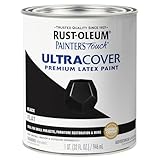
- Use for a variety of indoor and outdoor project surfaces including wood, metal, plaster, masonry or unglazed ceramic
- Water-based acrylic formula is low odor, resist chips and provides long-lasting protection
- Covers up to 120 sq ft and dries to touch in 30 minutes for quick project completion
- Flat finish provides a fresh new look for surfaces, goes on smoothly and provides excellent hide
- Prior to application sand surfaces with 180/200 grit sandpaper, then wash with a degreaser, allow the surface to dry and apply paint
9 colors that go with gray and black
| Combination | Why it works | Where to use it |
|---|---|---|
| Fossil gray + taupe | Taupe warms gray without losing its restrained, neutral character, creating a comfortable and quietly romantic scheme. | Use taupe on upholstery, curtains, rugs, or a feature wall; keep black to frames, lighting, or hardware. |
| Cool gray + green | Pistachio, light olive, and soft turquoise share a cooler bias with blue-undertoned gray. | Try green cabinetry, cushions, or painted furniture against cool gray walls and black accents. |
| Green-gray + pale green | Related green undertones create a tranquil, near-monochromatic effect with subtle variation. | Layer pale green textiles and ceramics over green-gray walls; use matte black sparingly for structure. |
| Charcoal gray + pink | Pink softens charcoal’s seriousness. Dusty rose, muted blush, and brown- or gray-based burgundy keep the result sophisticated. | Add pink through a headboard, artwork, bedding, or occasional chair rather than covering every surface. |
| Cloud gray + white | White brightens cloud gray, but its undertone must suit the room’s light so the pairing does not look dingy or icy. | Use compatible white on trim, ceilings, and larger furnishings; reserve black for slim lines and hardware. |
| Dark gray + blush | Soft blush lightens a warm charcoal base, while ivory prevents the dark color from overwhelming the room. | Combine charcoal walls or cabinetry with blush accents and ivory upholstery, bedding, or curtains. |
| Pale gray + crisp white | Fresh white is the simplest light-reflective partner, making a space feel cleaner and more open. | Choose pale gray for walls and crisp white for trim or major furniture; add black in measured details. |
| Steel gray + black and white | A grayscale structure feels classic and striking. Warm additions keep steel gray and black from becoming cold. | Introduce sand, taupe, chocolate brown, or natural wood through flooring, tables, baskets, or textiles. |
| Light gray + tan | Tan or ochre gives light gray an earthy, approachable dimension. | Use tan leather, woven shades, rugs, or wood tones, with black lighting or trim for definition. |
Additional accent colors worth considering
Sage, olive, and emerald
Sage is a versatile, nature-based partner that suits both contemporary and traditional rooms. Olive adds warmth and depth, while emerald creates a richer focal point against light gray. Keep emerald to one or two statement pieces if the black elements are already prominent.
Navy
Navy is a dependable darker partner for light gray. It preserves the tailored feel of a cool palette while adding more color than black alone. Use it on an accent wall, sofa, cabinetry, or window treatments rather than pairing every large surface in dark tones.
Rank #2

- ALL-IN-1 PAINT & PRIMER: A hardy multi-purpose and multi-surface one-coat paint and primer in one for almost any indoor or outdoor surface. A wall, ceiling, floor, skirting board, cabinet, furniture and door paint for your bathroom, kitchen, home and garden.
- DURABLE & VERSATILE: A highly pigmented, thick formula available in 12 bold colors and a Matte, Satin or Gloss finish. Ideal for interior and exterior paint jobs on wood, laminate, plastic/UPVC, metal, concrete, brick, masonry, stone, glass and more.
- EFFECTIVE MONEY & TIME SAVER: A quick painting solution for DIY or professional builders and painters; our luxuriously opaque formula requires just 1 coat and is fast drying for a premium finish.
- ADVANCED ECO FORMULA: Our UK-made chalk paint is water-based, non-toxic, low odor, and has low VOCs for an environmentally friendly decorating choice.
- EASY APPLICATION: Remove dirt with a damp cloth, wipe the surface clean and dry, sand/score the surface (optional based upon the finish required), stir to mix the color and paint with a brush or roller.
Teal
Teal works best when its blue undertone is balanced by a warmer gray or greige. Bright teal with pale gray can look overly clean, so choose a softened teal or add tan, wood, or cream to settle the contrast.
Blush, cream, and warm neutrals
Blush, cream, taupe, tan, sand, and ivory are the safest choices when a gray-and-black scheme feels chilly. They warm the room without competing with its architectural lines.
Rank #3

- Ready to use, pre-mixed door and trim paint offers a fresh new look on interior or exterior metal, wood and fiberglass
- Water-based paint formula emits less odor and withstands fading for a long lasting finish
- Dries to the touch in 45 minutes, up to 3X faster than traditional oil-based paints
- Durable, chip resistant coating provides ultimate protection with modern curb appeal
- Beautiful satin door paint is available in 6 pre-mix color options for the perfect look
Chrome and silver
Chrome and silver finishes reinforce a contemporary, polished look. Because they are cool and reflective, combine them with wood or a warm textile if the room already contains blue-based gray and substantial black.
Quick Recap
Best Value
- ALL-IN-1 PAINT & PRIMER: A hardy multi-purpose and multi-surface one-coat paint and primer in one for almost any indoor or outdoor surface. A wall, ceiling, floor, skirting board, cabinet, furniture and door paint for your bathroom, kitchen, home and garden.
- DURABLE & VERSATILE: A highly pigmented, thick formula available in 12 bold colors and a Matte, Satin or Gloss finish. Ideal for interior and exterior paint jobs on wood, laminate, plastic/UPVC, metal, concrete, brick, masonry, stone, glass and more.
- EFFECTIVE MONEY & TIME SAVER: A quick painting solution for DIY or professional builders and painters; our luxuriously opaque formula requires just 1 coat and is fast drying for a premium finish.
- ADVANCED ECO FORMULA: Our UK-made chalk paint is water-based, non-toxic, low odor, and has low VOCs for an environmentally friendly decorating choice.
- EASY APPLICATION: Remove dirt with a damp cloth, wipe the surface clean and dry, sand/score the surface (optional based upon the finish required), stir to mix the color and paint with a brush or roller.
Rank #4
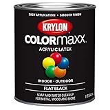
- Made in United States
How to test the combination before painting
- Collect physical samples. Compare the gray, black, white, and proposed accent on the same board; digital color chips cannot show undertones reliably.
- View the board in daylight. Check morning, midday, and late-afternoon light, including how nearby flooring and furniture reflect onto the colors.
- Check artificial light. Warm bulbs can pull gray toward beige, while cooler bulbs can make blue undertones more obvious.
- Paint a large test area. Observe the sample beside trim, flooring, and permanent fixtures before painting the whole room.
- Assign proportions. Decide which color dominates and where the accent repeats. A small, intentional accent usually looks more composed than equal blocks of competing color.
Quick decisions by room mood
- Airy and bright: pale gray, compatible crisp white, and limited black.
- Warm and inviting: fossil or warm gray with taupe, tan, cream, or wood.
- Calm and natural: green-gray with pale green or sage.
- Elegant with softness: charcoal with dusty rose, blush, or ivory.
- Bold and tailored: steel gray, black, white, and a measured dose of navy or emerald.
Common mistakes to avoid
- Choosing an accent by the word “gray” alone instead of checking its undertone.
- Using black on too many large surfaces, which can reduce light and make the room feel heavy.
- Pairing a stark white with a gray whose undertone makes the white appear blue, yellow, or dirty.
- Using complementary colors in equal amounts instead of establishing a dominant color.
- Approving a color from a phone or small swatch without testing it under the room’s real lighting.

Product prices and availability are accurate as of the date/time indicated and are subject to change. Any price and availability information displayed on Amazon at the time of purchase will apply.




