Recommended Free Tools
Outdated Drivers Are Slowing You Down
Free scan · exact hardware match
Windows Errors? Fix Them Before They Spread
Free scan · no reinstall
Crashes, No Sound, or Screen Glitches?
Free scan · under a minute
ThatPainter is reader-supported. When you buy through links on our site, we may earn an affiliate commission. Learn More
Soft blue walls pair most reliably with white, gray, beige, natural wood, and carefully controlled rust, terracotta, peach, or muted orange accents. White keeps the room crisp, gray builds a cool layered scheme, and beige or wood warms the blue. Orange-family accents supply contrast without requiring another large painted surface.
| # | Preview | Product | Price | |
|---|---|---|---|---|
| 1 |
|
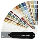
Benjamin Moore Collections Fan Deck | $33.99 | Buy on Amazon |
| 2 |

|
Sherwin Williams Colors collection Deck Complete Paint Colors | $35.00 | Buy on Amazon |
| 3 |
!['BENJAMIN MOORE' CLASSIC COLORS FAN DECK [CASE OF 1]](https://m.media-amazon.com/images/I/41Xq67AO80L._SL160_.jpg)
|
"BENJAMIN MOORE" CLASSIC COLORS FAN DECK [CASE OF 1] | $48.57 | Buy on Amazon |
| 4 |

|
RAL K7 Color Chart, 216 Colors, Gloss, 5 Languages | $26.13 | Buy on Amazon |
As an Amazon Associate I earn from qualifying purchases.
The best choice depends on the blue’s undertone (gray, green, or clear blue), its depth, your fixed finishes, and the light in the room. Use the guidance below to choose a direction, then test physical samples before committing.
Start with the five dependable directions
- White: Use it for trim, ceilings, cabinetry, bedding, or larger furniture when you want a clean, open result.
- Gray: Choose a related gray for a cool, layered room, but create enough value difference that the colors do not merge.
- Beige and warm neutrals: These temper blue’s coolness and make living, dining, and sleeping spaces feel more inviting.
- Natural wood: Oak and other natural wood tones add warmth and texture without introducing another strong paint color.
- Rust, terracotta, peach, or muted orange: Use these in small doses when you want the opposing-hue contrast of blue and orange.
A sixth option is another blue. A tonal scheme works when neighboring blues share a softness or undertone and differ clearly in depth.
#1 Best Overall
- Brand: Benjamin moore
- Container type: Box
- Finish type: Opa
Read the blue before choosing a companion
Identify the undertone
Soft blue is not one fixed color. A blue with a gray undertone behaves differently from one that leans green or reads as a clearer, purer blue. Gray-leaning blue usually sits comfortably with cool white, charcoal, silver, and blue-gray finishes. Green-leaning blue can bridge more naturally to warm beige, cream, tan, and natural wood. A clearer blue can tolerate a stronger warm accent such as terracotta or rust.
Check the depth
Pale blue has little visual weight, so bright white can make it feel airy while pale wood keeps the room casual. A mid-tone soft blue has more presence and may need a lighter trim, a lighter fabric, or a deliberate dark element to prevent the room from feeling flat. When two colors are close in value, separate them with texture or introduce a noticeable jump in lightness or darkness.
Outdated Drivers Are Slowing You Down
One free scan finds every outdated or missing driver and matches the right update for your exact hardware.Free scan · exact hardware matchPC Slower Than It Used to Be?
A free scan shows the junk files, broken settings and background clutter dragging Windows down - then fixes them in one click.Free scan · Windows 10 & 11Separate temperature from contrast
Temperature describes whether a color feels cool or warm; contrast describes how far apart the colors appear. White and gray generally keep a cool temperature. Beige and wood shift the room warmer. Rust, terracotta, peach, and muted orange create stronger contrast because orange sits opposite blue in traditional complementary color guidance. You can therefore make a room feel energetic with a small high-contrast accent, or calm it with a large area of a low-contrast neutral.
How each color works with soft blue
White for a crisp, defined room
White is the safest starting point for trim, ceilings, doors, built-ins, and large upholstered pieces. Against a pale, softened blue, it produces a relaxed, fresh outline. Against a deeper soft blue, it creates a sharper frame that makes the wall color look more intentional.
Use white when the room has limited daylight or when you want the walls to remain the main color. If the blue is grayish, a very stark white can feel more graphic than intended; a softened white keeps the transition gentler. Repeat the white in at least two places, such as trim and curtains or a ceiling and a sofa, so it reads as a plan rather than an isolated patch.
Gray for a cool, layered palette
Gray works when you want the room to remain tranquil and cool. A gray sofa, rug, tile, or bedding can connect to blue walls without competing for attention. Keep a visible difference in value: light gray beside pale blue may disappear, while a medium gray or a clearly lighter gray gives the eye an edge to follow.
Quick wins for a faster PC:
Clear out junk files and repair common Windows errorsFree Scan →Fix the driver behind crashes, sound loss and screen glitchesFind Drivers →Repair Windows errors before they cause bigger problemsFix Now →Blue-gray walls can also connect to white, wood, black, and metal finishes. Use black or dark metal sparingly as a line or frame rather than as another dominant color. If the room already contains gray flooring or stone, sample the wall and gray together; two grays that look similar on a screen can reveal different blue or green undertones in person.
Beige and warm neutrals for comfort
Beige counterbalances the coolness of blue and makes a room feel more grounded. It is especially useful in bedrooms, living rooms, dining rooms, and spaces that contain brick or stone. Look for beige in upholstery, curtains, rugs, baskets, or painted cabinetry rather than assuming the walls need another neutral.
Warm beige usually produces a softer transition than a stark yellow-cream. If your blue already leans green, a sandy or oat-like beige can reinforce its relaxed quality. If the blue leans gray, test the beige carefully so it does not appear unexpectedly yellow under warm bulbs.
Natural wood for warmth and texture
Natural wood is a practical companion because it contributes both color and texture. Pale oak supports a bright, casual scheme with light blue. Medium or warmer wood creates more contrast and can keep a larger room from feeling washed out. Use wood flooring, a dining table, bed frame, shelves, or picture frames to repeat the warm note throughout the space.
Do these 3 things before closing this tab:
1Clear out junk files and repair common Windows errors2Fix the driver behind crashes, sound loss and screen glitches3Repair Windows errors before they cause bigger problemsLet the existing woodwork lead. If the floor is already a strong honey or medium brown, it may supply enough warmth; adding a second painted warm neutral could make the palette busier. Coordinate by undertone rather than by trying to match every wood piece exactly.
Rust, terracotta, peach, and muted orange for controlled contrast
Blue and orange are complementary hues, so even a small orange-family accent can be visible against soft blue. Rust and terracotta create a deeper, earthier contrast; peach gives a lighter, gentler version; muted orange feels livelier without the intensity of a saturated orange.
Rank #3
- Very good condition
- Benjamin Moore Classic Colors Fan Deck
- Classic Colors
- Includes the American Classic Colors (AC)
Keep this family to pillows, throws, artwork, a lampshade, a single chair, or a small painted accent when you want a quiet room. A large orange wall or many equally bright accessories can overpower a soft blue. Repeating the accent two or three times in different materials makes it feel deliberate while preserving the blue as the dominant field.
More blue for a tonal scheme
Layering blue can look sophisticated when the shades share related undertones and differ clearly in depth. For example, a pale blue wall can support a deeper blue headboard or curtain, while a mid-tone wall can take a much lighter ceiling or textile. Keep the finishes varied—matte paint, woven fabric, glazed ceramic—so the palette gains dimension without adding another hue.
Compare the main directions
| Direction | Temperature effect | Contrast level | Useful in | Best proportion |
|---|---|---|---|---|
| White | Cool to neutral | Low to high, depending on value | Trim, ceilings, furniture, cabinetry | Large areas or architectural outlines |
| Gray | Cool | Low to medium when values are separated | Upholstery, rugs, tile, bedding | Medium or large supporting areas |
| Beige | Warm | Low to medium | Living, dining, and bedroom furnishings | Large textile or furniture areas |
| Natural wood | Warm | Medium, increasing with wood depth | Floors, tables, shelving, frames | Existing finishes or a few substantial pieces |
| Rust, terracotta, peach, or muted orange | Warm | Medium to high | Art, pillows, throws, and small accents | Small, repeated accents |
| Another blue | Cool to neutral | Low when close in depth; higher when separated | Textiles, furniture, doors, and ceilings | Layered areas with a deliberate value jump |
Match the palette to what cannot easily change
Floors, tile, stone, and brick
Permanent materials should establish the supporting direction. Beige or warm wood is often the easiest bridge to brick and stone. Gray can connect blue walls to cool tile or gray flooring. If the floor contains several colors, pull one existing neutral into the furnishings instead of introducing a new major paint color.
Furniture and woodwork
Inventory the large pieces first: sofa, bed, dining table, cabinets, and built-ins. A room with warm wood and cream upholstery already has a warm-neutral framework; soft blue can sit inside it without additional orange accents. A room dominated by gray upholstery and chrome may benefit from white and gray layers, with wood or terracotta added only if it feels too cold.
Metal finishes
Cool metals support a blue-gray direction, while brass and warmer metals reinforce beige, wood, or terracotta. Metal is a detail, not a substitute for a companion color, so use it to echo the chosen temperature rather than to create a whole new palette.
Choose a direction in six steps
- Classify the wall color. Decide whether the blue leans gray, green, or clear blue, and whether it is pale or mid-tone.
- Set the desired mood. Choose crisp and cool (white or gray), warm and grounded (beige or wood), or more energetic (a restrained rust, terracotta, peach, or muted orange accent).
- List fixed finishes. Note the floor, tile, stone, brick, furniture, woodwork, and metal finishes that will remain.
- Choose the largest supporting color. Use the existing floor or largest furniture piece as your anchor, then select white, gray, beige, or wood that relates to it.
- Add contrast deliberately. If the room feels flat, change value or add texture before adding a saturated hue. If it feels too quiet, introduce a small orange-family accent rather than repainting a large area.
- Test before buying or painting. Place physical samples beside the wall, floor, and key furnishings and view them at different times of day.
Test colors in the room’s actual light
Natural and artificial light can change how a soft blue and its companion appear. A sample that looks neutral near a window may look greener or grayer under evening bulbs. Digital images and printed color representations also may not match the finished surface.
Rank #4
- Features 216 timeless hues from the RAL CLASSIC collection with five colors per page - fan size 15.0 x 5.0 x 2.0, color display 2.0 x 5.0 cm
- Crafted with low-solvent, low-odour water-based paints for eco-friendly use
- Enhanced UV resistance provides long-lasting color protection
- Cover made from 100% recyclable post-industrial polypropylene waste
- Compact and portable design, ideal for precise color matching on the go
Use a paint sample card or peel-and-stick swatch, and place it on more than one wall if the room receives uneven light. Check it in morning, midday, and evening conditions. Hold fabric, wood, tile, or rug samples next to it rather than evaluating each item alone. Observe the combination from the room’s normal viewing distance before ordering major furnishings.
Room-by-room combinations
Bedroom
For a restful bedroom, pair soft blue with white bedding and pale or medium natural wood. Add beige in a rug or upholstered bench if the room feels chilly. A small rust or terracotta cushion can provide contrast without changing the calm base.
Living room
Use the sofa and flooring to set the temperature. Gray upholstery and white trim create a cool, layered room; beige upholstery and wood tables make it warmer. Repeat any rust, peach, or terracotta accent in artwork and one textile so it does not look accidental.
Dining room
Blue walls work with a natural wood table for an inviting, relaxed setting. White chairs or trim sharpen the scheme, while beige curtains soften it. If the room has brick or stone, warm neutrals can connect those materials to the blue.
Bathroom or utility space
White fixtures and trim provide a clear, clean counterpoint. Gray tile supports a cooler blue-gray scheme, while warm wood-look details or beige accessories prevent a mostly hard-surface room from feeling sterile. Sample the blue beside the actual tile because grout and reflected light can shift its appearance.
Troubleshoot common mismatches
- The room looks washed out: Add a darker wood, medium gray, or deeper blue element to create value contrast.
- The blue looks colder than expected: Bring in beige, warm wood, or a muted terracotta textile before changing the wall color.
- Blue and gray look muddy: Increase the value separation and check whether their undertones conflict.
- Orange accents dominate: Reduce their area or saturation; keep the color in small, repeated accessories.
- The palette feels disconnected from the floor: Repeat one of the floor’s existing neutrals in a rug, curtain, or major furniture piece.
- Samples look different from online images: Trust the physical sample in the room’s lighting, not a screen or printed reference.
Bottom line
Begin with white, gray, beige, or natural wood, selecting the temperature that suits your existing finishes and the mood you want. Add rust, terracotta, peach, or muted orange only in a proportion that matches the desired contrast. The wall’s undertone, its depth, and the room’s changing light matter more than a universal color rule, so test the complete combination in place before making a major purchase or repainting.
Quick Recap

Product prices and availability are accurate as of the date/time indicated and are subject to change. Any price and availability information displayed on Amazon at the time of purchase will apply.

