ThatPainter is reader-supported. When you buy through links on our site, we may earn an affiliate commission. Learn More
The 60-30-10 rule is a flexible way to balance color in a room: use one dominant color for about 60% of the visual field, a supporting color for about 30%, and a contrasting accent for the remaining 10%. The shares describe visual weight rather than a literal count of walls, objects, or square feet. Large fixed surfaces and furniture usually carry the 60%, medium-scale furnishings carry the 30%, and small, easy-to-change details carry the 10%.
As an Amazon Associate I earn from qualifying purchases.
What the 60-30-10 rule means
The formula gives each color a job. The dominant color establishes the room’s overall mood, the secondary color creates structure and contrast, and the accent adds energy at selected points. A room can follow the rule with warm neutrals, saturated colors, or an almost monochromatic palette; the relationship between the three roles matters more than the specific hues.
| Share | Role | Typical places | What it contributes |
|---|---|---|---|
| 60% | Dominant color | Walls, ceilings, flooring, cabinetry, a large sofa, or other major fixed surfaces | The base mood and visual background |
| 30% | Secondary color | Medium-scale furniture, curtains, rugs, bedding, chairs, built-ins, or similar elements | Contrast, layering, and visual interest |
| 10% | Accent color | Pillows, throws, artwork, accessories, and selected light fixtures | Focus, rhythm, and a noticeable burst of color |
Interior-design guidance from Sherwin-Williams, Asian Paints, Glidden, Benjamin Moore, and HGTV Magazine describes the same basic allocation. It is a design heuristic, not a measured scientific statistic. No verifiable inventor or first publication is established, so claims that attach the formula to a particular person or date should be treated cautiously.
#1 Best Overall
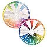
- This package include one Creative Color Mixing Board with one regular Color Wheel (9.25 inch).
- Easy-to-use tool that visually illustrates relationships between colors and demonstrates the results Features a grayscale, tints and tones, definitions of color terms, and illustrations of color.
- Color Wheel helps show which colors are complimentary, and how they go (or don't go) together.
- Some people know instinctively, and others need a visual tool to help them choose.
- Two sided wheel with indicators for complementary, split complementary and triad color schemes, how to tint and shade, primary, secondary and tertiary references, and more.
Why the percentages are visual, not mathematical
You do not need to calculate the exact painted area of every surface. Color has visual weight: a dark, highly saturated sofa can attract more attention than several pale accessories, and a long wall can outweigh a collection of small objects. A single large rug may function as more of the secondary color than six small chairs because it occupies more of the viewer’s field of vision.
Use the percentages as a proportion of what the eye notices first. Fixed or expensive elements should generally receive the largest share because they are difficult to replace. Smaller, movable items can carry the accent because they let you change the room without repainting or replacing furniture.
How to apply the rule step by step
- Inventory the room’s visual anchors. List the walls, ceiling, floor, cabinets, major sofa, bed, or other elements that dominate the view. Include finishes you cannot realistically change. Together, these usually determine the 60% color family.
- Choose the dominant family. Decide whether the base will be warm, cool, muted, or vivid. A pale neutral can be dominant even when the room contains colorful furniture because the walls and other large surfaces occupy most of the visual field.
- Assign a secondary hue. Pick a color that supports or deliberately contrasts with the base. Apply it to medium-scale pieces such as curtains, a rug, lounge chairs, bedding, or built-ins. Repeating the secondary color in two or three locations helps the room feel intentional.
- Select an accent. Reserve the strongest contrast or brightest chroma for details that are easy to move: pillows, throws, art, accessories, or one light fixture. The accent should appear in more than one spot when you want the eye to travel around the room.
- Check the balance from the doorway. Stand at the entrance and identify which color dominates, which supports it, and which catches your eye. If the accent is the first thing you see everywhere, it is probably carrying more than 10% of the visual weight.
- Sample before committing. Put paint chips or large swatches on different walls and observe them in morning, afternoon, evening, and artificial light. Benjamin Moore color expert Anastasia Livcha-Gourley advises using distinct colors that tie in with the main paint color, while also testing each room’s actual lighting.
Where each share can go in a typical room
The rule works best when you assign colors to groups of elements rather than forcing every object into a percentage. The following pattern is a starting map:
- Dominant 60%: wall paint, ceiling, flooring, cabinetry, or the largest upholstered piece. In a living room, this might be warm white walls and a large neutral sofa; in a bedroom, it might be the walls, headboard, and built-in storage.
- Secondary 30%: a substantial rug, curtains, occasional chairs, bedding, a painted built-in, or a group of medium-sized furnishings. This layer can be darker, lighter, warmer, or cooler than the dominant color.
- Accent 10%: cushions, a throw, framed art, ceramics, books, a lamp shade, or a small painted detail. Because these pieces are reversible, they are the safest place to experiment with a strong hue.
Wood, stone, metal, glass, and patterned fabrics complicate the count. Treat a multicolored pattern according to the color that reads most strongly at room scale, then use the other colors as minor accents rather than assigning every stripe a separate percentage.
Rank #2

- “The way it blocks out non-relevant colors so you can actually see the combination is genius.” Artists who paint, quilt, do interior decorating, or other crafts will consider this an especially useful tool.
- Painters, you will notice the colors typed around the rim of the wheel. Specific names are good to know for reference.
- Interior Designers, you will want to take this guide with you when choosing wall color, fabrics, and flooring. See the browns and grays? Even these are specified for your ease of selection.
- Quilters, as you hunt through your stash of fabrics, hold the color wheel up to them to get the right hues and neutrals for a lovely sewing project. Any fabric color which is not featured in the openings gets tossed aside! No arguments ;D
- Feedback: "I especially like having the reminder of where the different paint colors - Prussian Blue, Cobalt Blue, etc - fall in relation to one another on the wheel. I cannot recommend this product enough. " "The wheel is the only one of its kind I could find, excellent product and delivered promptly." "Finally, I'd been looking all over for a Munsell-type color wheel. This is it, very well executed. A huge help to my newest learning endeavor - painting. I would consider this a must have..."
Using 60-30-10 in a living room
Start with the fixed elements and the sofa because they are expensive to change. Suppose the walls and large sofa are soft gray-beige; together with the floor and cabinetry, they establish the dominant neutral. A deep blue rug and two lounge chairs can form the secondary share. Rust-colored pillows, a throw, and a small piece of art can provide the accent.
This example is not a prescription for those colors. The important decisions are the scale and placement: the neutral remains visually broad, the blue appears on medium surfaces, and rust is concentrated in small details. If the rug becomes very large or intensely patterned, it may visually exceed the secondary role; reduce the number or intensity of other blue elements rather than adding more accent color.
Choosing colors for the three roles
Build the dominant color around the room’s constraints
Consider the flooring, permanent cabinetry, stone, and adjoining rooms before selecting wall paint. A dominant color should coexist with those finishes at all times of day. If the room receives little daylight, a very cool gray may read blue or dull; a warm neutral may feel more balanced. In a bright south-facing room, a warm color can become more intense than it appeared on a small card.
What’s actually slowing this PC down?
Pick the symptom - the matching free tool is one click away.
Make the secondary color clearly related or intentionally contrasting
A related secondary hue creates a calm, layered scheme: variations of one color family can supply the 60% and 30% roles. A contrasting secondary hue gives the room more definition. Either approach works if the value and saturation are controlled; two equally strong colors spread across large surfaces can compete rather than support each other.
Rank #3

- Package include: 2 creative color wheel, 5.5 inch in diameter, the artist wheel helps show which colors are complimentary, and how they go (or don't go) together, suitable for learning how to color; Two identical color wheels, with different designs on the front and back
- Color mixing guide: the color wheel shows color, from basic principles and color mixing results on the front side; Spin around the paint wheel, then you will find the color mixture results in the windows, to learn the color theory in a fun way
- Color leaning tool: the backside of the color artist wheel that visually illustrates relationships between colors and demonstrates the results features a grayscale, and triad colors tints and tones, definitions of color terms, and illustrations of color, such as complementary colors, and triad colors
- Easy to use: this color mix guide consists of 3 layers, made of reliable cardboard with smooth surface and smooth rotation; And the size is moderate, easy to operate and carry
- Wide application: the relationship wheel is suitable to use when painting, quilting, interior design, having creative craft projects, and home decorating; Suitable for artists, teachers, kids, painters, designers, and tattoo learners
Use the accent to control energy
Accent color is not required to be the brightest color available. A black accent in a pale room, a saturated green in a blue room, or a metallic finish against matte paint can provide contrast without adding another intense hue. Choose an accent you can remove or replace when your taste changes.
Lighting changes the way the rule looks
Color is perceived through the room’s light, not in isolation. Daylight direction, bulb temperature, dimmers, surrounding foliage, and adjacent wall colors can all shift a sample. Place swatches on more than one wall, especially where direct sun and shadow fall at different times. Leave them in place long enough to see the colors in daylight and under the fixtures you use at night.
Evaluate the three colors together. A secondary fabric that looks balanced beside a paint chip may appear much darker next to a large painted wall. Likewise, a small accent can seem restrained in a showroom but become dominant against a quiet, pale background.
Do these 3 things before closing this tab:
1Clear out junk files and repair common Windows errors2Fix the driver behind crashes, sound loss and screen glitches3Repair Windows errors before they cause bigger problemsAdapting the rule to different rooms and styles
Small rooms
A small space does not require three dark colors. Keep the dominant share light or mid-value if you want the room to feel open, then use texture and a concentrated accent for definition. A dark accent wall may be visually larger than its physical area, so treat it as part of the dominant or secondary share depending on how strongly it reads.
Rank #4

- Helps organise colours to make choices and combinations easier;Defines common terms and helps the artist to understand colour uses and interactions.
- Designed for all artists, including: Painters, crafters, interior, graphic, garden, and landscape designers;Perfect gift for creative people!
- Two-sided rotating wheel shows colour relationships;230mm diameter,2 packs Convenient and portable.
- UV coated to minimise fading and protect from moisture.Paper cover makes it;Paper evelope cover makes it difficult to break during transportation.
- Good for beginners to identify any of the colors easily and recognize the middle of the color simply.
Open-plan spaces
Use one dominant color family to connect the full sightline, then vary secondary colors by zone if the areas need distinction. Repeat one accent across the living, dining, and kitchen zones so the changes feel related rather than random.
Bedrooms
Large bedding and curtains can carry much of the secondary share, while artwork, cushions, and a throw handle the accent. Remember that patterned bedding can have enough visual weight to become a secondary anchor even when it is physically smaller than the walls.
Maximalist or eclectic rooms
The rule can still help organize a busy scheme. Let one background color occupy most large surfaces, group several related secondary colors across furniture and textiles, and repeat a limited accent in small objects. The formula provides hierarchy without requiring a minimalist room.
Recommended Free Tools
Common mistakes and how to correct them
- Counting objects instead of visual area: Ten small cushions do not automatically equal 10%. Judge the combined visual impact from normal viewing distance.
- Putting the strongest color on too many large surfaces: If the accent appears on a wall, sofa, rug, and curtains, it may become the dominant color. Move some of it to smaller items or mute its saturation.
- Ignoring permanent finishes: Flooring, counters, and cabinetry are already part of the palette. Select paint and textiles in relation to them, not from a blank-room assumption.
- Choosing colors under one light source: A sample that works at noon can look different at night. Test in the actual room and at different times.
- Using three unrelated colors with no repetition: Repeat the secondary and accent hues so the eye recognizes a deliberate scheme.
- Treating the guideline as a compliance test: A room can be successful at 55-35-10, 65-25-10, or another balance when the visual hierarchy is clear.
Does the 60-30-10 rule have to be exact?
No. Glidden describes decorating rules as useful knowledge that decorators are free to break. The percentages are a starting framework for deciding where color belongs, not a requirement to measure every surface. Adjust the balance when the room’s architecture, lighting, furniture, or style calls for it.
Best Value

- Creative color wheel-9.25"
- This item Belongs to craft supplies, arts-and-crafts-supplies
- This item is manufactured in United States
- No batteries required
Keep the hierarchy in mind when you depart from the numbers. If you want a quiet room, reduce contrast and let the dominant color occupy more of the view. If you want a dramatic room, increase the secondary contrast or use a stronger accent, but reduce competing colors so the eye still knows what is primary.
How many colors should a room have?
The rule describes three color roles, not necessarily only three physical colors. A dominant neutral may include several close shades on walls, trim, and upholstery. A patterned rug can contain additional colors that read as minor notes. What matters is that one family clearly dominates, one supports it, and the remaining colors are controlled so they do not all demand equal attention.
A practical selection checklist
- Identify the largest fixed and expensive elements before buying paint or textiles.
- Choose the dominant color family around those existing finishes.
- Assign the secondary color to medium-scale furnishings and repeat it enough to connect the room.
- Reserve the accent for small, movable pieces unless you intentionally want a high-impact feature wall.
- Judge visual weight from the doorway and from the main seating position.
- Sample colors on multiple walls and observe them in daylight and artificial light.
- Adjust the proportions when the room’s architecture or style demands it; the guideline is flexible.
What the rule can and cannot tell you
The 60-30-10 framework helps answer “where should each color go?” It does not choose a universally correct hue, account for personal taste, or guarantee that a room will feel spacious, warm, or restful. Those outcomes depend on value, saturation, texture, lighting, and the materials already present. Use the rule to create a clear hierarchy, then make final decisions from real samples in the finished room.
Quick Recap

Product prices and availability are accurate as of the date/time indicated and are subject to change. Any price and availability information displayed on Amazon at the time of purchase will apply.

