Windows Errors? Fix Them Before They Spread
Recommended Free Tools
Outbyte PC Repair · freeRepair common Windows errors and clear accumulated junk for a smoother, more stable PC - no reinstall needed.
Fix My PC Now →ThatPainter is reader-supported. When you buy through links on our site, we may earn an affiliate commission. Learn More
There is no single best neutral for every kitchen. The reliable choice is the shade whose undertone agrees with your fixed finishes—countertop, backsplash, floor, appliances and trim—after you test it on the cabinets in both daylight and artificial light. Warm white and soft off-white are flexible starting points; greige, beige and light gray add more depth; muted sage and blue-green provide color while remaining restrained.
Start with the room, not a popular paint chip
Cabinets occupy a large visual area, but they are only one part of the kitchen’s color system. Countertops, backsplash tile, flooring, appliances, hardware and adjacent walls are expensive or disruptive to replace, so they should establish the boundaries for your paint choice. A neutral that looks balanced in a showroom can turn yellow beside creamy stone, pink beside some beige tile, or blue beside cool gray surfaces.
As an Amazon Associate I earn from qualifying purchases.
Free tools Windows power users keep installed
One-click scans. No signup required.
Before collecting samples, photograph the kitchen in the morning, midday and evening. Note which surfaces are warm (cream, tan, brown or yellow-leaning), cool (blue, blue-gray or crisp white), or mixed. Include the color of the wood in nearby rooms and the trim around doors and windows. The most successful cabinet color usually repeats or gently bridges an undertone already present rather than introducing a fourth competing temperature.
What “neutral” means for cabinets
A strict neutral has little obvious color, while a colored neutral carries a subdued hue. Warm whites, off-whites, greiges, beiges and light grays are conventional neutral families. Sage and blue-green are less strictly neutral, but their low saturation lets them function as quiet cabinet colors when you want more character than white or gray. Treat them as colored neutrals and test them against wood and stone with extra care.
#1 Best Overall
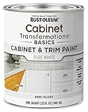
- CABINET TRANSFORMATION: Refresh outdated cabinets, vanities, furniture and trim with rich Pure White color and a smooth semi-gloss finish
- DURABLE PERFORMANCE: Easy-to-clean finish resists dirt and grime while standing up to household chemicals
- SMOOTH APPLICATION: Outstanding flow and leveling help create a beautiful finish with brush, roller, pad applicator or airless sprayer
- FAST PROJECT COMPLETION: Dries to touch in 30 minutes, recoats in 2 hours and is ready for normal use after 24 hours
- INTERIOR CABINET COATING: Ideal for kitchens, bathrooms, laundry rooms and other interior cabinet and trim applications
Best neutral cabinet color families
| Family | Visual character | Works especially well when | Manufacturer examples |
|---|---|---|---|
| Warm or soft white | Bright, adaptable and gently softened rather than stark | You want an open, light kitchen and your permanent finishes are warm or mixed | White Dove OC-17; Chantilly Lace OC-65; Alabaster SW 7008; Swiss Coffee 12; Blank Canvas DC-003 |
| Off-white | Classic white with enough warmth to avoid a sharp, clinical effect | Trim, counters or backsplash contain cream, ivory or warm stone | White Dove OC-17 |
| Greige or beige | More depth and warmth than white, without becoming a strong color | You need a bridge between warm wood, stone and painted surfaces | Revere Pewter HC-172; Whisper SW 9591; Limewash SW 9589 |
| Light gray | Restrained and cooler, with a clean relationship to gray materials | Countertops, tile, stainless steel or flooring already read cool | Seapearl OC-19; Stonington Gray HC-170 |
| Muted green or blue-green | Subdued color that still behaves quietly in the room | You want a departure from white or gray and have compatible wood and counters | Gloucester Sage HC-100; Aegean Teal 2136-40; Evergreen Fog SW 9130 |
These names are examples from different manufacturers, not interchangeable matches. A color number, sheen and formula belong to a specific brand; do not assume that two names such as “Swiss Coffee” and “White Dove” will look alike.
Warm white and soft white: the safest first shortlist
Warm or soft white is the most adaptable starting direction for a kitchen that needs brightness. Benjamin Moore lists White Dove OC-17 and Chantilly Lace OC-65 among kitchen and cabinet choices. Sherwin-Williams suggests creamy Alabaster SW 7008 for a small kitchen. Behr offers Swiss Coffee 12 and Blank Canvas DC-003 as warm or soft white examples.
What’s actually slowing this PC down?
Pick the symptom - the matching free tool is one click away.
Use these as separate candidates, not as a single universal “white.” Their undertones and light-reflectance behavior differ. Place each sample beside the countertop and backsplash. A white that appears neutral on a chip may reveal a yellow, pink, gray or green cast once it is surrounded by the room’s existing colors.
When warm white is a good fit
- The kitchen has cream, ivory, beige, warm marble, natural oak or other yellow-leaning elements.
- You want upper cabinets to recede and allow tile, lighting or architectural details to lead.
- The room receives limited daylight and a slightly softened white feels less harsh than a crisp, cool white.
When to be cautious
- Very cool gray counters or blue-gray tile can make a warm white look noticeably creamy.
- Bright white trim may emphasize the contrast and make the cabinet color appear darker or more yellow.
- On-screen and printed representations can differ from applied paint, so a digital preview cannot be the final decision.
Off-white: timeless without the sharp edge
Off-white occupies the space between a bright white and a pale beige. Benjamin Moore describes classic off-whites as a timeless direction and features White Dove OC-17. This family is useful when a stark white feels too severe but a beige cabinet would add more warmth than you want.
Compare the off-white with the exact trim, ceiling and backsplash rather than judging it alone. If the trim is a noticeably cooler white, an off-white cabinet can look intentionally layered or accidentally dingy depending on the contrast. If the room already contains several creamy surfaces, choose the sample that connects them without making the kitchen look uniformly yellow.
Rank #2

- Includes 30 featured and newest released color card. Sprayed on color to see our colors in your homes lighting for more accurate color choices.
- ALL-IN-ONE Paint - NO Sanding, NO Priming, NO Top Coat Required, Low Luster, Velvet Sheen Finish
- Interior/Exterior - Paint your whole house - Ideal for hard surfaces including walls, doors, cabinets, counters, furniture, metal, glass, ceramics and floor and wall tile
- Durable yet stretches to paint smooth fabrics, vinyl and leather
- Results cannot be guaranteed. Digital screens may not show color accurately. Product search "ALL-IN-ONE PAINT by Heirloom Traditions, Color Confidence Card", for an accurate color choice.
Greige and beige: depth without a strong color
Greige and beige provide more visual weight than white while remaining easy to coordinate. Benjamin Moore features Revere Pewter HC-172; Sherwin-Williams suggests beige Whisper SW 9591 and Limewash SW 9589. These shades can bridge painted cabinetry with warm wood, stone and woven textures, but they are not automatically compatible with every “neutral” room.
The Tool Desk
Outbyte Driver Updater FREEFix the driver behind crashes, sound loss and screen glitchesFind Drivers →Outbyte PC Repair FREERepair Windows errors before they cause bigger problemsFix Now →Choose greige or beige when
- White cabinets would make the room feel washed out against a busy countertop or pale floor.
- You want the island or lower cabinets to feel grounded while keeping the overall palette calm.
- Warm wood is prominent and you need a painted color that does not fight its orange, tan or honey notes.
Check for hidden undertones
Read the sample beside both the counter and the wall. Some greiges lean violet or pink; others lean green or yellow. A beige that coordinates with warm limestone may clash with a pink-beige backsplash. Look at the sample in the corners of the room and near the appliances, where reflected light can change the apparent hue.
Light gray: a cool, controlled neutral
Light gray is most coherent when the kitchen already has a cool framework. Benjamin Moore lists Seapearl OC-19 and Stonington Gray HC-170 among kitchen and cabinet choices and describes Seapearl as cool gray. Pair this family with gray tile, cooler stone, stainless steel and blue-leaning whites.
Gray cabinets can appear blue in north-facing or low-daylight rooms and warmer in strong afternoon sun. If your floor or counter is cream, a cool gray may make those surfaces look more yellow by comparison. Test the gray beside the largest fixed surface, not just a small hardware sample.
Muted green and blue-green: colored neutrals with restraint
Muted greens and blue-greens offer personality without the intensity of a saturated accent color. Benjamin Moore shows Gloucester Sage HC-100 and Aegean Teal 2136-40; Sherwin-Williams features Evergreen Fog SW 9130. These are less strictly neutral than white, beige or gray, so they should be evaluated as a deliberate color choice.
Recommended Free Tools
Rank #3

- Ultra-White Brilliance: Experience the transformative power of Titanium Infusion, an ultra-white hue inspired by the artist’s palette – perfect for a modern, timeless look.
- One-Day Transformation: Redefine your kitchen cabinets in a single day with our brush-and-roll application - no professional help needed.
- All-Inclusive Kit: Each package covers 100 square feet, ideal for the typical kitchen, and includes all the necessary tools for a flawless finish.
- Eco-Friendly & Safe: Enjoy the peace of mind with our low-VOC, water-based formula, ensuring a safer painting experience.
- Effortless Transformation: No stripping or priming required; our paint adheres beautifully to wood, laminate, and metal cabinets with minimal preparation.
Where they work
- Natural wood, aged brass, warm stone and simple white counters can support a subdued sage.
- Blue-green can connect to blue-gray tile or veined stone while keeping the cabinetry quiet.
- Using the color on an island or lower cabinets creates contrast without committing every cabinet to a deep shade.
What can go wrong
Green can become muddy beside yellow wood or green-veined stone, while blue-green can look much brighter in direct daylight than on a small chip. Check the color at the same distance and angle from which you normally see the cabinets. If it feels obviously colorful in every lighting condition, it is not functioning as a neutral in your room—and that may be either the desired result or a warning.
A step-by-step method for choosing the right neutral
- Inventory the permanent finishes. Record the dominant undertone of the countertop, backsplash, floor, appliances, trim and nearby wood. Include hardware and adjacent rooms because open-plan sightlines make abrupt temperature changes more noticeable.
- Define the visual goal. Decide whether you want the cabinets to blend into the architecture, brighten a small room, or create contrast on an island or on lower units. Lighter cabinets can make a small kitchen feel more open and spacious as a perceived design effect; they do not change the room’s actual dimensions.
- Choose two or three families. For warm finishes, start with warm white, off-white and greige. For cool finishes, start with light gray and a cooler off-white. Add a muted sage or blue-green only if you want a colored neutral.
- Compare undertones side by side. Place large samples together so you can see whether each reads yellow, pink, green, blue or gray. A single chip hides these shifts; side-by-side samples reveal them.
- Test the contrast level. Hold samples against the countertop, backsplash and wall. Decide whether the cabinet should disappear into the background or stand apart. Benjamin Moore describes both approaches: extending a wall or trim color onto cabinets for continuity, or using contrast to define the cabinetry.
- Move samples around the kitchen. Test near a window, under the range hood, beside the refrigerator and in a shadowed corner. Reflected colors from floors and walls can change the appearance.
- Review morning, afternoon and evening. Behr advises testing wall and cabinet colors together in the actual room because changing light can shift undertones. Leave samples in place for at least a full day of normal use, including the lighting you use after sunset.
- Confirm the applied color. Benjamin Moore cautions that on-screen and printer color representations may vary from actual paint. Use a physical color chip, sample board or peel-and-stick sample to narrow the choice, then approve the color on a properly prepared cabinet sample before buying enough paint.
- Record the final formula. Keep the manufacturer, color name, number and sheen with your project notes. This prevents a future touch-up from substituting a similar-sounding color from another brand.
How light changes a neutral cabinet color
Natural daylight
North-facing light commonly emphasizes cool blue or gray qualities, while warm afternoon sun can pull a neutral toward cream or beige. Direct sun can also make a muted green or blue-green appear more saturated. Observe the cabinet sample in both direct and indirect light rather than relying on a single photograph.
Artificial light
Warm bulbs can exaggerate yellow and beige undertones; cooler LEDs can make the same paint look grayer or bluer. Turn on the fixtures you actually use after dark and compare the sample beside the backsplash and counter under that light. If the color only works in daylight, it is not a dependable choice for the whole day.
Surrounding reflections
Wood floors, green landscaping, colorful rugs and painted walls reflect onto cabinet faces. Glossy counters and appliances can bounce additional color into the lower cabinets. A large sample positioned on the cabinet door gives a more realistic reading than a chip held in the center of the room.
What’s actually slowing this PC down?
Pick the symptom - the matching free tool is one click away.
Cabinet color and coating are separate decisions
Choosing a color does not establish whether a coating is suitable for your cabinet material or usage. Benjamin Moore describes Advance Interior as a durable, furniture-like cabinet finish and lists satin, semi-gloss and high-gloss options. Behr identifies Cabinet, Door & Trim Enamel for cabinet use and says satin or semi-gloss are commonly preferred for high-touch cabinet surfaces.
Rank #4
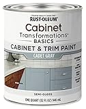
- CABINET TRANSFORMATION: Refresh outdated cabinets, vanities, furniture and trim with rich Cadet Gray color and a smooth semi-gloss finish
- DURABLE PERFORMANCE: Easy-to-clean finish resists dirt and grime while standing up to household chemicals
- SMOOTH APPLICATION: Outstanding flow and leveling help create a beautiful finish with brush, roller, pad applicator or airless sprayer
- FAST PROJECT COMPLETION: Dries to touch in 30 minutes, recoats in 2 hours and is ready for normal use after 24 hours
- INTERIOR CABINET COATING: Ideal for kitchens, bathrooms, laundry rooms and other interior cabinet and trim applications
How to evaluate the coating
- Confirm that the label specifically allows cabinet or millwork use and is compatible with your substrate.
- Follow the product’s preparation directions for cleaning, deglossing, sanding, priming and drying or recoat times.
- Choose sheen separately from color. Satin provides a softer reflection; semi-gloss is brighter and commonly selected for surfaces that need frequent wiping.
- Paint a test door or board before committing. Check leveling, brush or roller marks, adhesion and how the sheen looks beside your countertop.
- Allow the coating to cure according to the label before reinstalling doors or subjecting them to heavy use.
Cabinet painting is a substantial DIY project, and a generic supply list cannot guarantee adhesion or durability. The right preparation depends on whether the doors are wood, previously painted, laminate or another material, as well as their existing condition.
Independent reader supportYour contribution helps us test, update, and keep practical guides available for everyone.Common selection mistakes and their fixes
Choosing from a screen
Symptom: The delivered paint looks noticeably different from the online image. Fix: Treat digital visualizers as narrowing tools only. Compare physical samples in the kitchen and remember that printed and on-screen representations may vary from actual paint.
Ignoring the countertop undertone
Symptom: The cabinets look pink, yellow or green even though the chip looked neutral. Fix: Place the sample directly against the countertop and backsplash, then select the candidate whose undertone supports both rather than matching the wall in isolation.
Do these 3 things before closing this tab:
1Clear out junk files and repair common Windows errors2Fix the driver behind crashes, sound loss and screen glitches3Repair Windows errors before they cause bigger problemsUsing a cool gray with warm finishes
Symptom: Cream stone and wood look unusually yellow next to the cabinets. Fix: Test a warmer off-white or greige, or choose a gray with an undertone that repeats a cool element already present.
Assuming every white is interchangeable
Symptom: Trim, ceiling and cabinets look disconnected. Fix: Compare the exact whites together and decide whether you want a layered contrast or a continuous white field. Keep each brand’s color name and number with the order.
Best Value

- Includes 30 featured and newest released color card. Sprayed on color to see our colors in your homes lighting for more accurate color choices.
- ALL-IN-ONE Paint - NO Sanding, NO Priming, NO Top Coat Required, Low Luster, Velvet Sheen Finish
- Interior/Exterior - Paint your whole house - Ideal for hard surfaces including walls, doors, cabinets, counters, furniture, metal, glass, ceramics and floor and wall tile
- Durable yet stretches to paint smooth fabrics, vinyl and leather
- Results cannot be guaranteed. Digital screens may not show color accurately. Product search "ALL-IN-ONE PAINT by Heirloom Traditions, Color Confidence Card", for an accurate color choice.
Skipping the evening check
Symptom: The color looks right at noon but muddy or too bright at night. Fix: Evaluate samples under the kitchen’s actual artificial lighting before final selection.
Picking a sheen by habit
Symptom: Reflections highlight uneven doors or the finish is difficult to clean. Fix: Test satin and semi-gloss on a sample door, then follow the cabinet-coating label for the recommended use and preparation.
A practical decision framework
| If your kitchen has… | Start by testing… | Watch for… |
|---|---|---|
| Warm wood, cream stone or beige tile | Warm white, off-white and greige | A gray that makes the fixed finishes look yellow |
| Cool gray stone, stainless steel and gray tile | Light gray and a balanced or cool off-white | A warm white that turns visibly creamy |
| A small or low-light layout | Soft white or light off-white | Using brightness as a promise of actual added space; it is a perceived effect |
| A busy countertop or patterned backsplash | A quiet off-white, greige or light gray | Too much contrast competing with the pattern |
| A simple room where you want more character | Muted sage or blue-green on all or part of the cabinetry | Color becoming saturated or clashing with wood and counters |
| An island intended as a focal point | A deeper greige, beige or muted colored neutral on the island, with lighter perimeter cabinets | Undertones that disagree between island and surrounding cabinets |
How to buy and use samples efficiently
Limit the first round to three or four contenders from different families. Buy or make large samples rather than covering the entire kitchen with tiny chips. Label each sample with the brand, color name, number and date. Place them vertically on or beside the cabinet doors, because horizontal samples receive light differently.
Do not judge a sample while another strongly colored object is reflected in it. Temporarily move a bright towel, appliance or decorative item if necessary. Look at the samples from the room’s entrances and from the seating area, not only from a few inches away. Once one candidate wins in every lighting condition, paint a small section or spare door with the intended cabinet coating and sheen. The applied test confirms that the color, substrate and finish work together.
Putting the shortlist into a final choice
If you need the broadest adaptability, begin with a warm or soft white and compare it with an off-white. If the room needs more depth or contains substantial wood and stone, add a greige or beige. If the fixed finishes are distinctly cool, test light gray instead of forcing a warm neutral. Choose muted green or blue-green when you intentionally want a restrained color, not because it is a safe substitute for gray.
The winning sample is the one that remains coherent beside the countertop, backsplash, floor, appliances and trim throughout the day. Popularity cannot override an undertone conflict. Once the color is selected, make the separate coating decision using the cabinet material, preparation requirements and practical sheen you can maintain.
Quick Recap

Product prices and availability are accurate as of the date/time indicated and are subject to change. Any price and availability information displayed on Amazon at the time of purchase will apply.

