Recommended Free Tools
PC Slower Than It Used to Be?
Free scan · Windows 10 & 11
Crashes, No Sound, or Screen Glitches?
Free scan · under a minute
Windows Errors? Fix Them Before They Spread
Free scan · no reinstall
ThatPainter is reader-supported. When you buy through links on our site, we may earn an affiliate commission. Learn More
The right way to work with shapes on the web depends on what you are changing. Use border-radius when you are rounding a box, clip-path when you are cutting the visible result into a silhouette, shape-outside when text must flow around a shape, and SVG when the shape is an actual graphic such as a logo, icon, illustration, chart, or diagram.

As an Amazon Associate I earn from qualifying purchases.
These techniques can look similar on screen, but they affect different parts of the page. Choosing the wrong one is why text fails to wrap around a clipped image, focus outlines disappear, and fixed polygon designs break on smaller screens.
Shapes on the web are four different problems
In visual design, a shape may be a rounded panel, a decorative cutout, a text-wrapping boundary, or an independent illustration. CSS and SVG provide separate tools for each job:
#1 Best Overall
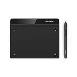
- Battery-Free Pen: StarG640 drawing tablet is the perfect replacement for a traditional mouse! The XPPen advanced Battery-free PN01 stylus does not require charging, allowing for constant uninterrupted Draw and Play, making lines flow quicker and smoother, enhancing overall performance
- Ideal for Online Education: XPPen G640 graphics tablet is designed for digital drawing, painting, sketching, E-signatures, online teaching, remote work, photo editing, it's compatible with Microsoft Office apps like Word, PowerPoint, OneNote, Zoom, Xsplit etc. Works perfect than a mouse, visually present your handwritten notes, signatures precisely
- Compact and Portable: The G640 art tablet is only 2 mm thick, it's as slim as all primary level graphic tablets, allowing you to carry it with you on the go
- Chromebook Supported: XPPen G640 digital drawing tablet is ready to work seamlessly with Chromebook devices now, so you can create information-rich content and collaborate with teachers and classmates on Google Jamboard’s whiteboard; Take notes quickly and conveniently with Google Keep, and effortlessly sketch diagrams with the Google Canvas
- Multipurpose Use: Designed for playing OSU! Game, digital drawing, painting, sketch, sign documents digitally, this writing tablet also compatible with Microsoft Office programs like Word, PowerPoint, OneNote and more. Create mind-maps, draw diagrams or take notes as replacement for mouse
| What you want to do | Best starting point | What it changes |
|---|---|---|
| Round corners, create pills, circles, or rounded panels | border-radius |
The painted border, background, and related box areas |
| Hide part of an element and create a triangle, polygon, or angled section | clip-path |
The visible painted region |
| Make paragraphs flow around a circular or irregular object | shape-outside |
The float area used by inline text |
| Create a logo, icon, illustration, chart, or reusable vector asset | SVG | An independent vector graphic and its geometry |
| Reveal, fade, feather, or texture a silhouette | CSS masking or an SVG mask | Visibility according to alpha or mask values |
Start with the simplest technique that matches the design. A rounded card is still a card; it does not need to become an SVG illustration just because its corners are soft.
Use border-radius for rounded interface elements
border-radius is the default choice for cards, buttons, tags, avatars, circular images, input fields, and panels. It changes the corner geometry while allowing the element to retain ordinary layout behavior.
Do these 3 things before closing this tab:
1Clear out junk files and repair common Windows errors2Fix the driver behind crashes, sound loss and screen glitches3Repair Windows errors before they cause bigger problems.card {
border-radius: 1rem;
background: white;
padding: 1.5rem;
}
.button {
border-radius: 999px;
padding: 0.75rem 1.25rem;
}
.avatar {
aspect-ratio: 1;
border-radius: 50%;
object-fit: cover;
}A percentage is resolved against the corresponding border-box dimension. That means border-radius: 50% produces a circle only when the element is square. If the element is wider than it is tall, the result is an ellipse. Set aspect-ratio: 1, or otherwise make the width and height equal, when a true circle is required.
Elliptical and asymmetric corners
Each corner can have a different radius. The shorthand accepts one to four values, and a slash separates horizontal radii from vertical radii. This lets you create deliberately stretched or irregular corners:
.soft-panel {
  border-radius: 2rem 0.5rem 2rem 0.5rem
                 / 1rem 0.5rem 1rem 0.5rem;
}
Use this approach when the element remains conceptually rectangular but its corners have an authored rhythm. If an entire edge must become diagonal or a section must be cut away, move to clip-path.
Use clip-path for visual silhouettes
clip-path defines a region that remains visible. Content painted outside that region is hidden. The element still has its layout box, but the visible result can be a circle, triangle, diamond, angled panel, or custom polygon.
Quick wins for a faster PC:
Clear out junk files and repair common Windows errorsFree Scan →Fix the driver behind crashes, sound loss and screen glitchesFind Drivers →Repair Windows errors before they cause bigger problemsFix Now →.hero {
clip-path: polygon(
0 0,
100% 0,
92% 100%,
0 88%
);
}
.profile-photo {
clip-path: circle(45% at 50% 50%);
}
.badge {
clip-path: inset(0 round 999px);
}CSS basic shapes include circle(), ellipse(), inset(), and polygon(). A polygon contains three or more coordinate pairs. The points are joined in the order written, so changing their order changes the outline and can create self-intersecting or unexpected results.
Responsive polygons
Use percentages for polygon coordinates when the silhouette should adapt to the element’s dimensions:
Rank #2

- Word-first 16K Pressure Levels: The upgraded stylus features 16,384 levels of pressure sensitivity and supports up to 60 degrees of tilt, delivering smoother lines and shading for a natural drawing experience. With no battery or charging needed, it operates like a real pen, making it easy for beginners to create effortlessly. This functionality helps novice artists develop their skills and explore their creativity without the intimidation of complex tools
- Designed for Beginners: This drawing pad desinged with 8 customizable shortcuts for both right and left-hand users, express keys create a highly ergonomic and convenient work platform
- Perfectly Adapted for Android: The XPPen Deco 01 V3 art tablet supports connections with Android devices running version 10.0 and above. It is recommended to download the XPPen Tools Android application, which adapts to your smartphone's screen aspect ratio, ensuring accurate mapping. It also supports mapping on Android screens with different aspect ratios in portrait mode
- Large Drawing Space, Bigger Bold Inspiration: This expansive drawing pad has10 x 6.25-inch helps you break through the limit between shortcut keys and drawing area
- Easy Connectivity for Beginners: The Deco 01 V3 offers USB-C to USB-C connectivity, plus adapters for USB C. This ensures easy connection to various devices, allowing beginner artists to set up quickly and focus on their creativity without compatibility concerns. Whether using a laptop, tablet, or desktop, the Deco 01 V3 provides a seamless experience, making it an ideal choice for those just starting their digital art journey
.diamond-card {
  clip-path: polygon(50% 0, 100% 50%, 50% 100%, 0 50%);
}
Fixed pixel coordinates often look acceptable at one desktop width and become cramped or distorted on a phone. CSS custom properties and clamp() are useful when the cut needs a controlled but flexible amount:
:root {
  --cut: clamp(1rem, 4vw, 5rem);
}

.feature {
  padding: clamp(2rem, 8vw, 7rem) 5vw;
  clip-path: polygon(
    0 var(--cut),
    100% 0,
    100% calc(100% - var(--cut)),
    0 100%
  );
}
Current browsers broadly support established clip-path syntax, but individual functions and newer syntax do not necessarily have identical support. Treat newer features such as shape() and border-shape as separate compatibility decisions. Check the browser matrix for your project before relying on them.
The Tool Desk
Outbyte Driver Updater FREEScan for outdated or missing drivers - takes under a minuteDriver Scan →Outbyte PC Repair FREERepair Windows errors before they cause bigger problemsFix Now →Clipping is not text wrapping
A frequent implementation mistake is applying clip-path to an image and expecting the paragraph beside it to follow the circular or polygonal edge. Clipping controls what is visible; it does not change the area around which inline text flows.
For classic magazine-style wrapping, the element must participate as a float, and shape-outside must define the float shape:
.article-image {
  float: left;
  width: 16rem;
  aspect-ratio: 1;
  margin: 0 1.5rem 1rem 0;
  border-radius: 50%;
  shape-outside: circle(50%);
}
Here, border-radius makes the image appear circular, while shape-outside tells text to wrap around a circle. Both are needed because they solve different problems.
shape-outside can use a shape box, a basic shape, an image, or a gradient. With a transparent PNG, for example, an image-based shape can derive the wrapping boundary from the image’s alpha information. The image must be valid and meet the relevant loading and cross-origin requirements. Gradients can likewise contribute a shape through their rendered alpha.
Shapes alter the float area, not the underlying box model. The element’s margins, borders, padding, and other layout calculations continue to follow normal box-model rules. Give the floated object enough margin so the text does not touch the visible edge.
Use SVG when the shape is a real graphic
CSS is excellent for geometry that belongs to a page layout. SVG is usually the better choice when the shape is an authored asset: a brand mark, icon, illustration, map, diagram, chart, or reusable symbol.
Rank #3
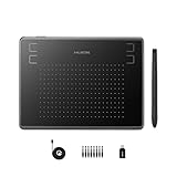
- Huion H430P supports Linux(Ubuntu), MacOS 10.11 and above, Windows 7 and above, and Android 6.0 and above. It can easily connect to your PC, laptop via USB cable for both left and right handed users.
- Digital pen PW201 is battery-free, no need to be charged. 4096 levels of pressure sensitivity with 233pps report rate provides you responsive and natural drawing and handwriting experience with control. 8 replacement nibs are included.
- 135g in weight,6.3mm in thickness,H430P graphics tablet is portable and compact. 4.8x3 inch active area offers perfect creative space for limited desktop areas.4 express keys on the top can be programed to your favourite shortcuts such as Scroll,Undo,Eraser.It will help you work more smoothly and efficiently.
- Compared with computer mouse,it couldn't be easier to draw,edit photos,annotate document,take notes,write formulas and equations with a digital pen. H430P is ideal for collegers and teachers to collaborate, share,interact in online class and video conferencing. No need to install driver for basic writing, annotation and OSU playing.
- H430P pen tablet is compatible with most mainstream drawing softwares like Corel Painter, Adobe Photoshop,Illustrator, SAI and so on. It also work with most softwares for education and business meeting such as Word, PowerPoint, OneNote,Google slides,Zoom,Skype and more.
SVG is vector-based, so it remains sharp as it is resized or zoomed. It can be embedded as an external image, used as a background, or placed inline in the HTML. Inline SVG exposes its markup to the document, which is powerful but creates an accessibility responsibility.
<svg role="img" aria-labelledby="logo-title logo-desc"
     viewBox="0 0 100 100">
  <title id="logo-title">Acme geometric logo</title>
  <desc id="logo-desc">
    Three overlapping blue circles forming a triangular mark.
  </desc>
  <circle cx="35" cy="40" r="25" />
  <circle cx="65" cy="40" r="25" />
  <circle cx="50" cy="65" r="25" />
</svg>
For an informative inline graphic, give the SVG an accessible name. A first-child <title> is commonly used, with <desc> for a longer explanation. If the same SVG is loaded through an <img>, provide the meaning through the image’s alt text instead.
Purely decorative shapes should not add unnecessary output for screen readers. A decorative HTML image generally uses alt=""; a CSS background or a deliberately ignored decorative layer may be more suitable. Do not label an illustration decorative merely because it is visually attractive: if it communicates data, instructions, identity, or meaning, provide an equivalent accessible name or text.
Readers creating logos or illustrations may find an SVG design software or vector graphics editor useful for authoring assets before embedding them in a page. Such software is optional; it is not required for CSS shapes, and the right choice depends on the asset, editing workflow, and export quality.
Use masking for alpha-based effects
Clipping is suited to a defined boundary: inside the path is shown and outside it is hidden. Masking is more appropriate when visibility varies gradually or follows an image’s alpha channel.
Use CSS masking or SVG masks for effects such as:
- feathered or soft edges;
- gradient reveals and transitions;
- textured silhouettes;
- complex alpha-based cutouts; and
- image-driven overlays.
Masking and clipping are related but distinct. A clipping path is generally a closed vector boundary, shape, or polygon. A mask is a layer whose luminance or alpha values can control how much of the underlying content is visible. Because masks can be less obvious to maintain and test, use clip-path when a crisp geometric edge is all the design requires.
Useful shape patterns
Angled section divider
If a diagonal boundary is decorative, put it on a pseudo-element or background layer rather than cutting the semantic content itself:
.section {
  position: relative;
  isolation: isolate;
  overflow: hidden;
}

.section::before {
  content: "";
  position: absolute;
  inset: 0;
  z-index: -1;
  background: #17324d;
  clip-path: polygon(0 0, 100% 0, 100% 82%, 0 100%);
}
This keeps the section’s heading, paragraphs, and controls in ordinary HTML while the pseudo-element supplies the painted shape.
Responsive card with a custom corner
Use border-radius for a rounded card. Use clip-path only when a corner genuinely needs to be removed or dramatically reshaped. Keep padding generous near the cut edge so text and controls do not approach an area that may disappear at a narrow width.
Rank #4
Decorative background blob
A pseudo-element with large radii, gradients, filters, or a mask can create a background blob without changing the document’s content structure. Keep it behind the content, prevent it from intercepting pointer input, and mark it decorative in implementation:
What’s actually slowing this PC down?
Pick the symptom - the matching free tool is one click away.
.blob {
  pointer-events: none;
}
That declaration is appropriate for a purely decorative overlay, not for a shape that is itself a button, link, or other interactive object.
Responsive design rules for shapes
- Prefer relative geometry. Use percentages, viewport or container-relative units,
aspect-ratio, and custom properties instead of a collection of fixed coordinates. - Provide a graceful fallback. Let the rectangular layout work before applying a decorative clip. A shape should enhance the design, not make the page unusable when unsupported.
- Protect content from the edge. Clipping can hide text, controls, and focus indicators. Keep essential content inside the safe visible region.
- Test text enlargement. A polygon that works with a short heading may cut into a longer translated heading or enlarged paragraph.
- Test narrow and wide containers. A responsive component should be tested at its actual container widths, not only at a few device presets.
SVG-style path() coordinates are not inherently responsive to an element’s size. The newer CSS shape() function is conceptually attractive because it can use CSS units, but its support should be checked independently rather than assumed from established clip-path support.
Accessibility and usability checklist
Before shipping a shape-heavy component, ask what role the shape plays:
- Decorative: Make it ignorable, keep it out of the way, and do not place essential meaning only in it.
- Informative: Supply equivalent text or an accessible name. A chart, instructional illustration, or meaningful logo may need a text alternative.
- Functional: Give the control a meaningful accessible name and ensure it remains keyboard and assistive-technology discoverable.
Also verify the following:
- Meaning is not conveyed by shape or color alone; add labels, text, patterns, or another redundant cue.
- Text and controls have sufficient contrast against the visible background.
- Keyboard focus indicators are fully visible. A clipped ancestor can cut off an outline even when the control remains technically focusable.
- Touch targets do not become too small because a corner or edge is clipped.
- Important content survives zoom, enlarged text, narrow widths, forced-colors modes, and high-contrast settings.
- Animations involving masks or clipping respect reduced-motion preferences.
- Semantic HTML still carries the structure: headings, landmarks, lists, links, and buttons should not be replaced by visual geometry.
How to choose quickly
Is it a normal box with softer corners? Use border-radius.
PC Slower Than It Used to Be?
A free scan shows the junk files, broken settings and background clutter dragging Windows down - then fixes them in one click.Free scan · Windows 10 & 11Crashes, No Sound, or Screen Glitches?
Random freezes, missing sound and display glitches usually trace back to one bad driver. Find and replace yours safely.Free scan · under a minuteShould part of the painted element disappear? Use clip-path.
Should surrounding text flow around a shape? Use a float with shape-outside; add visual clipping or rounding separately if needed.
Is it a reusable logo, icon, illustration, chart, or diagram? Use SVG.
Best Value

- Stable Bluetooth 5.0 Connection: you can easily connect the KD200 digital drawing tablet to your Mac, PC, or Android devices wirelessly with the built-in Bluetooth 5.0 technology, offering a strong connection up to 33ft and clutter-free workspace. The high-efficiency battery enables you to enjoy continuous creation for 18 hours minimum with only 1.2 hours of charging time
- Productive Keyboard Design: Huion Inspiroy Keydial KD200 is an innovative graphics tablet and keypad combos. The keyboard is designed with 23 standard keys you use the most on Windows and Mac to give you instant access to your favorite shortcuts. Also, the ergonomic wrist rest can reduce the fatigue of high-intensity creative work
- Dial and 5 Customized press keys: The KD200 drawing tablet is also equipped with a dial for zooming in/out, adjusting brush size, and 5 user-defined press keys to streamline work and boost work efficiency.
- Huion PenTech 3.0: The battery-free pen PW517 is ultra-responsive to every pen movement with amazing accuracy and control. Along with 60° Tilt function and 8192 levels of pressure sensitivity, you’ll feel like using a real pen
- Comfortable and portable: 8.9x5.6inch working area and paper-like matte surface bring you the most natural and comfortable drawing experience. The 8.5mm thickness design makes the KD200 pen tablet easy to carry so you can use it at home, on the go, or at your favorite cafe
Should the edge fade, reveal, or follow alpha values? Use a mask.
Free tools Windows power users keep installed
One-click scans. No signup required.
Common mistakes and fixes
- “I used
clip-path, but the text still wraps around a rectangle.” - Clipping changes visibility, not text flow. Use a floated element and
shape-outside. - “My circle becomes an oval.”
- The element is not square. Add
aspect-ratio: 1or equal dimensions. - “My polygon works on desktop but breaks on mobile.”
- Replace fixed pixel points with percentages or responsive custom properties, then test the smallest container.
- “The button is visible, but its focus ring is cut off.”
- Move the clip to a decorative pseudo-element, add space around the control, or redesign the boundary so focus remains visible.
- “The inline SVG has no accessible name.”
- Add an appropriate accessible name with
<title>and ARIA labeling, or make it decorative and provide the meaning elsewhere. - “I used a shape instead of semantic HTML.”
- Restore the correct heading, link, button, list, or landmark. CSS and SVG should express appearance, not replace document meaning.
- “I used a new shape function without checking support.”
- Verify the target browser matrix for features such as
shape()andborder-shape. Keep an ordinary fallback for nonessential decoration.
Learning and production workflow
If you are new to the subject, learn the box model, floats, responsive units, accessibility, and SVG basics alongside the shape properties. An HTML and CSS web design book or responsive web design reference can be useful as a structured companion, but no single resource replaces testing the component in the browsers and assistive technologies your audience uses.
For production SVG, inspect the exported markup, remove unnecessary metadata where appropriate, preserve the viewBox, provide an accessible name when the graphic is meaningful, and verify that the asset remains legible at its smallest intended size. Teams shipping many assets may later evaluate an SVG optimization tool, but that is a workflow decision rather than a prerequisite for creating shapes.
Frequently Asked Questions
Can I make text wrap around a clipped image with clip-path?
Not by using clip-path alone. clip-path controls which part of the element is visible. For text to flow around a shape, use a floated element with shape-outside, then use border-radius or clip-path separately for the image’s appearance.
What is the difference between border-radius and clip-path?
border-radius rounds the corners of an element’s painted box. clip-path hides everything outside a chosen region, allowing circles, polygons, angled edges, and other silhouettes while the underlying layout box remains.
What’s actually slowing this PC down?
Pick the symptom - the matching free tool is one click away.
When should I use SVG instead of CSS shapes?
Use SVG for an authored graphic such as a logo, icon, illustration, chart, map, or diagram. Use CSS for layout decoration and ordinary UI geometry that should remain part of the responsive page structure.
Is clip-path safe to use in responsive designs?
Established clip-path syntax is broadly supported in current browsers, but individual and newer functions can differ in support. Use relative coordinates, provide a rectangular fallback for nonessential decoration, and test focus, zoom, text enlargement, and narrow widths.
The Bottom Line
Think of web shapes by their job: border-radius rounds the box, clip-path cuts the visible paint, shape-outside controls text flow, SVG draws an independent vector graphic, and masking handles alpha-based effects. Keeping those responsibilities separate produces layouts that are easier to resize, debug, and make accessible.
Quick Recap

Product prices and availability are accurate as of the date/time indicated and are subject to change. Any price and availability information displayed on Amazon at the time of purchase will apply.