Recommended Free Tools
Windows Errors? Fix Them Before They Spread
Free scan · no reinstall
Outdated Drivers Are Slowing You Down
Free tools Windows power users keep installed
One-click scans. No signup required.
Free scan · exact hardware match
PC Slower Than It Used to Be?
Free scan · Windows 10 & 11
ThatPainter is reader-supported. When you buy through links on our site, we may earn an affiliate commission. Learn More
These are the 12 paint colors recommended by named designers in 2025 coverage: Vintage Vogue, Gloucester Sage, India Yellow, Wellfleet, Barnwood, Pure White, Havana Affair, Cinnamon Slate, Benjamin Moore Alabaster, Revere Pewter, Antique Pearl, and Heron Plume.

As an Amazon Associate I earn from qualifying purchases.
Quick wins for a faster PC:
Repair Windows errors before they cause bigger problemsFix Now →Fix the driver behind crashes, sound loss and screen glitchesFind Drivers →Clear out junk files and repair common Windows errorsFree Scan →The palette reflects a clear design direction: less reliance on flat cool gray and stark white, and more interest in softened greens, earthy yellows, rusty reds, plum-browns, warm neutrals, and whites with recognizable undertones. The list is a retrospective of the 2025 design cycle—not a claim that these are the newest or most popular colors in August 2026.
The 12 colors at a glance
Use the table to narrow the list to two or three samples. LRV, or Light Reflectance Value, is included only where the manufacturer publishes a readily verifiable figure. It runs from 0 for absolute black to 100 for pure white; a lower LRV generally means a color reflects less light and will appear deeper on the wall. LRV is useful for comparison, but it cannot predict the complete effect of undertones, sheen, nearby finishes, or artificial light.
#1 Best Overall
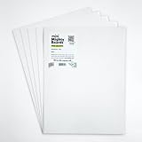
- PERFECT SAMPLES: These 12" x 9" white, styrene panels provide a smooth, warp-free surface for testing up to 5 color samples with paint, stain or other coatings.
- DURABLE MATERIAL: Made of sturdy styrene, these panels can withstand multiple coats and are non-absorbent so colors will stay true.
- CONVENIENT SIZING: At 12" x 9", the panels are just the right size for testing many common paint colors side by side before committing to a full project.
- PACKAGE INCLUDES: This value pack contains 5 white panels, enough for testing several color options on one purchase.
- VERY FLEXIBLE: Mighty Boards do not warp like foam core and you can bend them without breaking.
| Color | Brand and identifier | Color family | Designer-backed use | Published LRV | Watch for |
|---|---|---|---|---|---|
| Vintage Vogue | Benjamin Moore 462 | Ultra-dark smoky green | Kitchen, library, shelving, or color-drenched study | 11.85 | Absorbs considerable light |
| Gloucester Sage | Benjamin Moore HC-100 | Mossy medium sage | Powder room or breakfast nook | 19.25 | May shift beside tile and cool lighting |
| India Yellow | Farrow & Ball No. 66 | Earthy ochre-yellow | Laundry-room cabinetry or a warm accent | Not listed here | Can intensify in warm light |
| Wellfleet | Portola Paints | Deep, warm-leaning blue | Color-drenching or a grounding accent | Not listed here | Test the exact Portola finish |
| Barnwood | Benjamin Moore CSP-115 | Deep gray with brown hints | Dining room, bar, or dramatic millwork | 22.13 | Not a light greige; interior use only |
| Pure White | Sherwin-Williams SW 7005 | High-LRV white | Walls, trim, ceilings, or a flexible backdrop | 83.957 | Has a slight yellow undertone |
| Havana Affair | Alkemis Paint No. 56 | Bright rusty orange-red | Powder room or high-impact accent | Not listed here | Visually assertive; verify availability |
| Cinnamon Slate | Benjamin Moore 2113-40 | Plum-brown | Enveloping bedroom, living room, or dining room | Not listed here | Its plum and brown balance changes with light |
| Alabaster | Benjamin Moore 876 / OC-129 | Soft white with slight pink influence | Quiet, sophisticated white for walls or trim | 85.08 | Not the same as Sherwin-Williams Alabaster |
| Revere Pewter | Benjamin Moore HC-172 | Warm gray-greige | Bedroom, kitchen, trim, or transitional palette | 55.05 | Can read warm or cool depending on light |
| Antique Pearl | Benjamin Moore 2113-70 | Silver-lilac pale neutral | Soft wall color or aged, textured treatment | 72.43 | Lilac can emerge beside warm materials |
| Heron Plume | Sherwin-Williams SW 6070 | Creamy white-gray | Kitchen foundation or soft modern interior | 75.374 | Compare directly with cabinets and counters |
The designer recommendations and room applications in this table are drawn from Martha Stewart’s 2025 roundup. Manufacturer identifiers and technical descriptions are linked throughout the guide.
What the 2025 palette was really about
There was no single universally agreed-upon 2025 wall color. Instead, design coverage consistently pointed toward colors that were complex, softened, and slightly earthy rather than perfectly clear or aggressively saturated. Forecasts highlighted muddied pinks and purples, mossy greens, ochres, terracotta, chocolate brown, warm reds, dusty blues, and plaster-like neutrals.
The Tool Desk
Outbyte PC Repair FREEClear out junk files and repair common Windows errorsFree Scan →Outbyte Driver Updater FREEScan for outdated or missing drivers - takes under a minuteDriver Scan →Havenly’s design team described earthy shades as colors that could work almost like neutrals while giving a room more personality than a default white wall. ELLE Decor and Homes & Gardens likewise emphasized nuanced greens, warm browns, reds, yellows, blues, and pinks.
That does not mean white disappeared. Pure White, Benjamin Moore Alabaster, and Heron Plume show why warm and softened whites remain useful for ceilings, trim, kitchens, hallways, bedrooms, and rooms that need visual rest. The shift was away from treating white or gray as the only safe answer—not away from using them altogether.
Trend forecast versus designer recommendation
Several 2025 industry announcements supported the same color direction:
- Benjamin Moore selected Cinnamon Slate 2113-40 as its 2025 Color of the Year.
- Pantone selected Mocha Mousse, PANTONE 17-1230, a warm brown.
- Behr selected Rumors, a deep ruby red.
- Sherwin-Williams released a nine-color 2025 Color Capsule including Mauve Finery, Bosc Pear, Grounded, and Rain Cloud.
- Valspar selected Encore 8002-45G, an atmospheric deep blue.
These announcements are useful trend signals, but they are also brand forecasts and marketing programs. A Color of the Year does not prove that a shade was the country’s most purchased or most popular paint. In this article, a color is called designer-loved because a named professional recommended it for a particular application—not because a manufacturer promoted it.
Dark greens and immersive blue-greens
1. Vintage Vogue by Benjamin Moore 462
Benjamin Moore describes Vintage Vogue as an ultra-dark smoky green. With an LRV of 11.85, it is one of the deepest colors in this group. Designer Galey Alix recommended it for kitchens and libraries with extensive shelving, and for color-drenching. Her reasoning was practical as well as atmospheric: the color remains recognizably green instead of collapsing into black.
This is a good choice when the goal is a room that feels enveloping, collected, and architectural. Use it on library walls, built-ins, cabinetry, a study, a dining room, or a small room where a deliberate dark envelope will feel more interesting than an isolated accent wall. Brass, aged bronze, warm wood, cream textiles, and stone can keep the room from feeling flat.
Main caution: An LRV of 11.85 means the paint will absorb substantial light. It is not an automatic solution for a small, poorly lit room. Sample it beside the shelving, flooring, and bulbs that will remain in the space. If you color-drench, test the ceiling as well; the same dark color may look more dramatic overhead than on a vertical wall.
2. Gloucester Sage by Benjamin Moore HC-100
Gloucester Sage is part of Benjamin Moore’s Historical Colors collection and has a published LRV of 19.25. Alix suggested it for powder rooms and breakfast nooks, describing it as a mossy medium sage that holds onto its green character instead of becoming excessively gray as the light changes.
Do these 3 things before closing this tab:
1Scan for outdated or missing drivers - takes under a minute2Repair Windows errors before they cause bigger problems3Fix the driver behind crashes, sound loss and screen glitchesIt is more flexible than a near-black green but still has enough depth to make a room feel finished. Try it in a breakfast area with warm oak, a powder room with aged metal, or a traditional home with painted millwork. It can also bridge a garden-facing room and a palette of natural fibers.
Main caution: Green-gray paint is highly responsive to its neighbors. Warm wood can emphasize its mossy side; blue-white tile or cool LEDs can make it appear grayer or colder. Put the sample beside the actual tile, stone, countertop, and trim rather than judging it from a color card alone.
3. Wellfleet by Portola Paints
Designer Jessica Nicastro recommended Wellfleet as a blue with a useful balance of depth and warmth and suggested it for color-drenching. She also proposed pairing it with a warm brown such as Mocha Mousse. Portola’s official acrylic sample-color list includes Wellfleet.
Wellfleet suits a study, dining room, bedroom, cabinetry, or a room where a blue wall should feel grounded rather than coastal and crisp. Its warmth gives it a better chance of working with brown leather, walnut, terracotta, and aged brass than a stark, icy blue.
Do these 3 things before closing this tab:
1Clear out junk files and repair common Windows errors2Fix the driver behind crashes, sound loss and screen glitches3Repair Windows errors before they cause bigger problemsFinish qualification: Portola offers different paint and specialty-finish options. An acrylic sample should not be treated as proof of how the same named color will look in a limewash, Roman Clay, mineral, or other specialty finish. Sample the exact product and finish you intend to buy. Texture and variation can change the way light travels across the color.
Warm yellows, oranges, and reds
4. India Yellow by Farrow & Ball No. 66
India Yellow is not a pale, sunny pastel. It is an earthy, golden ochre. Mikala Kuchere of MDI Luxury Design recommended it for its earthy undertones and used it on a laundry-room cabinet alongside vibrant wallcovering, according to the source roundup.
That application illustrates a useful way to use strong yellow: as cabinetry or a concentrated architectural moment rather than necessarily covering every wall. It can energize a laundry room, breakfast nook, mudroom, pantry, or built-in while remaining more historic and grounded than a primary yellow. Cream, chocolate brown, muted blue, and deep green are natural balancing partners.
Main caution: India Yellow can become more intense in warm southern light or under incandescent bulbs. Check it at night before committing. If the room already contains yellow oak, warm beige tile, or golden metal, the combined effect may be much stronger than the sample appears against white paper.
The Tool Desk
Outbyte PC Repair FREEClear out junk files and repair common Windows errorsFree Scan →Outbyte Driver Updater FREEFix the driver behind crashes, sound loss and screen glitchesFind Drivers →5. Havana Affair by Alkemis Paint No. 56
Michelle Jacobson of ML Jacobson Design described Havana Affair as a bright rusty orange-red and used it in a powder room. Alkemis lists No. 56 in its Fire collection.
This is the high-impact option in the group. A powder room, ceiling, niche, door, or small accent wall can carry the color without requiring it to coordinate with every room in the home. In a larger space, use it selectively with quiet cream, warm brown, dusty blue, or olive green. A small room can also be color-drenched in Havana Affair if the goal is theatrical rather than understated.
Main caution: Rusty orange-red is not a low-risk whole-home neutral. Confirm current availability, the intended product type, coverage, and sheen before specifying it. Warm artificial light can push the color toward a deeper, more fiery red at night.
Browned grays and complex plum-browns
6. Barnwood by Benjamin Moore CSP-115
Benjamin Moore identifies Barnwood as CSP-115, with an LRV of 22.13, and notes that it is not available for exterior use. Emily Rand described it as a deep gray with brown hints and recommended it for bars and dining rooms.
Barnwood is a dramatic, warm gray—not the pale greige many people expect when they hear the word neutral. It can make a bar, dining room, office, or built-in feel substantial. It works particularly well when the room has walnut, smoked glass, leather, aged metal, or warm white upholstery.
Main caution: At an LRV of 22.13, the finish and wall condition matter. Satin or higher-sheen paint will reveal more surface irregularity and reflect more light; a flat or matte finish can make the color look quieter but may be less washable. Follow the product’s finish guidance and test it on the actual wall.
7. Cinnamon Slate by Benjamin Moore 2113-40
Cinnamon Slate is the strongest example on this list of a color that was both designer-recommended and a major brand’s official 2025 forecast. Benjamin Moore describes it as a blend of heathered plum and velvety brown. Designer Vyanca Soto called it a warm, enveloping combination of deep plum and earth brown.
Use it when you want color with the visual weight of a neutral. It can suit a bedroom, den, living room, dining room, hallway, or built-in cabinetry. The brown component makes it easier to combine with wood and tan upholstery, while the plum keeps it from becoming an ordinary chocolate or taupe.
Rank #3

- PAINT + PRIMER: KILZ TRIBUTE is a low VOC, 100% acrylic advanced technology paint and primer in one formulated for superior hide and coverage with exceptional durability. Paint and primer covers light-medium stains and light-dark color changes.
- ADVANCED FORMULA: This is our most technologically-advanced acrylic product which combines paint and primer properties with exceptional stainblocking performances. This remarkable formula can be scrubbed clean safely. GREENGUARD Certified: low emissions of VOCs
- MULTIPLE SURFACES: KILZ interior paint makes a great wall paint or cabinet paint for many home improvement needs. Use on properly prepared coated or uncoated wood, drywall, masonry and cured plaster. Surfaces should be clean and free of dust, grease, chalk, rust and peeling paint. Mix well before using.
- SUPERIOR COVERAGE: KILZ TRIBUTE interior satin paint and primer covers up to 400 sq. ft. per gallon depending on surface texture, porostiy, and application method. If desired, recoat after 2 hours. We offer an 8 oz sample size for color choosing convenience. Use with high-quality brushes or paint rollers.
- KILZ has been making premium primers and paints for 40 years and leverage this experience in every gallon of KILZ Paint. Named Paint Brand of the Year in 2015 in the Harris Poll EquiTrend Rankings. Lifetime Limited Warranty (see label for details).
Cinnamon Slate also connects to the broader 2025 preference for brown and plum tones. But its Color of the Year status should be understood as Benjamin Moore’s selection and forecast, not proof that it was objectively the most popular color nationwide.
Main caution: Plum-browns can look more purple beside warm whites and more brown in low or warm light. Test it beside the room’s trim and furnishings at several times of day before deciding whether you want the purple component to be prominent.
8. Revere Pewter by Benjamin Moore HC-172
Revere Pewter HC-172 has an LRV of 55.05. Benjamin Moore describes it as a neutral bridge between warm and cool tones, and identifies it elsewhere as a best-selling, homeowner-favorite greige. Isabel Byrnes recommended it as a warm, versatile gray with soft green-gray undertones for bedrooms, kitchens, and trim.
Revere Pewter is the established workhorse in this list. It can connect warm wood floors to cooler stone, brushed metal, or blue-gray upholstery, which is why it remains useful in transitional interiors. It is a sensible candidate for someone who wants more depth than white but less drama than Barnwood or Cinnamon Slate.
What’s actually slowing this PC down?
Pick the symptom - the matching free tool is one click away.
Main caution: Versatile does not mean identical in every room. Benjamin Moore notes that Revere Pewter can behave as warm or cool depending on lighting. Green-gray undertones may become more apparent beside pink-beige carpet, yellowed wood, or cool white trim. Sample it against all three-dimensional finishes, not just the wall.
Whites and pale neutrals with visible undertones
9. Pure White by Sherwin-Williams SW 7005
Sherwin-Williams lists Pure White SW 7005 at an LRV of 83.957 and describes it as a versatile white with a slight yellow undertone. Galey Alix recommended it as a reliable white that avoids strongly pulling yellow, pink, blue, or gray in changing light.
Pure White is useful for walls, ceilings, trim, kitchens, hallways, and rooms that need a flexible backdrop. It is bright enough to reflect a good amount of light without necessarily feeling as stark as a very clean, cool white. It can also provide a visual rest point beside a dark green, plum-brown, or rusty red.
Main caution: Pure White is not undertone-free. Its slight yellow influence may become visible beside a cooler white, a blue-green, or a bright white countertop. If you are painting trim and walls different colors, compare the two samples together rather than selecting each independently.
10. Benjamin Moore Alabaster 876 / OC-129
The Alabaster in this 12-color list is Benjamin Moore Alabaster 876 / OC-129, not Sherwin-Williams Alabaster. Benjamin Moore lists the color at an LRV of 85.08 and identifies a slight pink influence. Leah Bailey recommended it as a soft, sophisticated white.
Benjamin Moore Alabaster works when a room needs a white that is gentle rather than icy. It can suit walls, trim, bedrooms, kitchens, and transitional spaces, particularly where warm wood or natural textiles already provide texture.
Critical naming warning: Sherwin-Williams also sells a separate color named Alabaster, SW 7008. The two colors are not interchangeable. Always give the brand and identifier when ordering, and check the label on the sample pot.
11. Antique Pearl by Benjamin Moore 2113-70
Benjamin Moore describes Antique Pearl as a muted color with silver and lilac and lists an LRV of 72.43. Asler Valero described it as a silver-lilac that becomes warmer gray at night and used a sponge application to create an aged, textured effect.
Antique Pearl is a good choice for someone who wants a pale neutral with personality but does not want a clearly colorful wall. Consider it for a bedroom, dressing area, sitting room, or a room with plaster-like texture. It can look especially refined with soft gray, antique brass, dusty rose, natural linen, and warm white.
Rank #4
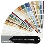
- Brand: Benjamin moore
- Container type: Box
- Finish type: Opa
Main caution: This is not a neutral gray with no color bias. Its lilac side may become obvious beside yellowed wood, cream trim, or warm beige furnishings. If you are using a sponge or other decorative application, sample the technique itself; application texture changes both color variation and reflectivity.
12. Heron Plume by Sherwin-Williams SW 6070
Sherwin-Williams lists Heron Plume SW 6070 at an LRV of 75.374 and describes it as a creamy white. Arlene Angard recommended it for kitchens as a warm cream-gray foundation for a soft, modern space.
Heron Plume is useful when a bright, pure white feels too sharp but a distinctly beige wall feels too heavy. It can create a calm kitchen backdrop, connect warm cabinetry to pale walls, or soften a modern room with black hardware and stone surfaces.
Windows Errors? Fix Them Before They Spread
Repair common Windows errors and clear accumulated junk for a smoother, more stable PC - no reinstall needed.Free scan · no reinstallOutdated Drivers Are Slowing You Down
One free scan finds every outdated or missing driver and matches the right update for your exact hardware.Free scan · exact hardware matchMain caution: Pale colors are especially dependent on what surrounds them. Compare Heron Plume with the cabinet door, backsplash, countertop, flooring, and existing trim. Against some finishes it may read cream; against others it may look gray or pink.
How to choose among the 12
Start with the room and its permanent finishes, then use mood and risk tolerance to narrow the choice. These groupings are editorial guidance based on the designer descriptions and manufacturer classifications, not objective ratings.
Choose by mood
- Grounded and enveloping: Vintage Vogue, Barnwood, or Cinnamon Slate.
- Natural and restorative: Gloucester Sage or Wellfleet.
- Warm and energetic: India Yellow or Havana Affair.
- Quietly elegant: Revere Pewter or Antique Pearl.
- Airy and flexible: Pure White, Benjamin Moore Alabaster, or Heron Plume.
Choose by light
- Low-light room: Begin by testing Pure White, Benjamin Moore Alabaster, Heron Plume, or Antique Pearl, but watch for unwanted gray, pink, or lilac casts. A high LRV does not guarantee that the color will feel warm or attractive in your particular room.
- Bright room: Deep greens, browns, reds, and plums can absorb excess brightness and add depth. Vintage Vogue, Barnwood, and Cinnamon Slate are the most immersive choices.
- Warm artificial light: Test India Yellow, Havana Affair, Benjamin Moore Alabaster, Pure White, and Antique Pearl after dark. Warm bulbs can intensify yellow, red, pink, and brown influences.
- Cool LED lighting: Test Gloucester Sage, Wellfleet, Antique Pearl, and Revere Pewter carefully. Cool bulbs can make blue-green, lilac, and gray colors appear colder.
Sherwin-Williams explains that room orientation and light source affect paint color. Do not rely on a universal rule that a north-facing room must use warm paint or a south-facing room must use cool paint. The size and direction of the windows, nearby trees or buildings, bulb temperature, flooring, and surrounding surfaces all matter.
Choose by fixed finishes
Before choosing a wall color, assemble samples of the elements that will not change easily:
- Flooring and exposed wood.
- Countertops and backsplash tile.
- Cabinetry and built-ins.
- Brick, stone, and fireplace surrounds.
- Upholstery, rugs, and large window treatments.
- Existing trim, doors, and adjacent rooms.
Sherwin-Williams specifically recommends considering permanent elements such as cabinets, tile, brick, and wood undertones. A color that looks balanced on a white display board may clash with a pink-beige carpet or make a blue-white backsplash look even colder.
Choose by visual risk
- Lower risk: Revere Pewter, Heron Plume, Pure White, and Benjamin Moore Alabaster.
- Moderate risk: Gloucester Sage, Antique Pearl, Wellfleet, and Barnwood.
- Highest visual impact: Vintage Vogue, India Yellow, Havana Affair, and Cinnamon Slate.
Lower risk means easier to use as a broad backdrop; it does not mean the color will work without sampling. A supposedly flexible neutral can fail quickly when its undertone conflicts with a countertop, floor, or existing trim.
Best matches for common decorating goals
- A dark, cozy library or study
- Start with Vintage Vogue or Cinnamon Slate. Use Wellfleet if you want the depth of a dark color with a clearer blue reading.
- A green for a traditional home
- Try Gloucester Sage for a medium, mossy effect. Choose Vintage Vogue when the room has enough light and you want the shelves, trim, and walls to read as one enveloping composition.
- A color-drenched powder room
- Havana Affair gives the most theatrical result. Gloucester Sage is quieter, while Vintage Vogue creates a dark, library-like mood.
- A warm white for a kitchen
- Compare Heron Plume with Benjamin Moore Alabaster and Pure White directly against the cabinetry and counters. There is no universally best warm white.
- A whole-home neutral
- Revere Pewter is the established, mid-value option. Heron Plume or Pure White may be better if you want a lighter backdrop, but both need to be checked against trim and flooring.
- Color that works with wood
- Revere Pewter, Cinnamon Slate, Barnwood, Gloucester Sage, and Wellfleet can all work with wood, but the exact wood undertone determines the result. Pair samples, not assumptions.
How to use color-drenching without making a room oppressive
Color-drenching means carrying one paint color across several architectural surfaces—usually walls, trim, doors, and sometimes the ceiling—instead of stopping the color at the wall. Vintage Vogue, Wellfleet, Cinnamon Slate, and Havana Affair are especially suited to an immersive treatment when the room’s purpose and lighting support it.
The approach can make a small powder room, office, or dining room feel intentional and enveloping. It can also visually simplify awkward transitions and make built-ins feel integrated. Use one color across surfaces when you want architecture and texture—not a contrasting trim line—to provide the interest.
Quick wins for a faster PC:
Clear out junk files and repair common Windows errorsFree Scan →Scan for outdated or missing drivers - takes under a minuteDriver Scan →The trade-off is saturation. A room with a dark ceiling, dark walls, dark flooring, and little window area may feel visually compressed. Architectural Digest’s 2025 color report includes a warning that color-drenching can become visual overload without restraint. Keep some relief through ceiling height, reflective hardware, pale upholstery, artwork, daylight, or a lighter adjoining room. Test the ceiling and trim before painting the entire envelope.
How to sample the paint correctly
Digital swatches and magazine photography are useful for finding a color family, not for approving a gallon. Screens, printing, photography, sheen, room lighting, and surrounding colors can all change the apparent result. Both Benjamin Moore and Sherwin-Williams warn that on-screen color representations may differ from actual paint.
Best Value

- Core Color Matching: Paint color sample cards include 83 standard colors to support paint color sample cards, color matching cards for painting, and paint chips standard samples, helping users compare shades before selecting a final finish for floor paint, hardware, and other project needs
- Reliable Reference: Paint samples are made with color matching materials designed to support accurate color comparison, giving painters and DIY users a practical paint and paint color samples reference for selecting tones that fit the project surface and intended look
- Portable Format: Measuring 3.74 x 1.57 x 1.18 in and weighing 3.88 oz, this paint samples set is compact for a toolbox, work bag, or travel use, making it easier to carry color test card paint and check shades on site when planning paint work
- Wide Project Use: Paint sample cards are suitable for floor paint, paint hardware, and related color selection tasks, offering a useful paint chips samples reference for contractors, decorators, and home improvement users working on color coordination across different surfaces
- Simple Set Package: Each package includes 1 set of paint sample cards, giving users a straightforward paint sample standard cards option for daily work, project planning, and quick shade comparison when choosing among paint color cards and paint chips sample cards
- Begin with chips. Compare several colors in the same family—such as two greens, three warm whites, or multiple plum-browns—before purchasing samples.
- Buy a liquid sample or large removable sample. A tiny card is too small to reveal how a complex neutral behaves across a wall.
- Apply two coats if using liquid paint. Benjamin Moore recommends two coats for a more accurate depiction. Allow the sample to dry fully between coats according to the product directions.
- Use the actual wall or a large white foam-core board. A board lets you move the color around without painting multiple walls, but an actual wall also reveals the effect of the existing surface and neighboring colors.
- Test more than one location. Move the board or paint samples near a window, in a corner, beside the trim, next to cabinetry, and on the wall opposite the main light source.
- View it morning, afternoon, evening, and under the room’s actual bulbs. Sherwin-Williams recommends viewing a swatch in the room at different times of day. Benjamin Moore likewise recommends observing samples from morning to evening in natural and artificial light.
- Compare permanent finishes beside the paint. Do not evaluate a kitchen color without the backsplash, countertop, cabinet door, floor, and hardware samples present.
- Live with the sample for at least a full day. If you still like it after the room has cycled through its normal light, then calculate the quantity and finish.
For Sherwin-Williams colors, its Color To Go samples are quart-sized and cover approximately 75 square feet, according to the company’s sample information. Coverage and sample formats vary by brand and product, so check the manufacturer’s instructions.
Sheen matters as much as color
The same color can appear different when its sheen changes because the surface reflects light differently. Finish should be selected for the wall’s condition, the room’s wear, cleaning needs, and the amount of reflectivity you want:
Recommended Free Tools
- Flat or matte: Minimizes reflection and can conceal minor wall imperfections, but is generally more difficult to clean.
- Eggshell or low-lustre: Provides moderate reflection and is a practical choice for many interior walls.
- Satin: Offers more washability and reflection, making it useful in higher-wear areas.
- Semi-gloss or gloss: Is durable and visually prominent, and is often used for trim, doors, and architectural details.
Sherwin-Williams notes that higher-sheen finishes are generally easier to clean but highlight surface flaws, while flat finishes conceal imperfections but can be harder to clean. Do not assume every designer uses matte paint for every dark color. A busy kitchen, a smooth cabinet, and a damaged plaster wall have different finish requirements.
Paint matching, product choice, and safety
Should you have the color matched?
A local store may produce a visually close match, but it should not be described as exact. Benjamin Moore warns that another brand cannot simply reproduce the full behavior of its proprietary color technology. For the closest color fidelity, buy the original brand—especially for nuanced colors such as Vintage Vogue, Cinnamon Slate, Antique Pearl, and Revere Pewter.
If you do use a match, sample the matched paint in the room and label the can with the original brand, color name, identifier, finish, and date. The sheen and base can affect the result as much as the tint formula.
Do low-VOC and zero-VOC labels make paint harmless?
No. The EPA cautions that low-VOC and no-VOC labels do not necessarily account for every potentially harmful indoor chemical. Most paints emit some VOCs, and a product’s actual formulation and certification matter.
Free tools Windows power users keep installed
One-click scans. No signup required.
Follow the product label, ventilate during and after painting, and keep children, pets, and people sensitive to fumes away from the work area. EPA recommends fresh-air ventilation when painting. Check the technical data and relevant certification instead of relying only on a marketing claim.
What if the home was built before 1978?
Repainting old trim, cabinets, or walls can disturb lead-based paint. For a U.S. home built before 1978, the EPA recommends treating existing paint as potentially lead-based unless testing shows otherwise. Review EPA remodeling guidance before sanding, scraping, or otherwise disturbing the surface. Use appropriate containment and lead-safe practices rather than treating an old painted surface like new drywall.
A practical shortlist from the 12
If the complete list feels too broad, select two or three candidates according to the room’s actual problem:
- You want depth without a strong color statement: Revere Pewter, Heron Plume, or Pure White.
- You want a green that feels natural: Gloucester Sage for medium depth, or Vintage Vogue for a dramatic envelope.
- You want a blue that feels warm rather than icy: Wellfleet.
- You want a sophisticated white: Compare Benjamin Moore Alabaster and Heron Plume; include Pure White if you want a brighter backdrop.
- You want a dramatic warm room: Cinnamon Slate or Barnwood.
- You want an accent with energy: India Yellow for ochre warmth or Havana Affair for rusty orange-red.
- You want a pale color with an unexpected undertone: Antique Pearl.
Then test the finalists together in the room. The best choice is not necessarily the most fashionable name or the highest LRV. It is the color that remains convincing beside the fixed finishes and under the light you actually live with.
Frequently Asked Questions
Which Alabaster paint color is included in the 12 designer recommendations?
The list refers to Benjamin Moore Alabaster 876 / OC-129, which has an LRV of 85.08 and a slight pink influence. Sherwin-Williams Alabaster SW 7008 is a different color, so always specify the brand and identifier when ordering.
Can a paint store match these designer colors exactly?
A store may create a visually close match, but an exact cross-brand result should not be assumed. For the best fidelity, buy the original brand and test the actual product in the room, particularly for complex colors such as Vintage Vogue, Cinnamon Slate, Antique Pearl, and Revere Pewter.
Will a dark paint color make a small room feel smaller?
Dark colors can make surfaces appear visually closer and can create a more intimate mood, but that is not automatically a problem. Window area, ceiling height, reflective surfaces, trim contrast, artificial lighting, and the room’s purpose all affect the result. A small powder room or library may benefit from an intentional dark envelope.
How long should a paint sample stay on the wall before I decide?
View it for at least a full day, including morning, afternoon, evening, and the room’s artificial lighting. Use two coats for a liquid sample, move it near windows and corners, and compare it with flooring, cabinetry, countertops, tile, and trim.
The Bottom Line
The most useful 2025 paint colors were not necessarily the newest or boldest. They were nuanced shades—greens, ochres, rusty reds, plum-browns, warm grays, and softened whites—that could shift with light and work with real materials. Narrow the list to two or three candidates, sample the exact brand and finish on a large surface, and judge the color beside the room’s permanent finishes before buying gallons.
Quick Recap

Product prices and availability are accurate as of the date/time indicated and are subject to change. Any price and availability information displayed on Amazon at the time of purchase will apply.




