What’s actually slowing this PC down?
Recommended Free Tools
Pick the symptom - the matching free tool is one click away.
ThatPainter is reader-supported. When you buy through links on our site, we may earn an affiliate commission. Learn More
As an Amazon Associate I earn from qualifying purchases.
Choose a 1950s direction if you want an airy, coordinated room with warm wood, efficient storage and restrained color. Choose a 1970s direction if you want saturated color, larger patterns, carpet or textile texture, modular furniture and a more expressive focal point. Neither decade has to become a time capsule. One or two convincing period cues, surrounded by contemporary pieces, usually look more intentional and remain easier to live with than a complete replica.
Free tools Windows power users keep installed
One-click scans. No signup required.
The most useful comparison is not “old versus new.” It is silhouette, material, color intensity, pattern scale, floor treatment, lighting and visual density. The sections below show what each decade actually contributed, how those choices behave in a real home, and how to combine them without creating a themed set.
Popular on Amazon
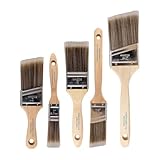
- COMPLETE 5-PIECE BRUSH SET FOR EVERY PAINTING TASK — Includes 1 Inch Flat, 1.5 Inch Angle, 2 Inch Flat, 2 Inch Angle Stubby, and 2.5 Inch Angle brush giving you every size professional painters use daily. Get all 5 for less than the price of a single brush from hardware store brands — professional grade performance at a fraction of the cost. Perfect for walls, trim, cabinets, doors, furniture, and detailed cutting-in work on any project.
- ZERO BRISTLE LOSS — GUARANTEED BY PRECISION ADHESIVE BONDING — Every bristle is locked in place with precision-set adhesive that keeps them in the brush — not in your paint job. The coated steel ferrule provides structural support while the adhesive bond ensures clean performance on every stroke. Premium SRT synthetic filaments load more paint and release it evenly for a smooth streak-free finish on walls, ceilings, and trim. Works with latex, oil-based paint, primer, sealer, and wood stain.
- INCLUDES THE ANGLE STUBBY MOST SETS LEAVE OUT — Professional painters know the 2 Inch Angle Stubby is the go-to brush for tight cabinet interiors, window sashes, inside corners, and detailed trim where standard angle brushes are too long. Combined with the 1.5 and 2.5 inch angle sash brushes you have precision cutting-in covered at every scale — baseboards, crown molding, door casings, and ceiling lines.
- FLAT BRUSHES FOR BROAD SMOOTH COVERAGE ON ANY SURFACE — The 1 and 2 inch flat brushes deliver even coverage on walls, furniture, shelving, doors, fences, decks, and wood surfaces. Ideal for applying primers, stains, varnishes, polyurethane, and specialty coatings. Solid wood handles provide all-day comfort and control for both professional contractors and weekend DIY homeowners tackling interior or exterior painting projects.
- TRUSTED BY PROFESSIONAL PAINTERS AND CONTRACTORS NATIONWIDE — Pro Grade delivers professional-grade results at a price that makes sense for crews who go through brushes on every job. Ideal for property managers, remodeling contractors, apartment turnover crews, maintenance teams, and commercial painting operations. Backed by thousands of verified reviews from working painters. Washable and reusable for multiple projects.
What defines 1950s interior design?
1950s interiors are best understood as practical postwar rooms made more optimistic by new materials, efficient production and carefully edited color. “Mid-century modern” is the usual label for much of the decade’s furniture, but it does not describe every 1950s room: American ranch houses also used vivid Formica, melamine, vinyl, wood paneling and patterned wall-to-wall carpet.
The Metropolitan Museum of Art describes the period as one in which new materials and production methods made abstract, sculptural and more affordable domestic objects possible. The Museum für Angewandte Kunst Köln identifies a productive tension between soft organic shapes and reduced geometry, with little applied decoration and a palette that moved between primary colors and natural tones.
Furniture and planning
IKEA Museum’s account of 1950s catalogues emphasizes a light, comfortable, flexible and functional home. Teak and mahogany case goods, airy chairs, low coffee tables, open shelving and coordinated seating groups kept rooms visually light while providing practical storage. The family room was increasingly organized around the television, so furniture was arranged for conversation and viewing rather than formal display.
Typical silhouettes include tapered legs, compact cabinets, nesting or stacking tables, low profiles and rounded edges. A sideboard or open shelving system can carry the period reference while keeping circulation clear. Molded fiberglass, plastic, laminate, vinyl, steel wire and glass extended the vocabulary beyond wood without making the room feel industrial.
Color and pattern
A restrained 1950s scheme might pair teak, walnut or mahogany with cream, warm gray or another quiet neutral, then add black or white linework and a controlled red, yellow, blue, pink or turquoise accent. The National Park Service’s documentation of ranch interiors is a useful corrective to the idea that every mid-century room was beige: bright, highly personal color was entirely compatible with simple forms and wood.
Also popular on Amazon

- Great Value Pack Artist Paint Brushes: Soucolor 20 brushes in 10 sizes professional paintbrushes set — no shedding, holds paint well, cleans easily, Acrylic, watercolor, oil, gouache, Halloween pumpkin decoration & face painting, rock painting, ceramics. Fantastic high quality gifts for creative, artistic siblings to share!
- Awesome Set of Paint brushes: Professional paint brushes can cover all of your needs. The multi-purposed brushes are ideal for Watercolor, Oil, Gouache, enamel, Acrylic Painting, Body, Nail, Face Painting, Miniature, Model, Wood, Glass, Cup, Ceramic, Fine work, Art class, Craft Art Painting, DIY Art Crafts etc.
- Soft and long-lasting: The bristles are soft and strong, with nickel metal ferrules and blue wooden handles. After cleaning, the bristles will become soft and fluffy again and will not fall off.
- Easy to clean: it’s very convenient to Wash well in soap and water. Retain shape after drying. the brushes hold up very well. Nice selection to beginners and professionals. Keep them clean and they last a long time.
- Halloween Pumpkin Ceramic Crafts Supplies: A Great painting gift for family, friends, kids, girls, women, student, classmate, teacher. For using in school, travel or used in the home and office.
Patterns are usually smaller and more deliberate than their 1970s counterparts. A geometric cushion, a compact abstract print or a narrow stripe can supply energy without competing with storage, windows or architectural details.
What defines 1970s interior design?
1970s rooms push the same modern confidence toward color, texture, informality and visual drama. IKEA Museum describes early-1970s interiors as youthful and colorful, with bold shapes, plastic and lacquered particleboard, removable sofa covers, posters, shelves, floor cushions, wall-to-wall carpets and broad colorful patterns. Brown became a grounding color, while knotty pine and do-it-yourself furniture grew more prominent as the decade responded to the 1973 oil crisis and increasing environmental awareness.
Furniture, surfaces and texture
Instead of a few elevated case goods, a 1970s room may use modular seating that can be rearranged, low tables, floor cushions and casual pieces that support lounging. Particleboard, plastic, synthetic upholstery, cork, rattan, chrome, smoked glass and knotty pine sit comfortably beside wood. Removable covers and simple utility furniture reflect a desire for adaptability rather than permanence.
Floor and wall surfaces do more of the decorating. Shag or high-pile carpet, wall-to-wall carpet, cork, bold wallpaper, paneling and layered textiles increase tactile depth. Because these surfaces occupy large areas, they can establish the decade more quickly than a collection of small ornaments.
Color, pattern and lighting
Useful 1970s colors include burnt orange, rust, olive or avocado, mustard, brown, aubergine, turquoise, cream and saturated red. Cooper Hewitt’s record of Verner Panton’s Decor I collection, released in 1971, shows the range: orange, bright and deep red, aubergine, mauve, violet, turquoise and a full-spectrum colorway appeared alongside checkerboards, circles, curves, squares and stripes.
Also popular on Amazon
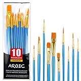
- 【All sizes of art brushes】: The 10 sizes of multi-functional brushes have various shapes, making the mixing color easier, which is very suitable for artists, students, teenagers, children and painters at all levels. Wonderful Present ideas for friends and family who like painting!
- 【general brush set】: Professional paint brush can meet all your needs. Multifunctional brush is very suitable for watercolor, oil, gouache, acrylic painting, body, nail, face painting, miniature, model, ceramics, arts and crafts painting, etc.
- 【high quality process】: It is designed with anti falling bristles, anti-rust nickel ferrule and solid wood handle. You can use the brush to focus on the painting and always be creative.
- 【easy to maintain】: After using the brush, it is very convenient to clean the brush with warm soapy water and reshape the tip of the brush. Air dry the brush and place it on top of the top for long use.
- 【100% satisfaction guarantee - buy now】1 packs of set brushes, you can also get friendly customer service, any questions feel free to contact us, within 24 hours to help you! There is no risk in buying our paint brush kit.
Large-scale geometry is often the main event. A single graphic rug, curtain or wallpaper panel can provide more period character than several small motifs. MoMA’s account of 1960s–70s lighting describes a move toward informality, wit, fashion, sculptural forms and experiments with new materials. A large, unusually shaped or colorful lamp can therefore establish a 1970s mood while the rest of the room stays edited.
Do these 3 things before closing this tab:
1Clear out junk files and repair common Windows errors2Fix the driver behind crashes, sound loss and screen glitches3Repair Windows errors before they cause bigger problemsThe decade’s changing priorities
The 1970s were not one unchanging look. The Swedish Furniture Design Museum describes a shift from rebellious design toward resource efficiency and simple utility furniture, alongside the spread of chipboard and rustic pine. Its 2021 account notes, “The number of Swedish furniture manufacturers decreased by over 70% in ten years.” That industrial contraction and the era’s environmental concerns help explain why inexpensive, repairable-looking or do-it-yourself pieces appear beside exuberant plastics and patterns.
What is the difference between 1950s and 1970s interior design?
The clearest distinction is the amount of visual information a room is asked to carry. 1950s design generally organizes color and pattern around light furniture and coordinated function; 1970s design lets color, surface and sculptural objects become the room’s dominant experience.
| Design axis | 1950s direction | 1970s direction |
|---|---|---|
| Silhouette | Tapered, light, organic or disciplined geometric forms | Rounded, modular, sculptural or oversized forms |
| Materials | Teak, mahogany, molded fiberglass, laminate, vinyl, steel wire and glass | Particleboard, pine, plastic, shag, cork, rattan, chrome, smoked glass and synthetic textiles |
| Color | Warm wood and neutrals with controlled primary or pastel accents | Saturated orange, rust, olive, brown, aubergine, turquoise and red |
| Pattern | Smaller abstract or geometric accents | Large geometry, stripes, checks and psychedelic or graphic textiles |
| Floor and wall treatment | Wood, restrained carpet, practical laminate and selective paneling | Wall-to-wall or shag carpet, cork, bold wallpaper, paneling and layered textiles |
| Lighting | Clean, functional and often organic or minimal | Sculptural, witty, colorful, oversized and materially experimental |
| Best fit | Order, visual lightness and coordinated function | Texture, color drama, informality and a statement room |
Which retro style fits my home’s size, light and storage needs?
Start with the room’s constraints rather than with a decade label. A small, storage-heavy or already busy room usually benefits from 1950s cues; a room that can absorb stronger color, a large pattern, carpet texture or a statement light can carry 1970s cues more comfortably.
Choose 1950s cues when you need visual breathing room
- Small footprint: Tapered legs, open shelving and low case goods expose more floor and keep circulation legible.
- Heavy storage requirements: A teak, walnut or mahogany sideboard can hide equipment and household items without adding visual noise.
- Many existing finishes: Warm wood, cream and one controlled accent color can connect disparate elements more calmly than several saturated hues.
- Mixed-use rooms: Coordinated seating and compact tables support work, conversation and television viewing without a full furniture reset.
Choose 1970s cues when the room can carry texture and drama
- Large or open plan: A broad rug, wallpaper field or sculptural lamp has enough surrounding space to read as intentional.
- Simple architecture: Saturated color and oversized geometry can supply character where the envelope is plain.
- Informal household routines: Modular seating, floor cushions and movable tables suit lounging and rearrangement.
- A desire for one strong statement: An unusually shaped light or a single graphic textile can do the work of many decorative objects.
If you are undecided
Keep the architecture and large upholstered pieces quiet, then test one decade through a sideboard, rug, lamp or removable wallpaper panel. Live with that cue at different times of day before committing to a larger surface. This approach lets you judge color intensity and visual density in your actual light rather than from a catalogue image.
Also popular on Amazon

- Bates paint brushes come in a convenient 6 pieces with 3 flat and 3 angled bristle styles, including (1”, 1.5”, 2”) flat and (1.5”, 2”, 2.5”) angled bristles, perfect for tackling any surface painting or staining job.
- The sturdy natural bristles of each brush are designed to hold more paint, creating a smoother finish with fewer streaks and saving you time on the job.
- The lightweight wooden handles provide extra comfort and ease during long painting processes like walls, trims, cabinets, and doors.
- These versatile brushes are ready-to-use, easy to clean, and can be reused multiple times, making them economical as well as reliable tools for any painting project.
- Bates paint brushes can be used for both oil-based paints as well as latex stains and are ideal for home or commercial projects such as decks, fences or DIY painting jobs.
How do I make a room look retro without making it look dated?
Use period references as a hierarchy, not as a shopping list. Contemporary guidance commonly treats “retro” as an edited reinterpretation of roughly the 1940s through the 1970s, so selective references are historically defensible and easier to maintain than a total time capsule.
- Set a quiet base. Keep walls, major upholstery or built-in cabinetry simple enough that one period feature can be seen clearly.
- Choose one anchor with a real design job. For a 1950s room, that might be a teak sideboard, low coffee table or open shelving. For a 1970s room, it might be a patterned rug, a large lamp or a modular seat.
- Repeat one material, not every motif. Echo warm wood, rattan, chrome, smoked glass or cork once or twice so the room feels connected without becoming a display set.
- Control intensity. If the rug has large saturated geometry, use quieter curtains and upholstery. If the lamp is sculptural and colorful, let nearby surfaces recede.
- Keep contemporary infrastructure visible. Modern lighting controls, efficient storage and current technology can remain; hiding every practical update is what makes a room feel staged.
- Edit small accessories last. Posters, ceramics and cushions should support the chosen silhouette and palette rather than introduce unrelated decades.
- Check the room from the doorway. The period cue should be legible at a glance, while clear walking paths and usable surfaces remain obvious.
How should I choose furniture and materials for each decade?
A 1950s furniture and material checklist
- Look for a light profile, tapered legs, compact dimensions and rounded or quietly geometric edges.
- Use teak, walnut or mahogany as the principal warm material; balance it with cream, a warm neutral, black or white linework.
- Consider molded fiberglass or plastic, laminate, vinyl, steel wire and glass for practical surfaces and seating details.
- Prioritize storage that closes or organizes: a sideboard, shelving system or nesting tables can carry authenticity and utility together.
A 1970s furniture and material checklist
- Look for modular, rounded, low or oversized forms that can be moved, recombined or used informally.
- Layer shag or high-pile texture, patterned textiles, vinyl, plastic, lacquered particleboard, knotty pine, cork, rattan, chrome or smoked glass.
- Use brown as a grounding tone when the palette includes orange, mustard, olive, aubergine, turquoise or saturated red.
- Allow one large geometric, striped, checked or graphic surface to lead instead of scattering many competing patterns.
How can I apply the choice room by room?
Living room
For a 1950s living room, center the plan on a low table, a compact sofa or lounge chairs, and a teak or walnut storage piece. Keep the floor readable and use one small abstract textile or bright cushion as the accent. For a 1970s room, begin with the rug or lighting: a broad pattern, high-pile texture or sculptural lamp can define the seating zone, while modular seating and floor cushions make the arrangement feel relaxed.
Dining room and kitchen
1950s dining areas suit a clean table, light chairs and a sideboard that keeps serving items organized. Laminate, vinyl and a controlled turquoise, yellow, red or pink accent can reference ranch interiors without covering every surface. A 1970s dining area can take more color on the chairs or wall, with chrome, smoked glass, knotty pine, cork or a bold graphic treatment adding texture.
Bedroom
Use 1950s cues through a simple wooden headboard or case good, a low bedside table and restrained geometric bedding. In a 1970s bedroom, let textiles do the work: a saturated cover, a large-scale pattern, rattan or a sculptural bedside lamp can create depth without permanently changing the architecture. Keep the largest sleeping surface calmer if the wallpaper or rug is already intense.
Recommended Free Tools
Entryway, studio or home office
An entry benefits from the 1950s emphasis on compact storage: a narrow sideboard, wall shelf or mirror can provide a clear landing place. In a studio or office, 1970s modular shelving, a movable table, cork or a vivid lamp can make a small footprint feel deliberately informal. In either case, protect circulation first; a period silhouette is not successful if it blocks the door or workspace.
Also popular on Amazon

- 2 Inch Angled Paint Brush for Precision Cutting-In – Designed for clean, sharp lines around trim, baseboards, ceilings, corners, and detailed edge work. The perfect size for control and coverage.
- Value 3-Pack for Pros & DIY Projects – Includes three professional 2-inch angled sash brushes — ideal for contractors, remodelers, and homeowners tackling multiple rooms or repeat paint jobs.
- Smooth Results on Walls, Trim & Cabinets – Great for interior wall painting, cabinet edges, furniture projects, and trim work where a smooth finish and crisp control matter most.
- Works with Latex Paint, Oil-Based Paint & Stains – Premium synthetic filaments hold more paint, reduce streaks, and provide a clean finish with latex paints, oil coatings, and wood stains.
- Works with Latex Paint, Oil-Based Paint & Stains – Premium synthetic filaments hold more paint, reduce streaks, and provide a clean finish with latex paints, oil coatings, and wood stains.
Can I combine 1950s and 1970s elements?
Yes. The decades already overlap in their use of new materials and mass production, so a blended room can feel historically coherent when one period supplies the structure and the other supplies the accent.
- Choose the structural decade. Use 1950s case goods and lighter furniture when storage and order are priorities; use 1970s modular seating or a textured floor when informality is the priority.
- Add one contrasting signature. Pair a 1950s teak sideboard with one 1970s saturated textile or sculptural lamp, or place a 1970s patterned rug under cleaner mid-century furniture.
- Limit high-intensity patterns. One large graphic surface is usually enough; let other textiles repeat a color or material rather than another motif.
- Bridge with natural materials. Rattan, warm wood, wool-like texture, glass or a restrained neutral can connect a bright 1970s accent to a lighter 1950s framework.
- Repeat the bridge at a small scale. A second wood tone, a matching metal finish or one shared accent color helps the mix read as planned.
What mistakes make a retro room feel dated or uncomfortable?
- Replicating every cue at once: Full wall-to-wall pattern, saturated upholstery, period accessories and matching lighting can erase hierarchy. Select an anchor and let supporting pieces stay quiet.
- Ignoring scale: A large 1970s pattern in a narrow room may dominate every sightline; a tiny 1950s accent in a large open plan may disappear.
- Confusing color with clutter: A vivid palette still needs a grounding neutral, wood tone or clear area of wall.
- Choosing a silhouette without a use: A low table that cannot hold daily items or a chair that blocks circulation is decoration, not successful design.
- Mixing decades without a bridge: Randomly combining pale Scandinavian-like pieces, rustic pine, chrome and psychedelic prints can look accidental. Repeat one material, color or curve.
- Overlooking maintenance: High-pile carpet, removable covers and layered textiles change cleaning and upkeep. Confirm that the texture suits your household before installing it over a large area.
- Treating “mid-century modern” as a neutral-only rule: The documented color of 1950s ranch interiors allows bright accents when the forms and storage remain disciplined.
What is the practical verdict for a real home?
Choose the 1950s direction for visual lightness, efficient storage, warm wood and a room that needs to perform several functions without feeling crowded. Choose the 1970s direction when texture, saturated color, broad pattern, casual seating or a sculptural light can be the room’s main experience. If the answer is still unclear, begin with one authentic anchor—such as a teak sideboard, a patterned rug or a distinctive lamp—and build the rest around how the room is actually used.
Frequently Asked Questions
Can I use 1970s wallpaper in a rental without committing to a permanent renovation?
Test the pattern on a single removable panel or a limited wall section first, and keep the surrounding furniture quiet. A sample viewed in morning and evening light will reveal whether the scale and saturation overwhelm the room before you cover a larger area.
How can I tell whether a wood piece will read as 1950s rather than generic vintage?
Check the combination of profile and function: tapered legs, a low height, compact casework and organized storage are stronger clues than a brown finish alone. Pairing the piece with simple upholstery and restrained geometry makes its period language clearer.
Are shag and high-pile rugs practical for an everyday living room?
They deliver immediate 1970s texture but require a cleaning routine suited to the pile and to your household’s traffic. If maintenance is a concern, use the texture in a smaller seating-zone rug or another textile rather than across the entire floor.
What lighting works when I want a retro look but need contemporary illumination?
Use a sculptural or colorful fixture as the visible period reference, then supplement it with discreet, current task or ambient lighting where activities require it. This preserves the 1970s sense of wit or the 1950s sense of function without sacrificing usability.
Quick Recap

Product prices and availability are accurate as of the date/time indicated and are subject to change. Any price and availability information displayed on Amazon at the time of purchase will apply.
Quick wins for a faster PC:
Clear out junk files and repair common Windows errorsFree Scan →Fix the driver behind crashes, sound loss and screen glitchesFind Drivers →Repair Windows errors before they cause bigger problemsFix Now →
