Do these 3 things before closing this tab:
Free tools Windows power users keep installed
One-click scans. No signup required.
1Fix the driver behind crashes, sound loss and screen glitches2Clear out junk files and repair common Windows errors3Scan for outdated or missing drivers - takes under a minute
ThatPainter is reader-supported. When you buy through links on our site, we may earn an affiliate commission. Learn More
There is no official ranking of anime art styles, so this list is an editorial one: it weighs line, shape, color, texture, movement, and how well a visual approach serves its story. Anime ranges from restrained, naturalistic scenes to graphic abstraction and visual excess; its styles are not determined by a single decade or audience category. The Cambridge Companion to Manga and Anime discusses this variety through line, visual density, abstraction, and movement (Cambridge University Press).
How this ranking judges anime art styles
Each entry describes a recognizable visual approach, not a claim that every shot in a series looks the same. The order favors styles with a strong identity and a particularly effective relationship between image and story. The criteria are line and shape, abstraction and detail, palette and surface, movement and staging, and the way characters sit within their environments.


As an Amazon Associate I earn from qualifying purchases.
Quick wins for a faster PC:
Scan for outdated or missing drivers - takes under a minuteDriver Scan →Clear out junk files and repair common Windows errorsFree Scan →Fix the driver behind crashes, sound loss and screen glitchesFind Drivers →“Art style” also means more than character design. Composition, pacing, and even a slowly shifting background can shape the way a scene feels. Production method is not destiny, either: drawn, painted, digital, and 3D elements can be blended into a coherent look or made to stand apart.
20. The clean, architectural future of Patlabor 2: The Movie
Rather than crowding every frame with action, Mamoru Oshii gives Patlabor 2 room to breathe. Buildings, infrastructure, and open stretches of sky help establish a measured, watchful mood. The film’s visual character comes as much from composition and duration as from its drawn contours: spaces can feel imposing precisely because the camera-like framing lingers on them.
#1 Best Overall
![[LEZHIN] Point Character Drawing [paperback] (Korean Edition)](https://m.media-amazon.com/images/I/51dIdFtGMDL._SL160_.jpg)
- A set of 2 volumes of Point Character Drawing Books
A Japan Media Arts Current Contents essay describes the film’s harbor conversation, where slowly shifting scenery accompanies dialogue and music. That kind of background movement makes a landscape part of the scene’s timing, not just its decoration (Japan Media Arts Current Contents).
19. The graphic, rough-edged energy of Ping Pong the Animation
Ping Pong the Animation rejects polished uniformity in favor of linework that feels immediate and expressive. Distorted proportions, loose contours, and sudden changes in emphasis give the characters a physical presence that suits a story about sport, ambition, and temperament. The style’s strength is how openly it uses drawing to convey a player’s state of mind rather than simply to make every figure conventionally handsome.
Crunchyroll’s 2023 feature identifies the series as an example of anime’s visual diversity; its page is useful here as a broad reference, not as a technical account of the show’s design (Crunchyroll).
18. The intimate pencil-and-paper feeling of Only Yesterday
Studio Ghibli’s Only Yesterday gives everyday experience an unusually unforced visual treatment. Soft colors, modest gestures, and carefully observed settings keep attention on memory and small changes in mood. The look is not trying to turn ordinary life into spectacle; its delicacy makes pauses, glances, and familiar places feel worth looking at.
17. The bold character silhouettes of JoJo’s Bizarre Adventure
JoJo’s Bizarre Adventure treats the human figure as a graphic event. Angular poses, dramatic profiles, sculptural musculature, and saturated color help characters read instantly, even before a line of dialogue explains their personality. Its striking silhouettes and highly staged confrontations make it one of anime’s most unmistakable styles.
16. The theatrical color and shape of Revolutionary Girl Utena
In Revolutionary Girl Utena, repeated settings and emblematic images build a world that feels part school, part stage, part dream. Strong color fields and deliberate framing make its duels and ceremonies read as symbolic performances as much as literal events. The consistency of that visual language gives the series room to be strange without losing its emotional focus.
15. The luminous, intricate fantasy of Violet Evergarden
Violet Evergarden builds its impact through fine detail: carefully rendered clothing, reflective surfaces, expressive eyes, and elaborate backgrounds. Light and color give its scenes a polished, almost tactile finish, while restrained movement keeps attention on faces and hands. The sumptuous detail works best when it supports the story’s quiet attention to feeling and communication.
14. The sunlit watercolor world of Children of the Sea
Children of the Sea makes water and light feel like active parts of the image. Painted-looking color, layered marine imagery, and fluid transitions lend the film an expansive, sometimes disorienting quality. Instead of separating foreground figures from their surroundings with hard graphic contrast, its imagery often lets bodies and environment flow into one another.
13. The ornamental gothic fantasy of Le Portrait de Petit Cossette
Le Portrait de Petit Cossette favors rich ornament, shadow, and decorative framing. Its gothic sensibility turns interiors and objects into extensions of the characters’ emotional world. Dense pattern and deep color create a deliberately heightened atmosphere: the image feels like a feverish illustration brought into motion.
12. The manga-like monochrome of Mononoke
Mononoke is among anime’s most distinctive uses of graphic pattern. Flat areas of color, decorative surfaces, sharp outlines, and compositions that can resemble printed illustration make its supernatural stories feel like moving woodblock-inspired tableaux. The density and ornament are not merely a look; they intensify the unsettling, ritual quality of the series.
What’s actually slowing this PC down?
Pick the symptom - the matching free tool is one click away.
Rank #3
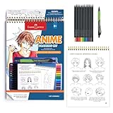
- DRAW YOUR OWN ANIME CHARACTERS: Step into the world of Shonen manga and learn to draw expressive anime characters with the Faber-Castell Anime Drawing Kit. For kids and beginners, this guided art set combines creativity, skill-building, and storytelling in one engaging project. A great pick for kids learning how to draw anime for kids 8-12+, it also serves as a starter color pencil set for beginners
- ALL-IN-ONE ANIME DRAWING KIT: Everything you need is included to start sketching right away! Inside you’ll find a spiral-bound instruction pad with step-by-step lessons, 20 practice pages, 10 Goldfaber colored pencils, a black Pitt Artist Pen, and a mechanical pencil with refills and eraser. This complete kit guides young artists through creating their own anime characters, scenes, and stories
- STEP-BY-STEP GUIDED INSTRUCTIONS: Learn the foundations of Shonen-style drawing with easy-to-follow tutorials. From head shapes and facial expressions to hairstyles, poses, and clothing, kids can build their drawing skills while discovering their unique anime style. The guided format makes it simple to progress while still leaving room for imagination and creativity
- PRACTICE, CREATE & SHARE: With extra practice pages and premium art supplies, kids can refine their skills and share characters with friends or display them as a collection. A creative alternative to coloring books for kids ages 8-12+, this kit inspires storytelling and imagination. Perfect for anime lovers, kawaii coloring book fans, or kids who enjoy K-pop fashion aesthetics, it brings characters and scenes to life in a whole new way
- WHY FABER-CASTELL: Since 1761, Faber-Castell has crafted premium art supplies trusted worldwide for their quality and creativity. The Anime Drawing Kit: Shonen Edition continues this tradition, giving young creators the tools and inspiration to explore anime art. A standout among craft kits, it combines quality materials with guided instruction to make learning fun, skill-building, and imaginative
11. The kinetic, pop-art spectacle of Redline
Redline is built for speed. Exaggerated designs, high-contrast color, crowded machinery, and aggressively composed action give its racing scenes a sense of continuous acceleration. Its hand-drawn visual excess is the point: the world seems to strain against the frame, making each race feel louder and faster than a clean, restrained design could.
10. The loose, expressive fantasy of Keep Your Hands Off Eizouken!
Keep Your Hands Off Eizouken! moves easily between grounded school life and sketches of imagined worlds. Its characters have lively, economical designs, while the visualizations of their ideas can expand into elaborate machines, landscapes, and action. That contrast makes the act of imagining visible: rough concepts become vivid environments without losing their sense of play.
9. The soft, nostalgic landscapes of Wolf Children
Wolf Children gives its changing seasons and rural settings a gentle naturalism. Open landscapes, muted color, and warm domestic interiors keep the emotional scale intimate even as the story spans years. Its backgrounds are more than scenic interludes: they help register the passage of time and the practical labor of raising a family.
8. The elegant, ink-like action of Samurai Champloo
Samurai Champloo mixes period setting with a contemporary rhythmic sensibility. Its clean character shapes and strong silhouettes keep sword fights legible, while loose timing and stylized motion give combat a dance-like snap. The visual contrast between composed historical spaces and disruptive movement mirrors the show’s blend of old and new.
The Tool Desk
Outbyte PC Repair FREEClear out junk files and repair common Windows errorsFree Scan →Outbyte Driver Updater FREEScan for outdated or missing drivers - takes under a minuteDriver Scan →7. The impressionistic motion of Mob Psycho 100
Mob Psycho 100 uses simple character designs as a platform for extraordinary movement. Faces and bodies can stretch, break apart, or become nearly abstract when emotion surges; shifting texture and color make psychic power feel unstable rather than neatly choreographed. The contrast between plain everyday figures and explosive passages gives the show its distinctive visual rhythm.
6. The painterly, mythic scale of Princess Mononoke
Princess Mononoke balances delicately observed natural settings with sharply defined figures and formidable creatures. Forest greens, earthy hues, and moments of violent color make the natural world feel alive without turning it into a simple pastoral backdrop. Its production history also shows why technique alone does not dictate appearance: Computer Graphics World reported that the film combined hand-painted cels with digitally composited 3D imagery, using toon shading to help digital elements retain a drawn quality (Computer Graphics World).
5. The precise, kinetic futurism of Akira
Akira marries densely constructed cityscapes with forceful character animation. Hard architectural lines, layered nighttime color, and controlled movement make Neo-Tokyo feel both monumental and unstable. The careful staging gives its bursts of violence weight: impact lands because the surrounding space has been made legible first.
Independent reader supportYour contribution helps us test, update, and keep practical guides available for everyone.4. The intimate realism of March Comes in Like a Lion
March Comes in Like a Lion shifts between grounded settings and visual metaphors for the characters’ inner lives. Quiet rooms, subdued palettes, and precise expressions can give way to washes of color or simplified imagery when emotion overwhelms ordinary observation. Its style is especially effective because the transitions feel purposeful: a change in the image marks a change in how a character experiences the moment.
Free tools Windows power users keep installed
One-click scans. No signup required.
3. The richly layered dream logic of Paprika
Paprika makes visual instability its organizing principle. Its cleanly drawn figures move through scenes that transform, collide, and fold into one another, letting a coherent character design persist amid an unpredictable world. Dense color and continuous transitions turn dream imagery into a visual experience rather than a set of symbolic illustrations.
2. The expressive, everyday wonder of My Neighbor Totoro
My Neighbor Totoro finds magic in clear shapes, warm color, and patient attention to ordinary places. Its rounded character designs are memorable without being overworked; fields, paths, trees, and rooms have enough detail to feel inhabited but leave space for wonder. A restrained visual approach lets small gestures and quiet encounters carry as much weight as the fantastical ones.
1. The fluid, layered world of Spirited Away
Spirited Away earns the top place for the way it makes a fantastical world feel both intricate and readable. Expressive characters, painted environments, and a broad range of colors give the spirit realm depth and variety, while clear staging keeps the viewer oriented as its rules and inhabitants change. The film’s visual richness never depends on detail alone; moments of stillness and open space are part of its design.
Its look also demonstrates that digital work need not announce itself as a separate aesthetic. TIME’s 2021 retrospective describes the film as using computer animation sparingly while retaining a traditional 2D appearance, and quotes Leiden University lecturer Mari Nakamura on the balance between 2D and 3D in Japanese animation (TIME). That observation is about this production and an attributed perspective, not a rule for every anime.
Windows Errors? Fix Them Before They Spread
Repair common Windows errors and clear accumulated junk for a smoother, more stable PC - no reinstall needed.Free scan · no reinstallOutdated Drivers Are Slowing You Down
One free scan finds every outdated or missing driver and matches the right update for your exact hardware.Free scan · exact hardware matchWhy anime has no single visual formula
Anime styles have developed through changing terms, tools, and artistic choices, rather than through a succession of uniform eras. Japan Media Arts Current Contents traces early Japanese animation descriptions including “manga,” “line drawing,” and “chiyogami film”; even a 1937 record of cel coloring described the work as a “color manga” (Japan Media Arts Current Contents). That varied vocabulary is a reminder not to reduce a period—or the medium—to one look.
For viewers comparing styles, pay attention to how the image works: whether contours feel delicate or forceful, how much detail competes for attention, how backgrounds frame or merge with figures, and whether movement is explosive, held, or gradual. The Cambridge Companion’s discussion of abstraction, density, line, and movement offers a useful framework for looking beyond character design (Cambridge University Press).
Quick Recap

Product prices and availability are accurate as of the date/time indicated and are subject to change. Any price and availability information displayed on Amazon at the time of purchase will apply.




